Please select the platform to login


The checkout page is the make-or-break moment of any online store. Customers have browsed, compared, and finally decided to buy—but if the checkout process feels confusing, slow, or overwhelming, they’ll abandon the cart without hesitation. With average cart abandonment rates hovering around 70%, getting the checkout experience right is crucial.
Among the biggest debates in eCommerce is whether a one-page checkout or a multi-step checkout works best. Some argue for speed and simplicity, while others prefer structure and clarity. In this guide, we’ll break down both approaches, compare their pros and cons, look at real-world examples, and help you decide which is right for your store.
Checkout isn’t just a formality—it’s a critical stage where small design choices have big consequences. A confusing form, too many fields, or a lack of trust signals can instantly cause customers to rethink their purchase.
In short, your checkout isn’t just the last step—it’s the heart of your revenue engine.
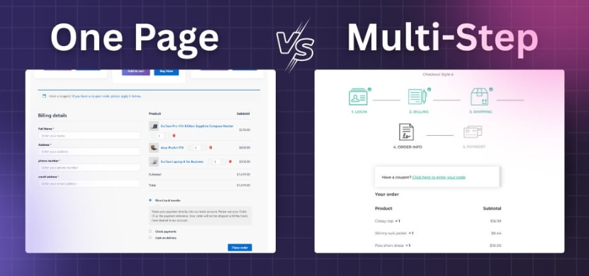
A one-page checkout compresses all checkout elements—shipping address, billing info, payment method, and order review—onto a single page. Customers can see everything at once, fill in details quickly, and confirm the purchase without clicking through multiple screens.
One-page checkout is all about speed—but sometimes at the cost of elegance and clarity.
A multi-step checkout divides the process into stages: shipping info, billing, payment, and confirmation. Each step appears on a separate page or as a guided flow with progress indicators.
Multi-step checkout is about structure and reassurance—but it may slow down fast-moving customers.

This isn’t about one being universally “better” than the other—it’s about matching checkout style to customer expectations.
Checkout style isn’t one-size-fits-all. The right choice depends on your products, audience, and brand positioning.
The key is aligning checkout flow with customer mindset and product complexity.
Regardless of which style you choose, these best practices apply:
Optimization is ongoing—there’s no “set it and forget it” in eCommerce.
A mid-sized fashion retailer switched from multi-step to one-page checkout. Their audience was young, mobile-first, and impatient. After testing, they saw a 12% lift in conversions and fewer abandoned carts.
An electronics brand selling high-ticket gadgets tested one-page checkout but saw higher cart abandonment due to perceived complexity. Sticking with multi-step, they added progress indicators and trust badges. Their checkout felt slower, but conversions improved 15%, as customers felt more secure entering payment details in steps.
Some brands use a “compressed multi-step” design—technically multiple steps, but displayed as accordion-style sections on a single page. This gives the speed of one-page with the clarity of multi-step.
Instead of asking “Which is better overall?”, ask “Which is better for my customers?”
The only way to know for sure is to test. Run experiments where half your traffic sees one-page checkout and half sees multi-step. Measure:
The data will tell you which option works best for your specific audience.
The debate between one-page and multi-step checkout isn’t about declaring a universal winner—it’s about context. One-page checkout excels at speed and simplicity, making it perfect for low-cost or mobile-first purchases. Multi-step checkout shines when clarity, trust, and reassurance matter most, particularly for high-value or complex products.
The truth is, both models have strengths, and the best solution often depends on your audience, product type, and brand maturity. The smartest eCommerce merchants don’t pick blindly—they test, measure, and refine their checkout flow over time. By focusing on customer experience and reducing friction, you’ll find the right approach that turns browsers into buyers and maximizes your store’s conversions.

