Please select the platform to login


In the world of web design, less is often more. One of the most overlooked yet powerful tools for improving user experience and increasing conversions is white space, also known as negative space. It’s not just “empty” space; it’s an intentional design element that creates balance, clarity, and focus. When used effectively, white space can guide visitors’ attention to the most important elements on your page and influence their buying decisions.
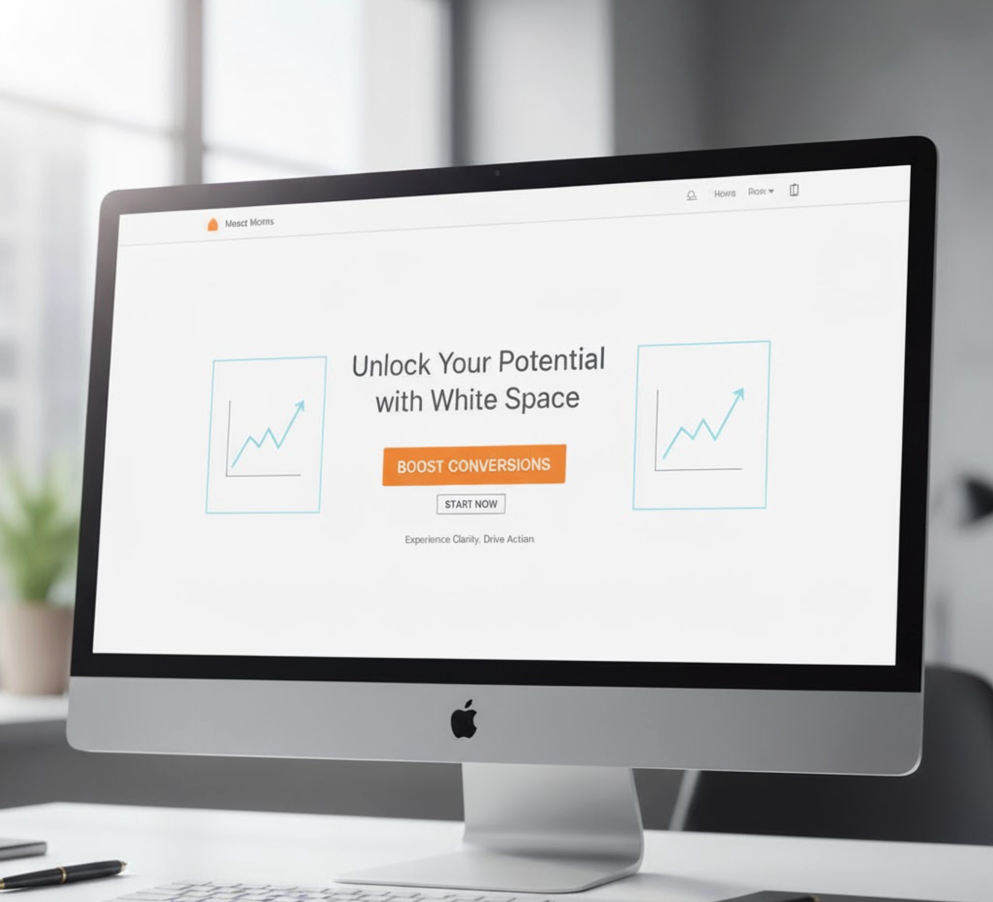
White space, also known as negative space, refers to the empty areas around and between the elements of a design, such as text, images, buttons, and graphics. It doesn’t necessarily have to be white; it can be any color, texture, or background image that provides visual breathing room. While it may seem like “unused” space, white space is a deliberate design choice that helps create structure, focus, and balance in your layout.
In digital design, especially on eCommerce sites, white space plays a critical role in how visitors perceive and interact with your brand. It shapes their first impression, determines how easily they can read your content, and influences their decision to stay, browse, or convert. A website crowded with content and visuals can feel overwhelming, whereas a layout that incorporates sufficient white space feels clean, modern, and professional.
White space also improves comprehension and retention. According to research from the Human Factors and Ergonomics Society, proper use of white space can enhance content understanding by up to 20%. This is because spacing reduces cognitive load, allowing users to focus on what truly matters—your product, message, or offer.
Ultimately, white space isn’t about removing content, but it’s about designing with intention. When used thoughtfully, it brings clarity to your message, elevates your brand perception, and drives users naturally toward conversion. Let’s find out the best practice to use white space smartly.
One of the simplest yet most effective uses of white space is around text. Long paragraphs, tight line spacing, and cluttered layouts can overwhelm visitors, making them leave before reading your message.
How to apply:
When your content looks approachable, users are more likely to read it, and the longer they stay, the more likely they are to convert.

White space can help your call-to-action buttons stand out naturally. Instead of using flashy colors or oversized buttons, simply surrounding your CTA with enough breathing room can make it pop on the page.
Best practices:
For instance, a product page designed with sufficient white space around the “Add to Cart” button often sees higher engagement, as users’ eyes are drawn directly to the intended action.
A cluttered navigation menu can confuse visitors and make it harder for them to find what they’re looking for. White space helps simplify navigation by separating items clearly and emphasizing hierarchy.
Tips to improve navigation:
A well-structured and spacious navigation bar not only improves usability but also keeps visitors moving smoothly through your conversion funnel.
White space helps you control what users see first and how their eyes travel across your page. It creates visual separation between key elements, guiding visitors toward what matters most.
How to create hierarchy with white space:
When applied strategically, white space directs attention without overwhelming the user, allowing your design to “breathe” while still communicating powerfully.

On mobile, space is precious, but that doesn’t mean you should fill every inch of the screen. In fact, mobile users rely even more on white space to navigate easily and focus on what’s important.
Mobile optimization tips:
A clean mobile layout feels faster, more intuitive, and less stressful, leading to higher engagement and conversions.
When combined with compelling product images or videos, white space creates a luxurious and professional impression. Many top Shopify stores, for example, use minimalistic layouts with generous white space to make their products feel more premium.
If you’re using an app like Lookfy, you can design your product galleries and “Shop the Look” sections with perfect balance, allowing visuals to shine while maintaining harmony and focus. The result is a shopping experience that feels elegant and conversion-driven.
White space isn’t only about aesthetics; it also affects how people feel. Cluttered pages can create anxiety or mistrust, while spacious layouts convey calmness and credibility. Visitors are more likely to trust a brand that feels confident enough to keep things simple.
Use white space to:
When users feel relaxed and confident, they’re far more willing to complete a purchase or subscribe to your offers.
White space is more than just a design trend, but it’s a strategic tool for improving user experience and driving conversions. By using it thoughtfully, you can enhance readability, focus attention on key actions, simplify navigation, and evoke positive emotions that lead to trust and sales.
Whether you’re designing a landing page, product gallery, or email campaign, remember that the most powerful designs are often the simplest. Embrace the space—because sometimes, what you don’t include is just as important as what you do.

