Please select the platform to login


Mobile shopping has become the default behavior for many consumers, yet the cart page is often still designed with desktop logic in mind. On small screens, every element competes for attention, and even minor usability issues can quickly turn into abandonment. Because the cart page sits at the most critical point of the buying journey, its layout directly influences whether a shopper completes a purchase or leaves.
A well-designed mobile cart page does more than list products. It reduces mental effort, removes uncertainty, and creates a clear path toward checkout. To achieve this, layout decisions must be intentional, mobile-first, and grounded in real user behavior. With that foundation in mind, let’s explore the most effective cart page layouts for mobile shoppers and why they consistently perform well.
The mobile cart page is where intent turns into action, or hesitation. At this stage, shoppers are no longer exploring; they are evaluating risk, cost, and effort. If the layout feels cluttered, confusing, or slow, even motivated users can lose confidence and abandon their carts.
Mobile shoppers are also more context-sensitive. They may be shopping during short breaks, while commuting, or in distracting environments. This makes clarity and speed far more important than visual complexity. A strong mobile cart layout respects these constraints by prioritizing readability, touch-friendly interactions, and immediate feedback.
When a cart page is thoughtfully designed for mobile, it creates a sense of momentum. Each scroll reinforces progress, each tap feels intentional, and the next step is always obvious. With that understanding, the most effective layouts share a few core structural principles—starting with how content is arranged on the screen.
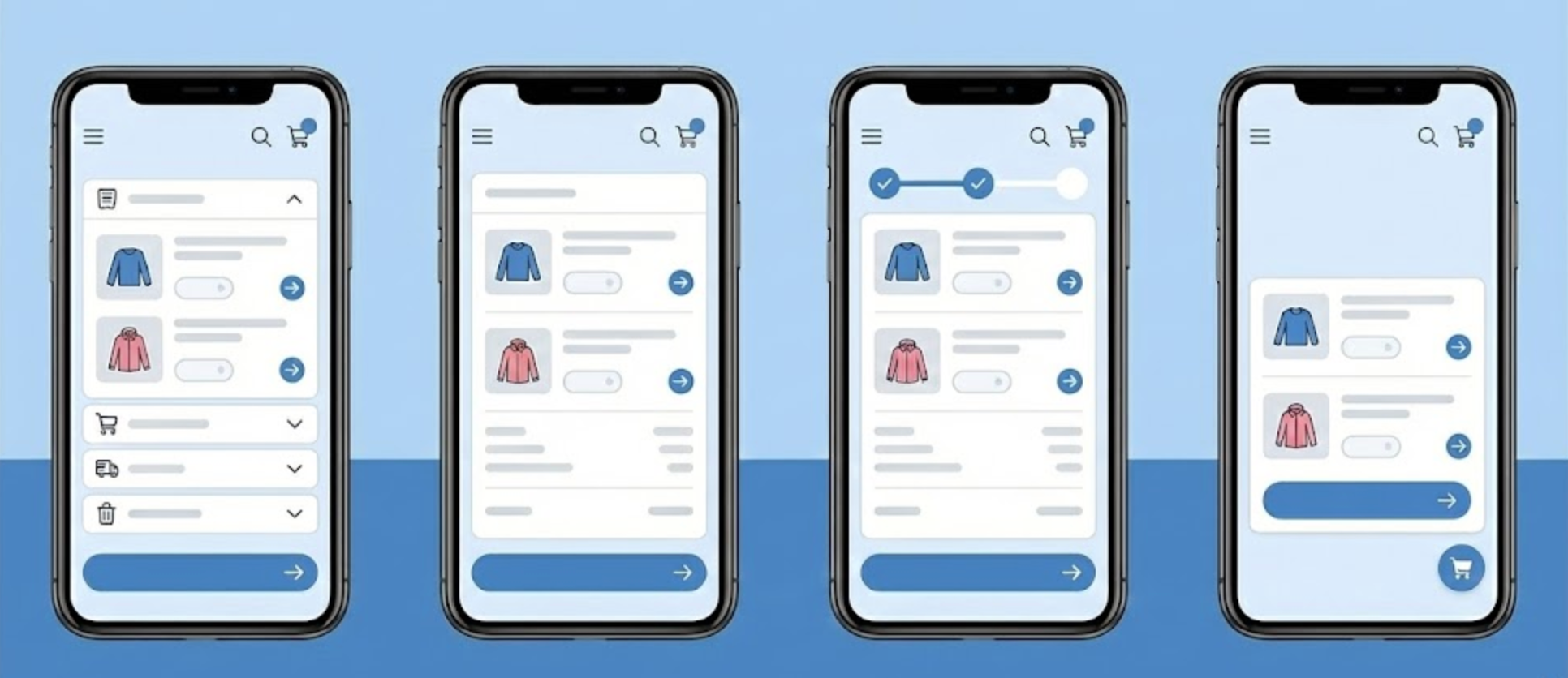
Single-column layouts are the backbone of high-performing mobile cart pages. Unlike desktop designs that can rely on horizontal space, mobile interfaces must guide users vertically in a clear and predictable way. A vertical flow aligns perfectly with natural thumb scrolling and reduces unnecessary eye movement.
This layout ensures that users consume information in the correct order. They see what’s in their cart, understand pricing, and encounter the checkout action without needing to search or zoom. By eliminating side-by-side elements, the interface feels calmer and more intuitive.
To maximize effectiveness, product images should appear first, followed by titles, variants, and pricing. Quantity controls and remove options should sit close to each item, while totals and checkout actions appear later in the flow. Once the structure feels logical, the next challenge is ensuring the primary action remains easy to access at all times.
On mobile devices, scrolling can quickly push important actions off-screen. This is why sticky checkout buttons have become a best practice in modern cart design. By keeping the checkout button visible as users scroll, the layout removes friction and reinforces the next step continuously.
A sticky button reduces the mental effort required to proceed. Shoppers never have to wonder where to go next or scroll back to find the action. This is especially helpful for carts with multiple items, long product names, or expandable sections that extend page length.
To maintain balance, the sticky button should feel helpful rather than intrusive. It should not cover critical content or distract from reviewing items. Pairing it with a small summary, such as the total price, adds clarity without overwhelming the interface. Once users feel guided toward checkout, simplifying what they see becomes the next priority.
Minimalist cart layouts focus on reducing visual noise while preserving access to important information. On mobile screens, showing too many details at once can feel overwhelming, even if the information is useful. This layout solves that problem by revealing complexity only when the user requests it.
At first glance, shoppers see only the essentials: product, quantity, and price. Additional information, such as shipping estimates, taxes, discount codes, or policies, is hidden behind expandable sections. This keeps the interface clean and focused on completion rather than exploration.
Expandable details also give users a sense of control. They can choose how much information they need before checking out, which helps reduce anxiety without forcing extra reading. As the interface becomes cleaner, visual organization plays an increasingly important role in usability.
Card-based layouts break the cart into clearly defined sections, with each product displayed in its own container. This design mirrors familiar mobile app patterns, making it immediately intuitive for users. Each item feels distinct, reducing confusion and accidental interactions.
The spacing and visual separation provided by cards improve scannability. Shoppers can quickly review what they’ve added, adjust quantities, or remove items without losing context. This is particularly helpful for stores selling visually driven or customizable products.
To keep the experience smooth, each card should include all relevant controls, image, title, quantity, price, and remove option, within easy thumb reach. Consistent alignment across cards reinforces predictability, which helps users move faster and with more confidence. With clarity established, allowing users to make quick changes becomes the next focus.
Inline editing layouts allow shoppers to update their cart without leaving the page or triggering disruptive popups. On mobile, every extra page load or modal introduces friction and increases the risk of abandonment. Inline controls keep the experience fluid and uninterrupted.
When quantity changes, price updates should happen instantly. This immediate feedback reassures users that their actions were successful and keeps them engaged. Removing items should feel just as seamless, without confirmation steps that slow momentum unless absolutely necessary.
The key to success here is touch-friendly design. Buttons must be large enough to tap accurately, and interactions should feel responsive even on slower connections. As users interact more confidently with their cart, transparency around pricing becomes increasingly important.
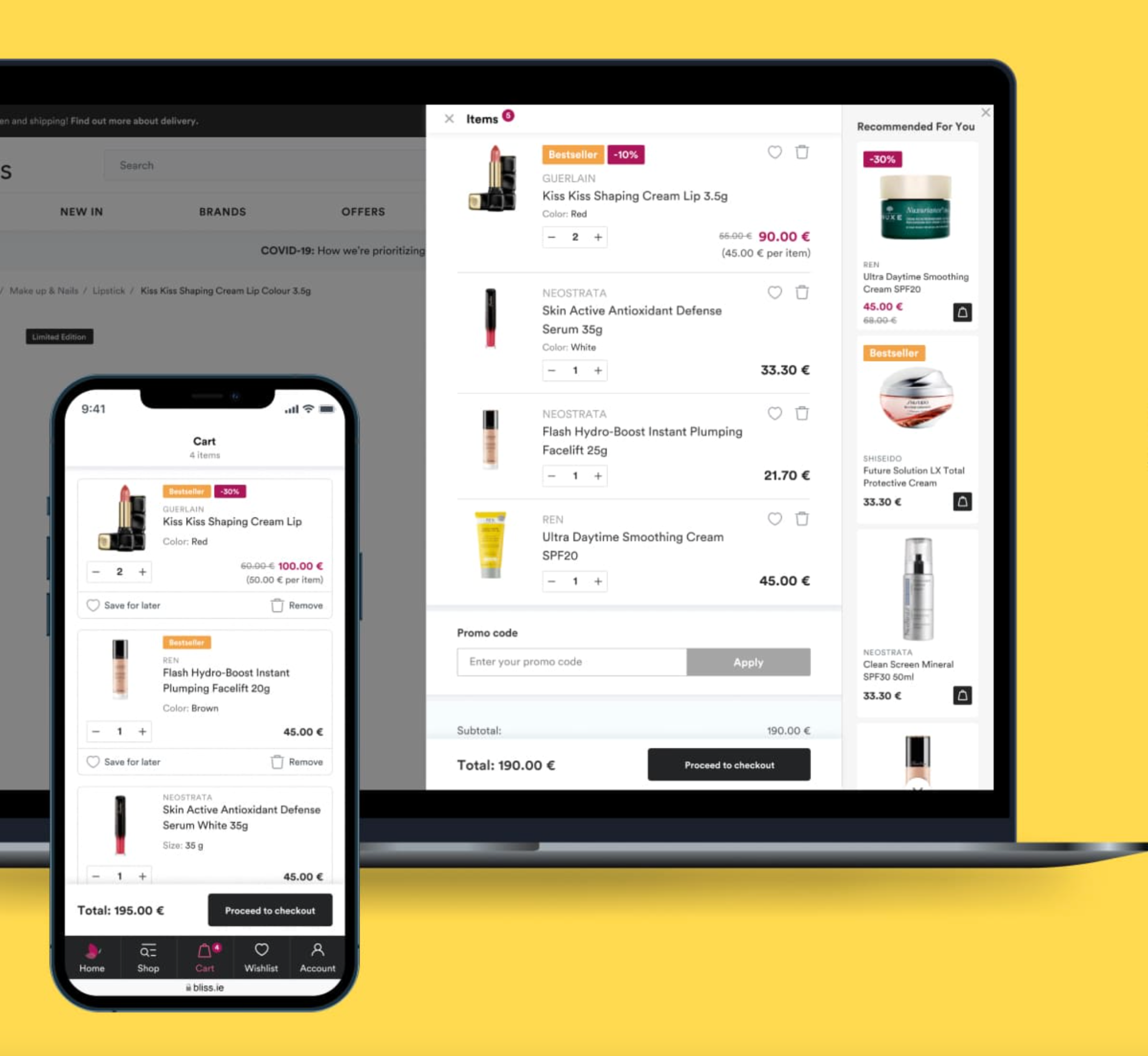
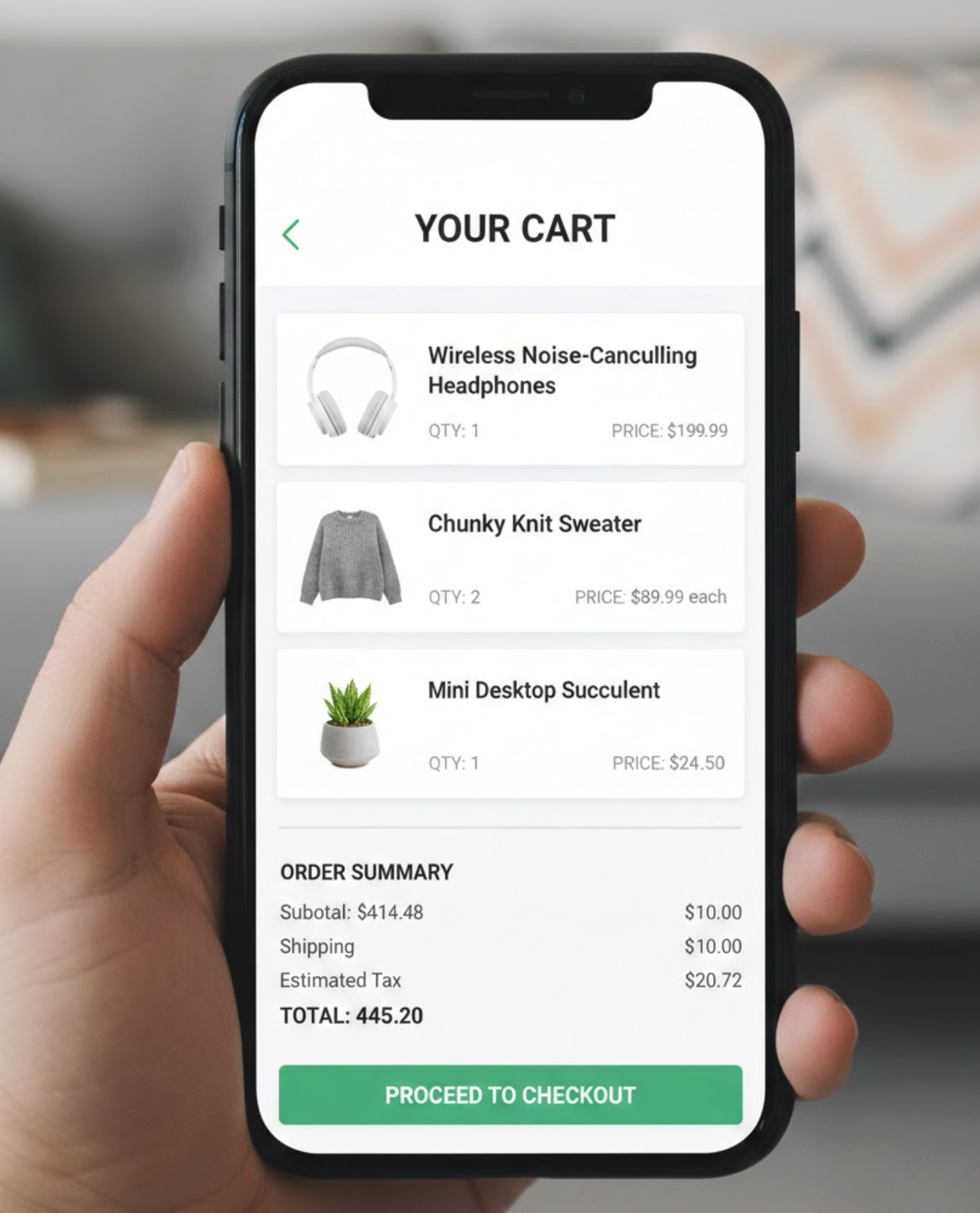
Price-related uncertainty is one of the biggest causes of cart abandonment, especially on mobile. A clear price breakdown layout addresses this by making all costs visible and easy to understand before checkout begins.
Rather than hiding fees until the final step, this layout shows subtotals, shipping costs, taxes, and discounts directly in the cart. When users understand how the total is calculated, they are less likely to feel surprised or misled later.
The presentation matters just as much as the information itself. Group related costs together, use clear labels, and update totals in real time as changes are made. Once pricing feels transparent, reinforcing trust becomes the final layer of optimization.
Even when everything looks correct, mobile shoppers often hesitate before completing a purchase. A trust-focused cart layout addresses this hesitation by subtly reinforcing security and reliability at the right moments.
Rather than large banners or lengthy explanations, effective trust signals are concise and well-placed. Secure payment icons, short return policy notes, and delivery assurances near the checkout button provide reassurance without distraction.
These elements work best when they feel integrated into the layout rather than added as afterthoughts. When trust signals are aligned with a clean design and clear pricing, they help users feel safe moving forward. Bringing all these elements together leads to a cart experience that feels complete and confidence-inspiring.
The best cart page layouts for mobile shoppers are built around clarity, momentum, and reassurance. Every design choice should reduce effort, answer questions before they are asked, and guide users naturally toward checkout. When layouts are single-column, actions are always accessible, details are well-organized, and pricing is transparent, the cart becomes a seamless extension of the shopping experience.
By investing in a mobile-first cart layout, you’re not just improving usability—you’re removing the final obstacles between interest and purchase. In today’s mobile-driven ecommerce landscape, that difference can have a direct and lasting impact on conversions and customer satisfaction.

