Please select the platform to login


Customer reviews are one of the most influential elements of an online store. They provide social proof, answer questions, and help hesitant shoppers feel more confident about making a purchase. However, the value of reviews depends not only on what customers say, but also on how easily other shoppers can read and understand those comments. When reviews appear cluttered, overly long, or difficult to scan, many visitors simply skip them.
Thoughtful formatting can transform reviews from dense blocks of text into clear, engaging insights that shoppers actually want to read. By improving structure, layout, and visual hierarchy, stores can turn everyday feedback into a powerful tool for trust and conversion.
Customer reviews are often treated as raw content that appears automatically on product pages. Yet formatting plays a critical role in how effectively this content communicates value. Even a thoughtful and detailed review can lose its impact if it is buried in a wall of text.
Most online shoppers skim rather than read carefully. When they visit a product page, they quickly scroll through reviews looking for signals: common compliments, repeated complaints, or confirmation that the product works as promised. If the layout of reviews makes this scanning process difficult, valuable information may go unnoticed.
Good formatting improves readability by guiding the reader’s attention. It breaks large ideas into smaller pieces and highlights the most useful insights. Instead of forcing shoppers to work through long paragraphs, well-structured reviews help them locate key points quickly.
In practical terms, readable reviews lead to:
The goal is not to change what customers say, but to present their words in a way that is easier to absorb.
One of the most common readability issues in review sections is the appearance of long, unbroken paragraphs. When text stretches across multiple lines without pauses, it becomes visually overwhelming. Many readers abandon these reviews before finishing them.
Short paragraphs make reviews feel lighter and more approachable. Each paragraph should ideally focus on a single idea, such as product quality, delivery experience, or usability.
Breaking reviews into smaller sections offers several benefits:
For example, a long review describing shipping, packaging, and product performance can be divided into three brief paragraphs. The meaning stays the same, but readability improves dramatically.
Not every sentence in a review carries equal weight. Often, one or two lines contain the most valuable insight for future customers. Highlighting these phrases can make reviews more useful at a glance.
Highlighting does not require heavy design elements. Subtle formatting choices such as bold text or quotation styling can draw attention to meaningful comments.
Important takeaways may include statements like:
By emphasizing these points, stores allow shoppers to extract useful information quickly without reading every word.
White space—the empty space around text—is one of the most powerful readability tools available. When review sections feel crowded, readers often struggle to distinguish where one review ends and another begins.
Spacing between reviews and paragraphs helps create a clear structure. It gives readers visual breathing room and improves the overall browsing experience.
Strategic use of white space can include:
A clean layout signals professionalism and encourages visitors to continue exploring feedback.
Shoppers often want to know who wrote a review. While anonymity is sometimes necessary, even small details about the reviewer can improve credibility.
Contextual information might include:
However, it is important that these elements support readability rather than overwhelm it. Too many labels or icons can clutter the layout.
The best approach is to keep reviewer context concise and visually secondary to the main review text.
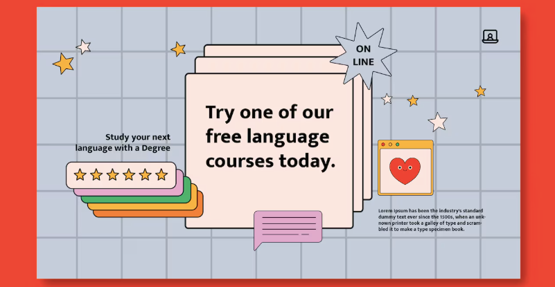
Star ratings act as quick visual summaries of customer satisfaction. They help readers evaluate reviews instantly before reading the full comment.
When ratings are clearly visible, shoppers can quickly identify positive and negative experiences. This visual cue helps them decide which reviews deserve closer attention.
Effective rating placement usually involves:
Clear rating visibility improves both readability and scanning speed.
While reviews should feel natural, a small amount of structure can make them easier to read. Some platforms guide reviewers by prompting them to comment on specific aspects of the product.
These prompts may include areas such as:
When reviewers respond to these prompts, their feedback becomes more organized and informative. Readers benefit from predictable sections that make comparison easier across multiple reviews.
However, prompts should remain optional. Overly rigid structures can make reviews feel forced rather than genuine.
Visual elements can support readability when used thoughtfully. Small icons next to key information—such as verified purchase badges or shipping feedback—can help readers interpret reviews faster.
Icons work well when they clarify meaning quickly without requiring extra reading. For instance, a simple checkmark next to “Verified Buyer” communicates authenticity instantly.
But excessive visual elements can clutter the page. Too many icons, badges, or labels compete for attention and distract from the review itself.
Balance is essential. Visual cues should guide readers, not overwhelm them.
A large portion of eCommerce traffic comes from mobile devices. On smaller screens, poorly formatted reviews become even harder to read.
Mobile readability requires careful attention to spacing, line length, and font size. What looks clean on desktop may appear cramped on a smartphone.
Effective mobile formatting includes:
When reviews are easy to read on mobile devices, more shoppers engage with them during the decision-making process.
Some reviews naturally provide more useful insights than others. Highlighting these helpful reviews at the top of the section improves the overall experience for readers.
Reviews that tend to perform well include:
Sorting reviews by helpfulness or relevance allows shoppers to see the most informative feedback first. This improves readability not by changing the content, but by prioritizing the best examples.
Images and videos within reviews can dramatically enhance readability and engagement. Visual content breaks up long sections of text and provides real-world context for the product.
Customers often trust visual reviews because they show authentic experiences rather than polished marketing images.
Visual reviews help readers quickly understand:
Even a single customer photo can make a review more compelling and easier to interpret.
However, visuals should complement text rather than replace it. A combination of short explanations and supporting images creates the most informative reviews.
Formatting reviews effectively is not about decoration—it is about communication. The goal is to help shoppers absorb meaningful feedback quickly and comfortably.
When reviews are easy to read, visitors naturally spend more time exploring them. This deeper engagement builds trust, especially for new customers who rely heavily on peer opinions before making a purchase.
A well-designed review section should feel organized, transparent, and welcoming. Instead of overwhelming visitors with dense information, it should guide them smoothly through the experiences of other customers.
Customer reviews are one of the most valuable assets an online store can have, but their impact depends heavily on readability. When reviews are formatted clearly—with thoughtful spacing, short paragraphs, visible ratings, and helpful visual cues—they become far easier for shoppers to explore and understand. These improvements do not require changing what customers say; they simply present feedback in a more accessible way.
By focusing on structure and clarity, businesses can transform ordinary reviews into powerful decision-making tools that build trust, reduce hesitation, and ultimately encourage more confident purchases.

