How to Optimize Above the Fold for Maximum Impact?
Marketing
Oct 29, 2025
7M
Alice Pham
When visitors land on your website, the first thing they see, before scrolling, is known as the “above the fold” area. This section is the digital storefront of your brand, where first impressions are formed and decisions to stay or leave are made within seconds. A thoughtfully designed above-the-fold area can increase engagement, build trust, and lead visitors toward conversion. Whether you’re running an eCommerce site, a landing page, or a business homepage, optimizing this space for clarity and impact is one of the most effective ways to boost your performance metrics.
What Does “Above the Fold” Mean?
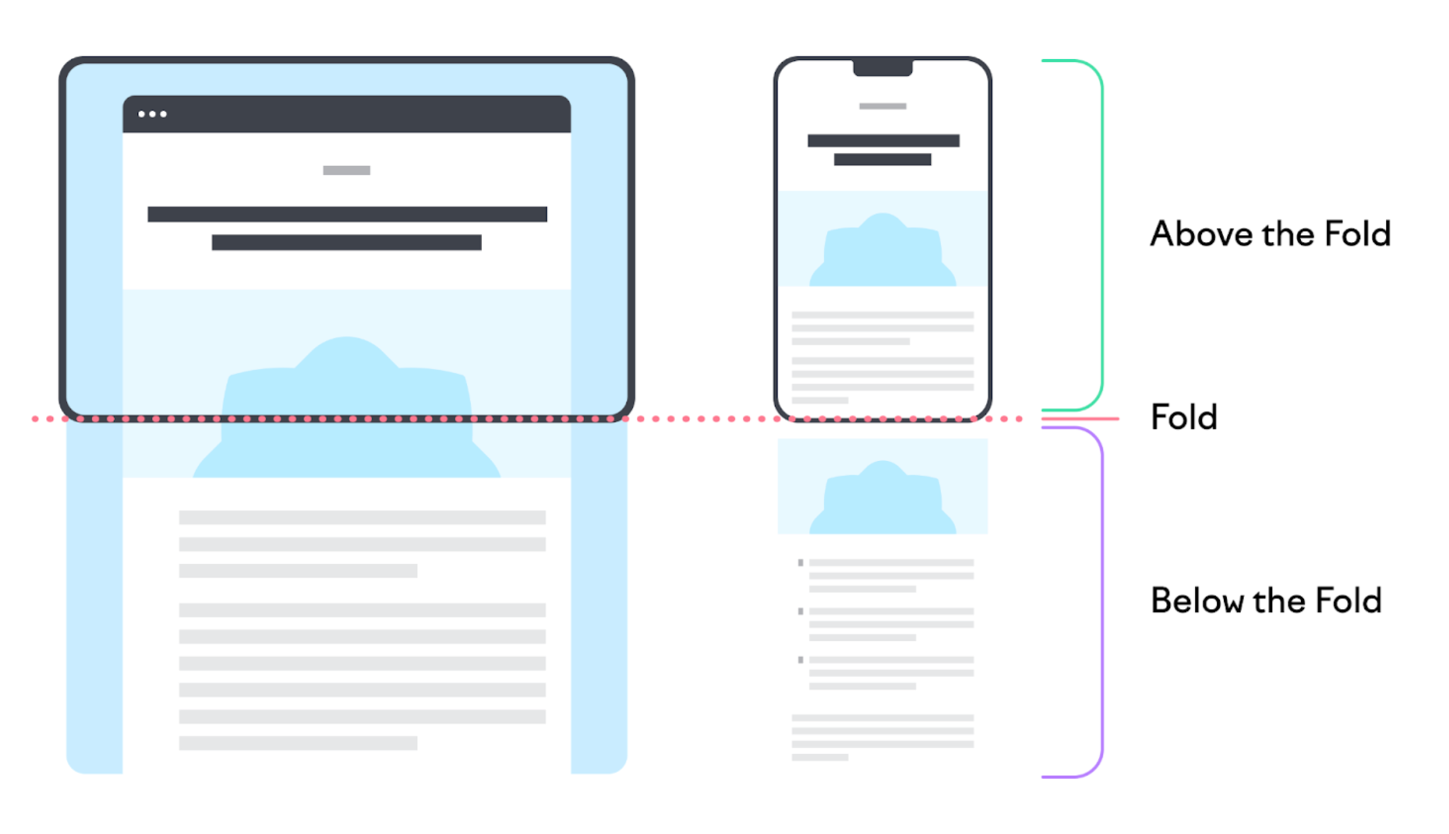
The term “above the fold” originated from the newspaper industry, referring to the top half of a folded newspaper that displays the most important headlines and images. In web design, it describes the visible portion of a webpage before a visitor scrolls down. This space varies across devices, what appears above the fold on a desktop might differ on mobile or tablet, making responsive design crucial.
This section sets the tone for the rest of your page. It’s where users decide whether to explore further or leave. Because attention spans online are short (often under 8 seconds), every element above the fold needs to deliver instant clarity and value. The goal isn’t just to look good, it’s to communicate what your website is about, why it matters, and what the visitor should do next.
Why Above-the-Fold Optimization Matters?
Your above-the-fold area is the visual and emotional handshake between your brand and your audience. It influences bounce rates, engagement, and conversions. Let’s explore why optimizing it is so essential:
First impressions count: Research shows users form opinions about websites in under 0.05 seconds. A clear and visually pleasing design helps establish trust immediately, while a cluttered or confusing layout can drive users away before they even read your content.
Guides user behavior: A strategic layout directs attention to the next action you want users to take, like clicking a “Shop Now” button, signing up for a newsletter, or scrolling for more information. Effective design reduces friction and increases flow.
Improves conversion rates: When your above-the-fold section clearly communicates your offer and makes it easy to act, visitors are more likely to convert. Even small tweaks, like simplifying the CTA or improving headline clarity, can yield significant results.
In short, above-the-fold optimization blends psychology, design, and marketing strategy. Done right, it can elevate your brand’s credibility and turn passive visitors into engaged customers.
Key Elements to Include Above the Fold-and How to Design Them for the Best Impact
A powerful above-the-fold section blends clear messaging, captivating visuals, and a seamless user experience. Each component must be purposeful and strategically designed to capture attention while guiding users toward action. Below are the most essential elements to include, and how to design each for maximum impact.
1. Headline and Subheadline
Purpose: Your headline is the most powerful text on the page and it's your one-sentence elevator pitch. Your headline is the anchor of your above-the-fold area. It’s the first piece of text visitors notice and the primary opportunity to communicate what your website offers. It should instantly convey your brand’s value proposition or unique selling point.
Let’s follow these guides to design for the best performance:
Craft a short, benefit-driven statement that directly addresses your visitor’s needs or desires. Avoid vague or generic phrases, and be clear and specific about your value.
Use the subheadline to expand on your headline with supporting details, emotional triggers, or proof points that reinforce your message.
Choose typography that stands out visually but aligns with your brand’s style, bold, clean, and easy to read even on smaller screens.
Place your headline at the center or upper-left area of the section since that’s where users naturally start reading.
Example: Instead of “Welcome to Our Store,” try “Transform Your Daily Routine with Eco-Friendly Essentials You’ll Love.” This phrasing is emotionally appealing, benefit-driven, and instantly communicates the brand promise.
2. Hero Image or Video
Purpose: Visuals are your most powerful storytelling tool. They create an instant emotional connection and reinforce the message in your headline.
How to design it:
Select a high-quality hero image or short looping video that visually represents your core offering or brand lifestyle. For eCommerce, show your product in use; for service brands, display real people or outcomes.
Keep the composition simple and uncluttered so the visual doesn’t compete with your headline or CTA.
If using a video, keep it under 10 seconds and ensure it plays smoothly without slowing page load times.
Optimize all media files for web performance, compress them to maintain speed without losing clarity.
Apply subtle overlays or gradients to ensure that your text remains readable over the background visual.
When done right, your hero visual instantly communicates mood, quality, and relevance, before a single word is read.
3. Primary Call to Action (CTA)
Purpose: Your CTA is the bridge between interest and action. It’s what converts curiosity into clicks. Whether it’s “Shop Now,” “Get Started,” or “See Plans,” it should be clear, visible, and persuasive.
Here is how to optimize it for the best result:
Use concise, action-oriented language such as “Shop Now,” “Start Free Trial,” or “Book Your Consultation.” The best CTAs tell users exactly what happens next.
Design the button to stand out visually through color contrast and generous padding. Choose a color that draws attention but still fits your brand palette.
Position the CTA where it’s immediately visible, typically below the headline or alongside key visuals.
Avoid multiple CTAs that compete for attention. If needed, use a secondary one with less visual weight (for example, “Learn More” beneath “Get Started”).
Include microcopy under or near the button to remove hesitation: phrases like “No sign-up required” or “Cancel anytime” increase confidence and click-through rates.
A strong CTA anchors your above-the-fold section and sets the stage for the rest of the page journey.
4. Navigation and Logo
Purpose: The header defines usability and brand recognition. It’s a small element that plays a big role in establishing trust and helping users orient themselves.
To maximize its impact, you should:
Place your logo in the top-left corner and link it to the homepage, it’s an expected convention that boosts navigation ease.
Keep navigation simple and minimal. Limit menu items to the most essential pages like “Shop,” “About,” and “Contact.”
Ensure the header remains sticky (visible when scrolling) if your site has a long layout, this helps with quick navigation.
Use clear labels instead of vague terms like “Solutions” or “Resources.”
On mobile devices, opt for a clean hamburger menu with a well-spaced dropdown. Include a search icon to help users quickly find what they need.
A clean and intuitive header helps users trust your site instantly and find their way effortlessly.
5. Trust Signals
Purpose: Visitors often hesitate when encountering a new brand. Trust signals act as reassurance, helping them feel safe and confident to take the next step.
Follow these actions to make the trust signals more valuable:
Add social proof elements like star ratings, customer testimonials, or “Verified Buyer” badges near your CTA or product visual.
Include recognizable security icons (SSL certificates, payment provider logos) if your page involves transactions.
Display mentions from press features or partner logos subtly, without overwhelming the main content.
Keep these elements visually balanced, small but noticeable, placed strategically near high-engagement areas.
If possible, use dynamic trust signals like live review counts or “X customers purchased this today” for real-time authenticity.
These small elements can make a big difference, especially for first-time buyers or users unfamiliar with your brand. They will feel at ease and more willing to engage.
Bringing It All Together
When all these elements, headline, visuals, CTA, navigation, and trust signals, are designed cohesively, they form a seamless narrative that instantly communicates who you are and why you matter. The key is harmony: each part should serve a purpose without overshadowing the others. By combining emotional appeal, clarity, and usability, your above-the-fold design can capture attention, guide action, and convert visitors before they ever scroll.
Best Practices for Above-the-Fold Design
Creating an effective above-the-fold section involves strategy, testing, and attention to detail. Here are key principles to guide your design:
Keep it simple and focused: Your goal is clarity, not complexity. Focus on one core message and avoid unnecessary distractions. A clean layout directs attention where it matters most.
Prioritize readability: Use large fonts, high-contrast colors, and concise copy. Users should be able to understand your offer within seconds, even when skimming.
Design for all devices: Test how your above-the-fold content displays on desktops, tablets, and smartphones. Fold height differs per device, so ensure that your key elements, such as headline, CTA, and image, remain visible and balanced across screens.
Use whitespace effectively: Empty space isn’t wasted but it creates visual breathing room that improves focus and hierarchy. Whitespace makes important elements stand out more naturally.
Ensure fast load speed: A slow-loading top section can cause visitors to leave before they even see your offer. Compress images, use efficient code, and test your site performance regularly.
Examples of Effective Above-the-Fold Designs
Looking at successful brands can provide inspiration for your own design approach.
Shopify: Features a clean hero section with a confident headline (“The platform commerce is built on”), a strong visual, and a high-contrast CTA inviting users to start a free trial. The simplicity communicates professionalism and trust.
Apple: Embraces minimalism. Each product section above the fold focuses on a single product, stunning visuals, and a simple “Learn more” button. The design evokes emotion and curiosity without overcrowding the space.
Airbnb: Uses lifestyle imagery of real experiences to engage visitors emotionally. Its interactive search bar immediately invites users to take action, searching for stays or experiences, turning the above-the-fold area into a functional engagement tool.
How to Test and Improve Above-the-Fold Performance?
Optimization doesn’t end with design, it’s a continuous process of measuring, learning, and refining. Here’s how to ensure your above-the-fold section keeps performing well:
Use heatmaps and scroll maps: Tools like Hotjar, Crazy Egg, or Microsoft Clarity show where users click, how far they scroll, and what parts of the page attract the most attention.
Run A/B tests: Try different headlines, images, or CTAs to identify what resonates best with your audience. Sometimes even small changes, like CTA color or wording, can improve conversions significantly.
Track performance metrics: Monitor bounce rate, click-through rate (CTR), and average session duration. A high bounce rate might indicate unclear messaging or slow load times.
Optimize for speed: Use Google PageSpeed Insights or GTmetrix to measure your load times. Slow performance can undermine even the best design.
Collect feedback: Use surveys or chat prompts to ask users what they expected to find on your page and whether they found it. Qualitative insights can be just as valuable as analytics.
Final Thoughts
Your above-the-fold section is one of the most valuable pieces of real estate on your website. It’s where first impressions form, trust begins, and user journeys start. A well-optimized design doesn’t just look good, but it speaks directly to your audience, loads quickly, and makes it effortless for visitors to engage with your brand.
Start by defining your primary goal, whether it’s driving sales, generating leads, or increasing sign-ups, and design your above-the-fold area to support that goal with focus and intent. Test, refine, and evolve based on user behavior.
Remember: your visitors don’t give you much time to impress them, but with the right design, you won’t need more than a few seconds to win them over.