Please select the platform to login


When it comes to designing an online store, navigation is everything. Your menu not only guides shoppers through your site but also influences how long they stay, what they click, and whether they make a purchase. Two of the most common menu types are traditional menus and hamburger menus. Each has its strengths, and choosing the right one can dramatically impact your store’s performance.
Let’s dive into the differences, pros and cons, and when to use each for the best user experience.
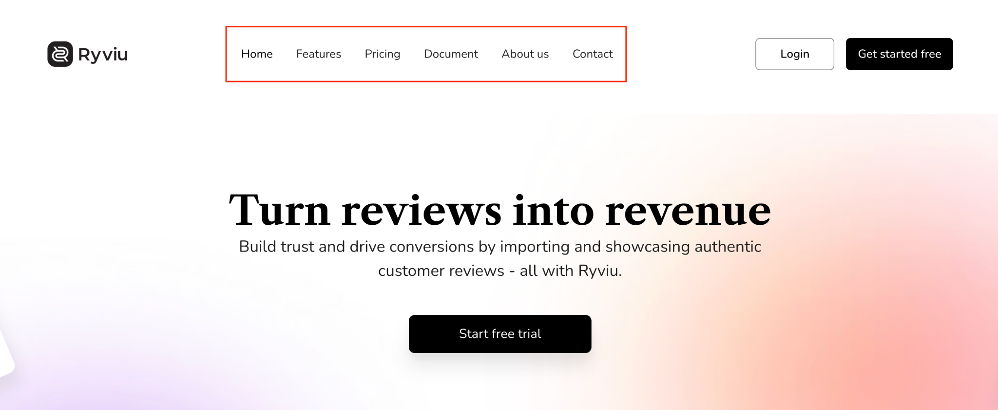
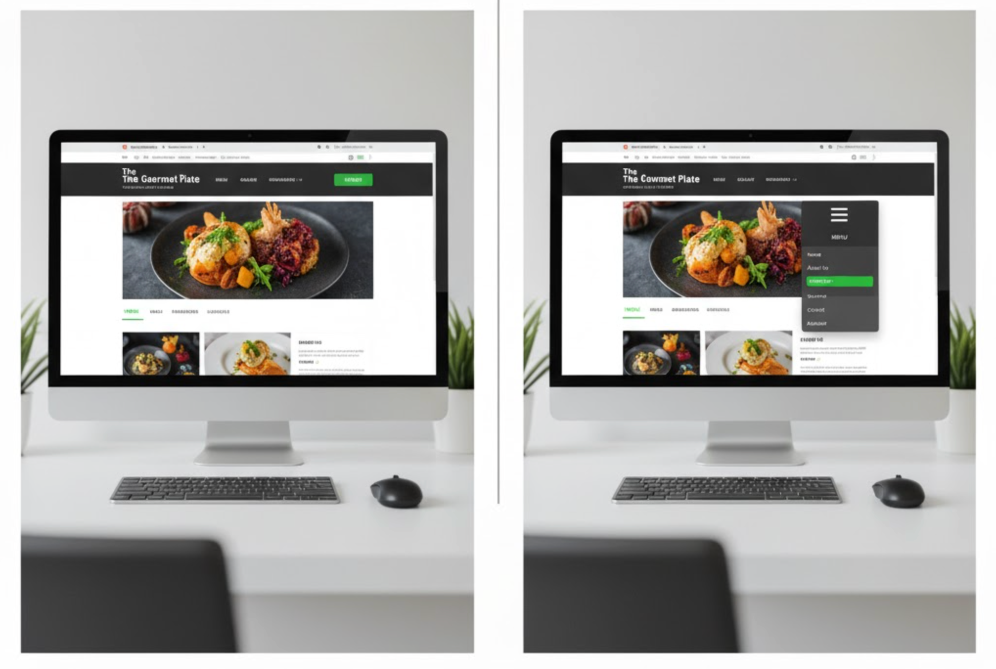
A traditional menu refers to the classic horizontal navigation bar displayed at the top of a webpage. It usually lists main categories like “Shop,” “About Us,” and “Contact.” This layout is immediately visible and intuitive, especially for desktop users.
Advantages of Traditional Menus:
Disadvantages:
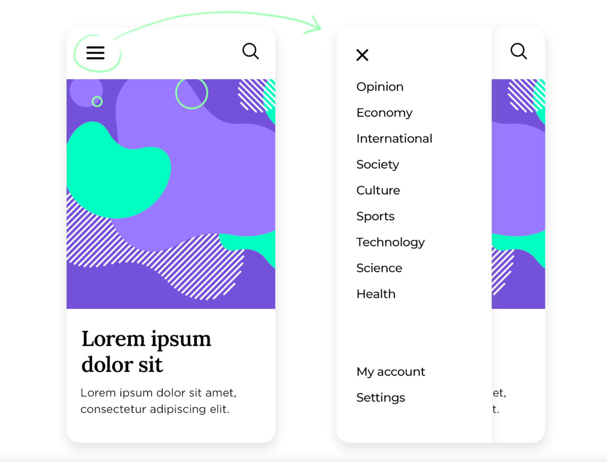
A hamburger menu uses a three-line icon, resembling a sandwich, to hide navigation links inside a collapsible panel. It’s widely used in mobile interfaces but also appears on minimalist desktop designs.
Advantages of Hamburger Menus:
Disadvantages:
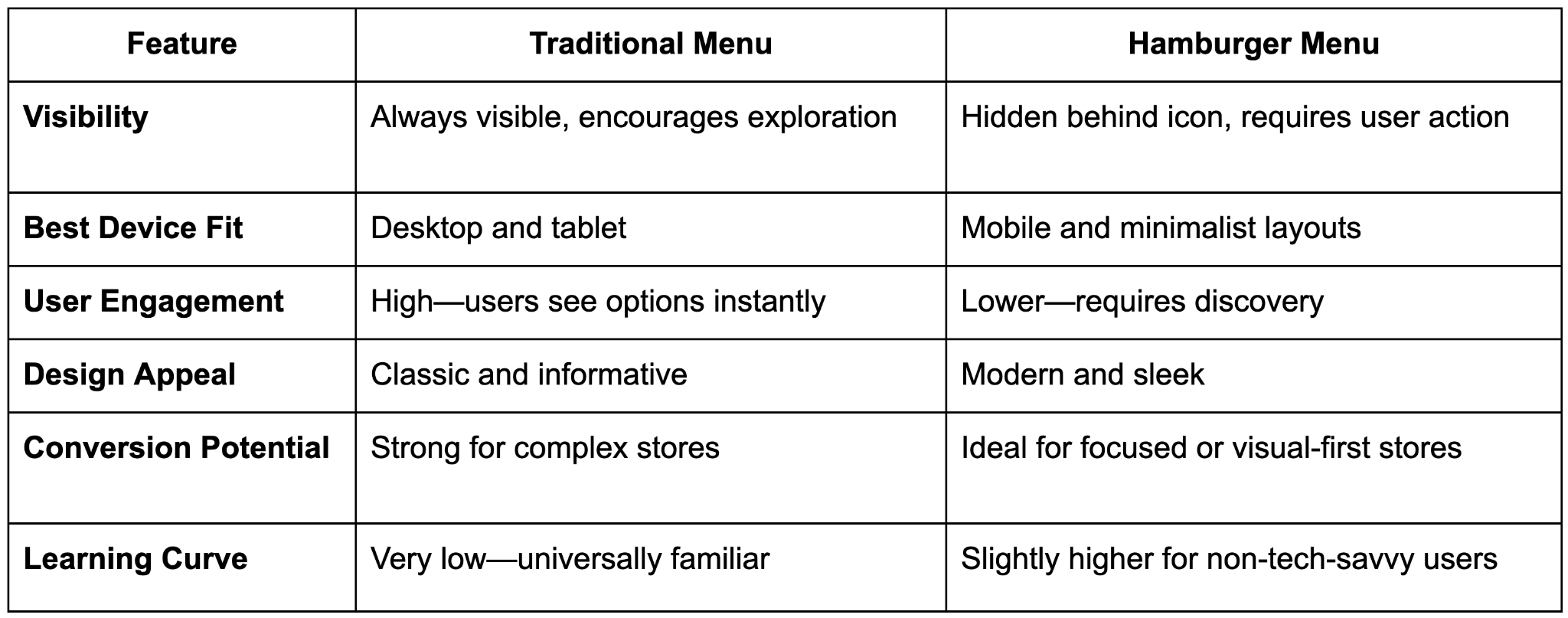
Below are detailed comparison by key factors:
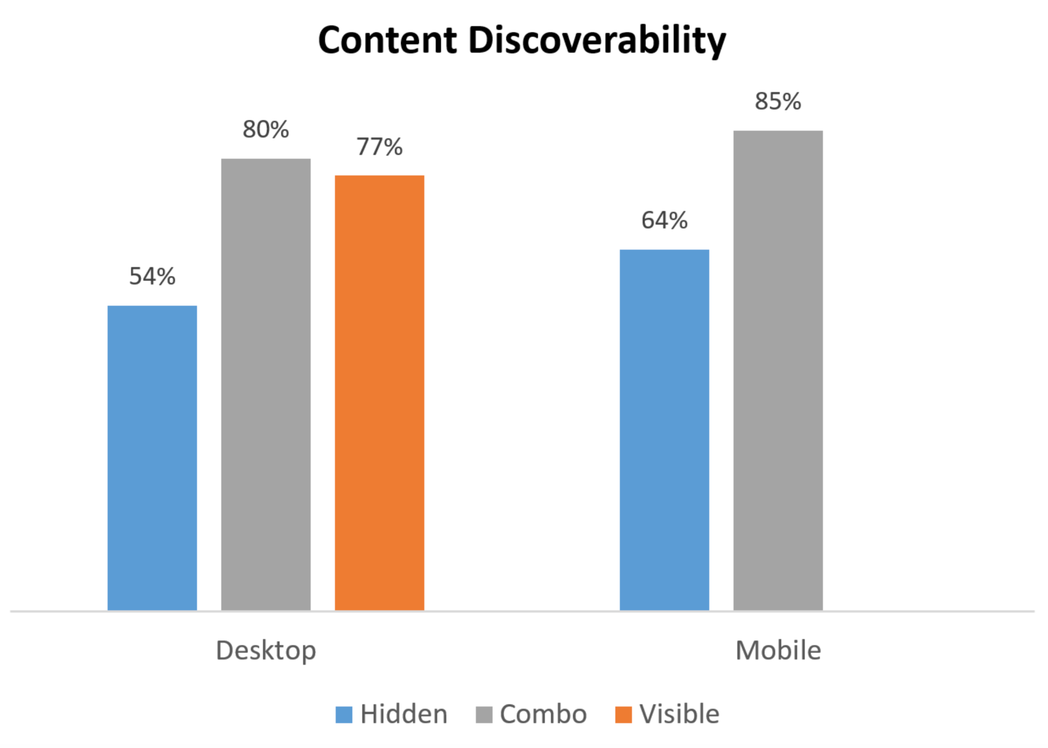
Traditional menus win in visibility since they display all main options upfront. Users can scan the page and understand where to go instantly. This leads to smoother navigation and fewer drop-offs.
In contrast, hamburger menus prioritize aesthetics over visibility. They keep pages clean but require an extra click, which might reduce discoverability. However, for brands targeting mobile-first audiences, this trade-off is often worth it.
For desktop experiences, traditional menus are unbeatable and they utilize the horizontal space perfectly. On the other hand, hamburger menus excel on mobile devices where screen space is limited. Many modern stores use a hybrid design: traditional on desktop, hamburger on mobile, ensuring both usability and style across platforms.
Because traditional menus expose options right away, they encourage exploration. Shoppers are more likely to browse multiple sections, leading to increased time on site. Hamburger menus may result in fewer interactions since the links are hidden, but they can focus users’ attention on key visuals or featured products, helping minimal brands maintain a clean narrative.
Traditional menus reflect familiarity and function, suitable for stores with diverse products or detailed navigation structures. Conversely, hamburger menus appeal to modern aesthetics, such as sleek, minimalist, and clean. If your brand emphasizes visuals and creativity, the hamburger menu enhances that contemporary feel.
Traditional menus help increase conversions for multi-category stores because users find what they want faster. Fewer clicks mean fewer opportunities for frustration. Hamburger menus work better for single-focus stores or product-driven brands where visuals lead the sales journey. They create a seamless flow between design and content.
Traditional menus have virtually no learning curve, everyone knows how to use them. Hamburger menus are widely recognized but can confuse less tech-savvy shoppers, especially older demographics. However, adding clear labels or animations (like “Menu” next to the icon) can significantly reduce friction.
If you sell multiple product categories (like fashion, electronics, or home goods), a traditional menu helps users find items quickly. For smaller or niche stores with fewer pages, a hamburger menu keeps things clean and focused.
Analytics often reveal where your customers shop most.
Design aesthetics matter. Traditional menus suit professional, content-heavy sites, while hamburger menus suit modern, image-driven stores.
For example:
Regardless of your choice, ensure your navigation:
Testing both versions using A/B testing can reveal what drives better engagement and conversions.
There’s no universal winner, it depends on your store’s goals and audience.
The best strategy? Combine both. Many successful Shopify and WooCommerce stores use hybrid designs, displaying a traditional menu on desktop and switching to a hamburger menu on mobile. This approach delivers the best of both worlds: clear navigation and a sleek, responsive layout.
Your navigation menu is more than a design choice, but it’s a sales tool. Whether you prefer the familiarity of traditional menus or the minimalist elegance of hamburger menus, the key is to make browsing effortless. Test both styles, analyze user behavior, and choose the layout that drives higher engagement, longer sessions, and ultimately, more conversions.
A smart, user-friendly menu can turn casual visitors into loyal customers.

