Please select the platform to login


Today’s eCommerce shoppers are constantly multitasking. They browse products while answering messages, scrolling social media, watching videos, or switching between tabs at work. Their attention is fragmented, their patience is limited, and their expectations are higher than ever. In this reality, eCommerce success no longer depends on persuading fully focused users, it depends on designing experiences that still work when attention is divided.
Designing for distracted shoppers means creating clarity, reducing mental effort, and guiding users toward decisions even when they are only partially engaged. Rather than fighting distraction, smart eCommerce design embraces it by simplifying choices, highlighting trust, and removing friction at every step of the journey.
This article explores proven strategies to design eCommerce experiences that convert distracted shoppers into confident buyers.
Distracted shoppers behave very differently from traditional, focused buyers. They rarely follow a linear journey from homepage to checkout. Instead, they skim quickly, jump between pages, and rely heavily on visual cues and emotional shortcuts to make decisions.
These shoppers are often:
Because distracted shoppers don’t invest much cognitive effort, they are more sensitive to friction, clutter, and uncertainty. Understanding this mindset is critical, because it shifts eCommerce design from “providing all information” to “providing the right information at the right moment.”
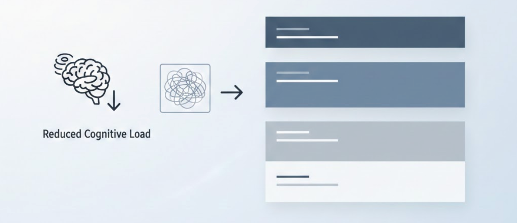
When attention is limited, complexity becomes a conversion killer. Crowded layouts, overlapping messages, and competing calls-to-action force users to think harder than they want to, and distracted shoppers simply won’t.
Effective eCommerce layouts for distracted users focus on clarity and hierarchy:
By simplifying layouts, you lower cognitive load and make pages easier to understand at a glance. Distracted shoppers don’t need to analyze your design, they need to feel immediately comfortable navigating it. Clean, predictable layouts help them do exactly that.
Distracted shoppers won’t dig through long descriptions to understand why a product is worth buying. If the value isn’t obvious within the first few seconds, they’re gone.
To communicate value instantly:
Instead of explaining everything, prioritize what matters most. When shoppers instantly grasp how a product solves their problem or fits their lifestyle, they are more likely to stay engaged, even if their attention is divided elsewhere.
Most eCommerce content is written as if users are reading carefully. Distracted shoppers don’t. They scan, skim, and cherry-pick information.
Designing for scanning means:
This approach allows shoppers to absorb critical information without fully committing their attention. Even if they only glance at the page, they should still walk away with a clear understanding of the product and next steps.
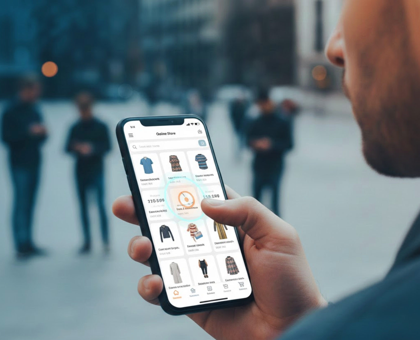
Distraction and mobile shopping go hand in hand. Many users browse on phones while standing, commuting, or multitasking, often using just one hand.
A mobile-first experience for distracted shoppers should:
When mobile design feels effortless, distracted users are far more likely to continue scrolling, exploring products, and completing purchases without frustration.
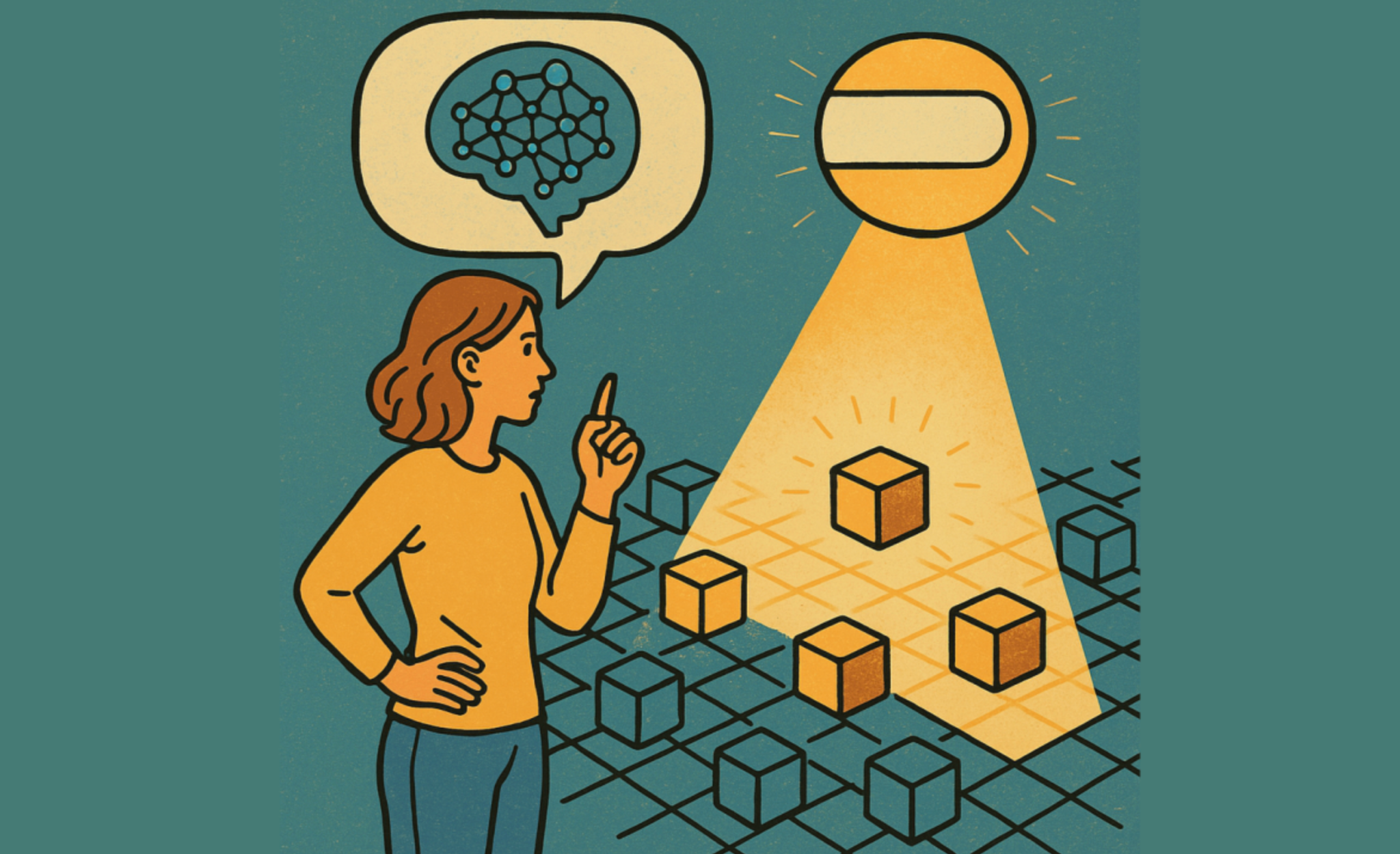
Too many choices demand too much mental energy. For distracted shoppers, this often results in hesitation, or abandonment.
You can reduce decision fatigue by:
Guided choices act as mental shortcuts. They help shoppers feel confident without requiring them to evaluate every option. This is especially effective when combined with social proof, such as showing which products other customers prefer.

Distracted shoppers rely heavily on trust signals because they don’t have time to research deeply. Visual reassurance plays a major role in keeping them engaged.
Strong trust elements include:
This is where tools like Ryviu fit naturally into the experience. By collecting and displaying customer reviews, ratings, and photo and video feedback, Ryviu helps eCommerce stores provide immediate social proof. Distracted shoppers can quickly see that others have bought, and liked, the product, reducing hesitation without requiring extra effort.
Checkout is one of the most distraction-sensitive moments in the shopping journey. Any confusion, delay, or unnecessary step can cause users to abandon their carts when their attention shifts.
A distraction-friendly checkout should:
The goal is to help shoppers complete their purchase before something else steals their attention. The simpler and faster the checkout, the higher the chance they’ll finish it.
Micro-interactions can be powerful tools for guiding distracted shoppers, but only if they are subtle and purposeful.
Effective micro-interactions:
Instead of drawing attention away from the goal, these interactions reassure users that they’re on the right path, helping them stay oriented even when multitasking.

After a distracted shopper takes action, adding to cart, selecting a variant, or proceeding to checkout, they often experience brief hesitation. Smart design reinforces confidence at this moment.
You can do this by:
This consistent reinforcement helps distracted shoppers feel reassured without stopping their flow.
Designing for distracted shoppers isn’t a one-time effort. Real-world behavior constantly changes, and ongoing optimization is essential.
Focus your testing on:
Session recordings, heatmaps, and review engagement metrics can reveal where attention fades and where clarity is needed. Continuous refinement ensures your eCommerce experience stays aligned with how people actually shop.
Distracted shoppers aren’t an edge case; they’re the majority. Successful eCommerce experiences are no longer built for perfect attention, but for real-life behavior filled with interruptions and competing priorities.
By simplifying layouts, making value obvious, guiding decisions, and reinforcing trust through tools like customer reviews and social proof, you can design experiences that work even when attention is limited. When eCommerce feels clear, reassuring, and effortless, distracted shoppers don’t just browse, they buy.

