Please select the platform to login


Typography is one of the most powerful yet underrated design elements in eCommerce. The fonts, spacing, and overall presentation of your text play a key role in shaping how customers perceive your brand. A store with refined typography instantly communicates professionalism, trust, and value. In contrast, inconsistent or cluttered fonts can make even great products look unappealing. Let’s explore how to use typography effectively to give your Shopify store a truly premium look.
Typography isn’t just about making words look good — it’s about enhancing readability, emotion, and user experience. In an online store, your text guides customers through their buying journey, from product descriptions to checkout. Premium typography ensures that your brand feels cohesive and credible, increasing customer trust and conversions.
Why typography matters:
Selecting the right font combination is the foundation of a premium look. A good pairing usually involves one font for headings (to draw attention) and another for body text (for easy reading). Mixing a serif and sans-serif can create an elegant balance between tradition and modernity. Limit yourself to two fonts to keep your design simple and consistent.
Tips for choosing fonts:
Readability should always come before style. No matter how beautiful your font looks, it must be easy to read across all screen sizes. Customers shouldn’t have to strain their eyes to understand your message. Simple, well-designed fonts are timeless and keep the focus on your products.
To enhance readability:

White space (or negative space) is one of the hallmarks of premium design. It gives your typography room to breathe and helps important elements stand out. A clutter-free design allows visitors to focus on what matters most, your content and products. White space can instantly transform a crowded layout into one that feels calm, balanced, and luxurious.
Best practices for white space:
Typography should guide visitors naturally through your store. A well-defined hierarchy helps users scan and absorb information quickly. By varying the size, weight, and style of your text, you create a structure that’s both informative and visually appealing. A strong hierarchy makes your store easier to navigate and boosts the perception of professionalism.
How to create hierarchy:
Premium brands often use restraint in color, and the same applies to typography. Too many text colors can distract and make your design feel unrefined. By sticking to a minimal palette, you allow your fonts and visuals to complement each other. A well-balanced color scheme exudes sophistication and consistency.
Typography color tips:
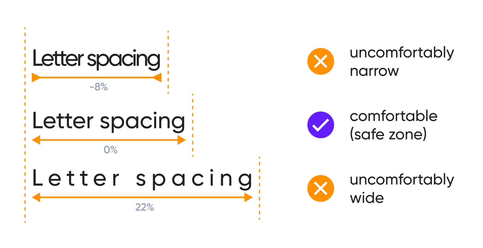
Small typographic adjustments can make a big difference in how your text feels. Slightly increasing letter spacing (tracking) and line height adds airiness and elegance. These details contribute to a sense of quality and refinement. However, the goal is subtle enhancement, overdoing it can break your design rhythm.
Optimization suggestions:
Alignment directly affects how professional your store appears. Consistent alignment ensures that your design looks neat, structured, and easy to follow. Misaligned text can make even a beautiful layout look messy. For most websites, left-aligned text offers the best readability, while centered text works best for short headlines or minimal hero sections.
Alignment best practices:

Your typography should adapt gracefully to different screen sizes. Large fonts that look great on desktop might overwhelm mobile screens, while small text can strain users’ eyes. Responsive typography ensures that your store looks polished and professional on every device. This adaptability is essential for maintaining a high-end shopping experience.
Font size tips:
Typography plays a crucial role in brand identity. The fonts you choose should communicate your brand’s tone, whether it’s elegant, playful, or modern. When your typography matches your brand personality, it reinforces your message and builds trust. Consistency across all platforms ensures your brand feels unified and memorable.
Brand typography ideas:
Typography is never “one and done.” As your brand evolves, so should your design choices. Testing different font combinations and layouts helps you discover what resonates best with your audience. Continuous refinement keeps your store looking current and visually engaging.
How to refine effectively:
Typography is the backbone of elegant web design. Every letter, space, and alignment choice sends a subtle message about your brand’s quality and personality. By implementing these typography tips, you can create a refined, user-friendly store that looks and feels premium. Remember, luxury is not about over-designing, but it’s about precision, balance, and attention to detail.

