Please select the platform to login


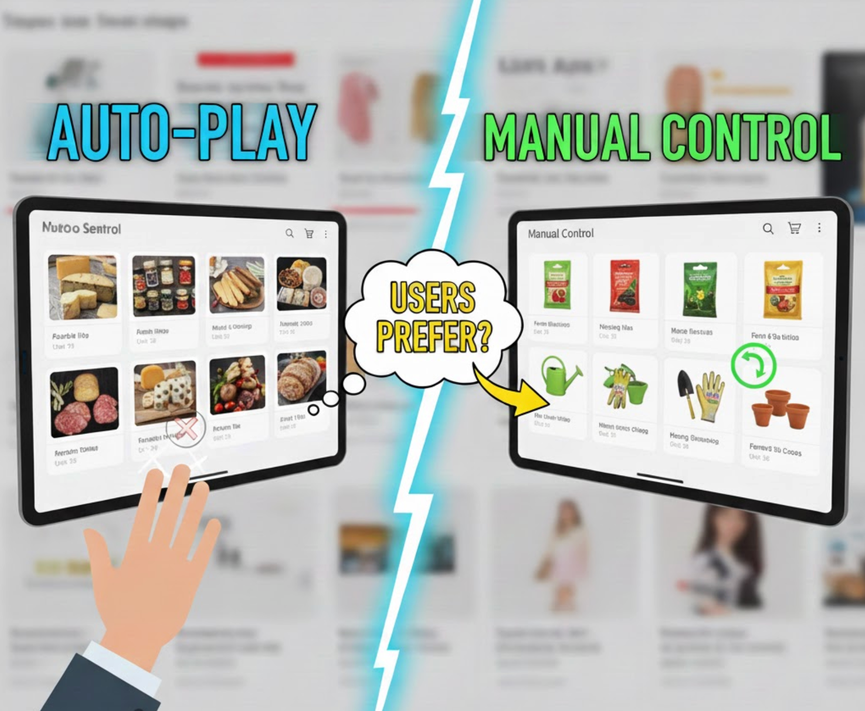
Carousels are a familiar design pattern across websites, apps, and eCommerce platforms. They promise a simple solution to a common problem: how to show multiple pieces of content without overwhelming the layout. However, one critical decision often determines whether a carousel helps or hurts the user experience, should it auto-play, or should users control it manually?
Although both approaches are widely used, they lead to very different outcomes in terms of usability, accessibility, engagement, and conversion. This article breaks down what users actually prefer, comparing auto-play and manual carousels across key UX dimensions, with a clear verdict for each.
At a high level, the difference between auto-play and manual carousels lies in who controls the interaction, the system or the user.
Auto-Play Carousels automatically advance slides after a fixed time interval, often between three and five seconds. Designers typically use them to create motion, attract attention, or rotate through multiple promotions without requiring user input.

Manual Carousels, by contrast, remain static until the user interacts. Slides move only when users click arrows, tap navigation dots, or swipe on touch devices. This approach prioritizes intentional interaction over automated behavior.
From a UX perspective, this distinction is crucial. Auto-play assumes that movement increases engagement, while manual carousels assume that users want control over pace and focus. Understanding which assumption aligns better with real user behavior is the foundation of this comparison.
Auto-Play Carousels: Auto-play shifts control away from users and places it in the interface logic. While this can feel lively at first glance, it often introduces friction. Users may want to pause, reread, or compare content, but the carousel continues moving regardless of their intent. This can create a subtle sense of conflict between user goals and system behavior.
Manual Carousels: Manual carousels respect user autonomy by responding only when users choose to act. This reinforces a feeling of control and predictability. Users can stop, revisit earlier slides, or ignore the carousel entirely without consequence, all of which contribute to a more comfortable browsing experience.
Verdict: Manual carousels are strongly preferred. Users consistently favor interfaces that adapt to them, rather than forcing them to adapt to the interface.
Auto-Play Carousels: When slides change automatically, reading becomes time-bound. Users must either rush to process the content or wait for the slide to cycle back. This is especially problematic for text-heavy slides, pricing information, or feature explanations, where comprehension directly affects decision-making.
Manual Carousels: Manual carousels eliminate time pressure. Users can read carefully, skim, or pause as needed. This flexibility supports different reading speeds, languages, and levels of familiarity with the product or message.
Verdict: Manual carousels win decisively. For any scenario where understanding matters, user-controlled pacing leads to better comprehension.
Auto-Play Carousels: Motion naturally draws attention, but constant motion also competes with other page elements. Auto-play carousels can increase cognitive load by repeatedly pulling focus away from what users are currently doing, such as scanning product grids or reading descriptions.
Manual Carousels: By staying still until activated, manual carousels reduce unnecessary visual noise. Users decide when to engage, which helps maintain focus and prevents the interface from feeling chaotic or overwhelming.
Verdict: Manual carousels are less mentally taxing. Reducing forced motion helps users stay oriented and focused.
Auto-Play Carousels: Auto-play creates barriers for many users. Screen reader users may encounter changing content without warning, while users with motor impairments may struggle to interact before slides advance. Additionally, continuous motion can cause discomfort for users sensitive to animation.
Manual Carousels: Manual interaction supports accessibility by default. Content remains stable, navigation is predictable, and users can interact at their own pace. Manual carousels are also easier to optimize for keyboard navigation and assistive technologies.
Verdict: Manual carousels are the accessibility-safe choice. From an inclusive design standpoint, manual control is clearly superior.
Auto-Play Carousels: Auto-play may give the impression of activity, but this movement does not necessarily translate into meaningful engagement. Users often ignore rotating banners, especially when they resemble advertisements or change too frequently.
Manual Carousels: When users interact with a manual carousel, the action is intentional. Clicks and swipes signal genuine interest, making engagement more valuable even if overall interaction volume is lower.
Verdict: Manual carousels produce higher-quality engagement. Intentional interaction is more meaningful than passive exposure.
Auto-Play Carousels: Auto-play excels in visually driven contexts. Smooth transitions and automated flow can create a cinematic or inspirational experience, especially for brand storytelling, lifestyle imagery, or portfolio-style presentations.
Manual Carousels Manual carousels prioritize clarity over drama. While they may feel less immersive, they offer reliability and user control, which is often more appropriate for functional or conversion-focused pages.
Verdict: Auto-play has an advantage in image-first storytelling. When emotion outweighs information, controlled auto-play can enhance the experience.
Auto-Play Carousels: On mobile devices, auto-play can interfere with scrolling and tapping. Slides may change while users are attempting to interact, leading to accidental clicks or frustration.
Manual Carousels: Manual carousels align naturally with swipe gestures, which users already expect on touchscreens. This makes interaction feel intuitive rather than intrusive.
Verdict: Manual carousels perform better on mobile. Touch-based interfaces strongly favor user-initiated movement.
Auto-Play Carousels: While auto-play may expose users to multiple messages, exposure alone does not guarantee action. Important offers may be missed if users are not paying attention at the right moment.
Manual Carousels: Manual carousels allow users to explore content deliberately, increasing the likelihood that interactions align with intent, a key driver of conversions.
Verdict: Manual carousels support stronger conversion outcomes. Intent-driven exploration typically leads to better results than forced rotation.
Yes, but only when done thoughtfully.
A hybrid approach can work when manual control is prioritized, and auto-play acts as a secondary enhancement rather than the primary driver. For example, a carousel might auto-play initially to signal interactivity, then stop once the user engages. Another common approach is enabling auto-play only for visual content, while ensuring clear pause controls are always available.
The key is restraint. Auto-play should never override user intent or accessibility needs. When users interact, the system should immediately defer to them. In this sense, the best “combined” carousels are still fundamentally manual-first, with auto-play used sparingly and respectfully.
Across usability studies, accessibility guidelines, and real-world behavior, one pattern is clear: users prefer manual carousels in most scenarios. They offer greater control, better comprehension, lower cognitive load, and stronger alignment with accessibility and conversion goals.
Auto-play carousels still have a place, primarily in image-driven, inspirational contexts, but they should never be the default for content that users need to read, understand, or act upon.
If your carousel communicates information or supports decisions, let users control it. Motion should support the experience, not compete with it.

