Please select the platform to login


Color is one of the most powerful storytelling tools in eCommerce. It sets the tone for your entire Shopify store, shaping how visitors feel about your brand before they even read a word. The right palette can make your products shine, strengthen your identity, and boost sales, all through emotion and visual harmony.
Imagine your store as a stage. The colors are your lighting and they guide where customers look, create mood, and make every detail pop. Whether you’re designing a new Shopify theme or rebranding your online store, choosing the right color scheme is a creative decision that blends aesthetics with psychology.
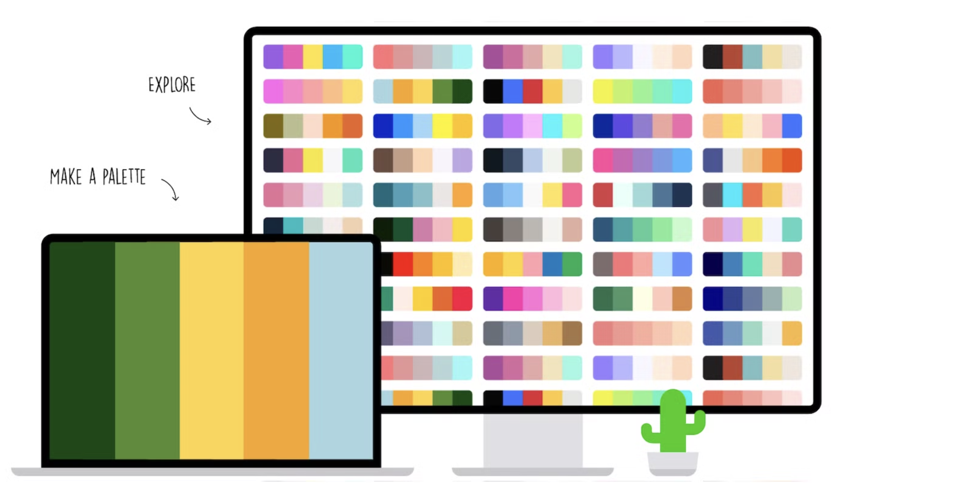
Below, you’ll find ten color schemes that not only look amazing but also work strategically to connect with shoppers and increase conversions.
Colors don’t just make your store “pretty.” They influence decisions, emotions, and trust. Studies show that people make subconscious judgments about a product within seconds, and up to 90% of that impression comes from color alone.
On Shopify, where users rely on visuals to gauge brand quality, colors can:
Now, let’s dive into ten winning color schemes that bring your Shopify store to life.
Mood: Minimal, elegant, timeless
This duo never goes out of style. Black and white create a sophisticated balance, perfect for brands that value simplicity, contrast, and focus. On Shopify, it’s a versatile palette that works beautifully with high-quality product photography.
Why it works:
Black and white is the ultimate minimalist statement and it highlights your product imagery and typography while keeping your layout clutter-free. The clean aesthetic projects authority and class, making visitors trust that your products are premium. Psychologically, black conveys power and exclusivity, while white provides openness and clarity. Together, they create a balanced experience that feels intentional and upscale.
Shopify tip: Use white for your background, black for headlines, and medium gray for product descriptions. Accent your “Add to Cart” buttons with a single pop of color like gold or green to attract attention.
Color Palette (HEX):

Mood: Natural, grounded, organic
Think soft beige, sand, olive, and warm taupe. Earthy tones bring a handcrafted, eco-conscious feeling that resonates with modern consumers who value sustainability and simplicity.
Why it works:
These hues mirror nature, wood, stone, and soil, creating a calming atmosphere that encourages slow, mindful shopping. Earth tones work because they feel familiar and safe, reminding customers of authenticity and natural beauty. They also pair beautifully with organic textures like linen, paper, or matte finishes, making them perfect for Shopify themes that feature storytelling or lifestyle imagery.
Shopify tip: Choose a warm beige or olive background, use deep brown for headlines, and contrast product cards with soft cream borders to maintain a natural flow.
Color Palette (HEX):

Mood: Energetic, confident, powerful
If your brand thrives on energy, this palette is your best friend. Red commands attention and black anchors the design, making your Shopify store feel exciting and bold.
Why it works:
Red sparks action, it’s associated with energy, urgency, and desire. When balanced with black, it delivers sophistication and intensity without feeling overwhelming. This combination works because it plays on contrast and emotion, such as red stimulates attention, while black provides balance and depth. Shoppers are more likely to click “Add to Cart” when CTAs stand out against a dark, confident background.
Shopify tip: Use red as an accent, like for sale badges, hover effects, or CTA buttons, while keeping your main design in black, white, and gray for a sleek, professional look.
Color Palette (HEX):

Mood: Gentle, friendly, inspiring
Soft pinks, mint greens, and sky blues bring a sense of freshness and approachability. They make your Shopify store feel like a breath of calm in a noisy digital world.
Why it works:
Pastel tones are non-threatening, and they make visitors feel comfortable, happy, and welcome. This is especially powerful for brands targeting younger audiences or industries like fashion, stationery, or wellness. Pastels signal openness and creativity without feeling too bold, encouraging a slower, more enjoyable browsing experience.
Shopify tip: Pair pastels with plenty of white space and simple icons. Avoid clutter, let your color breathe. This enhances readability and gives your store a light, modern aesthetic.
Color Palette (HEX):

Mood: Trustworthy, reliable, calm
Blue and white have universal appeal. This combo makes your store feel professional, balanced, and safe, perfect for businesses that need to establish credibility fast.
Why it works:
Blue evokes feelings of trust, dependability, and clarity, qualities that online shoppers crave. White adds contrast and cleanliness, improving user experience by reducing visual clutter. Blue also encourages prolonged browsing by creating a peaceful emotional state. That’s why it’s so common in tech and healthcare Shopify stores.
Shopify tip: Use blue for navigation and buttons, white for backgrounds, and gray-blue for subtle accents. This combination ensures easy readability and a sense of flow throughout your site.
Color Palette (HEX):

Mood: Dynamic, artistic, youthful
Gradients blend multiple colors like pink, purple, and orange, creating a sense of motion and energy. They’re popular with modern Shopify brands that want to appear forward-thinking and creative.
Why it works:
Gradients catch attention because they break from flat design. They add visual interest and energy without overwhelming the layout. Psychologically, gradient transitions feel innovative and tech-driven, appealing to younger audiences. Gradients also guide the viewer’s eyes naturally, great for drawing focus to promotions or featured products.
Shopify tip: Use gradients as section backgrounds or CTA overlays rather than full-page fills. Pair them with minimal typography to maintain readability.
Color Palette (HEX):

Mood: Sleek, consistent, modern
A monochrome palette, different shades of the same color, gives your Shopify store cohesion and style. It’s simple yet refined.
Why it works:
Consistency builds credibility. When your color shades come from one family, it creates a calm rhythm throughout your site. It’s especially effective for product-focused brands because the consistent palette doesn’t distract from images. Monochrome also feels sophisticated and design-forward, perfect for brands that want to appear minimalist and professional.
Shopify tip: Use your darkest tone for text, mid-tones for backgrounds, and light tones for highlights or hover effects. This layered contrast keeps your site dynamic yet simple.
Color Palette (HEX):

Mood: Warm, emotional, inviting
Inspired by golden sunsets, this palette mixes coral, terracotta, and amber. It adds warmth and personality to your Shopify store, making visitors feel emotionally connected.
Why it works:
Warm colors spark comfort and positivity. They make your brand feel human and approachable, encouraging trust and curiosity. The sunset palette works beautifully for lifestyle and handmade brands that want to tell a story or evoke nostalgia. Emotionally, these hues remind customers of relaxation and happiness, powerful motivators for engagement.
Shopify tip: Combine warm tones for banners and hero images, and keep product pages lighter to maintain balance.
Color Palette (HEX):

Mood: Refreshing, modern, uplifting
Mint green and white feel like a breath of fresh air. They instantly brighten your design and create a sense of cleanliness and renewal.
Why it works:
Mint represents freshness and health, ideal for beauty, skincare, or wellness brands. It evokes feelings of rejuvenation and trust. Paired with white, it feels clean and airy, reducing cognitive load and making browsing enjoyable. Shoppers stay longer when designs feel light and breathable.
Shopify tip: Use mint as a background or accent color for CTAs, while keeping your typography dark gray or navy for readability.
Color Palette (HEX):

Mood: Luxurious, exclusive, timeless
Gold and navy together radiate confidence and prestige. It’s a sophisticated palette that immediately elevates your Shopify store’s look.
Why it works:
Navy represents depth, authority, and professionalism. Gold symbolizes luxury, success, and celebration. Together, they create contrast and balance, dark tones for seriousness, gold for excitement. This combination makes customers feel they’re buying something valuable and exclusive, increasing the perceived worth of your products.
Shopify tip: Use gold accents sparingly, on icons, borders, or typography highlights, to maintain elegance. Keep plenty of negative space to avoid overloading the design.
Color Palette (HEX):

Finding your perfect palette takes a mix of creativity and strategy. Here’s how to nail it:
Your Shopify store’s color palette is your silent salesperson. It influences perception, mood, and action, all before a single word is read. Whether you go with the minimalist beauty of black and white or the creative energy of gradients, make sure your color choices express your brand story authentically.
The most successful stores don’t just look good, they feel right. When your colors align with your mission and audience, your entire store becomes an experience customers want to return to.

