Please select the platform to login


Empty states are often treated as an afterthought, yet they are some of the most emotionally charged moments in a user experience. An empty dashboard, an unfilled list, or a blank screen appears when users are expecting progress but haven’t taken action yet. At this moment, users are especially receptive to guidance.
A well-designed empty state does more than explain why nothing is there—it invites users to take the next step with clarity and confidence. In this article, we’ll explore how to design empty states that encourage action, turning moments of absence into opportunities for engagement, learning, and momentum.
Before designing an effective empty state, it’s important to understand what it represents. An empty state is not a failure or a dead end. It is a transitional moment between intent and action. Users arrive with a goal, but the system has nothing to show yet because no data, content, or activity exists.
When handled poorly, empty states feel like roadblocks. When handled well, they feel like helpful signposts that point users in the right direction.
Empty states often appear at critical early stages of the user journey, such as first-time use or feature exploration. At these points, users are still forming opinions about the product. A confusing or cold empty state can lead to hesitation or abandonment.
On the other hand, a thoughtful empty state reassures users that they are in the right place. It explains what belongs there and how to get started, reducing uncertainty and building trust.
Emotion plays a subtle but powerful role in empty states. Users may feel unsure, impatient, or even disappointed when they see nothing on the screen. Good design acknowledges these emotions without drawing attention to them.
By using friendly language, clear direction, and a supportive tone, empty states can shift the user’s emotional state from confusion to motivation.
Not all empty states are the same. Designing them effectively requires understanding why the state is empty and what the user expects to see.
Each type of empty state calls for a slightly different approach, even though the underlying goal remains the same: encourage meaningful action.
First-time empty states appear when users encounter a feature or screen for the very first time. In this case, emptiness is expected, but the user still needs guidance.
These empty states should focus on education and orientation. They explain what the feature does, why it’s useful, and how to get started without overwhelming the user.
Sometimes empty states appear because users have deleted content or reset data. In these moments, users already understand the feature but may feel uncertain about what to do next.
These empty states should be reassuring and action-oriented, helping users recover momentum rather than feel like they’ve lost progress.
An empty state may also appear due to filters, search queries, or system conditions that produce no results. In these cases, users are actively looking for something and feel blocked.
Designing these empty states requires acknowledging the user’s intent and offering clear alternatives, such as adjusting filters or trying a different approach.
One of the most important roles of an empty state is to explain what the user is looking at. Without context, a blank screen can feel meaningless.
Clarity should always come before persuasion. Users must understand the purpose of the space before they are encouraged to act.
An effective empty state briefly describes what kind of content or data will appear there once the user takes action. This explanation should be concrete and user-focused, not technical.
Instead of describing how the system works, focus on what the user gains. This helps users visualize the outcome of taking action.
Empty states should be simple. Overloading them with too much information defeats their purpose. A short explanation, paired with a clear action, is usually enough.
If additional learning is required, it’s better to link to further resources rather than crowd the empty state itself.
The call to action is the heart of an action-oriented empty state. Without it, users are left wondering what to do next.
A strong call to action is not just visible—it is meaningful and aligned with the user’s current mindset.
The best empty states remove decision-making friction by clearly highlighting the primary action. Whether it’s creating content, adding data, or connecting a tool, users should instantly know where to click.
This often means prioritizing a single primary action rather than offering multiple competing options.
Not all users are ready for the same level of commitment. For first-time users, the call to action should feel small and approachable. Asking for too much too soon can create resistance.
As users gain experience, empty states can gradually introduce more advanced actions that align with their growing confidence.
Visual elements play a critical role in how empty states are perceived. They can guide attention, reduce intimidation, and make the experience feel more human.
However, visuals should support the message, not distract from it.
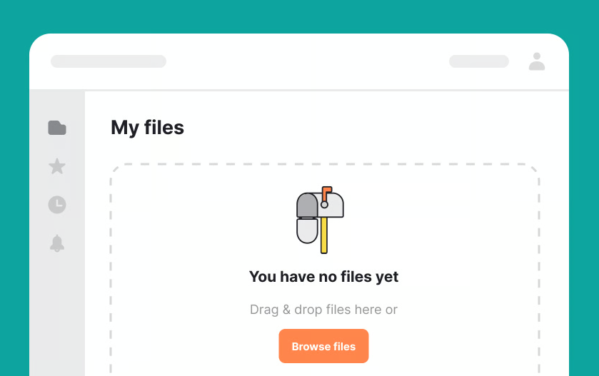
Illustrations can make empty states feel friendly and less intimidating. They help break the starkness of an empty screen and provide visual context.
That said, illustrations should be purposeful. Abstract or decorative visuals that don’t relate to the action can confuse users rather than help them.
Clear visual hierarchy ensures users know where to look first. Headings, supporting text, and calls to action should be arranged in a way that feels natural and intuitive.
Spacing, alignment, and contrast all contribute to making the next step feel obvious without being forceful.
Copywriting is often the difference between an empty state that feels passive and one that inspires action. The right words can turn uncertainty into curiosity.
For empty states, less is more—but every word matters.
Empty state copy should sound supportive, not instructional or technical. A conversational tone helps users feel guided rather than judged.
Avoid language that implies failure or inactivity. Instead, frame the empty state as a natural starting point.
Users are more likely to act when they understand the benefit of doing so. Briefly connecting the call to action with a positive outcome can significantly increase engagement.
These connections should feel natural and relevant, reinforcing why the action is worth taking right now.
Even well-intentioned empty states can fall short if common pitfalls are not avoided. These mistakes often stem from focusing on the system rather than the user.
Recognizing these patterns helps ensure your empty states remain helpful and motivating.
A common mistake is using empty states as temporary placeholders with minimal thought. This often results in generic messages that provide no real value.
Empty states deserve the same level of care as any other part of the interface, especially because of their impact on first impressions.
Offering too many actions in an empty state can paralyze users. When everything is possible, nothing feels urgent.
Prioritization is key. Focus on the most valuable next step and let other options appear later in the journey.
Empty states should evolve as users grow more familiar with the product. What works for a new user may feel repetitive or unnecessary for an experienced one.
Designing adaptive empty states allows you to stay relevant without adding complexity.
Behavior-based empty states can tailor messaging and actions to the user’s experience level. This makes guidance feel timely rather than generic.
When empty states reflect what users have already done, they feel more like helpful suggestions than instructions.
Like any design element, empty states benefit from testing and iteration. Small changes in copy, layout, or calls to action can lead to meaningful improvements.
Observing how users interact with empty states reveals whether they truly encourage action or simply fill space.
Empty states are powerful moments of opportunity. When designed with intention, they transform blank screens into clear invitations to act. By understanding the user’s context, clarifying purpose, and guiding the next step with thoughtful design and language, empty states can reduce friction and build momentum.
They remind users that progress starts somewhere—and that somewhere is often an empty screen. When you treat empty states as an essential part of the user journey rather than an afterthought, you create experiences that feel supportive, purposeful, and engaging from the very first interaction.

