Please select the platform to login


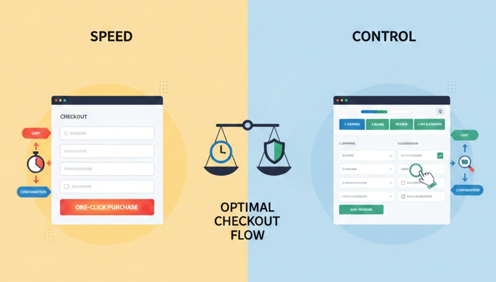
Checkout is where intent turns into revenue, or frustration. Shoppers reach this stage ready to buy, yet it’s also the moment when hesitation, doubt, or friction can cause abandonment. One of the biggest challenges in checkout design is balancing speed with control. Customers want to complete their purchase quickly, but they also want reassurance, flexibility, and confidence that they are making the right decision.
Too much focus on speed can make checkout feel rushed or risky. Too much control can overwhelm users with choices and slow them down. The key is not choosing one over the other, but designing a checkout flow that adapts to different user needs while keeping momentum high.
Speed in checkout design is about minimizing effort and time. It focuses on reducing steps, simplifying forms, and allowing users to complete purchases with as few interactions as possible. Fast checkout experiences feel smooth, predictable, and almost invisible, helping users move from cart to confirmation without second-guessing.
Control, on the other hand, is about empowerment. It gives users the ability to review details, change options, apply discounts, select shipping methods, and feel confident about pricing, security, and delivery. Control reassures customers that they’re not locked into mistakes and that they understand exactly what they’re paying for.
A well-designed checkout doesn’t force users to choose between speed and control. Instead, it layers control in a way that doesn’t interrupt speed unless the user needs it.
Checkout that feels slow introduces friction. Extra steps, confusing layouts, or excessive form fields can drain motivation and lead users to abandon, even if they want the product. Speed helps reduce cognitive load and keeps users emotionally aligned with their buying intent.
At the same time, checkout that feels too fast can create anxiety. When users don’t see enough information or feel rushed through payment, they may pause, hesitate, or leave to “think about it later.” Control helps users feel confident that they understand exactly what they’re agreeing to.
When speed and control are balanced, checkout supports both decisive buyers and cautious ones. This balance sets the foundation for the practical design strategies below, which show how to deliver efficiency without sacrificing clarity or confidence.
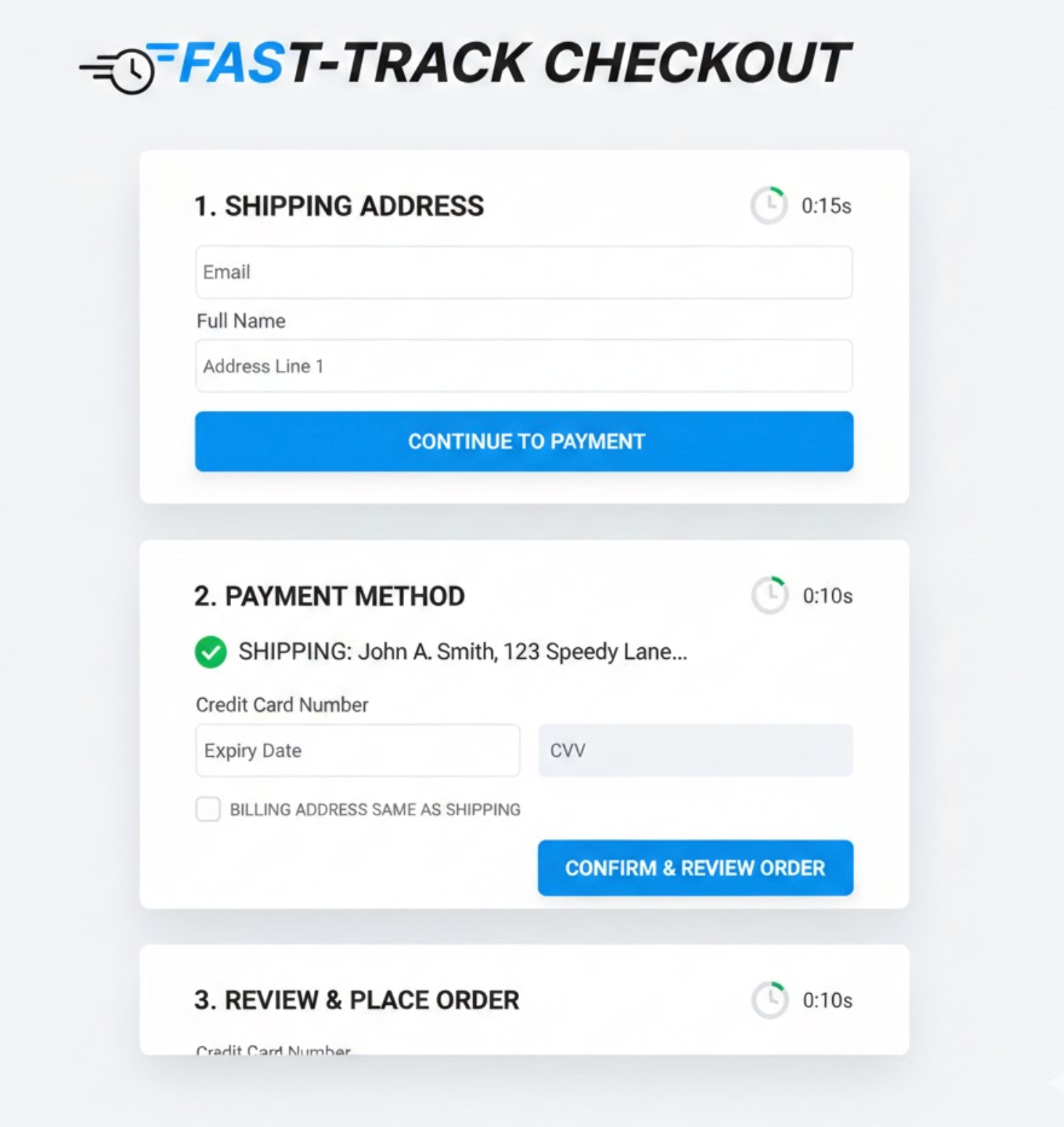
Progressive disclosure helps you keep checkout clean while still offering depth. Instead of overwhelming users with every option upfront, it allows you to reveal information only when it becomes relevant. This approach keeps the interface simple without limiting functionality.
By default, users see only the most essential fields and actions needed to complete checkout. Advanced options remain accessible but do not compete for attention unless users actively need them. This reduces visual noise and decision fatigue.
To implement this approach effectively, structure optional details so they feel supportive rather than hidden.
This design technique allows checkout to feel fast first, with control available second.
Not all shoppers approach checkout with the same expectations. Returning users often value speed above all else because they already trust your brand and know what to expect. For them, friction feels unnecessary and frustrating.
New customers, however, approach checkout more cautiously. They want reassurance, explanations, and the ability to review information carefully before committing. Removing too much control can make them uncomfortable.
A balanced checkout adapts to user familiarity instead of forcing a single experience for everyone.
By recognizing intent and context, you can speed up checkout without leaving new users behind.
Speed does not mean hiding information. When users can’t easily find totals, shipping costs, or delivery timelines, they slow down to search or reconsider. Visibility actually supports faster decision-making.
Control comes from clarity, not complexity. Showing essential details upfront prevents doubt and reduces the need for additional clicks or page changes. Users move faster when they feel informed.
The key is prioritization, showing what matters most without clutter.
When information is easy to scan, speed and confidence naturally work together.
Forms are one of the biggest friction points in checkout. Every field increases effort and the risk of mistakes, which can slow users down or cause frustration. Reducing form effort is essential for maintaining momentum.
However, speed should never come at the cost of flexibility. Users need reassurance that they can fix errors without restarting the process or losing progress. Control means making corrections feel safe and simple.
A forgiving checkout encourages users to keep going even when mistakes happen.
This balance keeps checkout moving forward instead of turning errors into exit points.
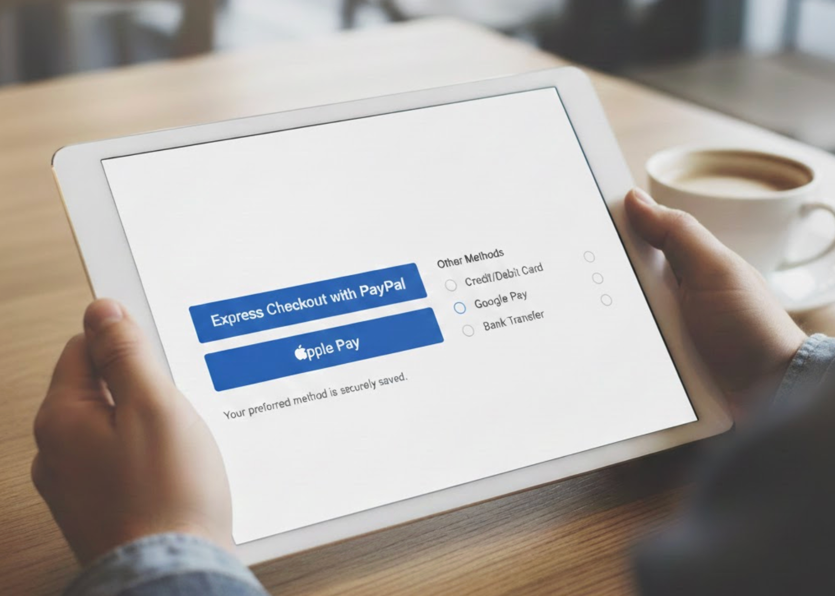
Fast payment options dramatically reduce checkout time. Digital wallets and express checkout methods allow users to complete purchases with minimal input. For many shoppers, this is the preferred path.
Still, not everyone trusts or uses these methods. Some users prefer traditional card entries or want to review details carefully before paying. Removing these options can make checkout feel restrictive.
A balanced checkout offers speed-first options without eliminating alternatives.
By presenting choice without friction, you support different comfort levels without slowing anyone down.
Trust is closely tied to control. Users want reassurance that their data is secure and their order is protected, especially at the payment stage. However, heavy trust messaging can disrupt flow if handled poorly.
Instead of large banners or pop-ups, subtle signals work best. Small visual cues and concise text provide reassurance without distracting users from completion.
Trust should feel integrated, not imposed.
When reassurance is seamless, it strengthens speed instead of slowing it down.
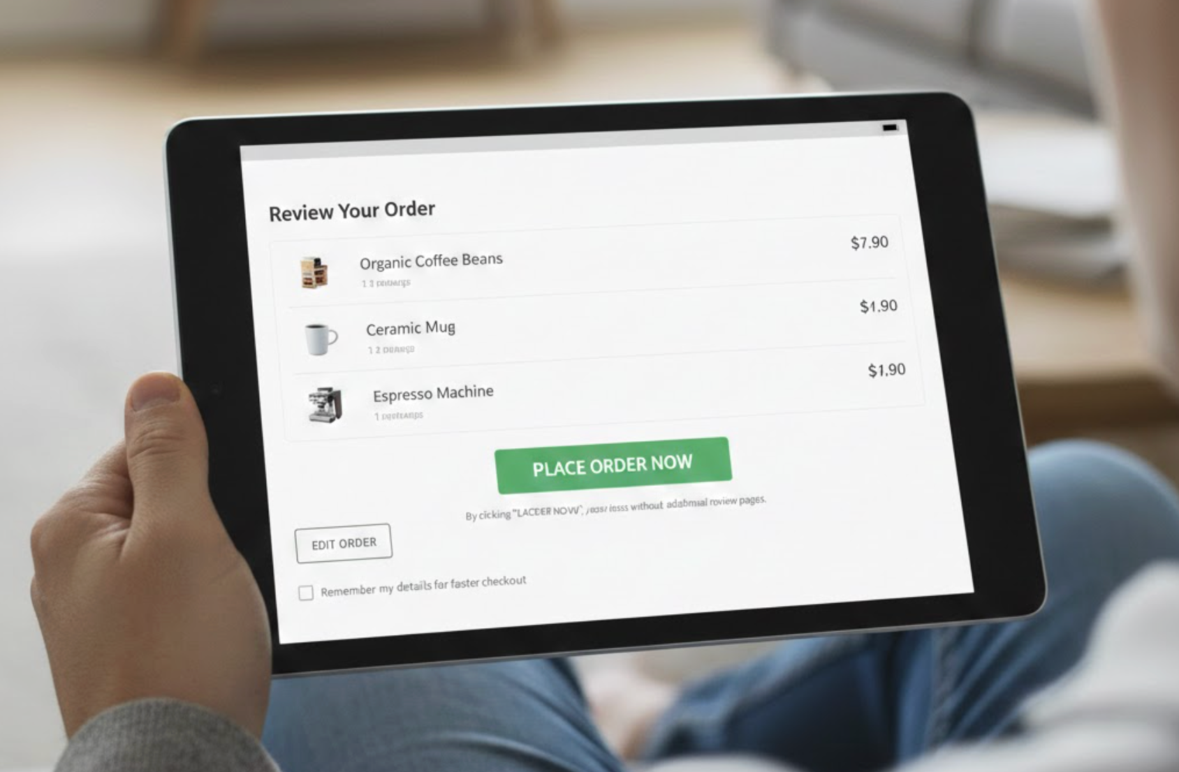
Reviewing an order is essential for control, but forced review pages can feel redundant. Confident users may see this as unnecessary friction, while cautious users appreciate the opportunity to double-check.
Inline review offers a balanced solution. Users can scan, edit, and confirm order details without leaving the checkout flow. This preserves speed while maintaining transparency.
Checkout should support review without demanding it.
When review feels optional, users remain in control without losing momentum.
There is no perfect balance that works for every store. Different audiences, price points, and product types require different levels of reassurance and speed. Assumptions can easily lead to over-design or under-design.
Behavioral data reveals where users hesitate, slow down, or abandon. These moments indicate where more control, or less friction, is needed. Testing helps refine the balance over time.
Checkout optimization is an ongoing process.
Let real user behavior guide how much speed or control you surface at each step.
Balancing speed and control in checkout design means respecting both urgency and uncertainty. Some shoppers want to finish instantly, while others need reassurance before committing. A successful checkout supports both without compromise.
By simplifying the default experience and layering control only when needed, you create a checkout that feels intuitive and trustworthy. When users feel confident and efficient at the same time, checkout becomes a natural conclusion, not a conversion risk.

