Please select the platform to login


In today’s global eCommerce landscape, catering to customers from different countries is no longer optional, it’s essential. Multi-language stores allow businesses to reach wider audiences, improve user experience, and build a strong international presence. However, designing navigation for such stores introduces unique challenges. A poorly structured navigation system can confuse users, hurt conversions, and increase bounce rates.
This article explores strategies and best practices for designing navigation that works seamlessly across multiple languages, ensuring your store feels intuitive, accessible, and professional to every visitor, regardless of their language.
Navigation is the backbone of any online store. It guides users to products, categories, and essential information quickly and efficiently. In a multi-language store, navigation must accomplish all these goals while ensuring clarity and consistency across languages.
Key reasons to focus on multi-language navigation include:
Designing navigation for a single-language store is straightforward, but multiple languages introduce complexities that require careful consideration:
Designing navigation for multiple languages requires thoughtful planning. Here are best practices that can significantly improve usability and conversions:

A visible and easy-to-use language selector is essential to let users navigate your store comfortably.
By making the language switcher intuitive, you reduce friction and keep users engaged.
Consistency is key to user familiarity. Users should be able to navigate your store intuitively, regardless of the language.
Consistency not only improves usability but also reinforces brand identity globally.
Translations often expand or contract, which can disrupt your navigation layout.
By preparing for text length variations, you maintain a polished and professional appearance across all languages.
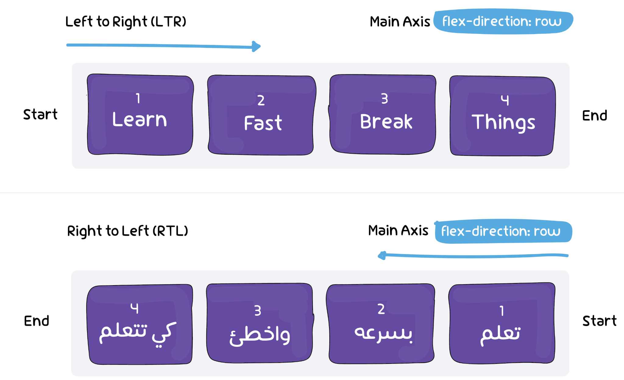
If your store targets Arabic, Hebrew, or other RTL languages, your navigation must adapt accordingly.
Ignoring RTL design can lead to a frustrating experience, causing users to leave your store.
Navigation impacts both usability and search engine rankings. Implementing proper URL structures and SEO practices is crucial.
Proper SEO ensures that your international audience can find your products easily.
For stores with large catalogs, mega menus or multi-column dropdowns can organize content efficiently.
Well-designed dropdowns improve discoverability and make browsing large inventories easier.
Even the best navigation design needs continuous evaluation.
Regular testing ensures that your multi-language navigation stays user-friendly and effective over time.
Designing navigation for multi-language stores requires careful planning, cultural sensitivity, and technical implementation. By focusing on clarity, consistency, flexibility, and usability, businesses can create navigation systems that feel intuitive and welcoming to users worldwide. Effective multi-language navigation enhances user experience, increases conversions, and strengthens your global brand presence, helping your store succeed in the competitive international eCommerce market.

