Please select the platform to login


Calls to action (CTAs) are far more than simple buttons or short phrases placed at the end of a page. They act as directional signals that guide users through a digital experience, shaping how they interact with content, products, and ultimately your brand. Even subtle differences in wording, tone, and urgency can influence whether a user feels encouraged, pressured, or fully confident in taking the next step.
As ecommerce and digital experiences become more user-centered, brands can no longer rely on a single CTA style across all touchpoints. This is where the distinction between Soft CTAs and Hard CTAs becomes especially important. Each serves a unique purpose within the user journey, and understanding how to balance them is key to improving conversions without damaging trust.
To help you make informed decisions, this article provides a deep comparison of Soft and Hard CTAs, clear verdicts for each factor, and a detailed explanation of how to use both together effectively.
A Soft CTA is intentionally low-pressure and invitation-based. Instead of asking users to commit immediately, it encourages them to continue exploring, learning, or engaging with content in a way that feels natural and self-directed. This approach is particularly useful when users are unfamiliar with your brand or still unsure about their needs.
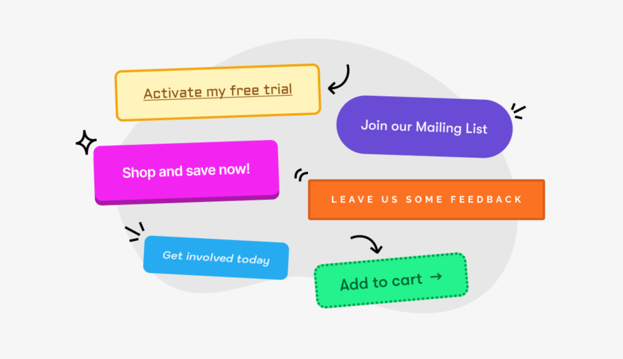
Examples of Soft CTAs include:
What makes Soft CTAs powerful is their ability to lower psychological resistance. They acknowledge that users may not be ready to buy yet and offer a comfortable next step instead. Over time, this builds trust, increases time on site, and prepares users for stronger conversion prompts later in the journey.
As we move toward more decisive CTA styles, it becomes clear that Soft CTAs are not weak, they are strategic stepping stones.

A Hard CTA takes a more direct and assertive approach. It clearly communicates the desired action and often includes language that signals urgency, exclusivity, or immediate value. The goal is to eliminate ambiguity and push users toward a specific outcome.
Common Hard CTA examples include:
Hard CTAs work best when users already understand the product and feel confident in their decision. At this stage, subtlety can become a barrier rather than a benefit. However, because Hard CTAs apply pressure by design, they must be used carefully to avoid overwhelming or alienating users.
With both CTA types clearly defined, we can now examine how they perform across critical decision-making factors.
User intent changes as people move through the funnel. At the beginning, intent is often vague—users are browsing, researching, or simply gathering inspiration. Soft CTAs align with this mindset by offering guidance without forcing commitment.
As users progress and gain clarity, their intent becomes more focused. At this point, they expect clearer direction. A Soft CTA may feel indecisive, while a Hard CTA provides the confidence boost needed to act.
Verdict:
Soft CTAs support a slower, more thoughtful conversion path. By encouraging users to engage gradually, they reduce the likelihood of regret or hesitation later. This often results in higher-quality conversions, even if they take longer to achieve.
Hard CTAs are designed to accelerate action. They capture attention and convert motivation into immediate results, which is particularly valuable during promotions or time-sensitive campaigns.
Verdict:
Soft CTAs contribute to a friendly, supportive brand image. They signal that your brand respects the user’s autonomy and prioritizes their comfort, which is crucial for trust-building.
Hard CTAs, while effective, can feel aggressive if not supported by strong value propositions or social proof. Without balance, they risk making the brand appear overly sales-driven.
Verdict:
Soft CTAs create a smooth and uninterrupted experience. They blend naturally into content and reduce cognitive load by allowing users to progress without pressure.
Hard CTAs simplify decision-making by making the next step obvious. However, when overused, they can increase cognitive strain and disrupt the browsing experience.
Verdict:
Soft CTAs are ideal for pages where the primary goal is engagement, education, or exploration, such as blog posts, guides, and category pages.
Hard CTAs perform best on pages designed for action, including product pages, pricing pages, and checkout flows.
Verdict:
Soft CTAs reduce emotional tension and allow users to move forward confidently, which is especially important for high-cost or personal purchases.
Hard CTAs intentionally create urgency, which can help overcome hesitation but may also increase stress if used prematurely.
Verdict:
Soft CTAs often produce more satisfied customers who feel confident in their decisions, leading to higher retention and loyalty.
Hard CTAs prioritize immediate revenue, which can be effective short-term but less impactful for long-term engagement.
Verdict:

The most effective ecommerce experiences rarely depend on a single CTA style, because users do not move from interest to purchase in one step. Instead, successful strategies intentionally combine Soft and Hard CTAs to match the natural progression of user confidence and intent. Early interactions focus on reducing uncertainty and building understanding, while later interactions emphasize clarity and action. When this balance is handled correctly, CTAs feel like guidance rather than pressure, helping users move forward comfortably and confidently.
As users progress through the journey, the key is to gradually shift from exploration-focused prompts to action-oriented prompts without disrupting the overall experience.
By treating Soft and Hard CTAs as complementary tools rather than opposing choices, you create a conversion path that aligns with user psychology while still driving meaningful business results.
There is no universal winner between Soft CTA and Hard CTA. Each serves a distinct purpose, and their effectiveness depends entirely on context, timing, and user intent.
When CTAs are aligned with user mindset rather than sales pressure, conversions feel natural, and that’s where sustainable growth truly begins.

