Please select the platform to login


eCommerce category structure is the foundation of how customers experience your online store. While beginners often focus on product images, pricing, or ads, category organization quietly determines whether shoppers can actually find what they’re looking for. A confusing structure increases frustration, while a clear one builds trust, reduces effort, and nudges users toward purchase.
In this ultimate beginner’s guide, we’ll explore what eCommerce category structure really is, why it plays such a critical role in usability and conversions, how to plan it correctly, and how to avoid common mistakes that hurt store performance.
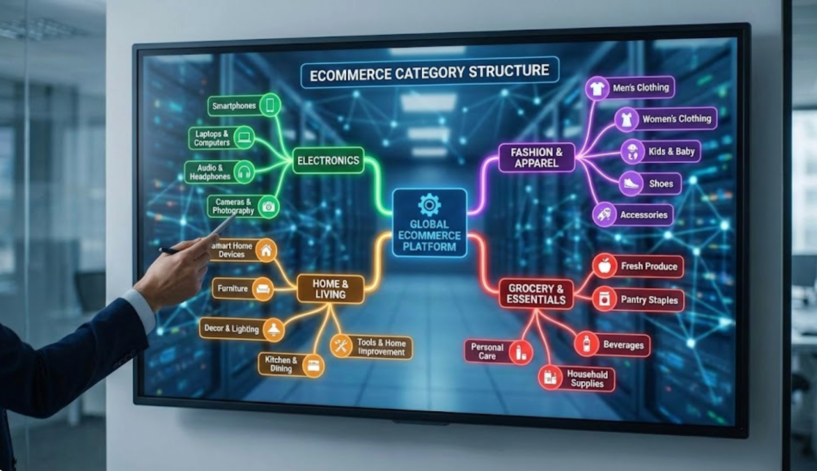
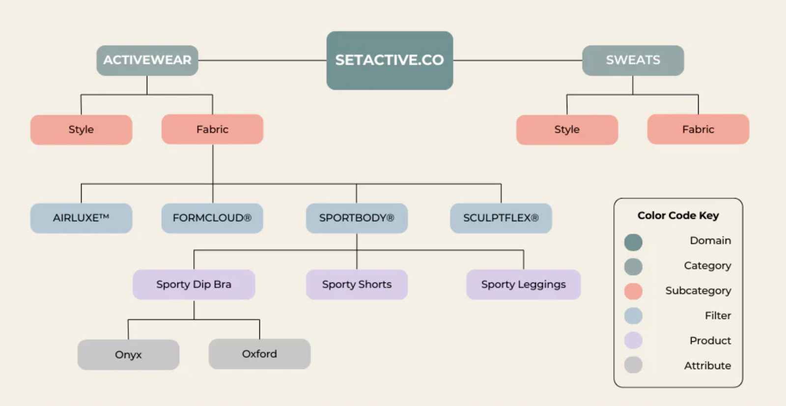
eCommerce category structure refers to the way products are grouped, labeled, and connected across your store. It defines the logical paths users follow, from broad product groups to more specific selections, before landing on a product page.
A strong structure reflects how customers naturally think and search. For example, instead of forcing users to browse randomly, a clothing store might guide them through Men → Jackets → Winter Jackets, allowing them to narrow choices step by step. Each level should feel intuitive and predictable, never surprising or confusing.
Beyond navigation, category structure also influences internal linking, search visibility, and how scalable your store is as your catalog grows. A poorly planned structure may work at first but quickly becomes messy once new products are added.
There is no one-size-fits-all structure. The right approach depends on your product range, audience expectations, and store size.
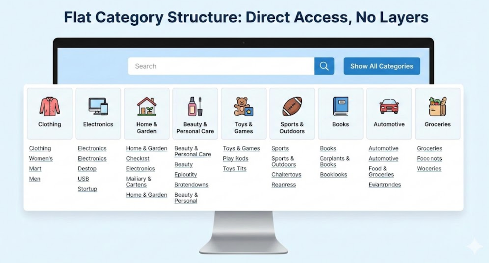
A flat structure limits the number of category levels, usually keeping everything within one or two layers. This model works well for niche stores or beginners with a small catalog.
Its main advantage is simplicity. Users reach products quickly with fewer clicks. However, as inventory grows, flat structures can become cluttered and difficult to scan.
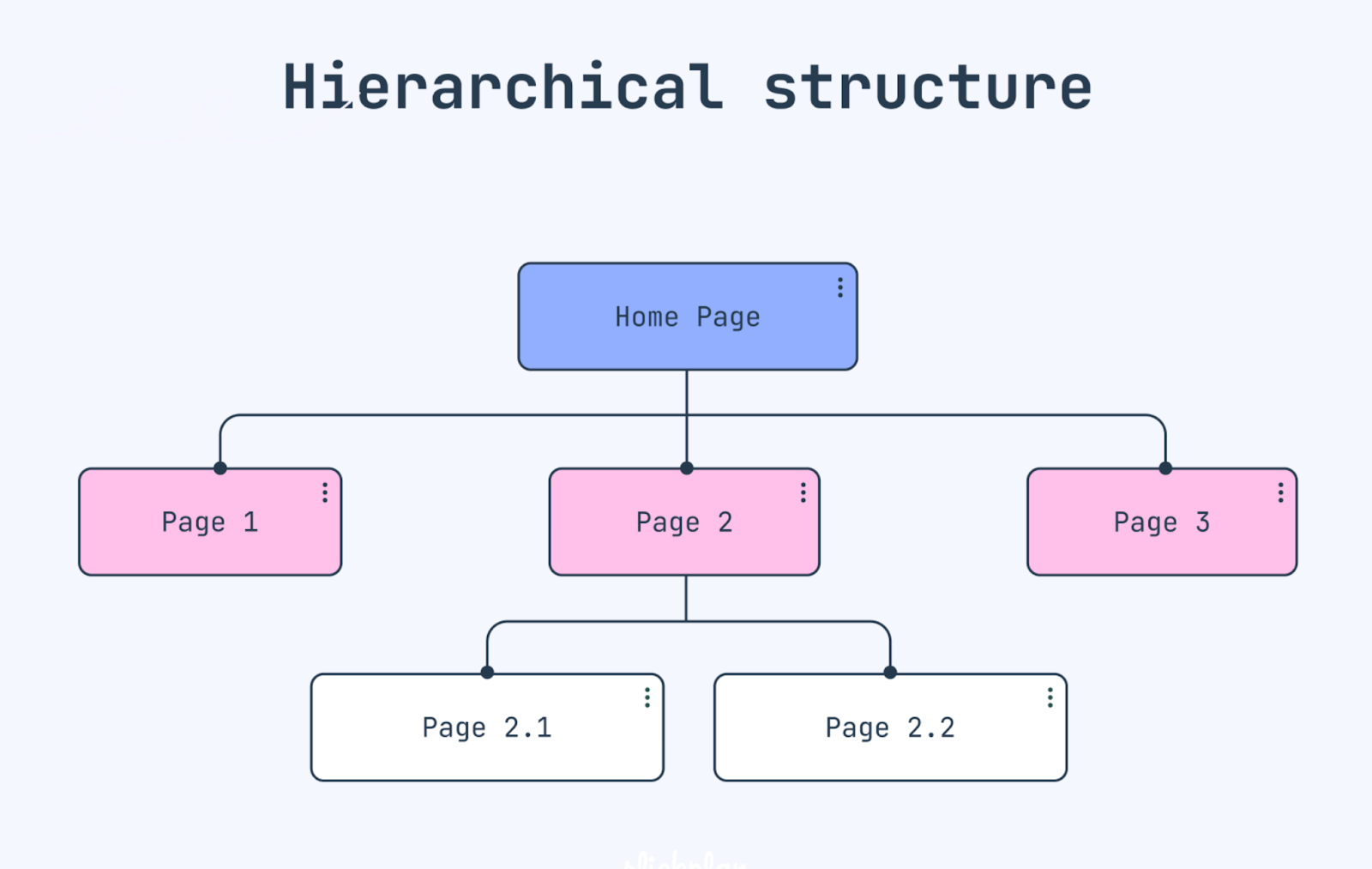
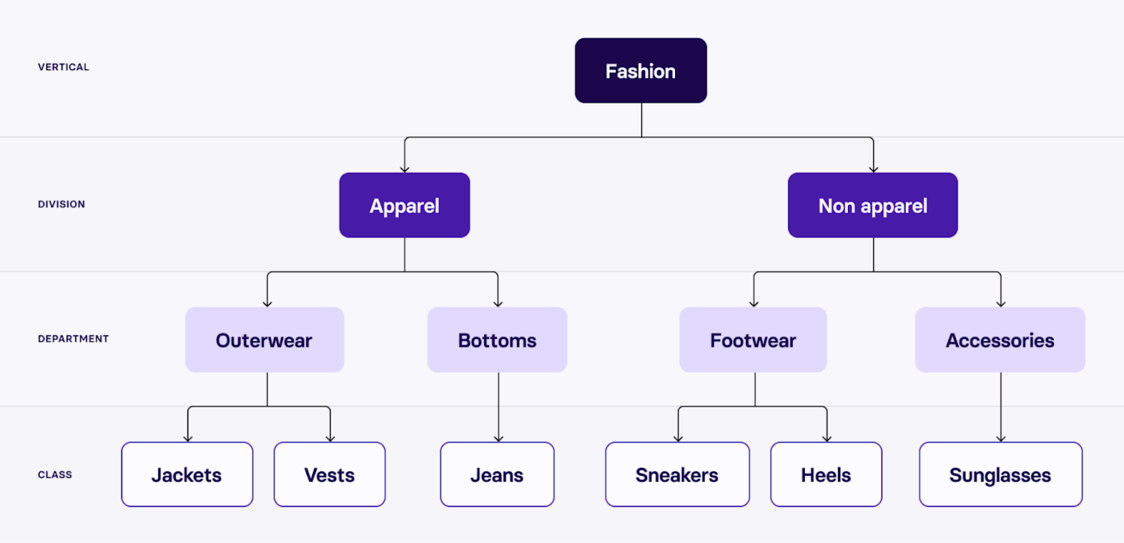
Hierarchical structures organize products into clear parent and child categories. This approach is ideal for medium to large stores with diverse product lines.
It allows better segmentation and scalability, but requires careful planning. Too many levels or poorly named subcategories can overwhelm users instead of helping them.
Many modern eCommerce stores combine broad categories with powerful filters. Products live in high-level categories, while attributes like size, color, price, or brand help users refine results.
This hybrid approach balances simplicity and flexibility, especially for stores with many similar products.
Category structure is one of the most influential yet underestimated elements of an eCommerce store. It shapes how visitors perceive your site, how easily they find products, and how confidently they move toward a purchase. For beginners especially, a well-planned structure can compensate for smaller budgets or limited brand recognition by making the shopping experience feel clear and trustworthy. When category structure is done right, it quietly supports usability, visibility, and sales at the same time.
A clear category structure makes navigation feel natural rather than forced. When products are grouped logically and labeled with familiar terms, users can predict where to click next without stopping to think. This reduces frustration, prevents endless backtracking, and helps shoppers maintain momentum as they browse. Over time, this smooth experience builds trust and encourages users to explore more categories instead of leaving early.
Category pages play a critical role in guiding users from browsing to buying. When shoppers can easily compare products within a well-defined category, decision-making feels simpler and less overwhelming. Clear structure reduces decision fatigue by narrowing choices in a controlled way, helping users feel confident about moving forward. As a result, well-organized categories often lead to higher add-to-cart rates and smoother checkout progression.
Search engines rely on category structure to understand how products and pages relate to one another. A clean hierarchy improves crawlability, strengthens internal linking, and helps category pages rank for high-intent keywords. These pages often attract users who are already close to making a purchase, making the traffic more valuable. When SEO-friendly structure aligns with user-friendly navigation, category pages become powerful entry points for both new and returning customers.
Category structure also determines how easily your store can grow over time. A flexible, well-planned system allows you to add new products or subcategories without breaking navigation or confusing users. In contrast, a poorly designed structure often requires major redesigns as the catalog expands. Building a scalable category framework early helps future-proof your eCommerce store and reduces costly restructuring later on.
Planning a category structure from scratch is one of the most important decisions beginners make when launching an eCommerce store. A well-planned structure reduces confusion, improves navigation, and prevents costly changes as your product catalog grows. Rather than copying competitors blindly, beginners should focus on building a system that reflects both their products and customer expectations. Investing time in planning upfront ensures your category structure remains clear, flexible, and scalable.
To create a strong foundation, the planning process should follow a structured, step-by-step approach.
Start by listing every product you plan to sell, including variations and future additions. Group products based on natural similarities such as type, function, use case, or target audience. This step helps reveal logical category patterns and prevents forced groupings that confuse users later.
Focus on defining your main, top-level categories before creating subcategories. These primary categories should represent the broad ways customers think about your products, not internal business divisions. Keeping top-level categories limited ensures the main navigation remains clean and easy to scan.
Shift your mindset from how products are managed internally to how customers search and browse. Use familiar, descriptive language and avoid technical terms or brand-specific jargon. If users instantly understand a category name, they are more likely to explore it confidently.
Avoid creating too many layers of subcategories, as deep structures increase friction and slow down browsing. Aim for a structure where users can reach any product within a few clicks from the homepage. When more refinement is needed, rely on filters instead of adding extra category levels.
Before finalizing your categories, review them as if you were a first-time visitor. Check whether category names feel intuitive, paths make sense, and no products feel out of place. Early validation helps catch usability issues before they impact real customers.
Building a clear and scalable category structure requires more than simply grouping similar products together. It involves anticipating how customers browse, how your catalog may grow, and how navigation will perform across different devices. For beginners, following proven best practices helps prevent confusion early on while laying a strong foundation for long-term growth. A thoughtful structure keeps your store easy to use today and adaptable tomorrow.
To achieve this balance, eCommerce teams should focus on clarity, consistency, and flexibility when designing categories.
Many eCommerce beginners underestimate how small structural decisions can create big usability problems. What seems logical during setup may feel confusing or frustrating to first-time visitors. These mistakes often don’t show up immediately, but they gradually hurt engagement, trust, and conversion rates as the store grows. Recognizing common pitfalls early helps beginners avoid costly redesigns later.
To build a stronger and more user-friendly category system, it’s important to watch out for the following mistakes.

