Please select the platform to login


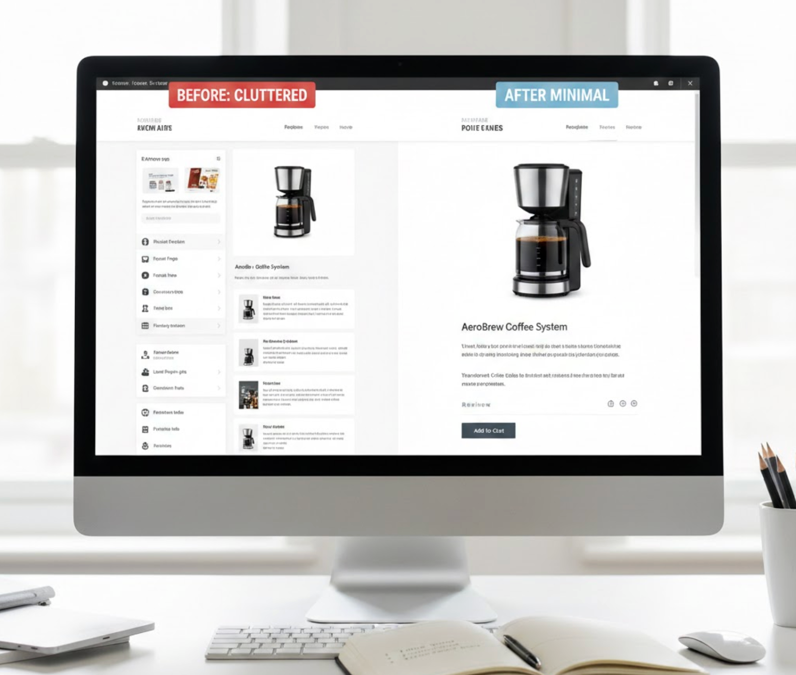
Visual noise is one of the most overlooked conversion killers on ecommerce product pages. When too many elements compete for attention, shoppers struggle to understand what matters, where to look next, and how to move forward with confidence. Instead of guiding users toward a purchase, the page forces them to work harder just to process information.
Reducing visual noise isn’t about removing content blindly, it’s about clarifying intent. By simplifying presentation, strengthening hierarchy, and removing unnecessary distractions, you make it easier for shoppers to focus, evaluate, and decide. Below are practical, UX-focused strategies to reduce visual clutter while preserving persuasion and trust.
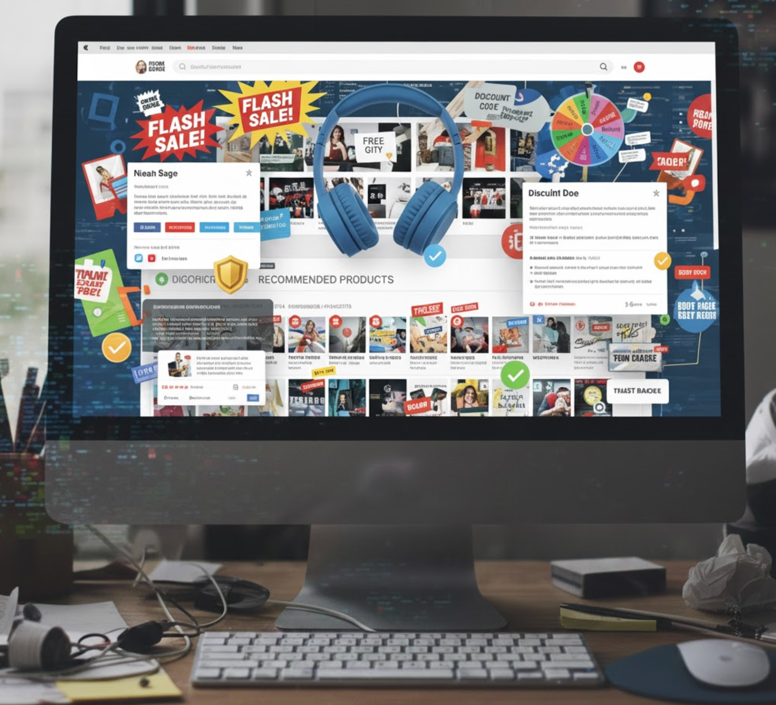
Visual noise refers to any element that distracts users from the primary goal of the page: understanding the product and deciding whether to buy it. This includes excessive colors, overlapping messages, dense text blocks, inconsistent typography, and decorative elements that don’t contribute to decision-making.
When visual noise is high, cognitive load increases significantly. Shoppers must constantly pause to interpret what’s important and what can be ignored, which slows decision-making and increases the likelihood of abandonment. Reducing visual noise helps create a calmer, more focused experience where information feels easier to digest.
A product page should quietly guide users’ eyes instead of forcing them to search for meaning. When visual hierarchy is weak, everything appears equally important, which quickly becomes overwhelming and mentally exhausting for shoppers.
By deliberately emphasizing certain elements over others, you help users scan the page effortlessly and understand the product story in the right order. This visual guidance builds confidence and reduces friction throughout the buying journey.
To create a hierarchy that feels intuitive rather than forced, focus on these principles:
Color is powerful, but when it’s overused, it becomes noise instead of guidance. Pages filled with multiple bright colors, gradients, and accent styles can feel chaotic and untrustworthy, even if the content itself is strong.
A restrained color system creates visual calm and makes important actions easier to recognize. When colors are used intentionally, they help users focus rather than distract them.
To keep color working for you instead of against you, consider the following adjustments:
Typography directly affects how heavy or light a page feels. When multiple font families, sizes, and styles appear together, users must constantly recalibrate how to read and interpret information.
Simplified typography improves readability and creates a sense of order. It allows shoppers to focus on content rather than struggling with inconsistent presentation.
A cleaner typographic system can be achieved by applying these guidelines:

When a product page presents too many actions at once, users hesitate. Competing CTAs create uncertainty about what the “right” next step is, often leading shoppers to delay or abandon the purchase altogether.
A clear CTA hierarchy removes doubt and encourages momentum. Supporting actions should exist, but they should never compete visually with the primary buying action.
To clarify intent and reduce decision paralysis, refine your CTA strategy as follows:
White space is not empty space, it’s a powerful design tool that improves clarity. Without enough breathing room, even well-structured content can feel dense and stressful to process.
Intentional spacing helps separate sections, highlight important elements, and reduce the need for visual separators that add clutter. It allows users to absorb information at a comfortable pace.
To use white space more effectively across your product pages:
Many product pages fail because they try to explain everything at once. While comprehensive information is valuable, presenting it all upfront overwhelms users and makes scanning difficult.
A progressive disclosure approach lets shoppers explore details gradually, based on their level of interest and intent. This keeps the initial view clean while still supporting deeper evaluation.
You can reduce noise while keeping information accessible by using these techniques:

Decorative elements often accumulate over time, badges, icons, banners, animations, until the page feels crowded and unfocused. While some visuals can reinforce trust or urgency, many simply distract.
Every visual element should support understanding, credibility, or action. If it doesn’t, it likely adds more noise than value.
Regularly audit decorative elements by reviewing the following areas:
Product images are essential for conversion, but excess imagery can clutter the layout and dilute focus. Showing too many images at once makes it harder for users to understand what they’re looking at.
A clean, well-organized image gallery keeps attention centered while still encouraging exploration. It also enhances perceived product quality and professionalism.
To strike the right balance with product images, apply these best practices:
Reducing visual noise on product pages is about creating clarity, not sacrificing persuasion. When design choices are intentional and information is presented thoughtfully, shoppers feel less overwhelmed and more confident in their decisions.
By improving hierarchy, simplifying visuals, and removing unnecessary distractions, you transform product pages into focused, high-converting experiences. In ecommerce, a quieter page often speaks louder, and sells better.

