Please select the platform to login


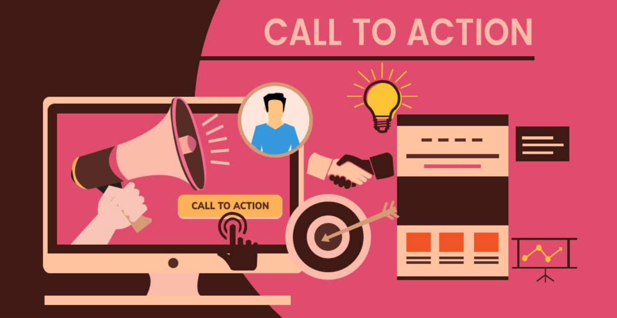
In eCommerce, a Call to Action (CTA) is far more than a simple button placed at the end of a page. It represents the moment where psychology, design, and user intent intersect. Every CTA asks a shopper to make a small commitment, and that decision is shaped by emotions, trust, and clarity as much as by logic. For beginners, understanding CTA psychology helps turn passive browsing into confident action, which is essential for building a store that converts consistently. With that foundation in mind, let’s explore how CTA psychology works and how you can apply it step by step.

A CTA is any prompt that guides users toward a specific action, such as “Add to Cart,” “Buy Now,” or “Sign Up for Updates.” In eCommerce, CTAs act as signposts that move shoppers through the buying journey, from discovery to consideration and finally to purchase. Without strong CTAs, even well-designed product pages can feel directionless, leaving visitors unsure about what to do next. As a result, users may hesitate, delay their decision, or leave the site entirely.
This is where psychology becomes important. A well-crafted CTA removes uncertainty and provides reassurance at critical moments. Instead of pushing users, it gently guides them forward by aligning with their expectations and mindset. To understand how to do this effectively, we first need to look at what drives people to click in the first place.
Every click begins with an emotional response, even if the shopper believes they are acting logically. Before clicking a CTA, users subconsciously evaluate whether the action feels safe, worthwhile, and easy. If any of these elements create doubt, hesitation follows, often leading to abandonment.
From a psychological standpoint, effective CTAs reduce perceived risk and increase perceived value. They answer silent questions like “What will happen next?” or “Can I trust this?” through clear wording and supportive context. When a CTA feels like the natural next step rather than a forced decision, users are far more likely to act. With this understanding in place, clarity becomes the first principle to master.
Clarity is the foundation of every successful eCommerce CTA. When shoppers instantly understand what a button does, they feel more confident clicking it. On the other hand, vague or generic CTAs introduce unnecessary thinking, which breaks momentum, especially on mobile devices where attention is limited.
Clear CTAs use specific, action-oriented language that matches the user’s current intent. For example, “Add to Cart” feels safer and more predictable than “Continue,” because the outcome is obvious. By clearly communicating the next step, you make the decision feel easy instead of risky. To make your CTAs instantly understandable, focus on these clarity-driven practices:
Urgency and scarcity work because they tap into a natural fear of missing out. When shoppers believe an opportunity is limited, they are more likely to act instead of postponing the decision. This psychological trigger is especially effective for users who already have purchase intent but need a final nudge.
That said, urgency should feel supportive rather than manipulative. Honest messages about limited stock or real deadlines maintain trust while still prompting faster decisions. You can create a sense of urgency and scarcity by applying the following techniques carefully:
Social proof reassures shoppers by showing that others have already taken the same action and had a positive experience. Psychologically, people feel safer when their decisions align with the behavior of others. This is particularly important in eCommerce, where users cannot physically interact with products before buying.
Placing social proof close to CTAs strengthens their impact by reducing last-minute doubt. Reviews, ratings, and customer counts signal that clicking the button is a normal and trusted action. The following social proof elements help reinforce trust and reduce hesitation at the moment of action:
CTA colors influence where users look, but they do not directly cause conversions on their own. The key psychological principle here is contrast, which helps CTAs stand out clearly from surrounding elements. When a button is easy to spot, users can quickly identify the next action without searching.
Consistency also plays an important role. Using the same CTA color across your store helps train users to recognize clickable actions instantly. When choosing CTA colors, these best practices help guide attention without overwhelming users:
Even the most persuasive CTA can fail if it appears at the wrong time or in the wrong place. Psychologically, users are more likely to click when they feel informed and ready. A CTA shown too early can feel pushy, while one shown too late may be overlooked.
Strategic placement aligns CTAs with natural decision points in the user journey. After users have read benefits, viewed images, or checked pricing, they are more prepared to act. Strategic CTA placement works best when aligned with these key moments in the user journey:
Many shoppers hesitate because they fear making the wrong decision or losing money. Reassurance-focused CTAs help reduce this anxiety by emphasizing safety, flexibility, and control. Messages like “Free Returns” or “Cancel Anytime” shift attention away from potential loss and toward confidence.
This psychological safety net is especially important for first-time buyers who are unfamiliar with your brand. Adding these reassurance elements near CTAs helps ease buyer anxiety and build confidence:
When too many CTAs compete for attention, users can feel overwhelmed. From a psychological perspective, excessive choices increase cognitive load and make decision-making harder. As a result, users may delay action or leave without clicking anything.
To prevent this, each page should focus on one primary CTA supported by secondary options. Visual hierarchy helps guide attention toward the most important action. To prevent decision overload, follow these CTA hierarchy guidelines to keep actions clear:
While CTA psychology provides strong guidelines, user behavior can vary depending on audience, product type, and context. This is why testing is essential, even for beginners. Small A/B tests allow you to validate assumptions and make data-driven improvements.
Over time, these incremental changes compound into meaningful conversion gains. If you’re just getting started, these simple testing ideas can help you learn what works best:
eCommerce CTA psychology is not about manipulation, but it’s about understanding how people think and removing unnecessary friction. For beginners, focusing on clarity, trust, and emotional alignment creates CTAs that feel natural and supportive. When CTAs guide users smoothly through the buying journey, higher conversions follow as a result of better experience rather than pressure. Master these fundamentals, and your eCommerce store will be far more effective at turning interest into action.

