Please select the platform to login


Mobile shopping has become the dominant way users browse, compare, and purchase products online. Yet many mobile conversion issues don’t come from pricing, product quality, or traffic sources, they come from usability. One of the most overlooked factors is tap target size, which directly affects how easily users can interact with buttons, links, and CTAs on small screens. When tap targets are too small or poorly spaced, frustration increases and conversions drop. Understanding and optimizing tap target size can significantly improve mobile conversion rates.
Tap target size refers to the interactive area users can tap on a touchscreen, such as buttons, icons, text links, form fields, or navigation elements. On mobile devices, users rely on fingers rather than precise mouse cursors, which makes size and spacing critical.
Unlike desktop design, where small clickable elements can still work, mobile interfaces must account for finger size, hand positioning, and movement. Even visually large buttons can fail if their actual tappable area is too small or too close to other elements. As a result, tap target size is as much about usability as it is about visual design.
In practice, tap target size determines how confident users feel when interacting with your site. When users can tap without zooming, retrying, or mis-clicking, they move through the funnel faster and with less friction.
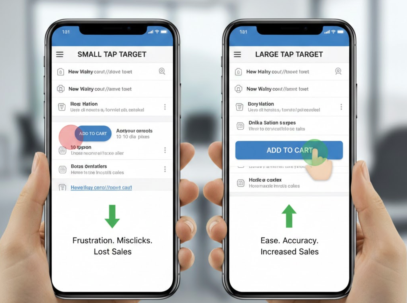
Small or cramped tap targets create friction at every stage of the buyer journey. From browsing product listings to completing checkout, users are constantly making micro-interactions that either build momentum or break it.
When tap targets are too small:
These issues may seem minor, but on mobile, even a few seconds of frustration can cause abandonment. A smooth tapping experience, on the other hand, builds trust and encourages users to continue.
In short, better tap targets reduce cognitive and physical effort, which directly improves conversion performance.
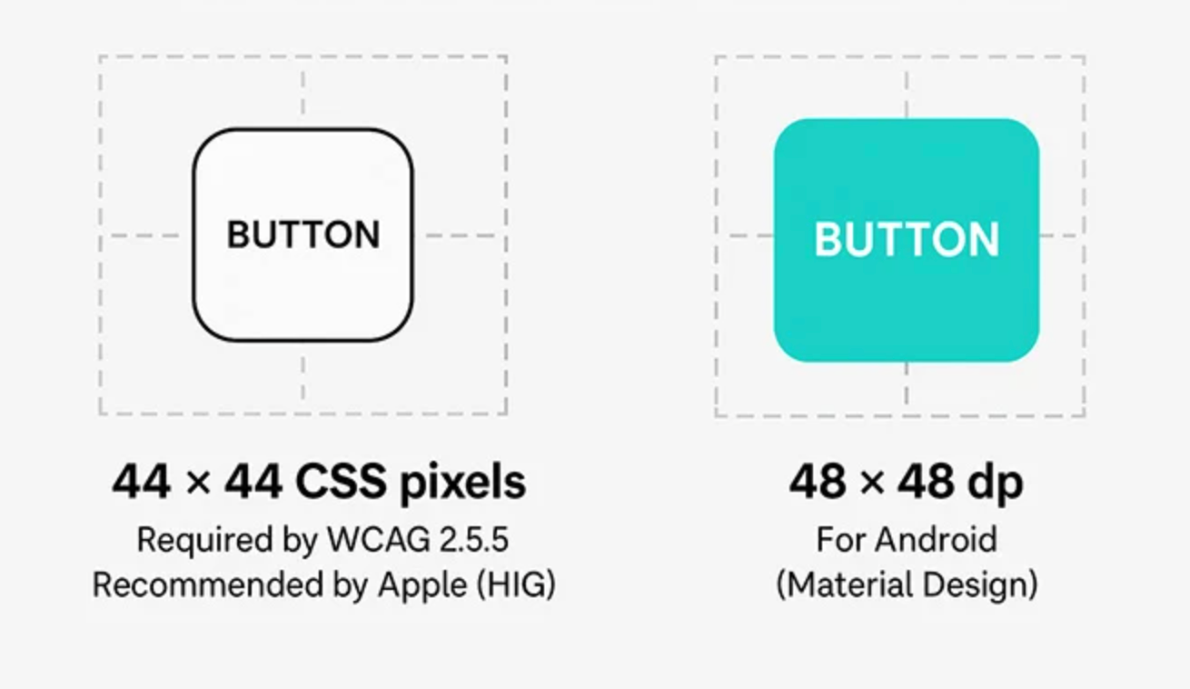
Most UX and accessibility standards agree on minimum tap target dimensions. While exact numbers can vary slightly, the goal is consistency and comfort.
General tap target recommendations include:
These guidelines are based on average finger size and typical mobile usage conditions, such as one-handed browsing or movement, which can improve speed and confidence.
By following these guidelines, you remove a major usability barrier that silently impacts conversions.
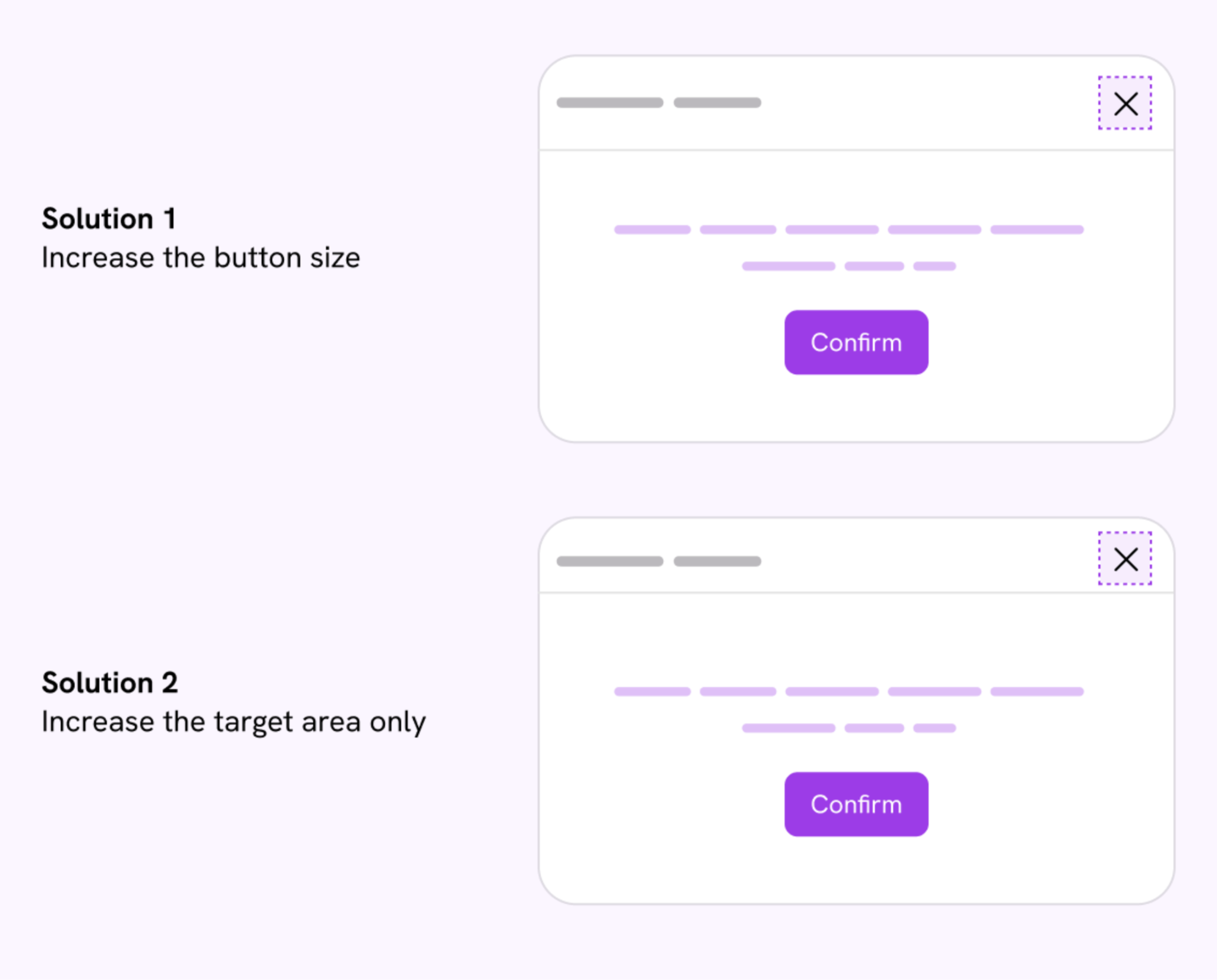
Improving tap target size doesn’t always require a full redesign. Small adjustments can lead to noticeable conversion gains.
Steps to optimize tap targets include:
These changes often improve usability without affecting visual design or brand identity.
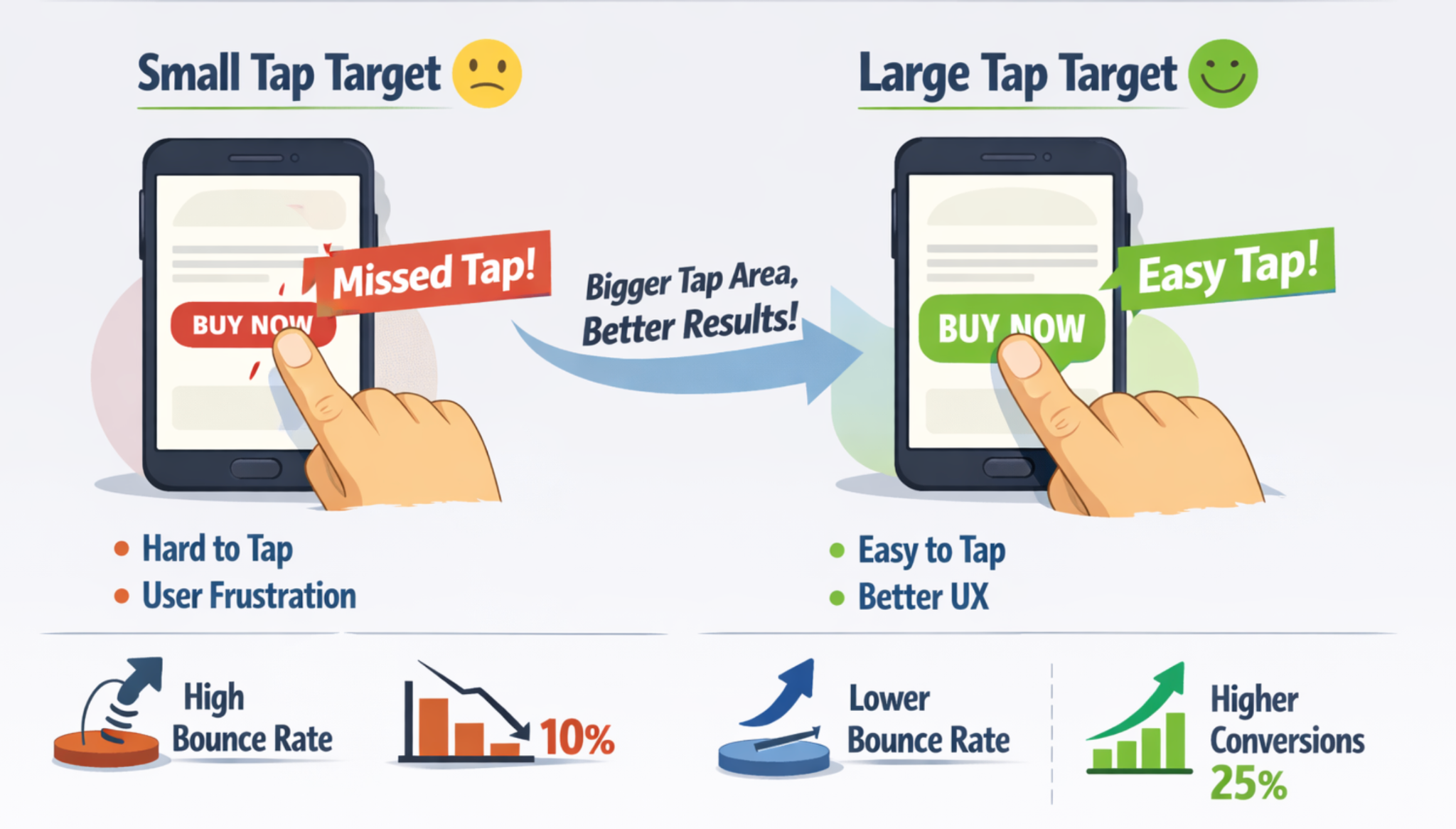
Poor tap target sizing affects more than just accuracy. It creates a chain reaction that negatively influences user behavior and perception.
First, users lose confidence. If they have to retry taps or zoom in to click something, they begin to doubt the reliability of the interface. Second, errors increase, especially during checkout, where tapping the wrong field or button can reset progress. Finally, frustration builds, leading users to abandon the session entirely.
Common issues caused by small tap targets include:
Over time, these small frustrations add up and significantly reduce mobile conversion rates.
Call-to-action buttons are some of the most important tap targets on any mobile page. If users struggle to tap “Add to Cart” or “Buy Now,” even the best copy and design won’t save the conversion.
Large, well-spaced CTAs stand out visually and functionally. They guide users forward and reduce hesitation. Conversely, small or crowded CTAs create uncertainty, especially when placed near secondary actions.
Effective mobile CTAs should:
When CTAs are easy to tap, users are more likely to act immediately rather than delay or abandon.
Mobile navigation is another area where tap target size plays a critical role. Hamburger menus, category links, filters, and sorting options all require frequent interaction.
If navigation elements are too small or tightly packed, users struggle to explore products efficiently. This often leads to shallow browsing sessions and lower average order value.
Optimized navigation tap targets help by:
By making navigation elements comfortable to tap, you remove friction from the discovery phase of the shopping journey.
Checkout is where tap target mistakes are most costly. A single mis-tap on a form field or button can cause errors, reloads, or lost data, which dramatically increases abandonment rates.
Form inputs, dropdowns, checkboxes, and action buttons must all be large enough to tap confidently. This is especially important for address fields, payment options, and confirmation buttons.
To improve checkout conversions:
When users feel in control during checkout, they are far more likely to complete the purchase.
Tap target size is closely tied to accessibility, particularly for users with motor impairments, larger fingers, or reduced precision. However, accessibility improvements almost always benefit all users, not just those with disabilities.
Larger tap targets:
By designing for accessibility, you naturally create a more conversion-friendly experience.
Tap target size may seem like a minor design detail, but on mobile, it has an outsized impact on conversions. Every mis-tap, retry, or accidental click adds friction that pushes users closer to abandonment. By making tap targets larger, clearer, and better spaced, you create a smoother, more confident experience.
Ultimately, optimizing tap target size isn’t just about design, it’s about removing barriers between intent and action. When users can tap easily and move forward effortlessly, mobile conversions naturally follow.

