Please select the platform to login


In eCommerce, images and text are the primary tools used to replace the in-store experience. Since customers cannot touch, feel, or test products online, they depend on visuals to form first impressions and on written content to validate those impressions. When images and text are carefully balanced, they work together to educate, persuade, and guide users through the buying journey. However, when one element dominates the other, it often leads to confusion, hesitation, or decision fatigue. Achieving the right balance improves user experience, strengthens brand credibility, and directly influences conversion rates.
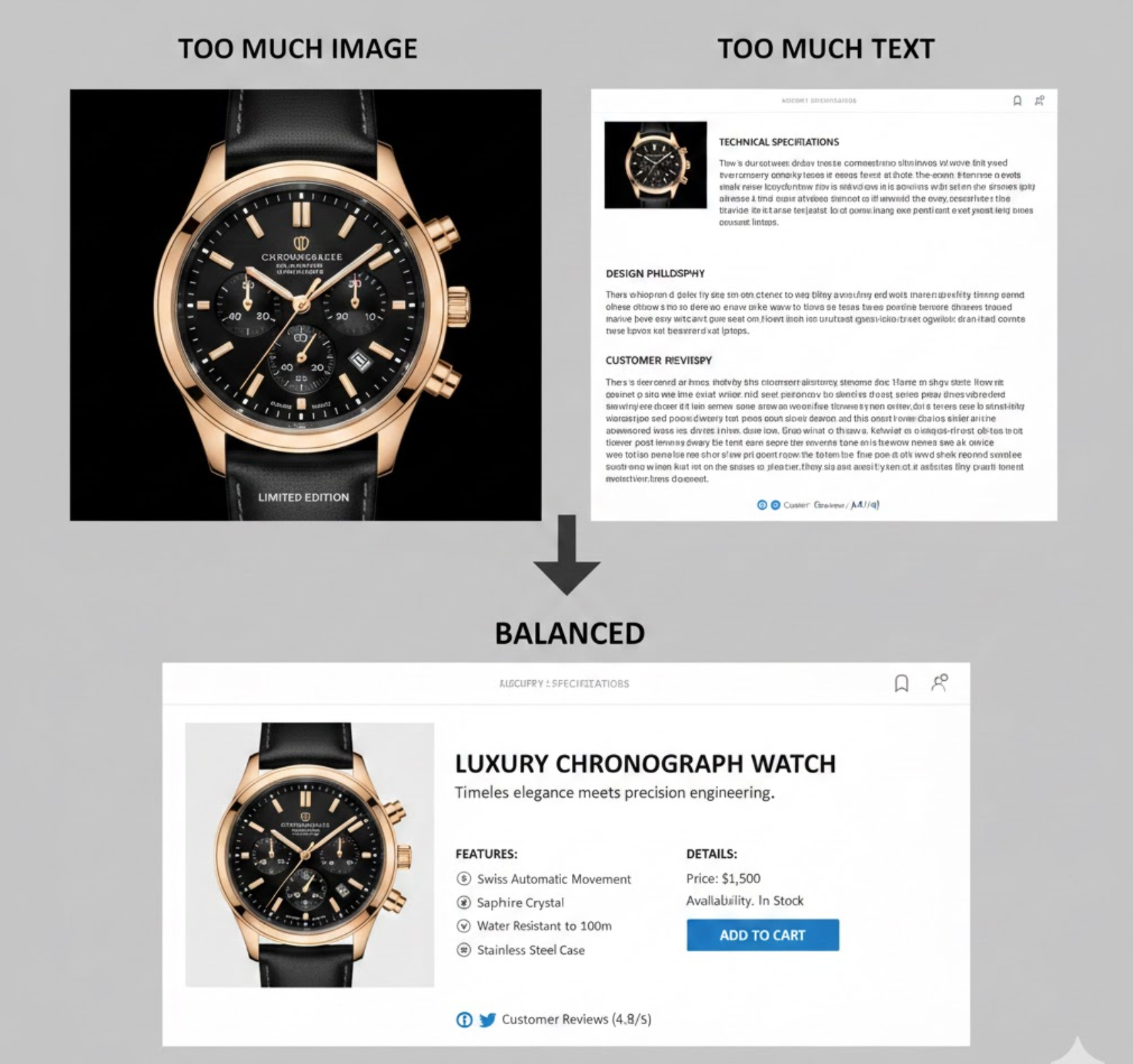
The way information is presented on an eCommerce page determines how quickly users understand a product’s value. Images communicate instantly, while text provides depth and precision. If a page relies too heavily on images, shoppers may struggle to find practical details needed to make a decision. On the other hand, dense text without visual support can feel overwhelming and discourage exploration.
A balanced combination reduces cognitive load by allowing users to process information in layers. Shoppers can scan visuals first, then dive into text only when they need clarification. This approach supports different browsing behaviors, improves accessibility for assistive technologies, and enhances SEO by ensuring important information is available to search engines as well as users.
To get the most value from product visuals, images should be intentional and informative rather than decorative. Well-chosen images can instantly answer questions about appearance, scale, texture, and quality, details that are often difficult to explain with words alone. High-quality visuals also help create an emotional connection, allowing shoppers to imagine how the product fits into their lives.
Rather than relying on a single hero image, eCommerce stores should use a variety of image types to support decision-making. Each image should serve a clear purpose, guiding users closer to confidence and purchase.
In practice, this means focusing on image types that actively support buying decisions, such as:
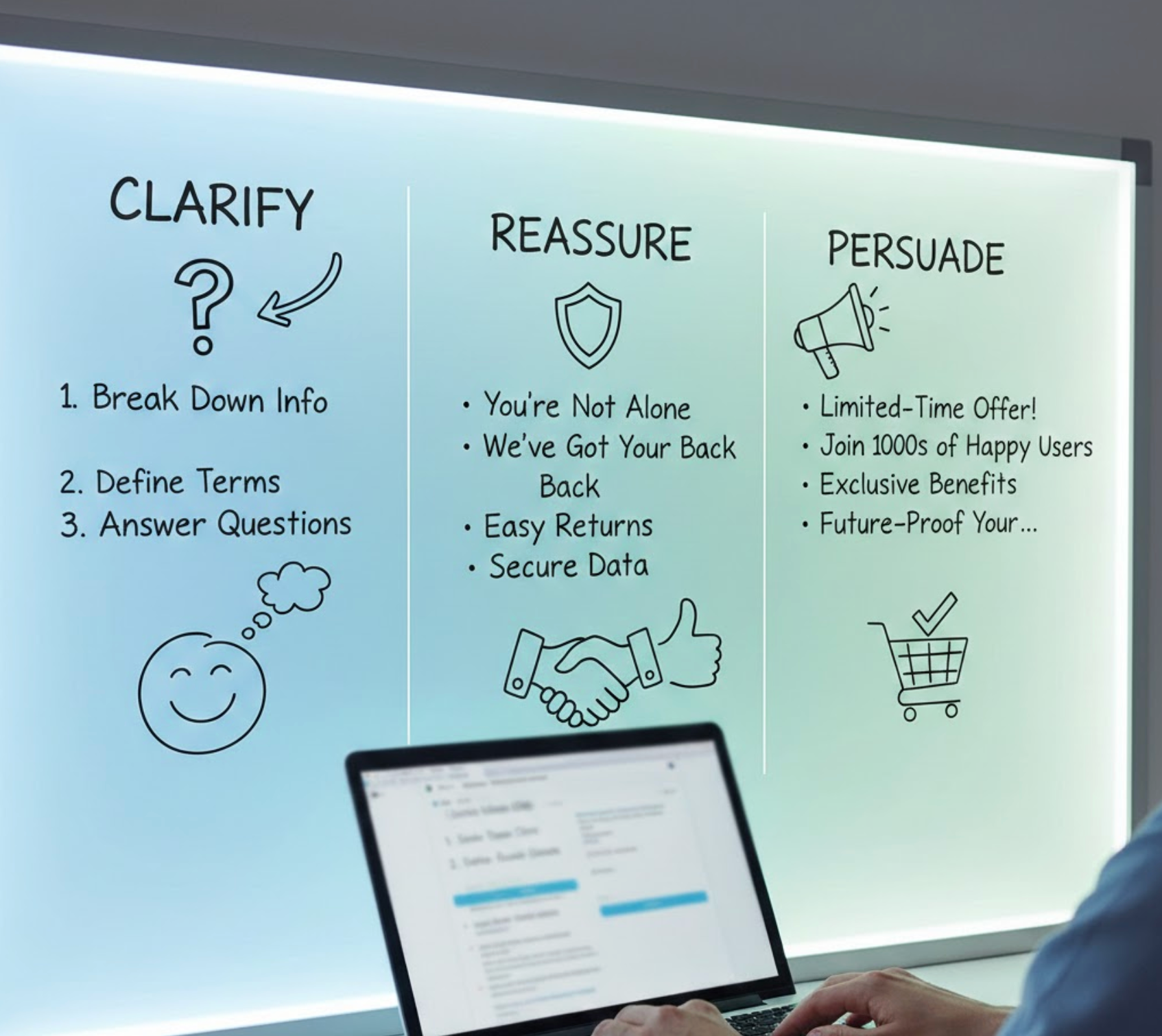
Once images have captured attention, text plays a crucial role in turning interest into intent. Strong product copy explains why a product matters, how it solves a problem, and what makes it better than alternatives. Text also addresses concerns that images cannot cover, such as durability, fit, compatibility, or long-term value.
Effective eCommerce copy is clear, concise, and customer-focused. Instead of simply listing specifications, it connects features to benefits and reassures shoppers that they are making the right choice.
To make your copy effective without overwhelming users, apply these writing principles:
A thoughtful visual hierarchy ensures shoppers know where to look first and what to focus on next. Without clear structure, even high-quality images and well-written text can feel chaotic. Visual hierarchy uses size, placement, contrast, and spacing to guide attention and create a logical reading flow.
On effective eCommerce pages, key visuals and headlines appear first, followed by supporting content that becomes more detailed as users scroll. This layered presentation respects both quick scanners and users who want in-depth information.
You can create this hierarchy by structuring your page layout in the following ways:
Most online shoppers do not read product pages word for word. Instead, they scan for relevant information that confirms their needs or answers specific questions. Long paragraphs placed next to images can disrupt this scanning behavior and make the page feel heavy.
Scannable text supports quick comprehension while allowing images to remain the focal point. Short lines, visual breaks, and clear emphasis help users extract value without slowing down their browsing experience.
To improve scannability without sacrificing clarity, consider these formatting techniques:
On mobile devices, space constraints make the balance between images and text even more critical. Large images are essential for visual clarity, but excessive scrolling or long text blocks can frustrate users. Mobile shoppers often browse quickly and expect immediate access to key information.
Designing for mobile means prioritizing essentials and progressively revealing secondary details. Images should load quickly and remain clear, while text should be concise and easy to interact with.
To optimize image–text balance for mobile shoppers, focus on the following adjustments:
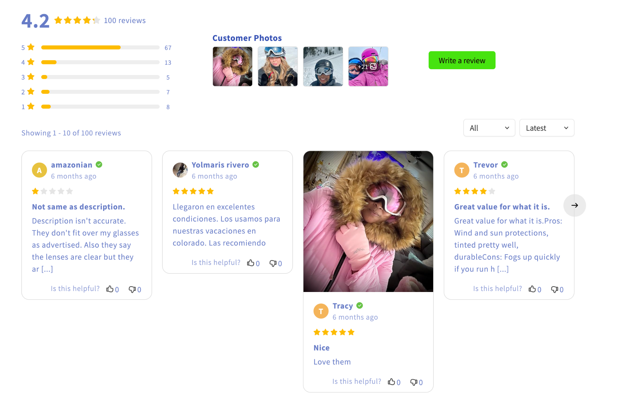
Trust is a critical factor in eCommerce, especially for first-time visitors. Images alone may look appealing, but without supporting text, they can feel superficial or misleading. Likewise, text-heavy trust signals without visual proof may fail to convince skeptical shoppers.
When images and text reinforce each other, they create transparency and credibility. Real product photos combined with clear explanations, policies, and social proof help reduce uncertainty and build confidence.
This trust-building effect can be strengthened by combining visuals and copy in these areas:
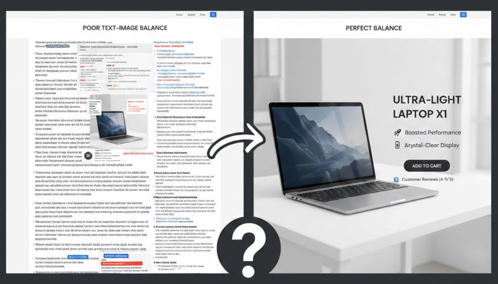
There is no universal formula for the perfect image-to-text ratio. Different products, audiences, and price points require different approaches. For example, visually driven products may rely more on imagery, while complex or high-ticket items may need more detailed explanations.
Continuous testing helps identify what works best for your store. By analyzing user behavior and performance data, you can refine layouts and content over time.
Over time, you can improve performance by experimenting with approaches such as:
Balancing images and text in eCommerce is not about choosing one over the other, but about creating harmony between visual appeal and informative content. Images should inspire, demonstrate, and attract, while text should clarify, persuade, and reassure. When both elements work together, they reduce friction, build trust, and support confident decision-making. By focusing on hierarchy, scannability, mobile optimization, and continuous testing, eCommerce businesses can create product pages that are both visually compelling and highly effective at converting visitors into customers.

