Please select the platform to login


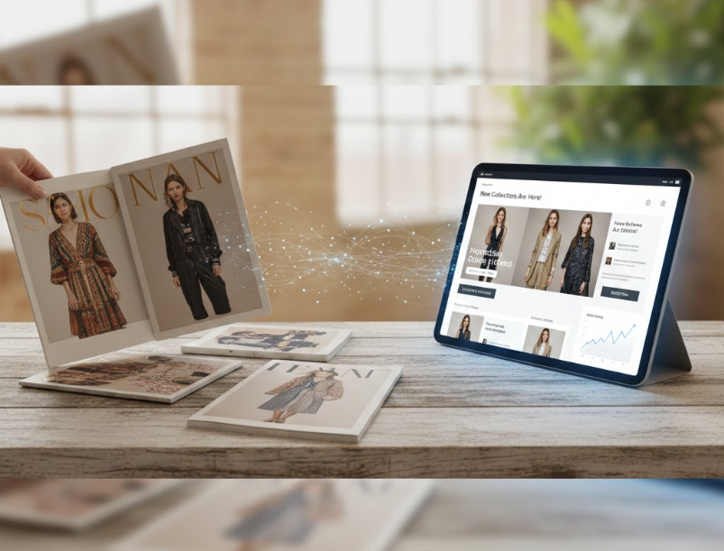
Lookbooks have become one of the most powerful storytelling tools in modern eCommerce, helping brands express style, seasonality, and personality in a visually compelling way. Email marketing, on the other hand, remains the most reliable channel for nurturing customers and driving repeat traffic. When these two elements intersect, something uniquely effective happens: your email campaigns transform from mere promotional messages into immersive experiences. This combination strengthens engagement, increases curiosity, and leads naturally to higher click-through rates (CTR).
In this guide, we explore how lookbooks and email campaigns can complement each other, how to structure content to encourage interaction, and which strategies help you deliver emails your audience actually wants to click.
Lookbooks and email campaigns complement each other because they engage customers in fundamentally different—but highly compatible—ways. A lookbook tells a visual story, inviting shoppers to explore products within context and lifestyle. Email provides the channel to deliver that experience directly into the user’s inbox. When paired well, the lookbook becomes the star of the show, and the email becomes the vehicle that drives attention, traffic, and eventual conversions.
Lookbooks are powerful because they present products as part of a larger narrative. Instead of focusing on specs, they highlight how items fit into a lifestyle or season. This emotional connection makes your audience more willing to click, explore, and eventually buy. People respond strongly to visual context—seeing a product in real-life settings makes it easier to imagine themselves owning it.
Email marketing bridges the gap between discovery and intent. A well-crafted email can place your lookbook in front of thousands of subscribers within seconds, offering a clear path to engage further. When recipients see a beautiful layout, a new collection, or a curated style guide, they immediately feel the urge to explore beyond the email.
When combined deliberately, lookbooks and email campaigns encourage curiosity and foster click behavior. The email should tease, not reveal everything; the lookbook should reward the click by delivering an experience worth exploring. This strategic partnership—between curiosity generated in the inbox and visual immersion on your site—is exactly why CTRs rise.
Before you think about email design, you need a solid lookbook foundation. The strength of your email campaign depends on how compelling your lookbook is. A well-structured, visually coherent lookbook will generate more clicks than an inconsistent or cluttered one.
A strong theme gives your email campaign a narrative to build upon. Whether you are launching a seasonal collection, running a holiday guide, or showcasing a user-generated lookbook, clarity helps both your visuals and email copy stay aligned.
Common lookbook themes you can use:
A cohesive theme makes your email feel intentional and helps guide recipients toward a desired action.
The email will not contain the entire lookbook, so you must select the most engaging visuals. These will act as hooks—glimpses that entice people to click through for more.
When selecting visuals:
Once readers click through, the experience should feel smooth and intuitive. That means your lookbook should be:
The better the lookbook’s user experience, the more likely subscribers will stay, explore, and convert.
Once the lookbook is ready, the next step is crafting an email that encourages people to click through. The purpose of the email is not to display the whole lookbook but to spark curiosity—just enough to make subscribers want more.
If you reveal too much inside the email, there’s no reason for subscribers to click. Instead, highlight three to five images that represent the lookbook’s strongest points. Think of the email as a movie trailer—it needs to excite, intrigue, and leave the reader needing the full experience.
Your subject line must capture both the theme and the value of the lookbook. It should communicate what readers gain from opening the email.
Examples:
A strong subject line sets expectations and increases open rate, which strengthens CTR.
Emails perform better when the layout naturally leads the reader toward the call-to-action. Use a design that feels clean, minimal, and digestible.
You can improve visual flow by:
The visual hierarchy should move the reader from curiosity → interest → click.
Because the lookbook contains the detailed story, the email’s copy should remain light and engaging. A few short lines are enough to set the mood and lead to the CTA.
For example:
“New season, new energy. We’ve curated our latest lookbook to showcase everyday comfort meets elevated style. Dive in to explore the full collection.”
Short, simple, and clickable.
Your CTA should feel clear, inviting, and action-oriented. It should motivate the reader to explore the lookbook without sounding pushy.
Examples:
Avoid overly sales-oriented CTAs such as “Shop Now” if your main goal is to drive engagement toward the lookbook rather than immediate purchase.
Personalization can significantly improve CTR because it makes your message feel relevant. Rather than sending the same lookbook email to every subscriber, segment your audience so the visuals and messaging resonate with their interests.
Look at the types of products customers typically browse or buy. This allows you to present lookbook sections most relevant to them.
Useful segmentation options:
Segmentation makes your email feel tailor-made, encouraging higher CTR.
Some brands go further by designing multiple lookbook variations—for example, a “minimalist lookbook” and a “colorful outfit lookbook.” Subscribers receive the one that matches their past behavior.
You can personalize:
The more aligned your lookbook feels with the reader’s taste, the more likely they are to click through.
If your lookbook includes multiple categories, dynamic elements can show customers the most relevant options first. This technique helps direct attention and increases the chances of interaction.
Automation makes your lookbook campaigns feel timely and relevant without manually sending messages each time. When your emails are triggered by customer behaviors, they feel more personal and drive higher CTR.
Automation can deliver lookbook emails exactly when customers are most receptive. For example:
These strategically timed messages feel helpful rather than promotional.
Testing helps determine which structures and visuals generate the highest CTR. Testable elements include:
By testing systematically, you refine your email-lookbook strategy over time.
Once subscribers click through, the lookbook must reward their curiosity. If the experience feels immersive and smooth, customers stay longer, interact more, and often end up browsing the rest of your store.
Consistency improves trust. Make sure the lookbook landing page matches the colors, tone, and visuals showcased in the email. This helps customers feel like they’re continuing the same journey instead of being redirected elsewhere.
Allow readers to shop directly from the lookbook page without leaving it. This minimizes friction and increases the chance of conversion.
Subtle but helpful references guide customers to the right products.
You can include:
Since many users click through on mobile, a smooth mobile experience is essential. Make sure:
Positive lookbook UX directly influences CTR, time on page, and conversion.
Improving CTR is an ongoing effort. Once your email + lookbook system is in place, analyze performance and look for areas to refine.
Important metrics include:
Each metric helps identify visibility issues, interest levels, and usability improvements.
Once you gather data, refine one element at a time. Consider:
Incremental improvements lead to significantly higher CTR over time.
When executed thoughtfully, combining lookbooks with email campaigns can significantly elevate customer engagement and CTR. Lookbooks provide the visual storytelling customers crave, while emails deliver that inspiration directly to their inbox in a curated, enticing format. The key lies in creating synergy—your email should tease the narrative, while your lookbook should reward the click with a seamless, immersive experience. By focusing on personalization, mobile-friendly design, automation, and audience-aligned themes, you build a marketing flow that feels both natural and irresistible. With consistency and ongoing optimization, this powerful pairing can become a long-term driver of visibility, exploration, and higher-quality traffic for your eCommerce brand.

