Please select the platform to login


Your Shopify homepage is the digital storefront of your brand, the first impression that can turn visitors into loyal customers or make them leave within seconds. A high-converting homepage doesn’t just focus on visual appeal; it strategically combines design, psychology, and storytelling to encourage action. Every element, from your hero banner to your reviews, plays a crucial role in building trust and guiding the customer journey. In this guide, we’ll walk you through how to create a Shopify homepage that not only looks stunning but also drives measurable results.
The hero section is your first opportunity to capture attention and communicate your brand’s essence. Within the first few seconds, visitors should know exactly what your store sells and why it’s worth exploring further. Use high-quality visuals, an eye-catching headline, and a short, persuasive subheading to deliver your main message. Don’t forget a strong call-to-action (CTA) that tells shoppers exactly what to do next.
Tips to boost conversions:
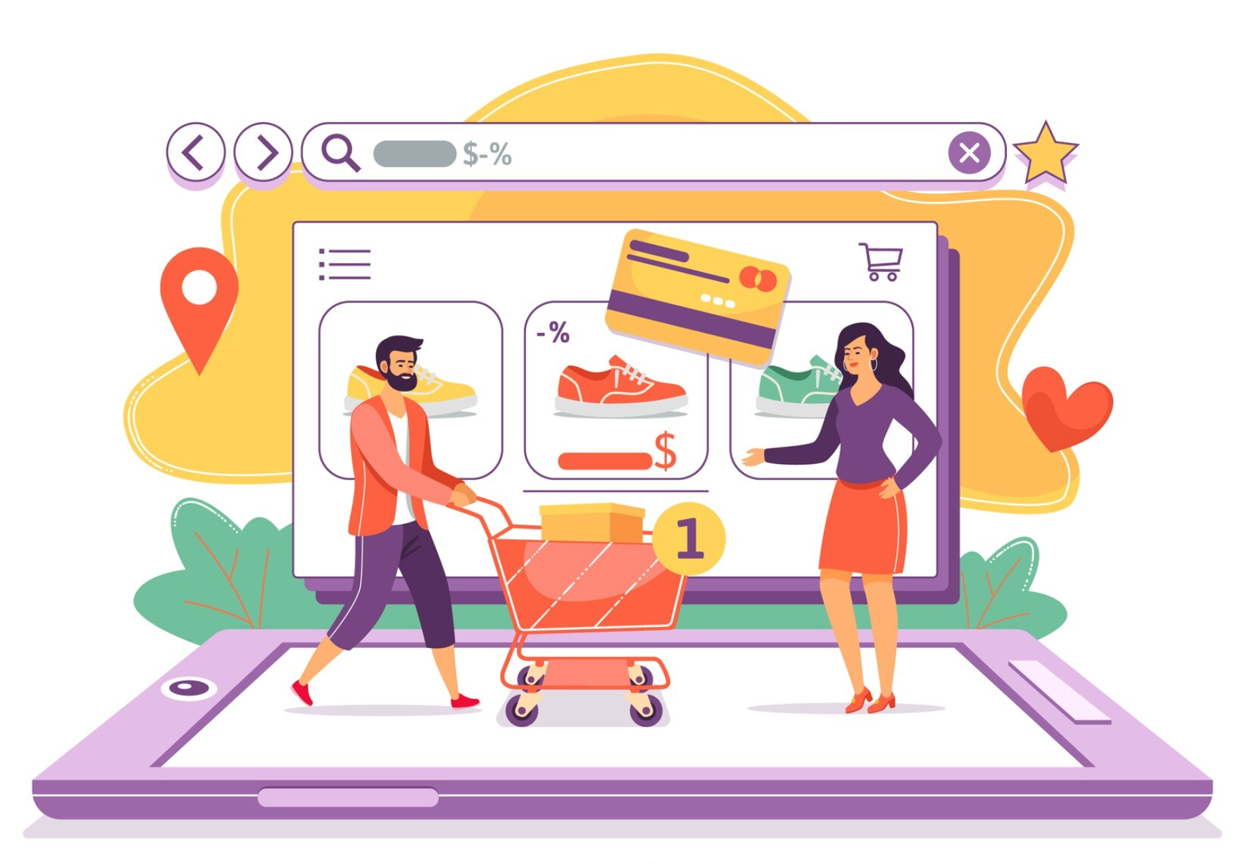
After grabbing attention, guide visitors toward products that convert best. Highlighting your best-sellers or featured collections not only showcases your strengths but also helps build instant credibility. Customers often trust popular products because they signal demand and quality. This section should be visually appealing, easy to navigate, and encourage quick action.
Conversion optimization ideas:
A confusing website layout can easily frustrate visitors and reduce conversions. Your homepage should make it effortless for shoppers to find what they need. Logical organization, minimal clutter, and visible navigation elements guide visitors naturally toward your key product categories. The goal is to make shopping intuitive from the very first click.
Best practices:
Your homepage should clearly communicate what makes your brand different, your Unique Value Proposition. This could be your quality, pricing, ethics, or innovation. When shoppers quickly understand your core advantage, they’re more likely to stay and explore. Use short, benefit-driven statements and appealing visuals to reinforce your uniqueness.
How to communicate your UVP effectively:

Before buying, most shoppers want proof that others trust your brand. Social proof builds confidence and reduces hesitation. Displaying reviews, testimonials, or influencer endorsements helps establish credibility instantly. This is where using an app like Ryviu becomes invaluable. It lets you easily import, display, and manage authentic product reviews, building strong trust directly on your homepage.
Trust-building tips:
Humans are visual creatures, and we process images much faster than text. Using high-quality, lifestyle-based visuals helps customers emotionally connect with your brand and see your products in action. Rather than only using studio photos, show your products being used or styled in real-life scenarios. These images make your homepage feel more authentic and aspirational.
Why it matters:
Your homepage should gently lead visitors through a journey, from awareness to action. CTAs (Calls-to-Action) are the signposts that guide them along the way. Each CTA should feel natural within its section and serve a specific purpose, whether it’s to explore products, subscribe, or learn more. Strategic placement and clear wording can dramatically increase engagement.
CTA placement ideas:
With over half of Shopify traffic coming from mobile, your homepage must perform beautifully on every device. Mobile users expect speed, simplicity, and smooth navigation. A responsive design ensures your visuals and content adjust seamlessly across screen sizes. The easier it is for users to browse and buy on their phones, the higher your conversion rates.
Mobile optimization checklist:
Not all visitors buy right away, but you can still turn them into potential customers. Adding an email signup form helps you capture leads for future marketing efforts. To encourage signups, offer something valuable like a discount, early access, or a free guide. This not only builds your email list but also strengthens long-term customer relationships.
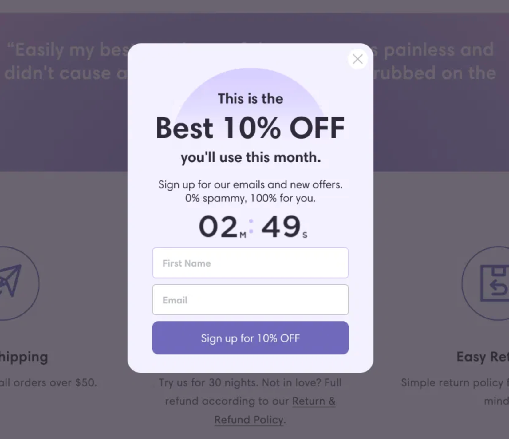
Email capture ideas:
Homepage performance is one of the biggest factors in conversions. A clean, fast-loading page keeps visitors engaged and improves trust. Cluttered designs and inconsistent branding can confuse users and push them away. Focus on simplicity, brand alignment, and optimized performance for the best results.
Optimization tips:
Your footer often gets overlooked, but it’s one of the most functional parts of your homepage. It provides reassurance and easy access to important information for shoppers. A well-structured footer not only improves navigation but also builds trust by showing transparency and professionalism.
Must-have elements:
Your homepage is never a one-and-done project, but it should evolve with your customers’ preferences and behavior. Use analytics tools to track visitor activity and identify what’s working and what’s not. By continuously testing, adjusting, and improving, you’ll keep your homepage performing at its best.
Testing suggestions:
A high-converting Shopify homepage is a balance of design, psychology, and trust. It tells your brand story clearly, shows off your best products, and leads visitors naturally toward action. By combining engaging visuals, authentic social proof through apps like Ryviu, and smooth navigation, you can create a shopping experience that not only attracts visitors but converts them into customers. Your homepage isn’t static. Keep testing, improving, and refining to ensure it remains a powerful conversion tool as your store grows.

