Please select the platform to login


When you're running paid advertising, whether through Google Ads, Facebook Ads, TikTok, or any other platform, the performance of your mobile landing page plays a massive role in determining conversion rates. Even the most compelling ad creative can't overcome a slow, clunky, or poorly optimized mobile experience.
Because of this, businesses are increasingly turning to Accelerated Mobile Landing Pages (AMLPs), high-speed, lightweight pages designed to load instantly and convert efficiently. These pages reduce friction, keep users engaged, and give you the best possible return on your ad spend.
In this guide, you’ll learn exactly how to create AMLPs that are fast, persuasive, and optimized for the mobile user journey.
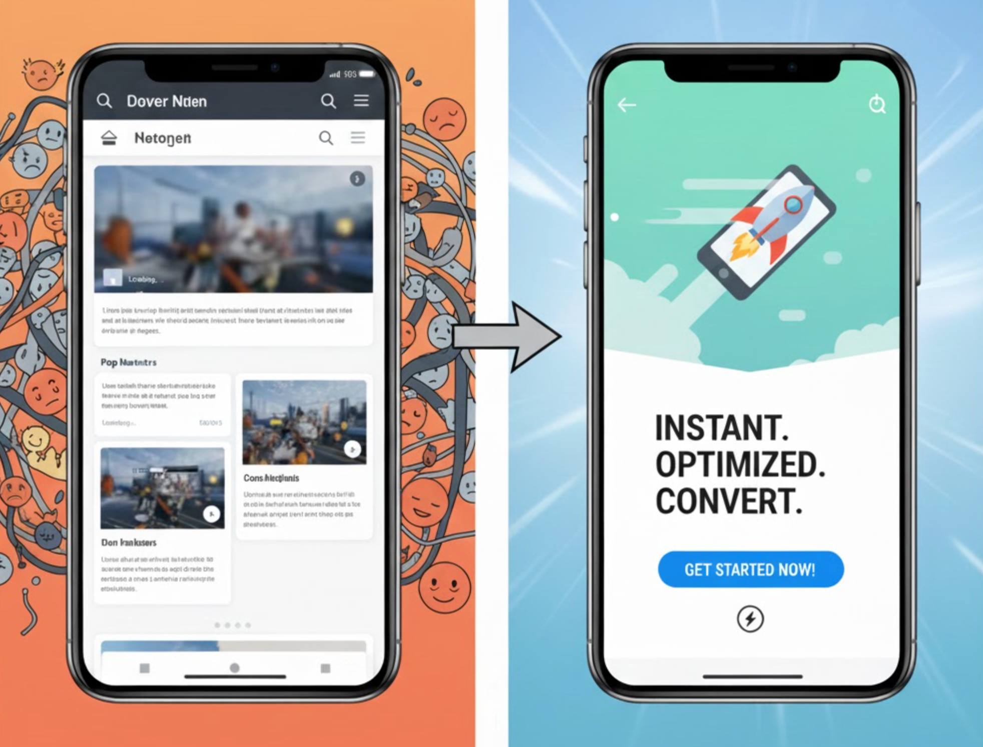
Before learning how to build them, it’s important to clearly understand what Accelerated Mobile Landing Pages (AMLPs) actually are. In simple terms, these are ultra-fast, hyper-optimized landing pages built specifically to serve paid advertising traffic on mobile devices. They are designed with one goal in mind: to load instantly and capture conversions before users lose interest.
To transition into the details naturally, think of AMLPs as the “performance version” of normal landing pages, leaner, faster, and engineered specifically for the unique behavior of mobile visitors.
Unlike standard landing pages that may prioritize aesthetics or storytelling, AMLPs prioritize speed and efficiency above everything else. These pages act like conversion machines, trimming away anything that slows users down or distracts them from completing the ad’s intended action.
As digital advertising becomes more competitive, and as user attention spans continue to shrink, AMLPs have become a core strategy for brands that want maximum ROI from their mobile ad spend.
Before diving into the creation process, it’s important to understand why AMLPs are so impactful. Mobile users behave differently, they’re impatient, easily distracted, and expect instant results. If your landing page doesn’t load fast enough, studies show that each additional second reduces conversions significantly.
To help you visualize the benefits, let’s look at why AMLPs are worth the investment:
Now, let’s explore how to build them effectively.
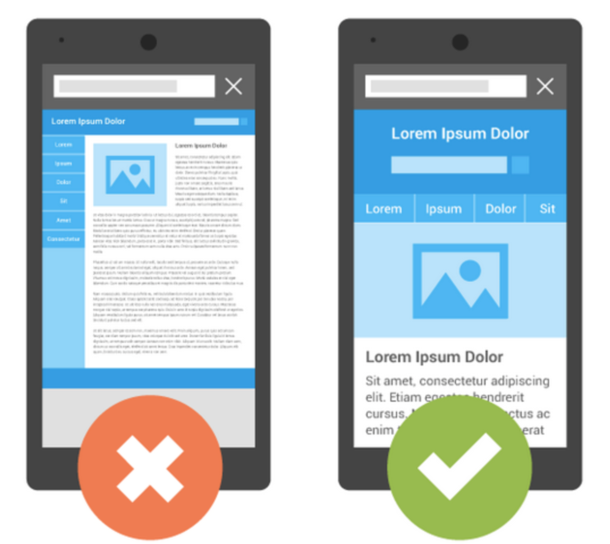
Because mobile users expect pages to load instantly, your design should prioritize simplicity and speed. Instead of thinking visually first, think functionally, what elements are absolutely necessary for conversions?
To make this shift more naturally, consider this: every element you remove saves loading time, reduces cognitive load, and simplifies decision-making. This is why the best AMLPs look clean, lightweight, and laser-focused.
Try these tips for designing a minimalist AMLP:
A simple design ensures faster loading, higher engagement, and clearer messaging.
Building an AMLP is about aesthetics and speed which depends heavily on technical decisions. Since most mobile users access pages over inconsistent networks, your page must load instantly under all conditions.
To make the technical part easier to digest, let’s walk through a few critical optimizations that instantly boost performance:
Technical enhancements that matter most:
Even modest improvements shave off milliseconds, often the difference between a bounce and a conversion.
Mobile users scan, rarely do they read word-for-word. That’s why your messaging should be sharp, concise, and immediately persuasive. As a smooth transition into this section, remember that speed isn’t only about load time; it’s also about how quickly a visitor understands your offer.
Your AMLP should communicate:
Best practices for effective mobile messaging:
Your message should convince visitors within the first 3–5 seconds.
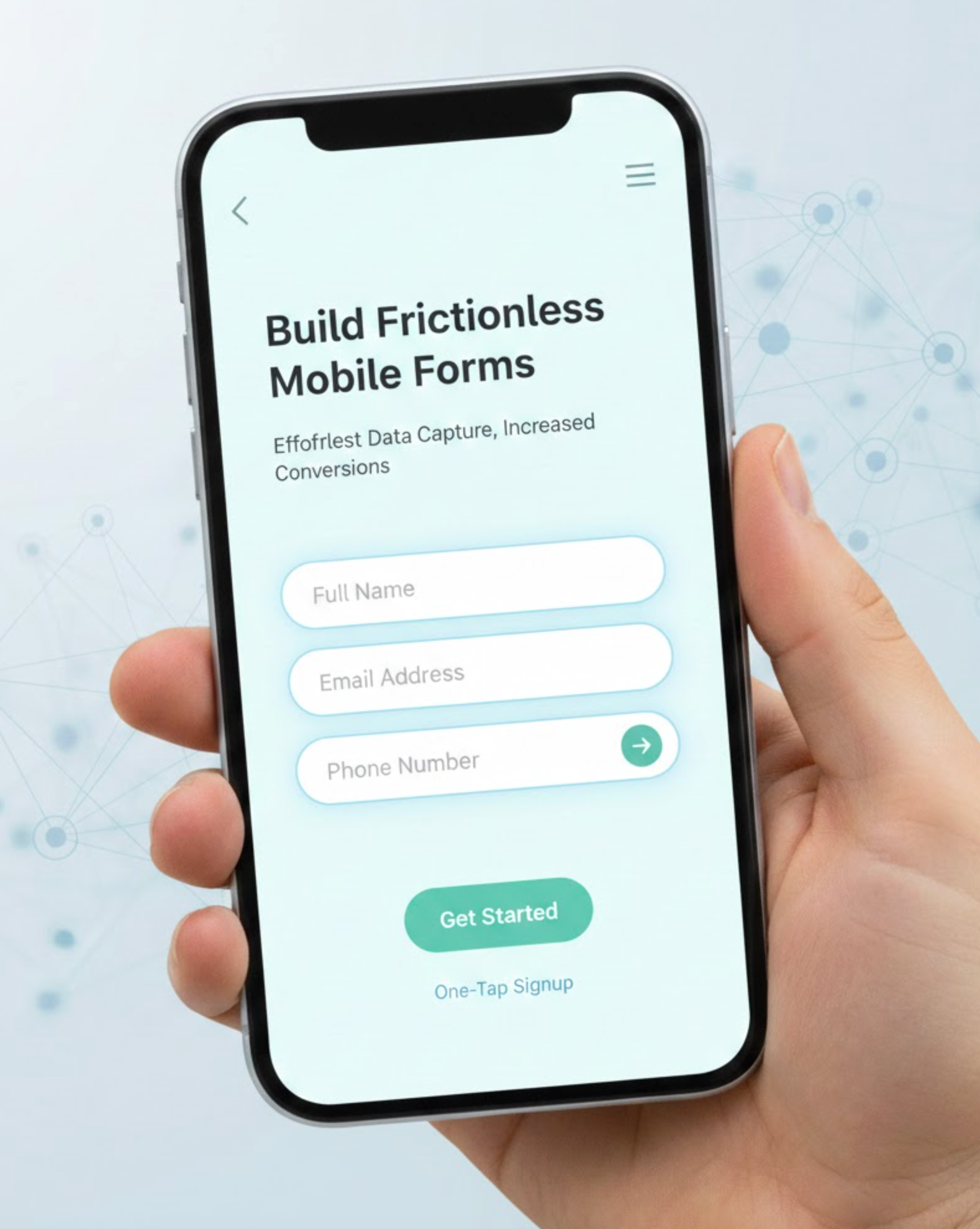
If your landing page includes a lead form, optimizing it for mobile is essential. Complex forms reduce submission rates dramatically. Before listing improvements, here’s a natural shift: because mobile users don’t like typing, your form design must do the heavy lifting.
How to create high-converting mobile forms:
Small usability improvements can dramatically increase conversions.
One of the biggest reasons mobile landing pages fail is message mismatch. If users click an ad expecting one thing and land on a page offering something different, they bounce instantly.
To keep your message consistent, imagine your ad as the “promise” and your landing page as the “delivery.”
To ensure the seamless, you have to match these elements between ad and landing page:
Strong continuity increases trust and makes users feel confident they are in the right place.

Social proof is critical, especially for performance-driven ads. However, on mobile pages, it must be integrated lightly to avoid slowing down the experience.
To guide this transition naturally, consider this: users trust other users more than brand claims, but the challenge is showing that trust without sacrificing page speed.
Here are some lightweight social proof options for you to consider adding in your landing page:
Avoid embedding heavy carousels or third-party widgets that load slowly.
Creating an AMLP isn’t a one-time task, it’s a continuous optimization process. To maintain performance, you need to test page variations and track metrics that specifically matter for mobile traffic.
What to monitor closely:
What to A/B test:
Mobile behavior changes quickly, so testing ensures you keep winning.
Finally, even the best-optimized design can’t overcome a slow hosting environment. If your server is sluggish, every part of your landing page will suffer.
For a smooth transition into the final section, it’s worth noting that infrastructure is often the hidden driver of true “acceleration.”
In this case, you should choose hosting or platforms that provide:
Platforms built for landing pages (Unbounce, Webflow, Shopify Landing Apps, custom headless builds) tend to perform better than generic site builders.
Accelerated Mobile Landing Pages aren’t just another optimization trend, they’re essential for successful ad campaigns in a mobile-first world. Speed, clarity, and user experience determine whether your ad budget drives conversions or wastes clicks.
By focusing on fast loading, clean design, consistent messaging, optimized forms, and ongoing testing, you can create AMLPs that elevate your advertising results and unlock stronger returns.

