Please select the platform to login


A floating cart is one of the most effective UX elements for eCommerce stores as it keeps the checkout option visible at all times, helping customers stay aware of their selections and encouraging them to complete purchases faster. However, if it’s too flashy or poorly placed, it can easily interrupt browsing flow or clutter the screen. The best floating carts strike a balance: always accessible but never intrusive.
Let’s explore how to design a floating cart that enhances the shopping experience while staying subtle and user-friendly.
A floating cart should serve as a gentle reminder, not a constant distraction. The goal is to make it visible enough to guide shoppers but discreet enough to let them focus on product discovery. A cluttered or oversized cart button can make your store feel crowded, especially on smaller screens. By keeping it minimal, you maintain visual harmony across your pages while still improving usability.
Here are a few ways to achieve that:
Positioning is critical for a floating cart because it determines how easily users can access it without interference. A well-placed cart improves flow and convenience, while a misplaced one can block essential content or buttons. Most users naturally expect to find floating elements like chat widgets or carts at the bottom corners, especially on mobile screens. Your design should align with this behavior for a familiar, frictionless experience.
To ensure optimal placement:
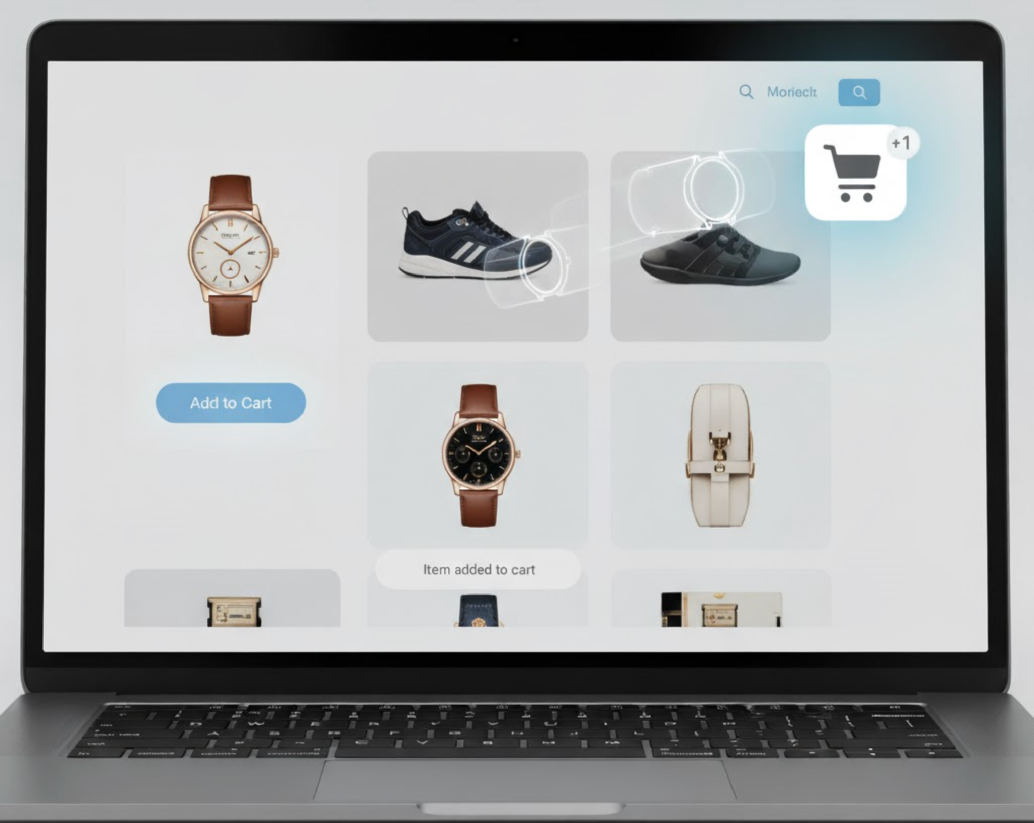
Motion in UX design should inform, not distract. Adding small animations to your floating cart can help draw attention at key moments, such as when an item is added, but overdoing it can break the browsing flow. Subtle transitions make the experience feel polished and interactive without overwhelming the user. The best motion effects are brief, purposeful, and easy on the eyes.
Try incorporating these animation principles:
A floating cart doesn’t need to show every product detail at once. Instead, it should provide quick insights while allowing users to view the full cart only when they choose to. Showing too much information upfront can overwhelm shoppers and reduce focus on browsing. A better approach is to use a compact icon with expandable content that reveals relevant details smoothly.
Design your cart’s content flow like this:
The floating cart should complement, not compete with, your product visuals or calls-to-action. Maintaining a strong visual hierarchy ensures users’ eyes are guided naturally across the page without unnecessary distractions. Think of the cart as a supporting element, always available but never demanding attention unless it’s relevant. Proper contrast, spacing, and layering will help it blend seamlessly into your layout.
Follow these hierarchy guidelines:

On mobile, screen real estate is limited, meaning your floating cart must be even more thoughtful. A large or fixed cart could cover crucial product information or filter options. Designing a responsive cart that adapts to different orientations and resolutions ensures usability for all shoppers. The mobile experience should focus on convenience, accessibility, and fluid interaction.
Here’s how to optimize it for mobile:
Even a visually perfect floating cart may behave differently under real conditions. Regular testing ensures it enhances usability instead of hindering it. A/B testing variations in size, color, and animation can help you understand what users respond to best. Collecting user feedback provides insights into whether your cart feels convenient or distracting, and helps you iterate effectively.
Here’s what to test and track:
Designing a floating cart that doesn’t distract users is about mastering subtlety and functionality. It should stay visible as a gentle guide, helping users complete their purchase journey without pulling attention from the browsing experience. By keeping it minimal, well-positioned, and context-aware, you make it an extension of your brand’s UX rather than an intrusive add-on.
A thoughtfully designed floating cart can quietly boost conversions, reduce friction, and make shopping feel seamless, reminding users that convenience doesn’t have to come at the cost of clarity.

