Please select the platform to login


A great product can still fail if users don’t understand how to use it. This is especially true when your audience includes non-technical users—people who may feel intimidated by dashboards, settings, or unfamiliar terminology. Onboarding is not just a tutorial; it is the first relationship your product builds with its users. A well-designed onboarding experience helps users feel confident, supported, and successful from the very beginning.
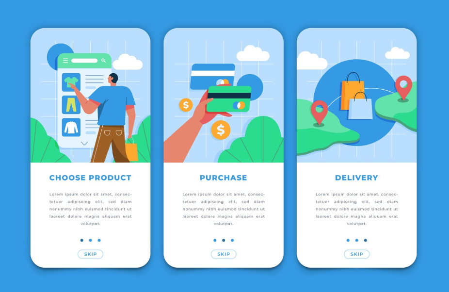
In this guide, we’ll explore how to design onboarding specifically for non-technical users, focusing on clarity, empathy, and gradual learning. The goal is not to teach everything at once, but to guide users toward meaningful progress as naturally as possible.
Before designing any onboarding flow, it’s critical to understand who non-technical users really are. They are not less capable; they simply have different mental models and priorities. Many are business owners, marketers, creators, or operators who care about outcomes rather than systems.
Non-technical users often approach software with a goal-oriented mindset. They want to complete a task quickly, not learn how the system works behind the scenes. When onboarding ignores this, it creates friction. Users may feel overwhelmed, frustrated, or even blame themselves for not “getting it.”
Non-technical users often share several traits that should influence onboarding design:
Designing onboarding without acknowledging these traits can lead to confusion and early churn.
Empathy is the foundation of effective onboarding. Instead of asking, “How do we explain this feature?” ask, “What does the user need to feel confident right now?” When onboarding is empathetic, it anticipates confusion and reduces anxiety before it appears. This mindset shift changes everything from copywriting to flow design.
Onboarding is not about showing every feature. It’s about helping users reach their first moment of success as quickly and smoothly as possible. This moment is often called the “aha moment,” where users clearly see the value of your product.
To design effectively, you need to define what success looks like for a new user. This definition should guide every onboarding decision.
Ask yourself what a non-technical user should achieve within their first session or first day. This could be publishing content, completing a setup, receiving their first result, or seeing data populate. The key is that the outcome must feel tangible and rewarding.
Once this outcome is clear, onboarding should focus almost entirely on guiding users toward it, removing distractions along the way.
One of the most common onboarding mistakes is trying to explain too much, too soon. Non-technical users can quickly become overwhelmed when faced with complex menus or long checklists. Instead of presenting all options, progressively reveal features as users gain confidence.
By narrowing the initial focus, you help users feel successful rather than confused.
The first impression of your product sets the tone for everything that follows. For non-technical users, simplicity is not a luxury—it is a requirement.
A strong first-time experience reduces cognitive load and gently guides users forward without demanding too many decisions at once.
Cognitive friction occurs when users must stop and think too hard about what to do next. To reduce this, onboarding screens should clearly answer three questions:
Clear headings, concise explanations, and visual cues help users move forward without hesitation.
Non-technical users feel more comfortable when interfaces behave in familiar ways. Buttons, forms, and navigation should follow widely accepted conventions. Avoid creative but unconventional patterns that require explanation.
Language also matters. Use plain, conversational language instead of technical terms. When specialized words are unavoidable, explain them in simple terms at the moment they appear.
Effective onboarding feels like a guided journey rather than a lecture. For non-technical users, step-by-step guidance builds confidence and reduces fear of making mistakes.
The key is pacing. Each step should feel achievable and clearly connected to the user’s goal.
Progressive disclosure means showing only what the user needs at each moment. Instead of exposing the full interface immediately, reveal advanced options later, when they become relevant.
This approach keeps the experience clean and focused. Users learn by doing, not by reading long explanations upfront.
Non-technical users often need reassurance that they are on the right track. Visual indicators such as progress bars, checkmarks, or completion messages can be surprisingly powerful.
These signals reduce anxiety and motivate users to continue. They also help users understand how much effort remains, making the journey feel manageable.
For non-technical users, visuals often communicate more effectively than text. A well-placed tooltip or illustration can replace paragraphs of explanation.
However, visuals must be purposeful. Overuse can distract rather than help.
Short, contextual tooltips can guide users at the exact moment they need help. Instead of launching a long product tour at the start, introduce tips gradually as users interact with specific elements.
This contextual approach feels supportive rather than intrusive and respects the user’s pace.
Interactive onboarding is far more effective than passive instruction. Encourage users to take real actions during onboarding, such as entering sample data or completing a small task.
By actively participating, users build muscle memory and confidence, making it easier to continue using the product independently.
Copywriting plays a major role in how onboarding feels. For non-technical users, the wrong tone can create intimidation, while the right tone can feel like a friendly guide.
Every word should reduce friction, not add to it.
Avoid language that sounds authoritative or technical. Instead, write as if you are helping a colleague. Phrases that reassure users, such as gentle confirmations and positive feedback, can significantly improve confidence.
When users complete a step, acknowledge it. Small moments of encouragement help users feel capable and supported.
Non-technical users are more likely to follow instructions when they understand the purpose behind them. Briefly explaining why a step matters helps users stay motivated and reduces resistance.
These explanations should be short and relevant, connecting actions directly to outcomes the user cares about.
Mistakes are inevitable, especially for non-technical users exploring a new product. How your onboarding handles errors can either build trust or destroy it.
A good onboarding experience treats errors as learning moments, not failures.
Error messages should clearly explain what went wrong and how to fix it. Avoid technical codes or vague statements. The tone should be calm and supportive, not alarming.
When possible, suggest a solution directly within the message. This prevents users from feeling stuck or helpless.
Proactive design can reduce errors significantly. Input validation, clear instructions, and examples help users avoid mistakes in the first place.
By guiding users gently, you reduce frustration and increase the likelihood that they will continue using your product.
Onboarding does not end after the first session. Non-technical users often need continued support as they explore deeper features or return after time away.
A strong onboarding strategy includes ongoing education and assistance.
Accessible help options, such as searchable guides or contextual help buttons, empower users to solve problems independently. These resources should be easy to find and written in the same simple language as the onboarding flow.
When users know help is available, they feel safer experimenting with the product.
As users become more comfortable, gentle nudges can introduce new features or best practices. These nudges should be based on user behavior, not arbitrary timelines.
By aligning guidance with real usage patterns, you ensure that learning feels relevant and timely.
Designing onboarding is not a one-time task. It requires continuous improvement based on real user behavior and feedback.
For non-technical users especially, small changes can have a big impact.
Focus on metrics that reflect user success rather than surface-level engagement. Completion rates, time to first success, and early retention provide valuable insights into how effective your onboarding is.
If users drop off at a specific step, that’s often a signal of confusion or friction.
Qualitative feedback is invaluable when designing for non-technical audiences. Short surveys, usability tests, or support conversations can reveal issues that metrics alone cannot.
Listening to how users describe their struggles helps you refine language, flow, and structure in ways that truly matter.
Designing an onboarding experience for non-technical users is ultimately about respect and empathy. It requires understanding users’ goals, reducing complexity, and guiding them with clarity and encouragement. When onboarding is designed thoughtfully, it transforms uncertainty into confidence and curiosity into long-term engagement.
By focusing on simplicity, progressive learning, supportive language, and continuous improvement, you create an experience that welcomes users rather than overwhelms them. The result is not just better onboarding, but a stronger, more trusting relationship between your product and the people who rely on it every day.

