Please select the platform to login


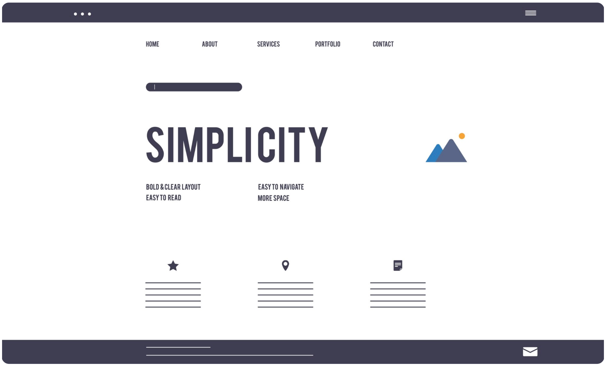
When it comes to web design, navigation can make or break a user’s experience. While creative menus, animated transitions, or complex layouts might look visually impressive, they often sacrifice usability for aesthetics. Simple navigation, on the other hand, focuses on clarity and function, helping users find what they need faster and encouraging them to stay longer. In a world where attention spans are short and choices are endless, simplicity wins.
Simple navigation prioritizes the user’s journey over design experimentation. It uses intuitive labels, predictable layouts, and consistent placement so visitors can instantly understand how to explore your site. Instead of making people think, it allows them to act effortlessly. This reduces frustration, speeds up decision-making, and strengthens brand trust.
Clarity gives users confidence. When navigation feels seamless, it communicates professionalism and reliability, essential traits for any online business.
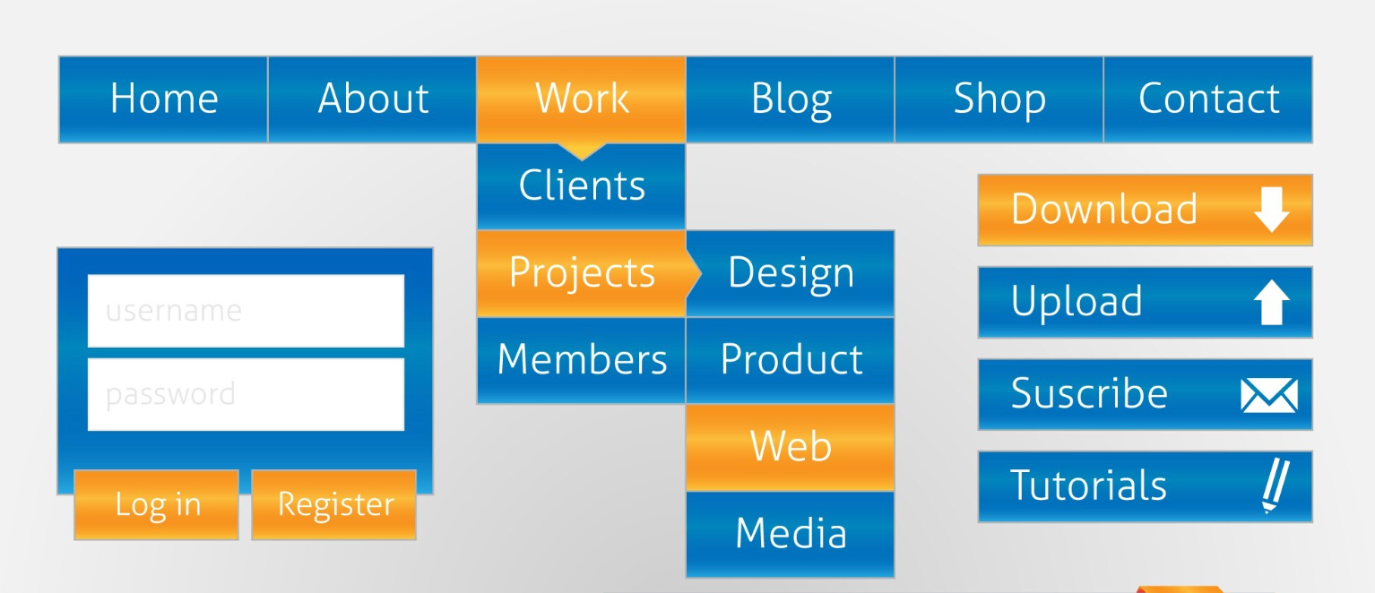
Fancy navigation designs, such as hidden menus, experimental layouts, or overly animated transitions, might look unique but can easily backfire. They increase cognitive load, slow down site performance, and confuse visitors who just want to browse or buy.
For instance, menus that rely on hover animations or nonstandard icons may work beautifully on desktop but fail on mobile devices. What’s more, flashy effects often distract from key actions like “Add to Cart” or “Contact Us.” When users can’t find what they need within seconds, they leave, and every bounce represents a lost opportunity.
A minimal, user-first approach to navigation brings measurable benefits for both user experience and conversions:
Designing simple navigation doesn’t mean stripping your website down to the bare minimum. Instead, it’s about crafting an experience that feels effortless, logical, and purposeful. Every click should guide users closer to their goal, whether that’s making a purchase, reading a blog post, or learning more about your brand. Below are practical steps to help you design navigation that’s simple yet powerful.
Your navigation should always begin with understanding what users truly want from your site. Before adding any design elements, take time to research how visitors behave and what pages they visit most often. This ensures your structure is built around real user needs, not assumptions. To put this into action, you can start by:
A simple structure helps users find what they need quickly without getting lost in layers of menus. Think of your site like a map, every path should lead somewhere clear within a few steps. Avoid unnecessary nesting that forces users to dig too deep. To achieve this, try these practices:
The words you choose for your menu matter more than you think. Labels should guide users instinctively, not make them guess. Using clear and familiar terms builds trust and helps visitors act faster. You can make your labels clearer by:

With most users browsing on smartphones, mobile navigation must be intuitive and responsive. Designing with mobile in mind ensures your site stays accessible and easy to use on all screen sizes. To create a mobile-friendly navigation experience:
When navigation looks and behaves the same everywhere, users feel more confident exploring your site. Consistency builds a sense of control, visitors always know where they are and how to get where they want to go. You can maintain this consistency by:
Effective navigation does not only guide, but it also directs attention toward the actions you want users to take. The trick is to make these CTAs stand out naturally without overwhelming the overall simplicity. To highlight actions effectively:
As users scroll through your site, don’t make them work to find the menu again. A sticky navigation bar ensures essential links are always within reach, improving usability and reducing frustration. You can implement this smoothly by:
Navigation design is not static, but it evolves with your users’ needs and your site’s growth. Regular testing helps you identify what’s working and where users struggle. To continuously improve your navigation:
By following these steps, you’ll create navigation that feels intuitive, consistent, and conversion-driven. Remember, the goal isn’t to impress users with complexity but to empower them with clarity. When navigation feels natural, your visitors stay longer, explore deeper, and engage more with your brand.
A simple navigation doesn’t have to look plain. You can enhance it with subtle typography, contrast, and whitespace to create a visually pleasing experience. Think of simplicity as a design strategy that highlights content and actions rather than competing with them.
When users move through your site effortlessly, they remember the experience, not the interface. That’s what builds loyalty and trust over time.
In web design, simplicity isn’t about doing less, but it’s about doing what matters most. Fancy navigation might impress at first glance, but clear and consistent navigation converts. By focusing on usability, clarity, and accessibility, you make your website not just beautiful but effective.
Ultimately, the best design is the one that helps users reach their goals with ease, and simple navigation does exactly that.

