Please select the platform to login


Forms are a crucial part of the user journey, especially in ecommerce, SaaS, and lead-generation experiences. They often represent the final step between user intent and conversion, yet they are also one of the most common sources of friction. Even small moments of confusion, such as unclear instructions or formatting rules, can cause hesitation or abandonment. Helper text exists to bridge this gap by guiding users clearly and confidently as they complete each field.
When written well, helper text acts like a silent assistant that anticipates questions before users ask them. It reassures users, reduces mistakes, and makes forms feel easier and faster to complete. To achieve this impact, helper text must be intentional, user-focused, and strategically designed.
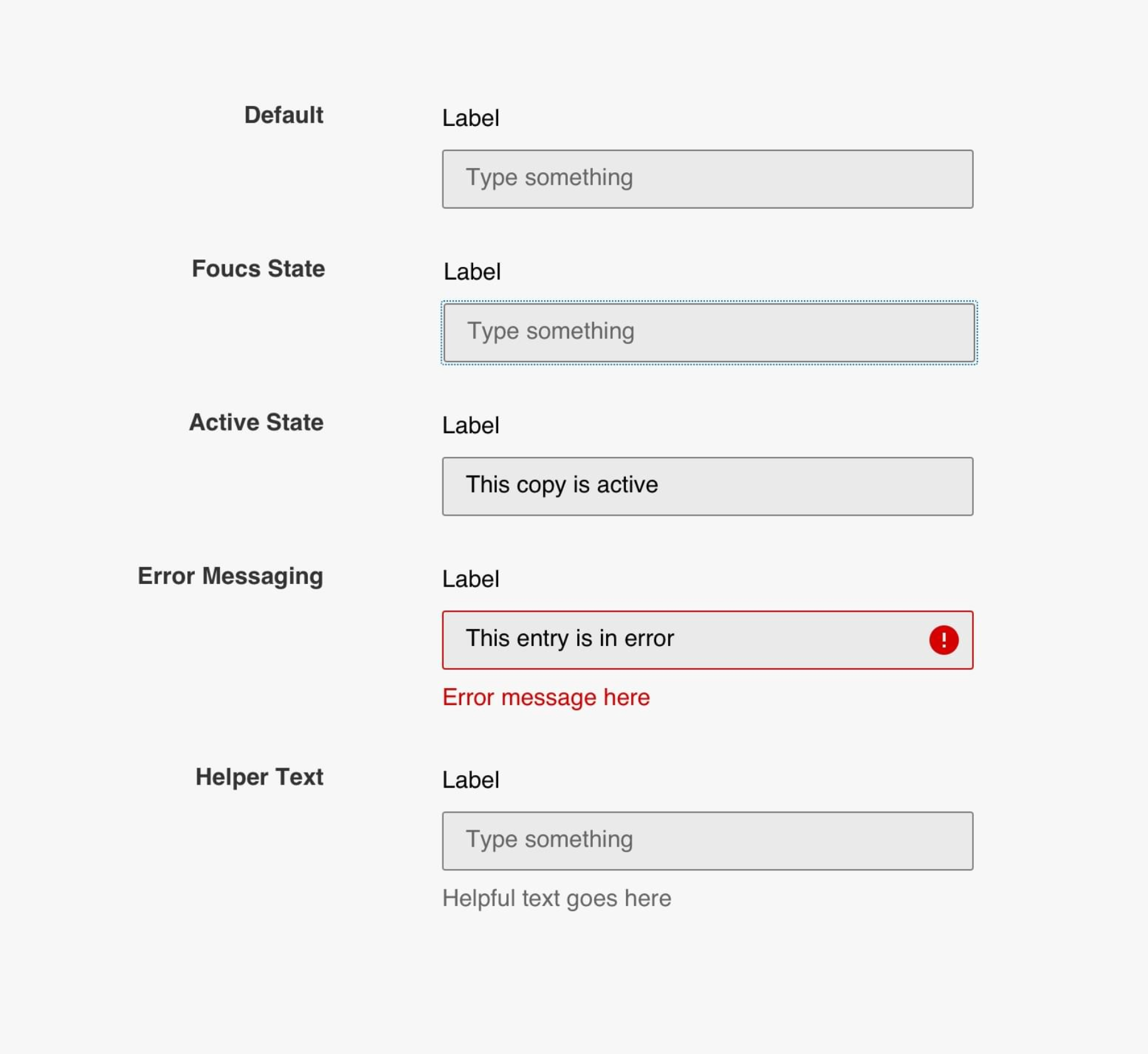
Helper text is supportive instructional content placed near a form field to explain what information is required and how it should be entered. Unlike labels, which simply name the field, helper text provides context, rules, or examples that help users understand expectations. It is especially valuable for fields that are complex, unfamiliar, or sensitive, such as passwords, payment details, or legal information.
Good helper text reduces ambiguity before users begin typing. Instead of forcing users to guess or rely on trial and error, it proactively answers common questions. This guidance creates a smoother interaction and increases the likelihood that users will complete the form successfully.
To better understand its role, helper text typically serves several distinct purposes:
Many users abandon forms not because they are unwilling to complete them, but because they feel uncertain or frustrated during the process. Helper text reduces this uncertainty by setting clear expectations at the right moment. When users understand what is required, they feel more confident and are less likely to pause, hesitate, or exit.
Helper text also lowers cognitive load by eliminating guesswork. Instead of stopping to think about formatting rules or wondering if their input is correct, users can focus on moving forward. This sense of momentum plays a key role in improving completion rates and overall user satisfaction.
This improvement happens for several important reasons:
Clarity is the most important principle of effective helper text. Vague instructions force users to interpret meaning on their own, which often leads to mistakes or hesitation. Specific, concrete guidance eliminates ambiguity and helps users feel confident as they type.
Clear helper text uses simple language and avoids technical jargon. It tells users exactly what to enter, how to format it, and what constraints apply. The more precise the instruction, the less mental effort users need to expend.
To achieve clarity, helper text should follow a few key practices:
Placement is just as important as wording when it comes to helper text. If users cannot easily see or associate the guidance with the correct field, its effectiveness drops significantly. Helper text should be visually connected to the input it supports, typically appearing directly below the field.
Visibility is especially critical on mobile devices, where screen size and scrolling can hide important information. Helper text that appears at the right place and time ensures users receive guidance without breaking their flow.
This placement strategy works best when:
Helper text should always be written from the user’s point of view, not the system’s. Many forms fail because instructions reflect internal logic or business rules rather than user needs. User-centered helper text focuses on helping people succeed, not enforcing rules.
By framing instructions around what benefits or helps the user, helper text feels more supportive and less demanding. This approach is particularly important for sensitive fields, where users may already feel cautious or uncertain.
User-focused helper text typically emphasizes:
While helper text should be informative, it should never overwhelm users with excessive detail. Long paragraphs can slow users down and make forms feel more complex than they are. The goal is to provide just enough information to remove doubt without adding friction.
Concise helper text respects users’ time and attention. When guidance is easy to scan, users can quickly understand what to do and move on to the next field.
To maintain this balance:
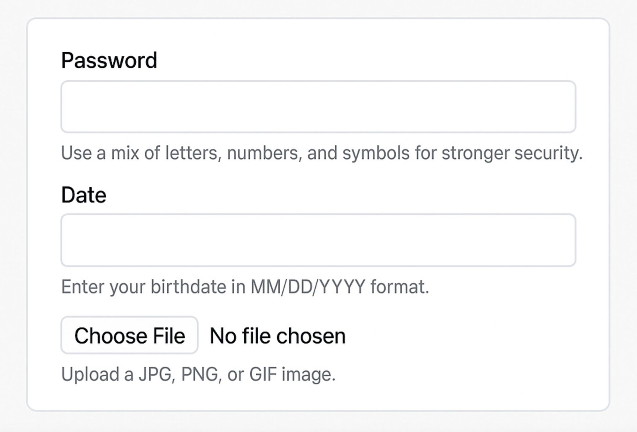
Examples are one of the most effective ways to clarify helper text. They show users exactly what a correct input looks like, removing interpretation and guesswork. This is particularly helpful for fields with specific formats, such as dates, phone numbers, or custom IDs.
By providing a model to follow, examples increase accuracy and reduce errors. Users are far more likely to get it right on the first attempt when they can see a clear reference.
Examples work best when they:
Helper text should add new information, not restate what users already see in the label. Repetition wastes space and does not help users understand the field any better. Each element of a form should have a distinct role and purpose.
Labels identify the field, while helper text explains how to complete it correctly. When these roles are blurred, users may ignore helper text altogether.
To avoid redundancy:
The tone of helper text should align with both the brand voice and the context of the form. A checkout or legal form benefits from a calm, reassuring tone, while a newsletter signup may allow for something more friendly or conversational. Tone influences how users emotionally respond to the experience.
Consistency across the form builds trust. When helper text feels aligned with the rest of the interface, users perceive the experience as more professional and reliable.
Effective tone choices include:
Helper text should not be treated as a static element. User behavior, analytics, and feedback often reveal where forms still cause confusion or drop-offs. These insights highlight opportunities to improve helper text for better performance.
Continuous refinement ensures helper text stays aligned with real user needs. Even small wording changes can lead to noticeable improvements in completion rates and error reduction.
To optimize helper text effectively:
Helper text may seem like a minor detail, but it has a major impact on form completion and user experience. When written with clarity, empathy, and intention, it removes friction and guides users smoothly toward completion. Forms that feel supportive rather than demanding are far more likely to convert.
By focusing on user needs, placing guidance strategically, and refining helper text over time, you can turn forms into efficient, confidence-building experiences. In the end, great helper text doesn’t just help users fill out forms, it helps them move forward without hesitation.

