Please select the platform to login


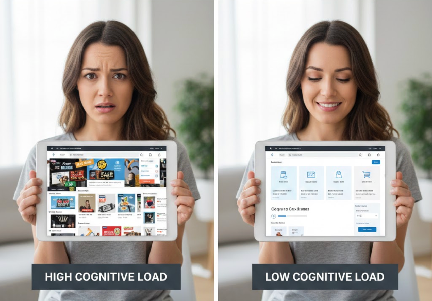
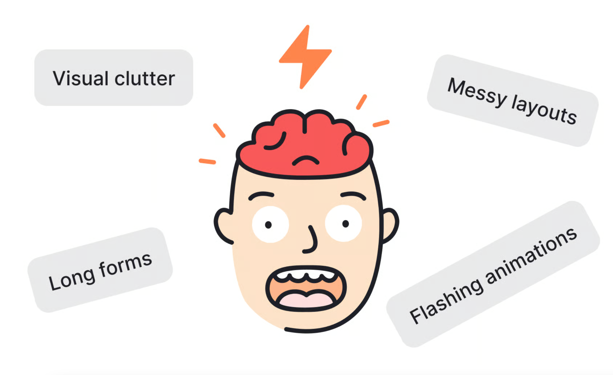
Online shopping should feel easy, fast, and intuitive, yet many eCommerce stores unintentionally overwhelm users with too many choices, unclear layouts, or complex interactions. Cognitive load refers to the mental effort required for users to process information and make decisions. When this load becomes too high, shoppers feel stressed, confused, or fatigued, and often leave without completing a purchase. Reducing cognitive load helps customers focus on buying rather than thinking, leading to better user experience and higher conversion rates.
Below are in-depth strategies to reduce cognitive load in online shopping, with clear explanations and practical actions.
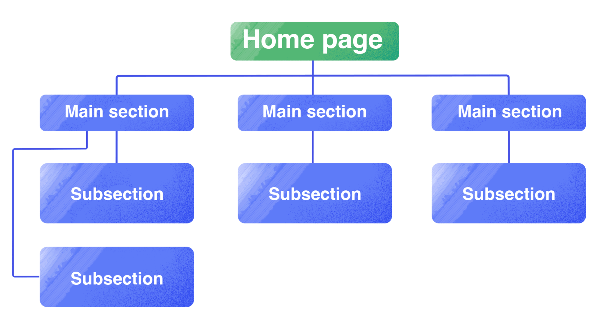
Navigation is the foundation of the shopping experience, and users rely on it to understand how your store is organized. When menus are cluttered or categories are unclear, shoppers must pause and think about where to click next. This extra mental effort quickly adds friction, especially for first-time visitors. A simple, logical structure allows users to browse confidently without second-guessing themselves.
As users move through your store, navigation should guide them naturally rather than force them to analyze options.
While offering variety is important, presenting too many options at once can overwhelm users and lead to decision paralysis. When shoppers are forced to compare many similar products, cognitive load increases and confidence decreases. Instead of feeling empowered, users may delay or abandon their decision. Thoughtful limitation of choices helps users feel guided rather than pressured.
To support easier decisions, it’s important to structure choice in a way that feels helpful and intentional.
Visual hierarchy helps users understand what matters most without consciously thinking about it. When pages lack hierarchy, users must scan and analyze every element, which increases mental fatigue. A strong hierarchy naturally directs attention to key information such as product names, prices, and calls to action. This makes the page easier to scan and quicker to understand.
To guide users smoothly, design should communicate priority at a glance.
Online shoppers rarely read every word; they scan for key information. Long paragraphs and complex language increase cognitive effort and slow down decision-making. Simple, scannable content allows users to grasp value quickly and move forward with confidence. Clear writing reduces both reading effort and uncertainty.
To support fast understanding, content should be structured for scanning first, reading second.
Product pages are where users make critical purchase decisions, so clarity is essential. Overloaded pages with too many images, badges, or messages force users to filter information mentally. This added effort can delay decisions or create doubt. A focused product page keeps attention on what matters most.
To maintain clarity, product pages should prioritize essentials and hide secondary details.
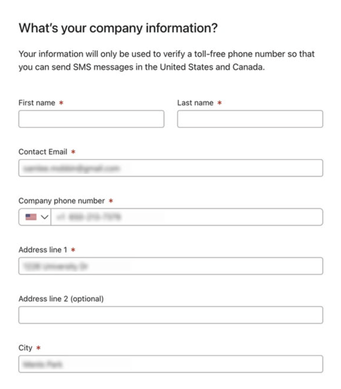
Forms are often the most cognitively demanding part of the shopping experience. Long or confusing forms require users to remember information, interpret labels, and correct errors. This mental strain frequently leads to abandonment. Simple, predictable forms reduce stress and increase completion rates.
To keep users moving forward, forms should feel easy and transparent.
Users rely on past experiences to navigate new websites. When familiar patterns are missing or altered, users must stop and think about how things work. This increases cognitive load and creates unnecessary friction. Familiarity allows users to operate on instinct rather than analysis.
To reduce learning effort, eCommerce interfaces should meet user expectations.
Uncertainty increases cognitive load, especially when users are close to making a decision. Without guidance, shoppers may overthink or postpone action. Subtle cues can reassure users and reduce analysis. The goal is to guide without overwhelming.
To help users decide confidently, guidance should be timely and minimal.
Mobile users face higher cognitive load due to smaller screens and shorter attention spans. Cluttered layouts or tiny tap targets increase effort and frustration. A mobile-first approach prioritizes simplicity and clarity. This ensures users can shop comfortably anywhere.
To reduce mobile cognitive load, design must focus on essentials.
When users don’t trust a store, they question every step of the process. This constant evaluation increases cognitive load and slows decisions. Trust signals reassure users and reduce the need for mental verification. Feeling safe makes buying feel easier.
To reduce doubt, trust should be visible and consistent.
Reducing cognitive load in online shopping is about designing experiences that respect users’ mental limits. By simplifying navigation, limiting choices, improving visual hierarchy, and guiding users thoughtfully, you make shopping feel effortless instead of exhausting. When users don’t have to think hard about how to shop, they can focus on what they want to buy, leading to higher satisfaction, stronger trust, and better conversions.

