Please select the platform to login


In today’s fast-paced digital marketplace, consumers are exposed to countless online stores competing for their attention. Static visuals alone can no longer sustain engagement or leave a lasting impression. This is where animation and motion design come into play. When used strategically, motion elements bring vitality, flow, and emotion to your eCommerce store, helping guide users, communicate brand personality, and encourage conversions. From subtle hover effects to full-scale animated product showcases, animation has become a cornerstone of modern digital design that blends usability with storytelling.
Let’s explore in depth how you can effectively integrate animation and motion into your eCommerce design for maximum visual impact and user satisfaction.
Animation does far more than make your website look “cool.” It’s a functional design element that enhances the way users experience your store. Thoughtful animation can guide attention, explain complex ideas quickly, and make browsing feel more intuitive. Motion helps customers understand cause and effect, when they click, swipe, or scroll, the website responds in a meaningful way. This feedback loop increases trust and makes your interface feel more human and engaging.
Moreover, motion supports brand storytelling. Smooth transitions, creative hover effects, and interactive banners give your site a distinct personality. They convey tone, whether playful, luxurious, or minimalistic, and set your brand apart in an increasingly crowded online space. The key is subtlety and purpose: animations should enhance the user journey, not distract from it.
Navigation is one of the most critical components of user experience, and animation can make it feel seamless and enjoyable. Smooth transitions between pages or sections provide users with a sense of continuity, preventing abrupt jumps that can disrupt the browsing experience. For example, when a customer clicks a menu link and the next section slides smoothly into view, it creates a natural sense of movement that mirrors real-world interactions.
Additionally, animated icons or dropdowns can help users intuitively understand where to go next. Scroll-triggered animations can reveal content progressively, ensuring that users stay focused on one piece of information at a time without feeling overwhelmed. These techniques also make navigation memorable and guide customers through your sales funnel more effectively.
Best practices for navigation animations:
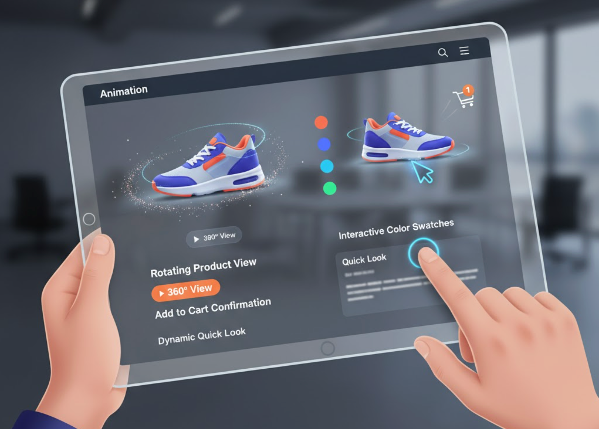
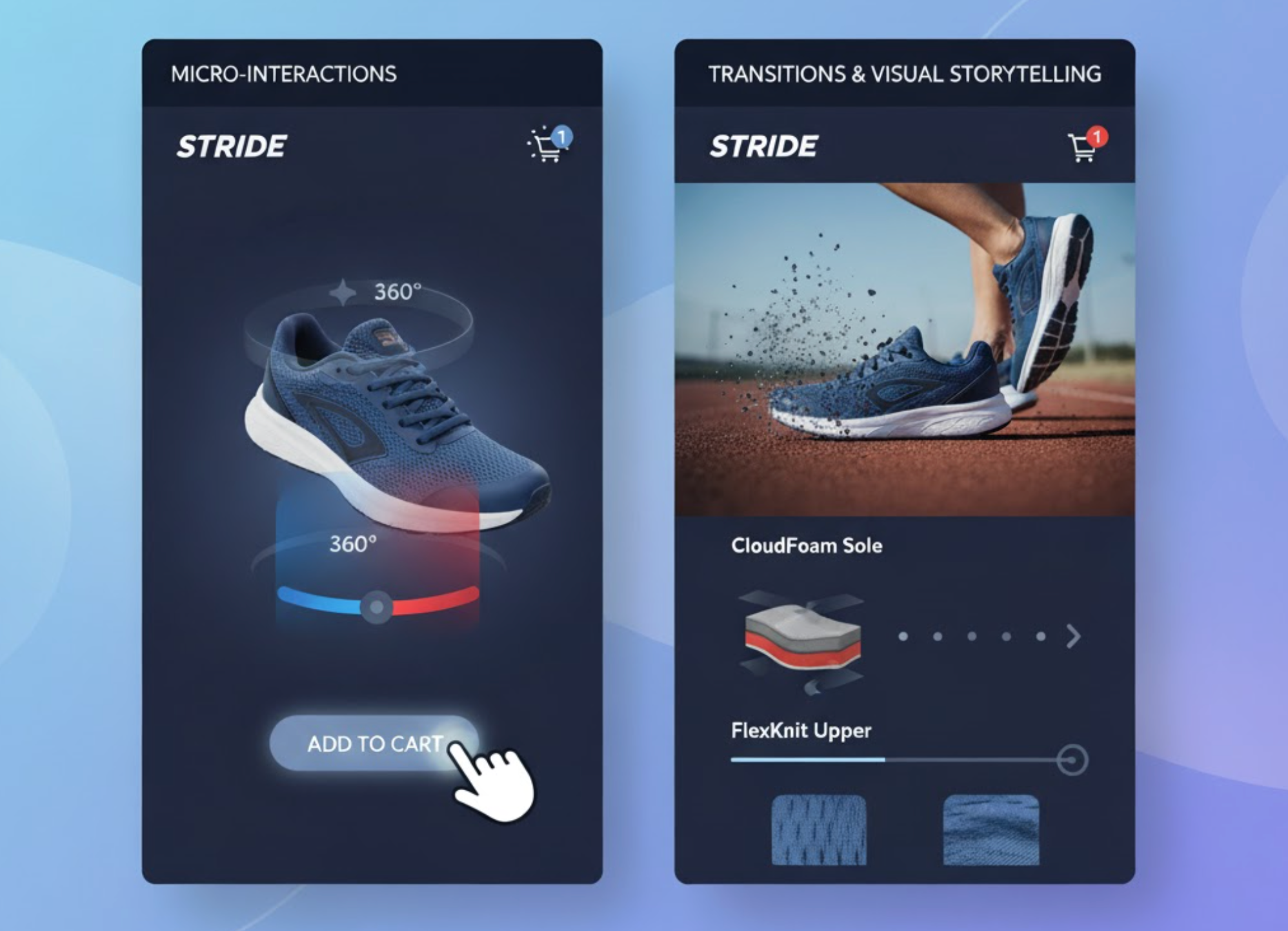
Static product images can only do so much to capture attention. By incorporating animation, you can turn your catalog into an immersive showcase. For instance, a subtle hover animation that zooms in on a product or changes its angle can make it feel tangible and inviting. Adding rotating 3D views or motion-triggered color changes helps shoppers visualize the product as if they were holding it.
Animations can also simulate real-world interactions, like a backpack unzipping or shoes spinning 360°, which not only entertain but inform the buyer about features and textures. This kind of motion increases emotional connection and confidence in the purchase decision. It bridges the gap between physical and digital retail experiences.
Best practices for product animations:
Animation is a powerful directional tool. In a crowded interface filled with products, banners, and text, motion helps you lead the viewer’s eye toward what matters most, discount offers, CTAs, or featured collections. For example, a slight bounce or glowing pulse on a “Buy Now” button naturally attracts the eye without being intrusive.
Similarly, animated banners or sliding promotions can highlight ongoing deals without cluttering the layout. These visual cues improve conversion rates by ensuring that important elements never go unnoticed. However, restraint is crucial, too many moving parts can cause distraction or visual fatigue.
Best practices for attention-guiding motion:
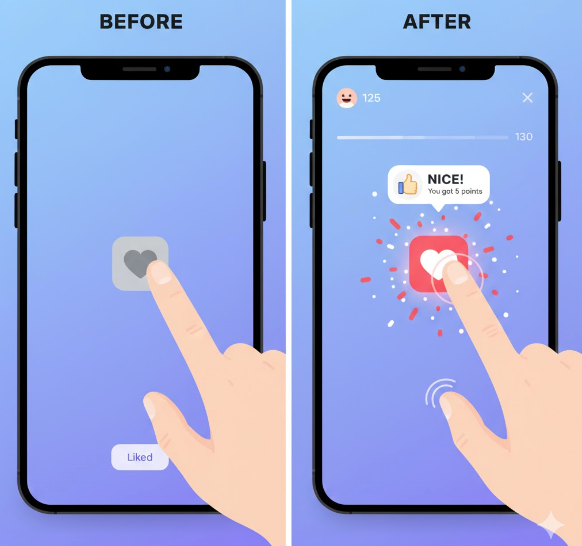
Microinteractions are small but meaningful animations that provide instant feedback for user actions. Think of a heart icon that fills with color when “liked,” a cart icon that jiggles after adding an item, or a progress bar that smoothly fills as users complete checkout steps. These animations communicate system status and make the interface feel alive and responsive.
They also help build trust, users know their action was recognized. Without motion feedback, a site can feel static or unresponsive, leading to confusion or errors. Micro-animations make every click, hover, or scroll feel rewarding, reinforcing the sense of control and satisfaction that keeps shoppers engaged.
Best practices for microinteractions:
Animation is a storytelling medium in itself. From logo reveals to scroll-based hero animations, motion can communicate your brand’s identity, energy, and emotion in ways that static images cannot. Imagine a luxury brand’s homepage where the logo elegantly fades in while a product rotates slowly under soft lighting, this instantly conveys sophistication and exclusivity.
Story-driven animations can also walk users through your product’s benefits or brand journey. Animated infographics, progress bars, or motion sequences on landing pages can illustrate complex information more effectively than text alone. This approach not only captures attention but also helps visitors emotionally connect with your brand narrative.
Best practices for storytelling animation:
The checkout process can often be stressful for customers, especially if it feels slow or unclear. Animation can turn it into a smooth, reassuring journey. Animated progress bars show how many steps remain, creating a sense of accomplishment as customers advance. Subtle loading spinners or success checkmarks provide confirmation that actions have been processed correctly.
Transitions between checkout stages, such as shipping, payment, and confirmation, should feel seamless, maintaining the shopper’s confidence throughout. When users feel guided and informed through motion, they’re less likely to abandon their carts and more likely to complete their purchase.
Best practices for checkout animations:

A beautifully animated website is useless if it loads slowly or lags. Optimization ensures that your motion design enhances rather than harms performance. Large GIFs or heavy scripts can delay page speed, frustrating users and negatively impacting SEO rankings. To prevent this, use efficient animation formats like CSS transitions, SVG animations, or Lottie files, which offer smooth motion at minimal file sizes.
You should also consider accessibility and user preferences. Some visitors may experience motion sickness or prefer static visuals, so offering an option to disable animations demonstrates inclusivity and thoughtfulness. Ultimately, optimized animations create a balance between creativity and practicality, delivering the best of both worlds.
Best practices for optimization:
Animation and motion are no longer luxury elements, but they’re essential components of modern eCommerce design. When implemented purposefully, they elevate user engagement, clarify navigation, and express brand identity in ways that static design simply cannot achieve. From guiding users through the checkout process to making your products feel more tangible, motion bridges the gap between interaction and emotion.
The secret lies in balance: use motion to inform, not to overwhelm. When executed thoughtfully and optimized for performance, animation becomes one of the most powerful tools to transform your eCommerce store into an experience, one that delights, guides, and converts customers with every click, scroll, and movement.

