Please select the platform to login


Errors during form completion are one of the most common reasons users abandon checkout, sign-up, and contact flows. When users are forced to repeatedly correct mistakes, retype information, or guess what went wrong, frustration builds quickly. Autofill and validation, when designed thoughtfully, can dramatically reduce these errors while making the experience feel faster and more intuitive.
In this article, we’ll explore how autofill and validation work together, best practices for implementing them effectively, and how they directly improve accuracy, user confidence, and conversion rates.
Forms are often the final step before a conversion, whether that’s a purchase, account creation, or lead submission. Even small errors, like mistyped email addresses or invalid phone numbers, can interrupt momentum and cause users to quit altogether.
Poorly designed forms also place unnecessary cognitive load on users by asking them to remember formatting rules, required fields, or specific data structures. Reducing errors isn’t just about correctness, it’s about making the process feel effortless and forgiving.
Autofill and validation address these problems by minimizing manual input and guiding users in real time.
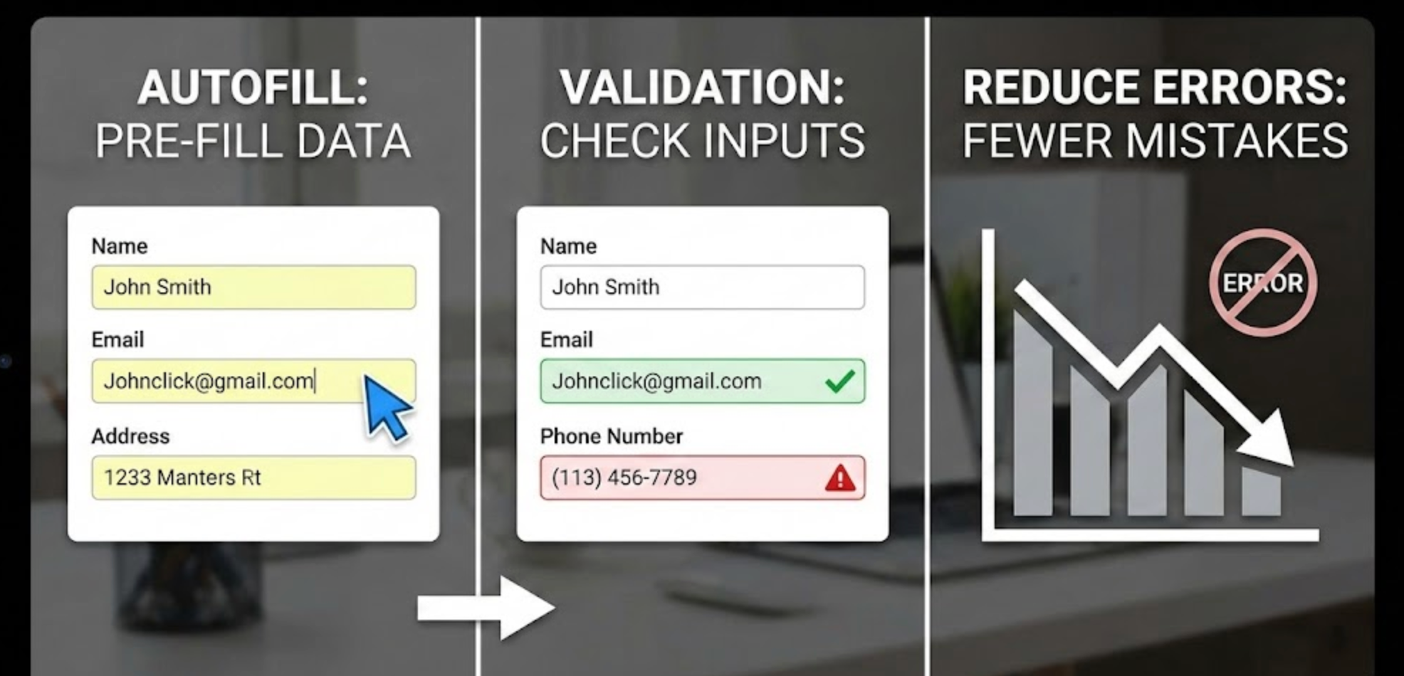
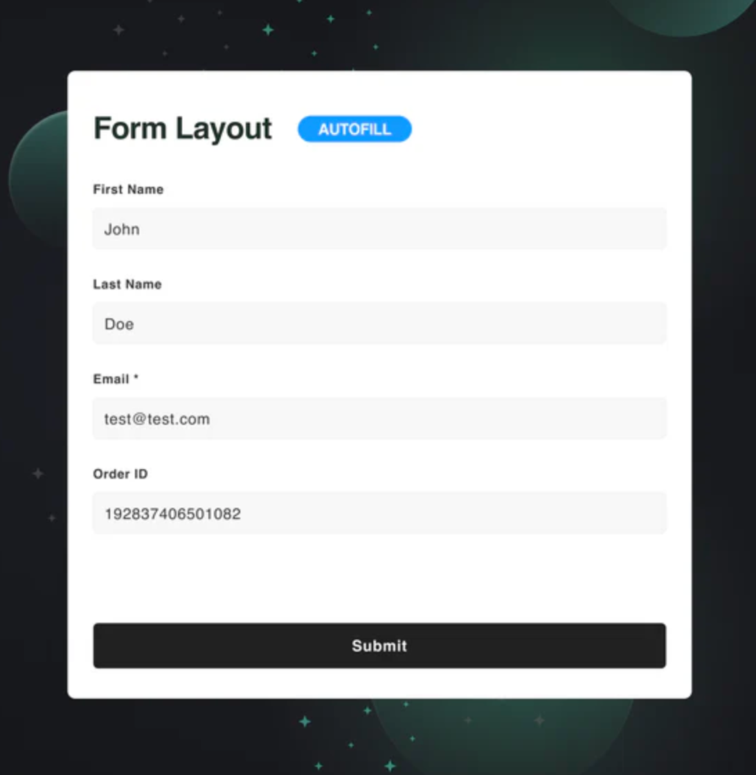
Autofill automatically populates form fields using saved browser data, device information, or previously entered values. By reducing the amount of typing required, autofill significantly lowers the chance of spelling mistakes, formatting errors, and missing fields.
When users don’t have to manually re-enter common information like names, email addresses, or shipping details, they can move through forms more confidently and quickly. This is especially important on mobile devices, where typing is slower and more error-prone.
Well-implemented autofill also creates a sense of familiarity and trust, as users recognize their browser or device assisting them during the process.
Browsers rely on recognizable field names and HTML input types to trigger autofill correctly. Using standard naming conventions like email, tel, address-line1, and postal-code ensures better compatibility across browsers and devices.
Avoid overly custom or ambiguous field labels that may confuse autofill systems. Clear, predictable structure helps both users and technology work together seamlessly.
This consistency helps reduce errors before they even occur.
Autofill should be an option, not a requirement. Users should always be able to edit or override pre-filled values if the information is outdated or incorrect.
Forcing autofill or locking fields can lead to hidden errors that users don’t notice until submission. Allowing flexibility ensures accuracy without removing control.
A smooth experience respects user choice while offering helpful shortcuts.
Grouping related fields, such as shipping address components, helps autofill systems understand context and fill information correctly. Logical grouping also helps users visually scan and confirm their information quickly.
When autofill fills an entire section at once, users are more likely to notice inconsistencies and correct them early. This reduces submission errors and follow-up corrections.
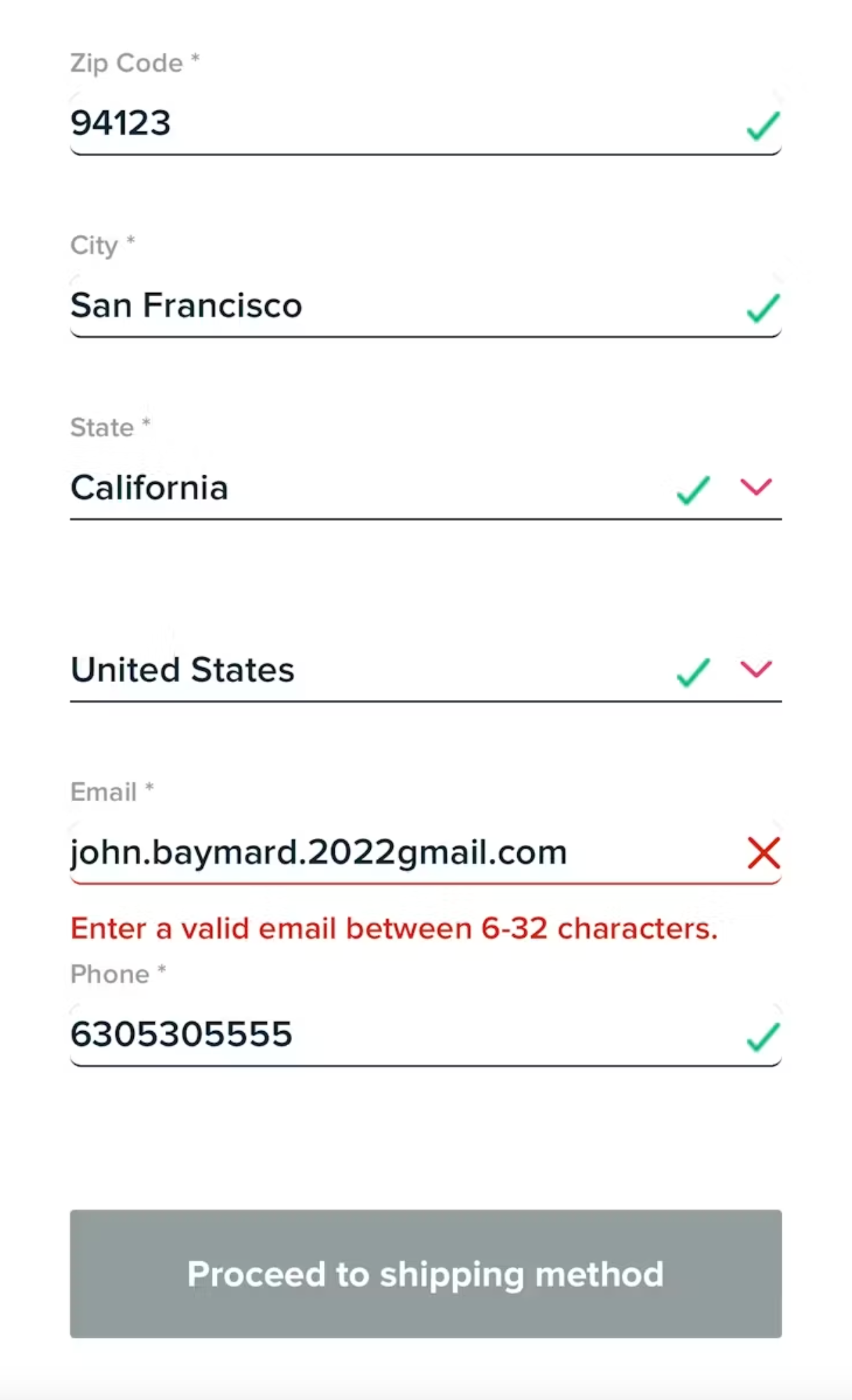
Inline validation provides immediate feedback as users complete each field. For example, showing a confirmation icon for a valid email or a gentle message when formatting is incorrect helps users correct mistakes instantly.
This reduces the mental effort of remembering multiple errors at once after submission. Real-time feedback keeps users moving forward instead of backtracking.
The smoother the correction process, the higher the completion rate.
Error messages should explain what went wrong and how to fix it in simple, human language. Avoid technical terms or vague phrases like “Invalid input.”
For example, instead of “Error 400,” say “Please enter a valid phone number using numbers only.” Clear guidance prevents repeated mistakes and user frustration.
Helpful messages turn errors into learning moments rather than obstacles.
Over-validating can be just as harmful as under-validating. Triggering errors too early, such as while a user is still typing, can feel intrusive and stressful.
A good balance is validating after a field loses focus or once enough input has been provided to make a meaningful judgment. This approach keeps validation supportive instead of disruptive.
Validation ensures that the information users enter meets predefined rules, such as correct formats, required fields, and acceptable character limits. By checking inputs as users interact with a form, validation helps catch mistakes before they turn into submission errors. This reduces frustration caused by rejections or unclear error messages after clicking the submit button. Validation also improves data accuracy, ensuring that the information collected is reliable and usable. When implemented well, it creates a smoother, more confidence-building form experience.
By guiding users step by step instead of correcting them at the end, validation keeps the interaction flowing and reduces abandonment.

Autofill and validation work best when they complement each other. Autofill reduces manual entry, while validation ensures pre-filled data is still correct and usable.
For example, if autofill inserts an old email address or an incomplete phone number, validation can gently prompt users to review and update the field. This combination prevents silent errors from slipping through unnoticed.
Together, they create a faster, safer, and more forgiving form experience.
On mobile devices, autofill and validation are even more critical. Small keyboards, limited screen space, and distractions increase the likelihood of errors.
Using appropriate input types (such as numeric keyboards for phone numbers) supports autofill and reduces typing mistakes. Clear validation messages that don’t cover the input field help users quickly understand what needs fixing.
Optimizing for mobile ensures accuracy without slowing users down.
Reducing errors is an ongoing process. Track metrics like form abandonment rates, validation error frequency, and time to completion to understand where users struggle.
User testing and session recordings can also reveal confusion points that metrics alone might miss. Continuous iteration helps refine autofill behavior and validation rules over time.
The goal is not perfection, but steady improvement in clarity and confidence.
Autofill and validation are powerful tools for reducing form errors, but their effectiveness depends on thoughtful implementation. Autofill minimizes effort, while validation provides timely guidance that prevents mistakes from becoming blockers.
When combined with clear field structures, helpful messaging, and user-friendly timing, these features transform forms from friction points into smooth, confidence-building experiences. By prioritizing accuracy and ease, you not only reduce errors, you increase trust, satisfaction, and improve conversions.

