Please select the platform to login


Online shoppers do not read the way they do in physical environments. They skim quickly, jump between sections, and make judgments within seconds of landing on a page. In this fast-paced context, icons play a critical role in helping copy feel easier to understand and faster to process.
When used correctly, icons act as visual shortcuts that reinforce meaning without adding extra text. They help users grasp key messages, benefits, and assurances at a glance. To use icons effectively, however, eCommerce brands must understand where icons add clarity and where they create confusion.
To begin, it is important to understand why icons matter so much in eCommerce communication.
eCommerce environments are crowded with information competing for attention. Shoppers are often overwhelmed by product options, messaging, and visual stimuli across multiple tabs and devices. Icons help simplify this complexity by translating text-based messages into instantly recognizable visual cues.
Icons also reduce the effort required to understand your content. Instead of forcing users to read full sentences, icons allow them to scan and prioritize information quickly. This is especially important for first-time visitors who are still deciding whether to trust your store.
Because of this, icons are most powerful when they reduce mental effort rather than add visual noise, which leads directly into how they should be used alongside copy.
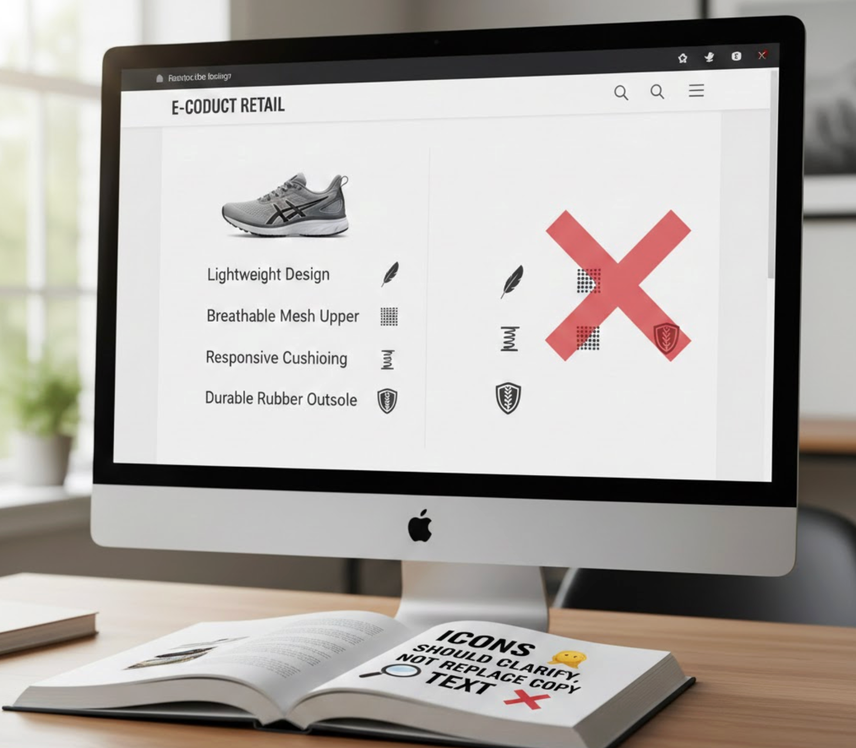
Many online stores mistakenly assume icons can communicate meaning on their own. While icons are powerful, they are not always self-explanatory, especially when used out of context. Without text, icons can create uncertainty instead of clarity.
Copy provides precision, while icons provide speed. When icons are paired with short, clear copy, they reinforce understanding rather than leaving users guessing. This combination ensures that shoppers do not misinterpret important information.
To achieve this balance, icons must always work as visual reinforcement rather than standalone messages.
Product benefit sections are one of the most important areas on any product page. Shoppers want to quickly understand how a product helps them and why it is better than alternatives. Icons make benefits easier to identify and remember.
Without icons, benefit lists often turn into dense blocks of text. Icons break these blocks into visually distinct points, encouraging users to scan rather than skip. This keeps attention focused on value instead of specifications.
To maximize impact, icons should always highlight outcomes rather than abstract claims.

Trust is a major barrier for online shoppers, especially when encountering a brand for the first time. Without physical interaction, users rely on visual and textual cues to assess credibility. Icons can reinforce trust when paired with reassuring copy.
Trust-related icons should always appear near moments of decision. When shoppers hesitate, icons can provide subtle reassurance that lowers perceived risk. This is particularly important near pricing, add-to-cart, and checkout areas.
When used strategically, icons help turn uncertainty into confidence.
Product pages often contain a large amount of information. Without clear structure, shoppers may feel overwhelmed and abandon the page. Icons help create visual organization that guides users through the content.
By signaling different sections, icons help users understand where to focus next. This makes scrolling feel purposeful instead of exhausting. Scannability becomes especially important on long-form product pages.
To achieve this, icons must be used consistently and intentionally.

Microcopy plays a critical role in guiding users through small interactions. These moments often determine whether users proceed or hesitate. Icons can make microcopy more noticeable and intuitive.
Small visual cues help users understand actions, warnings, or additional information. This reduces friction during interactions such as form filling or option selection. When done well, icons make microcopy feel supportive rather than instructional.
The key is subtlety and restraint.
Collection pages are designed for exploration and comparison. Shoppers want to quickly understand what makes each product different. Icons help communicate these differences without requiring extra clicks.
By highlighting key attributes, icons guide users toward products that match their needs. This makes browsing feel efficient instead of overwhelming. However, restraint is critical to avoid clutter.
Icons should support decision-making, not distract from products.
Mobile shopping behavior is fast and interruption-prone. Screen space is limited, and attention spans are shorter. Icons help communicate meaning quickly without consuming valuable space.
Icons allow designers to simplify navigation and content structure. When paired with minimal text, they keep mobile layouts clean and functional. This improves usability and reduces bounce rates.
Mobile icons must be designed with touch and visibility in mind.
Icons can greatly improve clarity, but when implemented incorrectly, they often do the opposite. Many eCommerce stores add icons without a clear strategy, which leads to confusion rather than better understanding.
To ensure icons truly support your copy, it is essential to recognize and avoid the most common mistakes.
Successful icon usage always starts with intentional communication. Icons should enhance clarity, not attempt to compensate for weak or unclear copy.
By following proven best practices, icons can become reliable visual aids that strengthen both usability and conversion.
Applying these principles ensures icons consistently reinforce your message across the store.
Icons are not decorative elements; they are communication tools. When paired with strong copy, they help shoppers scan faster, understand benefits clearly, and feel more confident in their decisions. This combination reduces friction and improves the overall shopping experience.
Successful eCommerce brands use icons intentionally to reinforce meaning, not replace it. By focusing on clarity, consistency, and relevance, icons become silent sales assistants across the store.
In a competitive eCommerce landscape, stores that communicate clearly win. Thoughtful icon usage is one of the simplest ways to achieve that clarity.

