Please select the platform to login


Transparent pricing is one of the strongest trust signals an eCommerce store can offer. When customers clearly understand how the final price is formed, including taxes and additional fees, they feel more confident moving forward with a purchase. Transparency reduces anxiety, removes doubt, and reinforces the idea that your brand is honest and customer-focused.
In contrast, unexpected charges that appear late in the checkout process often feel deceptive, even when they’re legitimate. These surprises can quickly undo all the effort you’ve put into marketing, product presentation, and UX. This article explores why tax and fee transparency matters, common visibility issues, and practical strategies to present costs clearly without overwhelming shoppers.
Taxes and fees are a normal part of online transactions, but confusion around them is not. When shoppers encounter extra charges without prior context, it disrupts their mental price expectation. Even a small increase can trigger hesitation if it feels sudden or unexplained.
Transparent cost display directly impacts conversion rates, customer satisfaction, and long-term brand trust. Shoppers who feel informed are less likely to abandon carts, contact support, or request refunds later. More importantly, they’re more likely to return because they know what to expect from your store.
To deliver this experience effectively, transparency must be woven throughout the entire buying journey, not treated as an afterthought at the final step.
Many eCommerce stores struggle to strike the right balance between keeping pricing information clear and maintaining a clean, distraction-free interface. In an effort to simplify early-stage browsing, some merchants delay showing additional costs, while others overload customers with numbers before they fully understand the product’s value. When pricing information is either hidden or poorly framed, it creates uncertainty rather than clarity.
These issues often don’t come from bad intentions, but from unclear decisions about when, how, and where taxes and fees should appear. If customers can’t form a consistent mental model of how the final price is calculated, even small charges can feel unexpected or unfair. Over time, this confusion chips away at trust and increases the likelihood of cart abandonment.
In practice, tax and fee visibility problems usually show up in a few recurring patterns that disrupt the checkout experience:
Recognizing these recurring issues early allows you to address them intentionally. By resolving timing gaps, improving language clarity, and ensuring consistent presentation, you can create a pricing experience that feels stable, predictable, and trustworthy rather than confusing or frustrating.
One of the most effective ways to reduce price shock is to set expectations before checkout. While exact tax amounts often depend on the customer’s location, offering early indicators helps shoppers mentally prepare for the final total.
Rather than leaving customers guessing, you can introduce tax context earlier in subtle but helpful ways, such as:
By gradually introducing this information, the final price feels like a confirmation, not a surprise.
How you name fees is just as important as where you display them. Labels that feel technical, vague, or unfamiliar can confuse shoppers and make legitimate charges seem suspicious. Clear wording reduces mental effort and builds confidence.
Instead of relying on generic or internal terminology, focus on labels that are easy to understand at a glance, such as:
When customers don’t have to interpret what a fee means, they’re far more likely to accept it.
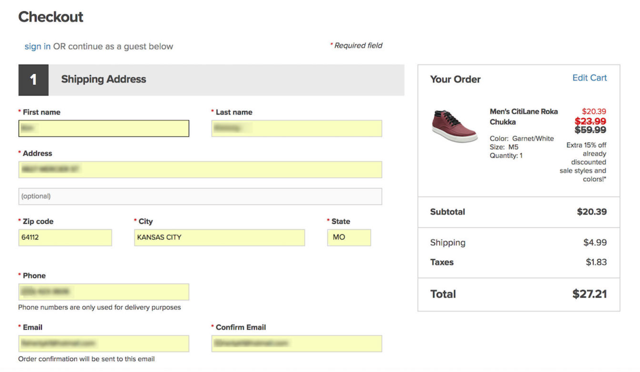
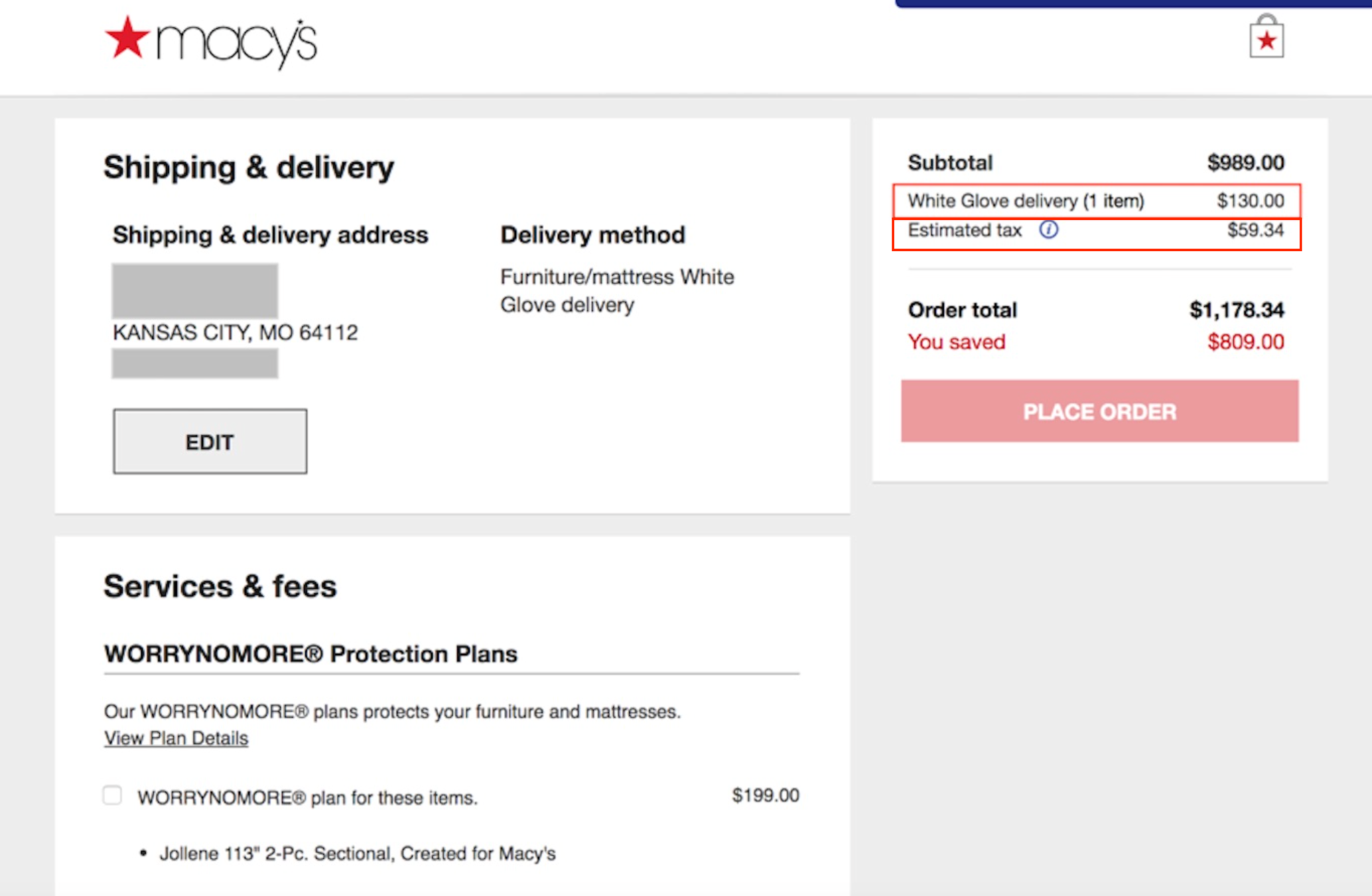
Checkout is the moment when transparency carries the most weight. Customers expect clarity here, and presenting a single combined total without explanation can raise suspicion. Itemizing costs helps users see that every charge has a clear reason.
To make the breakdown feel intuitive rather than overwhelming, structure the summary in a logical, easy-to-scan format that includes:
This structure reassures customers that nothing is hidden and that the final amount is fair and intentional.
Customers are generally more accepting of additional charges when they understand their purpose. A brief explanation can completely change how a fee is perceived—from frustrating to reasonable.
You can provide helpful context by offering short, accessible explanations that clarify intent, including:
Even a single sentence of context can significantly reduce resistance and build trust.
Consistency plays a critical role in perceived transparency. When prices change unexpectedly between the product page, cart, and checkout, customers may assume an error, or worse, manipulation.
To maintain a sense of stability and reliability, it’s important to ensure that:
When pricing behaves predictably, customers feel more in control of their purchase.
In some scenarios, the clearest option is to show a single, all-inclusive price upfront. This approach works especially well for products or regions where taxes and fees are predictable.
All-in pricing can be particularly effective when:
If you choose this approach, always make it explicit that taxes and fees are included to avoid confusion or mistrust.
Transparency is not just about what information you show, but it’s also about how you present it. A strong visual hierarchy helps customers quickly understand the most important numbers without feeling overwhelmed.
You can guide attention more effectively by:
Good visual design turns complex pricing into something easy to process.
Even well-designed pricing displays can be improved over time. Monitoring real user behavior allows you to refine how and when cost information is presented.
To continuously improve transparency, consider:
Ongoing optimization ensures your pricing communication stays aligned with customer expectations.
Displaying taxes and fees transparently is not just about avoiding complaints and building lasting trust. When customers understand what they’re paying and why, they feel respected and confident in their decision.
By setting expectations early, breaking down costs clearly, using plain language, and maintaining consistency, you reduce friction and strengthen credibility. In the long run, transparent pricing doesn’t hurt conversions, but it creates stronger relationships and more sustainable growth.

