Please select the platform to login


Buttons are one of the most influential elements in any digital interface. They are the final touchpoint where user intent turns into measurable action, whether that action is adding a product to the cart, subscribing to a service, or completing a purchase. Because buttons carry so much responsibility, even small design decisions, such as choosing between an icon or text, can significantly affect usability and conversion rates.
Icon buttons are often associated with modern, minimalist design and fast interactions, while text buttons are known for clarity and persuasion. Instead of framing this as a design trend debate, it is more valuable to evaluate how each option performs across usability, accessibility, and conversion-focused criteria. Below, we compare icon and text buttons across key aspects, provide a clear verdict for each, and then explore whether combining both approaches can deliver better results.

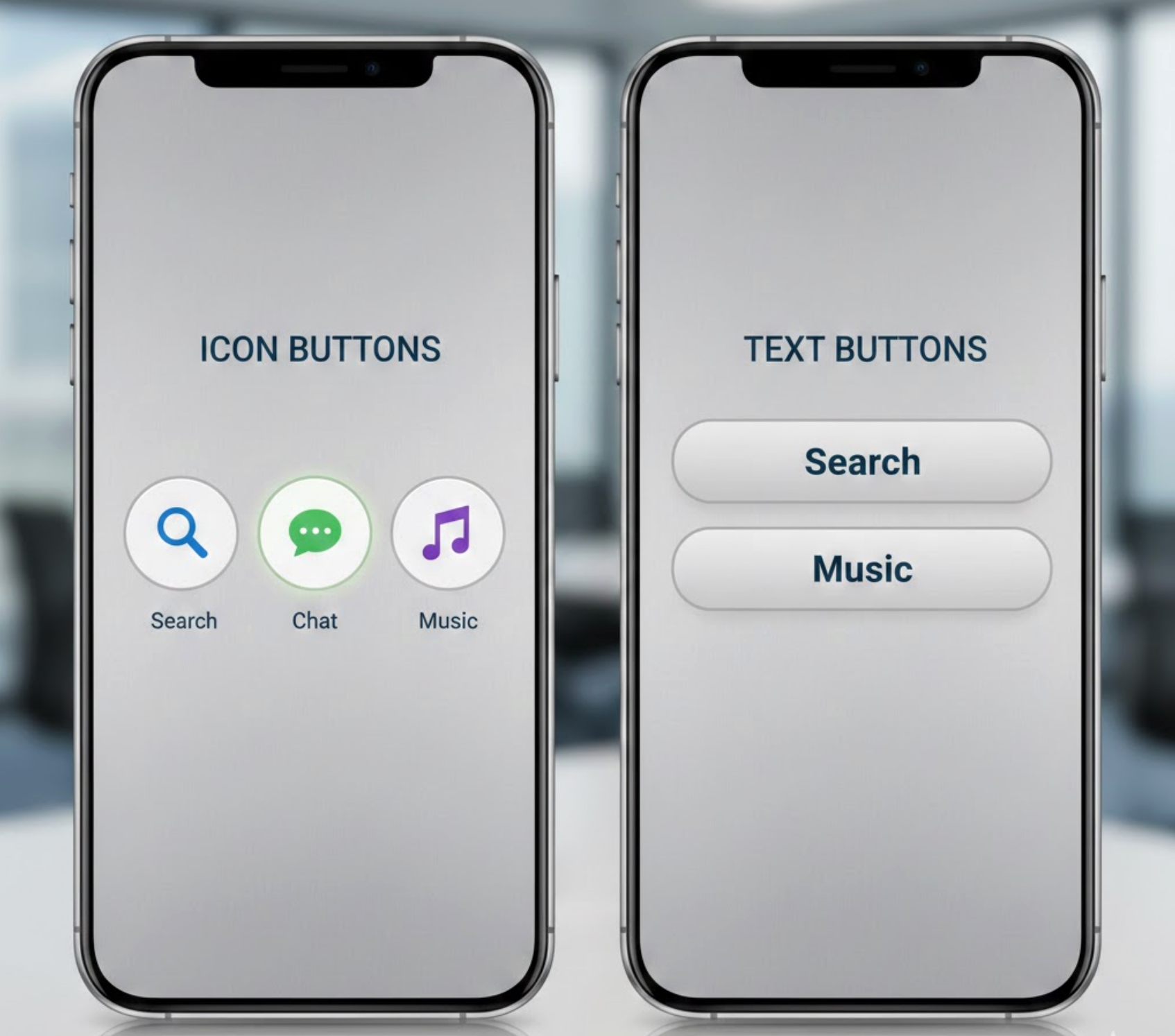
Icon buttons are buttons that communicate an action primarily through a visual symbol rather than words. Common examples include a magnifying glass for search, a shopping cart for viewing items, or a heart for saving products. These buttons rely on visual recognition and are designed to be understood quickly, often without reading. Because they take up less space and reduce visual clutter, icon buttons are widely used in headers, navigation bars, toolbars, and mobile interfaces where efficiency and minimalism matter.
Text buttons, on the other hand, use written labels to describe the action a user will take. Examples include “Add to Cart,” “Buy Now,” “Learn More,” or “Start Free Trial.” Instead of relying on interpretation, text buttons explain intent directly, which helps users understand both the action and its outcome. This makes them especially effective for important or high-commitment actions, such as purchasing, signing up, or submitting information.
In short, icon buttons emphasize speed and visual simplicity, while text buttons emphasize clarity and communication. Neither approach is inherently better on its own, their effectiveness depends on how well they align with user intent, context, and the importance of the action being performed.
Clarity determines whether users feel confident enough to take action without hesitation. Text buttons communicate intent explicitly, explaining the action in plain language and leaving little room for interpretation. When users see a button labeled “Add to Cart” or “Proceed to Checkout,” they immediately understand what will happen next and why they should click.
Icon buttons, by contrast, rely on recognition rather than explanation. While some icons are widely understood, others depend heavily on context or prior experience. If users need to pause and think about what an icon means, clarity is compromised. This becomes especially problematic for new visitors or less tech-savvy users who may not share the same visual vocabulary.
Verdict: Text buttons clearly outperform icon buttons when it comes to clarity and immediate understanding.
Speed is where icon buttons often shine. Because they can be recognized instantly, icon buttons allow experienced users to interact with an interface quickly and effortlessly. This makes them particularly effective for frequent or repetitive actions, such as opening search, viewing notifications, or accessing the shopping cart.
Text buttons require users to read, which introduces a small but measurable delay. However, this slight slowdown can actually be beneficial for important actions, as it encourages users to confirm their intent before clicking. In this way, text buttons trade a bit of speed for greater certainty and reduced error.
Verdict: Icon buttons perform better for speed and efficiency, especially in familiar and repeated interactions.
Primary calls to action play a direct role in driving revenue and growth. In these moments, users are often making decisions that involve money, commitment, or personal data. Text buttons perform better here because they clearly communicate what will happen after the click, reducing anxiety and hesitation.
Icon-only buttons lack the explanatory power needed for high-stakes actions. When users are unsure about the outcome, they are more likely to delay or abandon the action altogether. Clear, descriptive text helps align expectations and builds the confidence required to convert.
Verdict: Text buttons are more effective for primary, conversion-focused CTAs.
Accessibility affects not only users with disabilities but also overall usability and trust. Text buttons are naturally accessible because screen readers can interpret them without additional configuration, and users with cognitive or visual impairments benefit from explicit language.
Icon buttons require extra effort to make them accessible, such as adding ARIA labels and tooltips. Even when technically accessible, icons can still be confusing for users who struggle with abstract visual symbols. This makes icon-only buttons a riskier choice from an inclusivity standpoint.
Verdict: Text buttons are significantly more accessible and user-friendly across diverse audiences.
From a visual perspective, icon buttons contribute to a clean, modern, and minimalist interface. They reduce text density and help maintain balance, especially on smaller screens where space is limited. This makes them attractive for design-driven brands and mobile-first experiences.
Text buttons, while functional, can feel visually heavy if overused or poorly styled. Long labels or multiple text-based CTAs can compete for attention and disrupt visual hierarchy. That said, thoughtful typography and spacing can mitigate these issues and keep text buttons visually appealing.
Verdict: Icon buttons lead in visual simplicity, while text buttons prioritize communication over aesthetics.
Learnability is critical for onboarding new users and reducing friction during the first interaction. Text buttons help users understand how an interface works by clearly explaining available actions. This guidance makes it easier for new visitors to navigate and complete tasks confidently.
Icon buttons assume familiarity. While returning users may appreciate the efficiency, first-time users may overlook icons or misunderstand their purpose. This can slow down learning and increase frustration, particularly in complex interfaces.
Verdict: Text buttons are better suited for first-time users and learning-focused experiences.
From a conversion optimization perspective, text buttons offer far more flexibility. Copy can be adjusted to test different value propositions, tones, or urgency signals without changing the overall design. This makes text buttons ideal for ongoing A/B testing and incremental performance improvements.
Icon buttons are harder to test effectively. Visual changes can confuse returning users, and subtle icon variations may not produce meaningful insights. As a result, optimizing icon-only buttons is often more challenging and less predictable.
Verdict: Text buttons provide greater control and effectiveness in optimization and testing.
Yes. Icon and text buttons can be combined, and when used intentionally, this approach often delivers the best overall performance. Each button type serves a different purpose, and understanding when to use them individually versus together is key to creating clear and effective interfaces.
Use icon-only buttons when actions are familiar, low-risk, and repeated frequently. These include behaviors like opening search, accessing a cart from the header, or navigating between views. In these cases, icons prioritize speed and visual simplicity, allowing experienced users to act quickly without reading.
Use text-only buttons when clarity and confidence are critical. Primary actions such as purchasing, subscribing, or submitting information benefit from explicit wording that explains exactly what will happen next. Text-only buttons are especially effective for first-time visitors, conversion-focused pages, and accessibility-sensitive experiences.
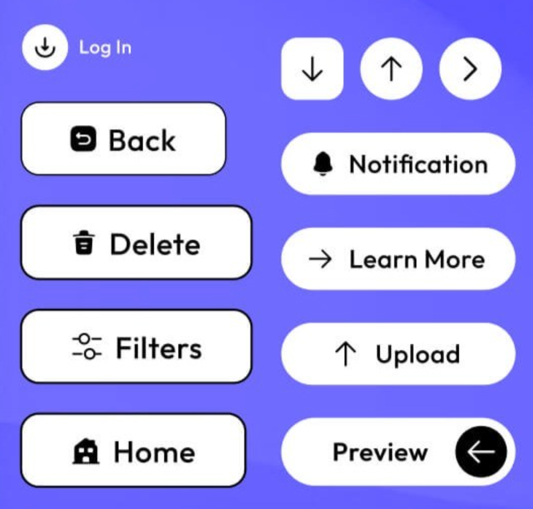
Combine icon and text buttons when you need both speed and certainty. This is ideal for primary CTAs where users should act quickly but still require reassurance. For example, pairing a cart icon with “Add to Cart” reinforces meaning visually while eliminating ambiguity through text. The icon attracts attention and aids scanning, while the text builds trust and understanding.
The key is restraint. Icons should enhance the message, not compete with it. When icons support the text, rather than replace it, the button remains clear, accessible, and conversion-friendly.
Icon buttons and text buttons each excel in different contexts. Icon buttons are best for speed, repetition, and visual minimalism, while text buttons dominate when clarity, accessibility, learning, and conversions are the priority.
For most conversion-driven pages, text buttons should form the foundation of your CTA strategy. Icons can then be layered in strategically to enhance recognition and usability. When applied intentionally, icon and text buttons do not compete, they complement each other to create clearer, more confident, and more effective user experiences.

