Please select the platform to login


Product grids are not just containers for products. They are decision environments. Before users read descriptions, compare specs, or evaluate reviews, they interact with the grid, scrolling, scanning, filtering, and forming early judgments about relevance and value.
Because of this, the structure of a product grid directly shapes user behavior. Among modern eCommerce stores, two dominant grid strategies have emerged: Image-First and Info-First. Each represents a different philosophy about how shoppers think, feel, and decide.
Understanding how these approaches differ, and how they perform under real-world conditions, is critical for building high-conversion category and collection pages.
At their core, Image-First and Info-First grids differ in what they prioritize during the earliest stage of interaction.
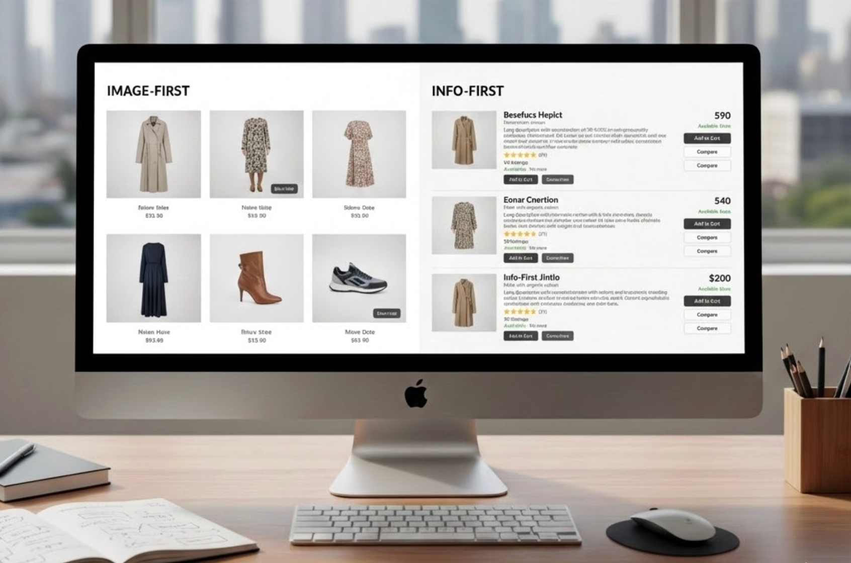
An Image-First product grid is designed around visual dominance. Product images are large, immersive, and often lifestyle-oriented. Textual information exists, but it plays a secondary role. The assumption is that users should feel attracted to a product before they are asked to evaluate it.
An Info-First product grid, in contrast, is structured around immediate clarity. Product names, prices, discounts, ratings, and sometimes short feature summaries are clearly visible from the start. Images still matter, but they support understanding rather than leading the experience.
This difference is not merely aesthetic, it reflects two different interpretations of shopper intent:
This foundational distinction explains why each approach performs differently across engagement, confidence, and conversion metrics.
The first few seconds on a product listing page are decisive. Users rapidly judge whether a page feels appealing, trustworthy, and worth their time, often before consciously reading anything.
Image-First grids dominate this moment because visuals are processed almost instantly. Large images create emotional resonance and communicate product style, quality, and aspiration without effort. Especially in visually expressive categories, users can “feel” the product before understanding it, which lowers resistance to continued exploration.
Info-First grids create a more utilitarian first impression. By surfacing prices and product variety immediately, they reduce uncertainty and set expectations. However, the visual impact is often diluted because attention is split between images and text, which can make the page feel more transactional.
Verdict: For immediate attention and emotional engagement, Image-First grids perform better, particularly in discovery-oriented browsing.
After the initial impression, users shift into scanning mode. At this stage, the ease with which information can be absorbed becomes more important than visual drama.
Image-First grids initially reduce cognitive load because there is very little to process. Users can scroll quickly and rely on visual patterns to identify products of interest. However, this efficiency often collapses when products look similar or when users need to compare prices or variations. Repeated clicks to uncover basic details increase effort and frustration.
Info-First grids ask more from users upfront by displaying multiple data points. When poorly designed, this can feel overwhelming. When designed well, however, they significantly reduce total effort by allowing users to evaluate multiple options directly within the grid.
Verdict: For brief, exploratory browsing, Image-First grids feel easier. For longer, goal-driven sessions, Info-First grids ultimately reduce cognitive strain.
As users narrow their choices, comparison becomes unavoidable. At this stage, missing information becomes a major source of friction.
Image-First grids delay comparison by hiding key attributes such as price, ratings, or variations. Users are forced to rely on memory or open multiple product pages, which interrupts flow and increases uncertainty. This is especially problematic for high-consideration purchases.
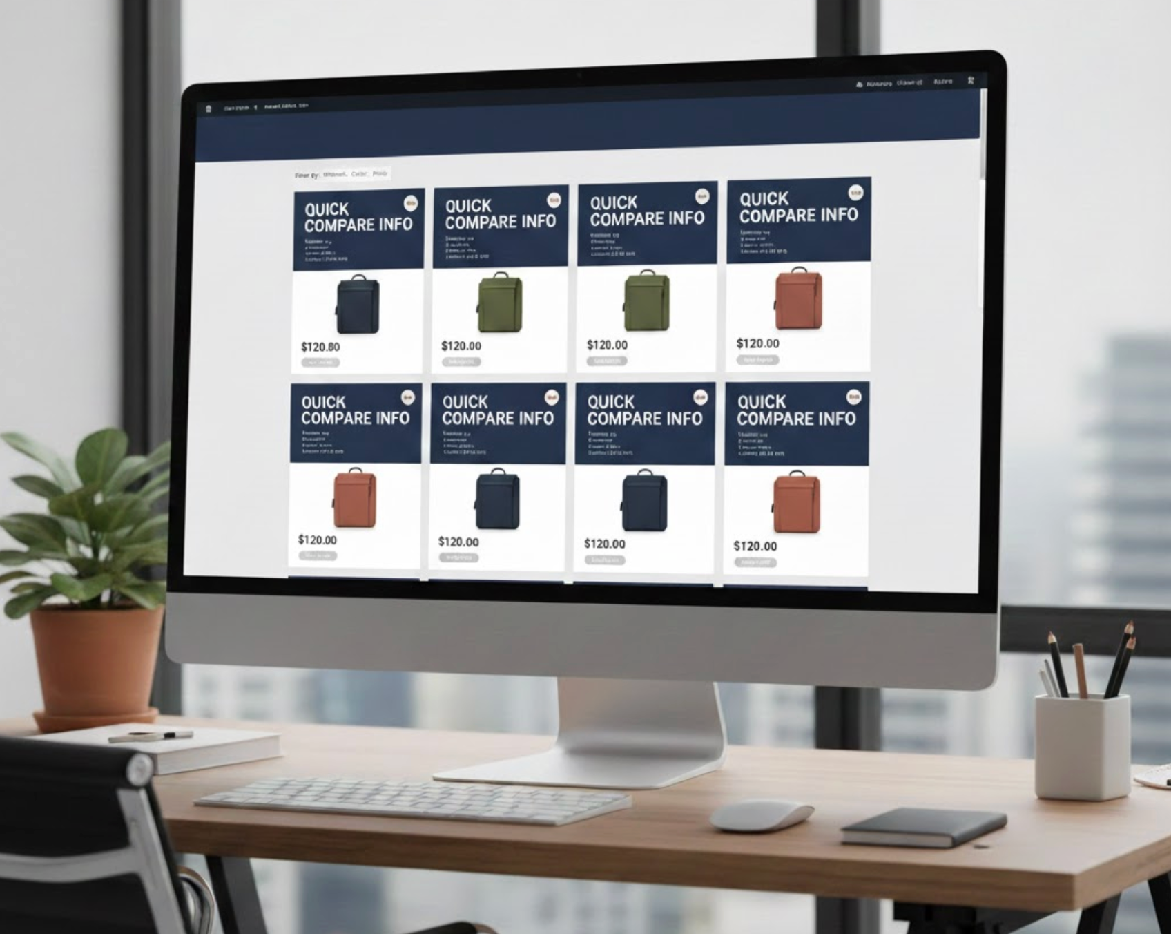
Info-First grids support confidence by making differences visible. Users can immediately compare price ranges, social proof, and product positioning without leaving the grid. This reduces doubt and reinforces the feeling that the store is transparent and trustworthy.
Verdict: For comparison-driven decision-making, Info-First grids clearly convert better.
Most eCommerce purchases involve a tension between desire and logic. Users may want a product emotionally, but still need rational justification to proceed.
Image-First grids strongly activate desire. They allow users to imagine ownership and lifestyle fit, which is critical for categories driven by self-expression. However, without visible justification, this desire may remain abstract and fail to convert.
Info-First grids speak to logic. They explain value, pricing, and credibility early, helping users justify their interest. The downside is that logic alone rarely inspires excitement or differentiation.
Verdict: Image-First grids excel at creating desire, while Info-First grids excel at legitimizing it. Neither alone supports the full decision process.
Grid performance is often misjudged by click-through rate alone. What matters more is why users click.
Image-First grids typically generate higher click-through rates because visuals spark curiosity. Users click to learn more, not necessarily to buy. This can inflate engagement metrics while weakening downstream conversion.
Info-First grids tend to attract fewer clicks, but those clicks are more intentional. Users already understand price and relevance, which increases the likelihood of meaningful actions after the click.
Verdict: Image-First grids drive exploration, while Info-First grids drive more qualified intent.
Mobile shopping amplifies every design decision. Space is limited, attention is fragmented, and users scroll quickly.
Image-First grids can feel immersive on mobile, but large visuals often push essential information out of immediate view. This forces extra interactions and increases friction. Info-First grids improve clarity, but dense text can feel cramped if not carefully prioritized.
Verdict: On mobile, Info-First or well-balanced grids perform better, as long as hierarchy remains clean and scannable.
Product grids do more than organize products; they subtly communicate what a brand stands for. The balance between imagery and information shapes how users interpret quality, credibility, and intent before they ever click a product.
Image-First grids often signal aspiration and confidence. By prioritizing visuals, they suggest that products can speak for themselves through design, lifestyle fit, or emotional appeal. This approach helps brands feel curated and premium, and it can support higher perceived value when differentiation matters more than price transparency.
Info-First grids communicate a more practical value proposition. By surfacing prices, ratings, and key details early, they emphasize transparency and efficiency. This can increase trust, especially for brands competing in crowded or price-sensitive categories, even if the experience feels less expressive.
Perceived value is strongest when grid design aligns with user expectations. When the layout reinforces the brand’s promise, confidence increases and hesitation drops.
Verdict: There is no universal winner. Brand positioning should determine grid strategy, not aesthetics alone.
Yes, and in modern eCommerce, they almost always should be.
Pure Image-First grids risk leaving users under-informed, especially as intent increases. Pure Info-First grids risk overwhelming users or suppressing emotional engagement early in the journey. A combined approach resolves this tension by aligning with how people actually make decisions.
In reality, shoppers rarely remain in a single mode. They often begin in an exploratory, emotional state and gradually shift into a rational, evaluative one. A hybrid grid supports this transition without forcing users to change pages or mental context.
High-performing hybrid grids typically follow a layered structure:
Rather than treating image and information as competing priorities, hybrid grids treat them as sequential partners, visuals initiate interest, information sustains momentum, and clarity enables action.
This approach not only improves conversion rates but also reduces frustration, unnecessary clicks, and abandonment caused by missing or delayed information.
There is no single winner between Image-First and Info-First product grids.
The strongest eCommerce experiences are not built on extremes, but on intentional balance. By combining visual appeal with decision clarity, product grids can support the full spectrum of user behavior, from curiosity to confidence to conversion.
Ultimately, the question is not which grid converts better, but whether your grid evolves with your user’s intent.

