Please select the platform to login


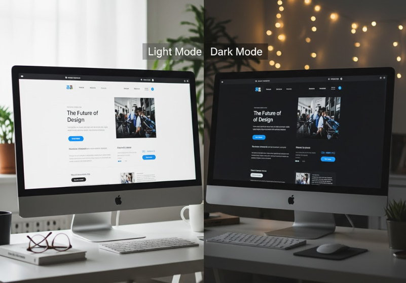
The choice between light and dark themes is more than just a matter of taste — it’s a design decision that directly influences user experience, brand perception, and even conversion rates.
In the digital age, where users spend hours staring at screens, color contrast and visual comfort have become central to UX design. While light themes have long been the default, dark themes are now gaining massive popularity for their sleek look and potential to reduce eye strain. But which one actually performs better? The answer lies in understanding how context, audience, and usability interact to shape the right choice for your website or app.
Color psychology plays a powerful role in how users emotionally respond to your design. Light themes, dominated by white or neutral backgrounds, evoke clarity, openness, and professionalism. They reflect traditional reading experiences — like black ink on white paper — and naturally feel familiar and trustworthy. On the other hand, dark themes create an atmosphere of modernity, luxury, and focus. They immerse users in a visually rich environment, often enhancing the prominence of content or images.
Research also shows that brightness and contrast affect user attention and emotional state. Light backgrounds make content easier to scan during the day, while dark backgrounds help reduce glare in low-light conditions. This is why apps like YouTube, Instagram, and Slack have introduced dark modes — allowing users to switch based on context or preference.
However, designers must remember: color and brightness aren’t universal experiences. Cultural associations, device screens, and personal preferences all influence how users respond. For instance, while black may symbolize elegance in Western cultures, it might convey mourning or negativity in others.
Light themes have dominated web and app design for decades for a reason. They mirror printed text, feel open and professional, and maintain strong readability under bright conditions — which is ideal for most users during the daytime.
Light themes tend to align with clean, minimalist branding and work well for eCommerce, blogs, SaaS dashboards, and corporate websites. They help products stand out by allowing visuals to pop naturally against a neutral backdrop. Moreover, since text readability is crucial, dark text on light backgrounds generally offers higher legibility and better contrast ratios, reducing cognitive strain for long reading sessions.
Light themes excel when clarity, accessibility, and professionalism are priorities — but as users’ screen habits evolve, dark themes are increasingly becoming an essential alternative.
Dark themes, once confined to coding environments or entertainment apps, have exploded into mainstream design. Their aesthetic appeal is undeniable: they look modern, bold, and visually striking. But beyond style, dark mode offers real functional benefits — especially for nighttime browsing and extended screen use.
Dark backgrounds with lighter text reduce glare and can help users focus more on content. In visual-heavy interfaces like photography, gaming, or streaming platforms, dark themes enhance image contrast and make media appear more vibrant. They also extend battery life on OLED and AMOLED displays, where darker pixels require less energy.
A dark theme works best when used thoughtfully — with careful color calibration, consistent contrast ratios, and adaptive design for accessibility.
The ongoing debate between light and dark mode often overlooks one critical factor: context. Users’ preferences shift throughout the day and depend on their environment, device type, and task.
For instance:
Data from major platforms like Android, iOS, and Chrome suggests that user-controlled theme switching increases satisfaction and engagement. People want flexibility — not a forced visual experience. This is why modern UI trends favor auto-theming, where the system adapts to ambient light or time of day.
Beyond comfort and aesthetics, the choice between light and dark themes can subtly influence brand perception and even conversion rates. Your color scheme sends a message about who you are and what your users can expect.
Light themes communicate:
Dark themes communicate:
From a conversion perspective, contrast and hierarchy are what truly matter. Regardless of theme, the key is guiding the user’s attention effectively — highlighting CTAs, pricing, or form fields. In A/B testing, both themes can perform equally well when contrast and usability are optimized.
In short, it’s less about which is “better” universally, and more about which better fits your brand’s tone, audience, and usage scenarios.
Given that user preferences vary, the smartest approach is often to offer both themes. A theme toggle or adaptive mode helps accommodate diverse needs while showcasing your brand’s flexibility.
Modern design systems like Material Design and Tailwind UI make it easier to create dual themes with consistent performance. Shopify, Slack, and Discord have set great examples by allowing seamless switching without compromising on UI coherence.
The future of digital design is adaptive theming — interfaces that automatically adjust to context, user behavior, or even biometric cues. Instead of asking “light or dark,” we’ll be asking “how does the user feel?”
Emerging technologies allow themes to change dynamically based on:
This kind of personalization ensures optimal comfort while aligning with brand aesthetics. As design evolves, flexibility and empathy will matter more than fixed styles.
So, which works better — light or dark themes? The answer isn’t black and white. Both have clear strengths and situational advantages, and the most effective choice depends on your users’ needs, environment, and brand personality. Light themes offer clarity and accessibility, while dark themes deliver sophistication and comfort.
The real victory lies in balance — designing adaptable systems that empower users to choose their experience. Whether bright and open or deep and immersive, the best theme is the one that feels right for your audience and enhances their journey from the first click to the final conversion.

