Please select the platform to login


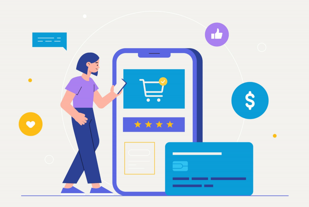
In the fast-paced world of eCommerce, customers expect everything to happen instantly — browsing, adding to cart, and especially checking out. Yet, the checkout process is often where even the most engaged shoppers drop off. The culprit? Poor mobile checkout experiences. As mobile traffic continues to dominate online shopping, optimizing the checkout flow is no longer a luxury — it’s the moment that determines whether you make or lose a sale.
A smooth, intuitive, and fast mobile checkout doesn’t just improve conversion rates — it builds trust, reduces friction, and creates returning customers. Understanding how to perfect this critical step can transform your store’s performance.
Mobile commerce, or mCommerce, has reshaped the retail landscape. Shoppers now browse, compare, and purchase products directly from their phones — often in a matter of seconds. According to global eCommerce studies, more than 70% of all online traffic now comes from mobile devices, and yet, mobile conversion rates remain significantly lower than desktop.
This gap isn’t due to lack of intent but rather poor user experience. Tiny text fields, long forms, unexpected pop-ups, and confusing payment processes create unnecessary friction. Mobile shoppers are quick to abandon carts when checkout feels tedious or untrustworthy.
Optimizing mobile checkout means more than just shrinking your desktop design to fit smaller screens. It requires understanding mobile behaviors — fast scrolling, short attention spans, and the need for simplicity. Mobile shoppers want to buy in seconds, not minutes, so your design and process must meet that demand.
The checkout page is where all your marketing efforts either pay off or go to waste. You’ve already convinced the shopper to click “Add to Cart,” but if the checkout experience feels clunky, you risk losing them forever. Research shows that mobile cart abandonment rates average around 85%, with checkout-related friction as one of the main causes.
At this stage, customers are emotionally ready to buy — they’ve invested time, chosen a product, and decided on your brand. But even small obstacles — like unexpected costs, mandatory account creation, or slow page loading — can create hesitation. That hesitation often turns into abandonment.
Understanding checkout as a make-or-break moment means prioritizing every element that affects the final decision. Each tap should feel effortless, secure, and guided. The fewer steps required to complete a purchase, the higher your conversion rate will climb.
Shopping on mobile devices is driven by convenience. People often shop during short moments — on the go, between meetings, or while watching TV. This means attention spans are shorter, and patience for complex forms is almost nonexistent.
Mobile users are also more emotionally driven. The purchase journey relies heavily on trust, speed, and perceived simplicity. If a customer senses risk or inconvenience, their instinct is to abandon rather than troubleshoot.
Several psychological triggers affect checkout completion:
By designing your checkout process with these behavioral factors in mind, you reduce mental strain and enhance emotional confidence — two keys to higher conversion.
A great mobile checkout isn’t built on flashy design — it’s built on frictionless flow. Every tap, swipe, and input should move customers closer to completion without distraction.
The best mobile checkouts remove unnecessary steps. Avoid sending customers through multiple pages or asking for redundant information. Enable one-page checkout where possible.
Typing on mobile screens is error-prone and frustrating. Offer autofill for addresses and payment fields, and allow guest checkout to reduce barriers for first-time buyers.
Keep forms clean and minimal. Use large, tappable fields and limit them to essential information only — name, email, address, and payment. Use progress indicators so users know how close they are to finishing.
Mobile users expect flexibility. Integrate digital wallets like Apple Pay, Google Pay, and Shop Pay. These one-tap payment systems significantly increase conversion rates because they remove the need for manual input.
Avoid unnecessary pop-ups or cross-sells during checkout. Focus the customer’s attention on one goal — completing their purchase.
When checkout feels seamless, it gives shoppers confidence that your brand values their time.
Payment is where intent turns into transaction — and it’s often where shoppers hesitate most. Customers want reassurance that their data is safe, but they also don’t want to jump through extra hoops. Balancing speed and security is key.
Visible trust badges, SSL certificates, and familiar payment gateways immediately reduce anxiety. But just as important is payment speed. Every additional second of load time can drop conversions by up to 7%.
To improve both:
The more fluid and secure the payment feels, the higher your checkout completion rate will be.
Design is the silent salesperson in mobile checkout. Every visual cue either invites completion or causes friction. A well-optimized design isn’t just about aesthetics — it’s about flow, clarity, and user confidence.
A minimal, responsive design creates a sense of control — customers can move confidently through each step without confusion or doubt.
Even small errors can cost big revenue. Identifying and fixing these friction points can dramatically improve your mobile conversion rates.
Some of the most common issues include:
To reduce friction, constantly test your checkout process. Run usability tests on real devices and monitor analytics for drop-off points. Regular optimization ensures your mobile experience stays competitive as user expectations evolve.
Data is your best ally in refining the mobile checkout process. Analytics can reveal where customers drop off, how long they spend on each step, and what factors influence their decision to buy or abandon.
Use tools like Google Analytics, Hotjar, or Shopify Analytics to track user behavior across checkout stages. Pay attention to:
Once you identify pain points, run A/B tests to experiment with layout changes, button placements, or payment options. Even small adjustments — like shortening the checkout form — can result in significant performance gains.
Mobile checkout is evolving rapidly as technology adapts to consumer behavior. The next wave of optimization focuses on personalization, automation, and trust.
Trends shaping the future include:
Adapting early to these trends ensures your store remains competitive in an increasingly mobile-first world.
In today’s mobile-driven eCommerce world, checkout optimization is the final — and most crucial — battleground for conversions. Every second, every field, and every tap matters. Mobile users crave simplicity, speed, and trust. When your checkout process delivers those effortlessly, it transforms hesitant visitors into confident buyers.
By eliminating friction, optimizing payment options, and designing with mobile behavior in mind, you don’t just increase conversions — you strengthen your brand’s reputation for convenience and reliability. The checkout page is where sales are won or lost, and the stores that master it don’t just get more purchases — they earn loyal customers who come back again and again.

