Please select the platform to login


Pricing tables are one of the most important visual tools businesses use to communicate value clearly and directly to potential customers. They function as a structured map that organizes your product or service options into a format people can quickly understand. For beginners, the idea of building a pricing table can feel overwhelming, but once you understand the logic behind how customers make decisions, everything becomes much easier. Because customers visually compare choices before they commit, pricing tables play a central role in improving clarity, boosting credibility, and driving purchases.
To help you approach pricing tables with confidence, this guide walks through what they are, why they matter, the benefits they bring, the key components you should include, common mistakes to avoid, and practical tips to optimize your tables for higher conversions. By moving through each section, you’ll gain a strong foundation to start creating pricing tables that truly support your business goals.
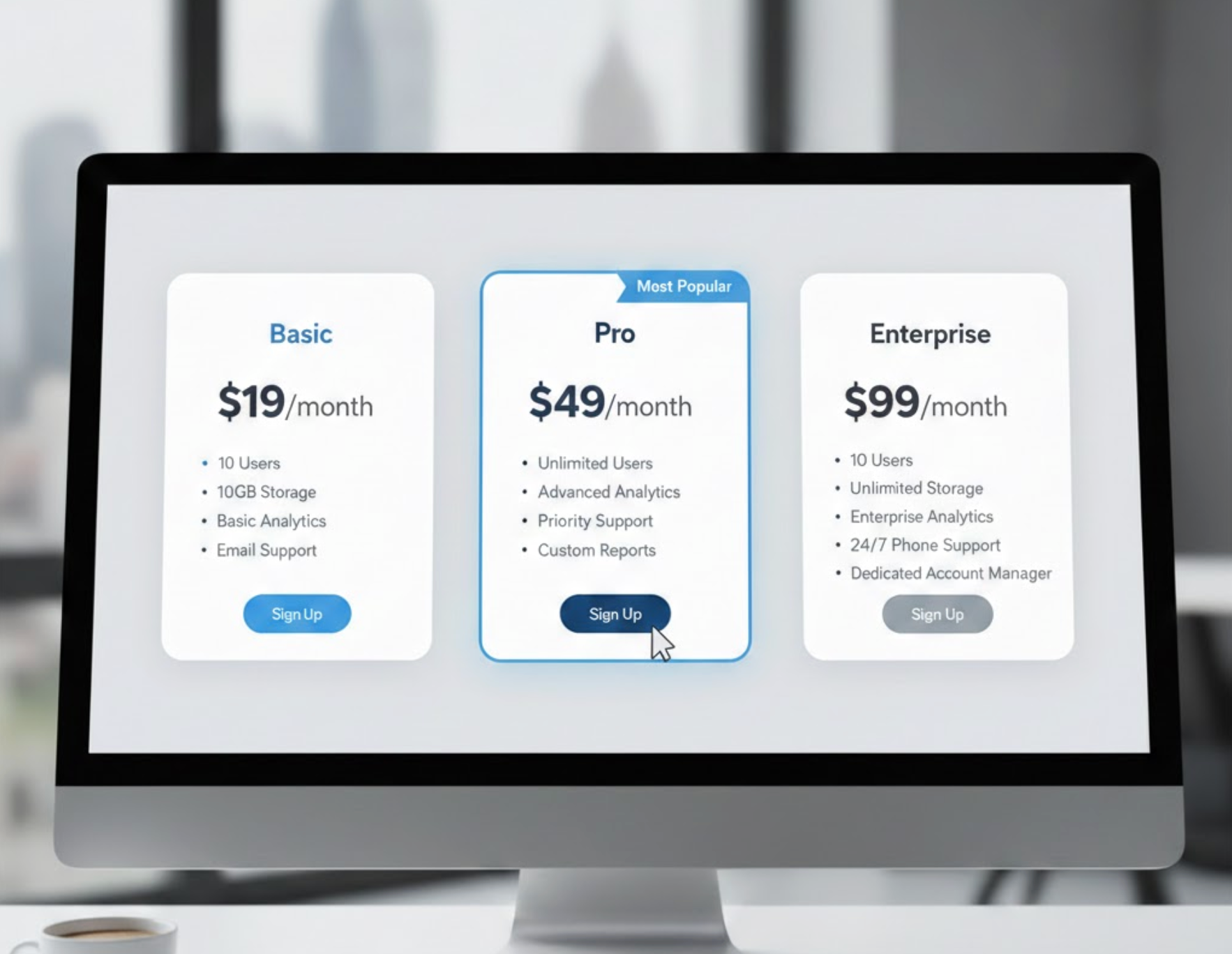
A pricing table is a structured visual layout that displays your product or service plans in a side-by-side comparison format. Instead of forcing customers to read long descriptions or navigate multiple pages, the pricing table brings all essential details together in a clean and organized view. This helps users immediately grasp what each plan includes, how the levels differ, and which option aligns best with their needs.
Most pricing tables use clear plan names, feature lists, and noticeable call-to-action buttons to provide users with all the information they need at a glance. As you consider how to build yours, it helps to remember that the primary purpose is simplicity. Customers shouldn’t have to think too hard or decode anything. And because modern users expect quick answers and clear structure, offering them a straightforward visual breakdown significantly improves their browsing experience and confidence.
By shifting from lengthy explanations to a structured comparison layout, you reduce friction and help users navigate the buying process more smoothly. When customers feel guided instead of confused, they are far more likely to complete a purchase.
Pricing tables offer multiple advantages, and understanding these benefits helps you design with purpose rather than simply filling in boxes.
One of the strongest benefits of pricing tables is how they simplify complex offerings into an easily digestible comparison. Without a pricing table, customers must scroll through paragraphs or click between pages to understand the differences between options, a process that often leads to frustration and abandoned sessions. With a pricing table, users can absorb key information in seconds because everything is neatly placed in aligned columns.
As customers move through the comparison, they rely on visual cues to determine which plan best suits their situation. This moment of clarity helps them avoid decision fatigue and keeps them engaged longer. When users understand the trade-offs clearly, they feel more confident moving toward the checkout page.
Pricing tables can significantly boost conversions because they guide customers toward the plan you want them to choose. When you highlight or emphasize a recommended option, you gently influence the user’s decision without being pushy. This technique taps into psychological principles such as anchoring and choice architecture, allowing you to create a “default” option that feels appealing and balanced.
By presenting plans clearly, users spend less time hesitating, and with smoother navigation, they are more likely to make a purchase. Clear pricing also builds a sense of security, making customers feel that your business is transparent and trustworthy, both essential factors in improving conversions.
A well-structured pricing table communicates that your business is organized, legitimate, and confident in its offerings. Customers often feel anxious when pricing is unclear or hidden, so giving them complete transparency helps eliminate doubts before they arise. When visitors see a pricing table that is thoughtfully arranged with accurate information, they interpret it as a sign that the company values clarity and customer experience.
The ability to scan a table and immediately understand the differences between packages builds trust more effectively than long text descriptions. Even if the customer is not ready to buy immediately, the clarity of pricing leaves a positive impression that can influence future decisions.
Many pre-purchase questions revolve around what each plan includes, what limitations exist, and how the different levels compare. Pricing tables answer all of these concerns upfront, saving your customer support team from repetitive queries. When visitors easily find what they need, they move through the buying process without needing extra help.
This not only improves operational efficiency but also enhances customer satisfaction, since users can get answers instantly instead of waiting for email replies or live-chat responses. As more people make decisions independently, your team has more time to focus on high-value interactions.
To create a pricing table that truly supports conversion goals, you need to include the right elements in the right order. Each component plays a unique role in guiding users and reducing confusion.

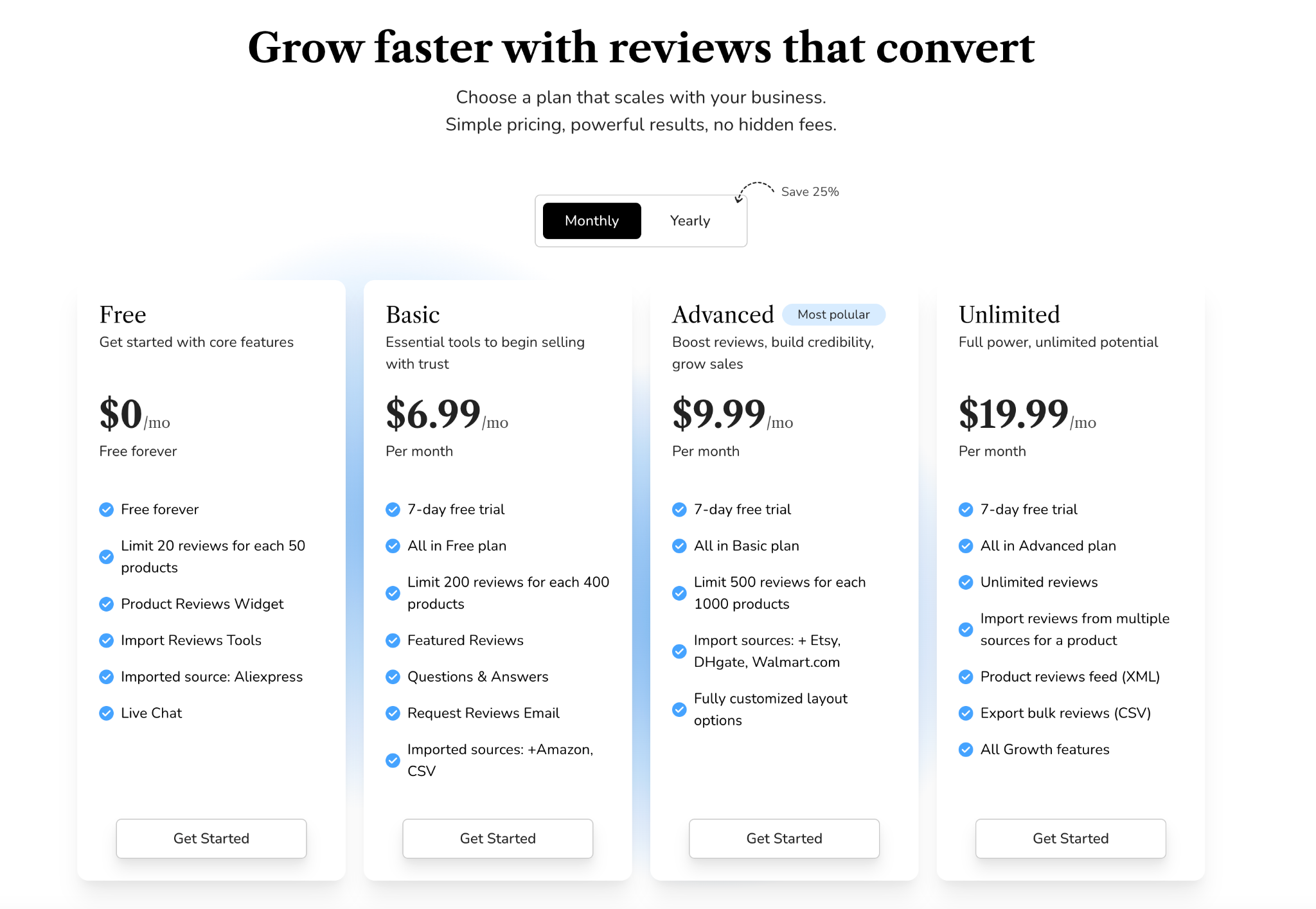
Plan names are often the first thing users see, so they should be simple, descriptive, and easy to remember. Names like Free, Basic, Advanced, Unlimited instantly communicate value levels. In contrast, overly technical or vague names force customers to spend extra mental effort, slowing down decision-making.
Clear naming acts as a mental shortcut for users and helps them quickly identify which tier may be appropriate. Once users feel oriented, they move more fluidly into feature comparison and pricing evaluation.

Features are the heart of the pricing table. This section should outline what users receive at each level, but it’s important not to overload the table with unnecessary details. Your goal is to highlight the features that most influence purchasing decisions, such as limits, support level, integrations, or premium benefits.
By ordering features from the most essential to the least essential, you help users track differences more clearly. This structured layout allows them to understand value progression, making the higher-tier plans feel more meaningful.
Pricing must be easy to read and understand. Display the price prominently and offer both monthly and yearly billing options if applicable. Showing the savings for annual plans, such as “Save 20%”, encourages users to commit to longer billing cycles.
Clear pricing reduces uncertainty and helps customers align your plans with their budgets. When the costs are visible and transparent, users feel more comfortable assessing the value of each plan.
Every plan needs a strong call-to-action (CTA) button to guide users into the next step. Whether your button says “Get Started,” “Sign Up,” “Buy Now,” or “Try Free,” it should be prominent and easy to identify. The CTA is a directional cue that transforms comparison into action.
When users see a clear next step, they experience fewer obstacles in their buying journey. This small but crucial element ensures that your pricing table doesn’t just inform, it actively drives conversions.
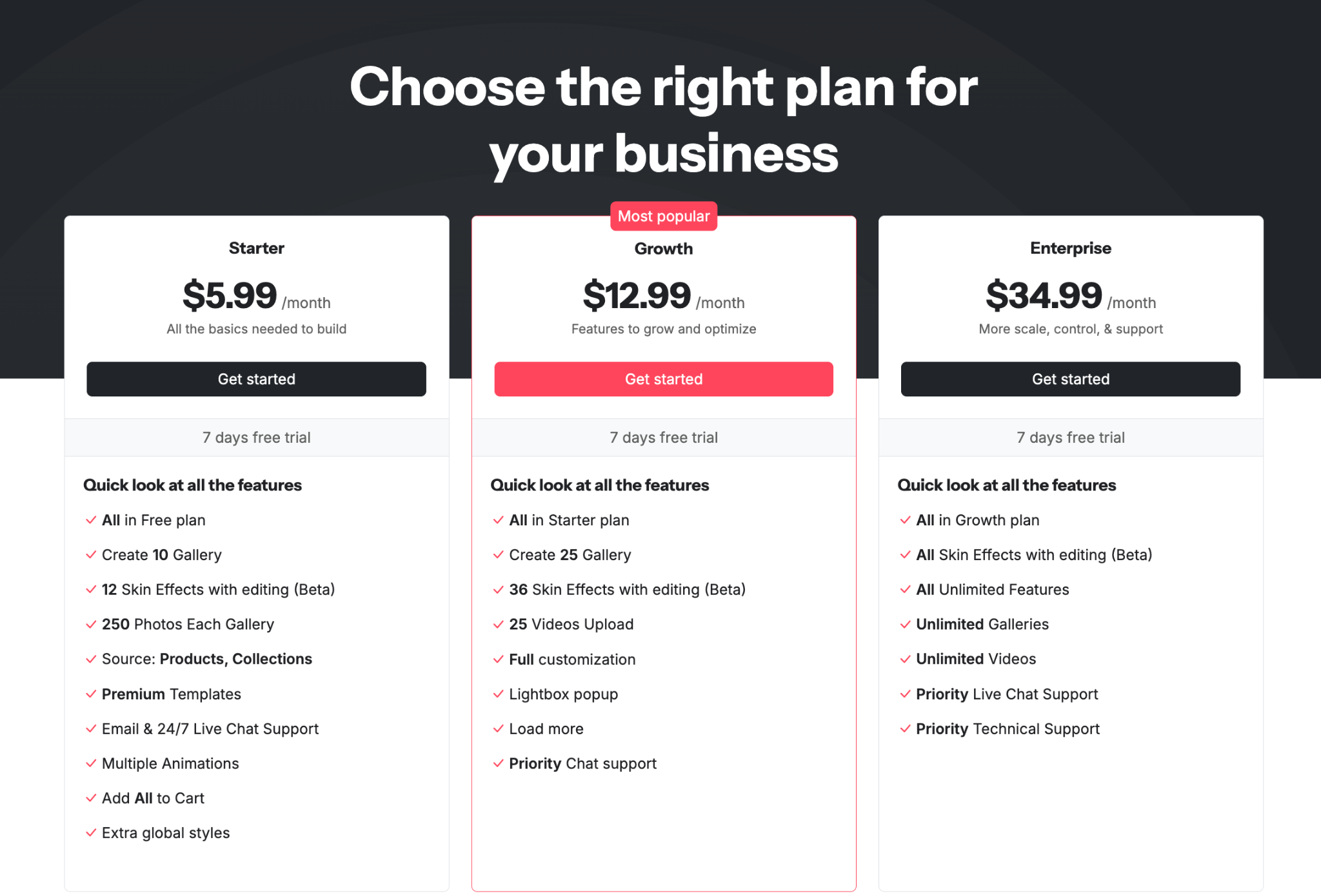
The recommended or most popular plan is often called the “anchor” plan because it shapes how users evaluate the other options. By giving this plan visual emphasis, such as a badge, a different background, or a subtle highlight, you draw attention to the tier that delivers the best balance of value and price.
This strategy helps guide customers who feel unsure or overwhelmed. When they see that most users choose a particular plan, they feel more confident selecting the same option. It creates social reassurance even without testimonials.
Risk-reducing elements like free trials, money-back guarantees, or “cancel anytime” notices help customers overcome hesitation. These safety nets signal that you’re confident in your offering and willing to let customers test it without pressure.
When users feel they have nothing to lose, they are more willing to take the next step. This increases sign-ups and strengthens trust simultaneously, making it one of the most effective additions to a pricing table.
Understanding what to avoid can help you design pricing tables that feel intuitive rather than overwhelming. By recognizing common pitfalls, you can refine your layout to ensure it supports clarity and conversions.
Providing too many plan choices forces customers to think harder than necessary. When users feel overwhelmed by choices, they often choose nothing at all. Limiting your pricing table to three or four plans creates a smoother decision path and reduces mental load.
By narrowing the number of options, you improve the overall user journey and make the decision feel manageable. The goal is to guide, not confuse, your customers.
Labels like “Premium Support” or “Advanced Tools” don’t communicate real value because they lack context. Users need specific, action-oriented descriptions to understand what they are paying for.
Clarity increases customer confidence, so avoid jargon and instead use terms that describe benefits in plain language. When the value is clear, users feel more justified selecting higher-tier plans.
Nothing breaks trust faster than unexpected charges. Customers expect transparency, and pricing tables should present all relevant costs upfront. If there are additional fees, such as setup costs or usage-based charges, they should be clearly noted in the table or right underneath it.
Transparency creates a smoother customer experience and prevents frustration later in the buying cycle.
While details matter, too much information can make your pricing table feel heavy and difficult to scan. Users should be able to understand your plans quickly without reading long descriptions.
Strive for balance by including only what impacts decisions. Additional details can be placed in tooltips, FAQs, or collapsible sections near the table.
A pricing table that looks good on desktop but breaks on mobile causes instant drop-offs. Since a large number of users browse from mobile devices, your table must adapt seamlessly to smaller screens.
A smooth mobile experience ensures that users can still compare and choose options effortlessly, maintaining high conversion potential across devices.
Once your pricing table is structured properly, you can further enhance its performance through strategic optimization. These adjustments help transform your table from a simple comparison tool into a powerful conversion driver.
Different layouts, colors, CTAs, and highlighted plans can affect user behavior in surprising ways. A/B testing allows you to compare variations and discover what resonates most with your audience.
By experimenting with small adjustments, you can uncover high-impact improvements that elevate your conversions without redesigning the whole page. Continuous testing turns your pricing table into a learning system that adapts over time.
When customers encounter pricing decisions, they often seek reassurance. Placing testimonials, review snippets, or trust badges near the pricing table adds credibility and reduces hesitation.
These trust signals reinforce value and highlight real experiences, making customers feel safer about committing to a plan. This emotional reassurance complements your pricing table’s logical clarity.
Options like money-back guarantees or free trials significantly reduce perceived risk. When customers feel they can try your product without commitment, they’re more open to taking the first step.
This small adjustment can dramatically increase sign-ups because it eliminates the fear of making the wrong choice.
FAQs help eliminate common doubts such as cancellation policies, billing cycles, upgrade options, or usage limits. When customers find answers immediately below the pricing table, they are less likely to leave the page searching for information elsewhere.
This creates a smoother, uninterrupted decision-making process that leads users directly toward your call-to-action button.
These labels guide users subtly by showing which option other customers prefer. People tend to feel more secure choosing what others have already validated, making these labels effective for influencing decisions.
The subtle psychology behind these cues can significantly increase conversions without any major design changes.
Pricing tables are more than a design element, but they are strategic tools that help users understand your offerings, compare options, and confidently make decisions. By focusing on clarity, transparency, and user guidance, you create an environment where customers feel informed rather than overwhelmed.
As you refine your pricing table, remember that its core purpose is to simplify the decision-making process. Whether you emphasize your best-selling plan, add trust-building elements, or streamline your feature list, each improvement contributes to a smoother user journey. With the right structure and thoughtful optimization, your pricing table becomes a powerful asset that increases conversions, enhances customer trust, and supports long-term business success.

