Please select the platform to login


In eCommerce, conversion optimization isn’t just about visuals or pricing, but it’s also about user experience. One of the most debated UX choices is whether to emphasize Quick View or push visitors to Full Product Pages. Both serve different purposes in the buying funnel and can significantly impact how fast customers move from discovery to purchase. Let’s explore their strengths, weaknesses, and which setup can convert better for your store.

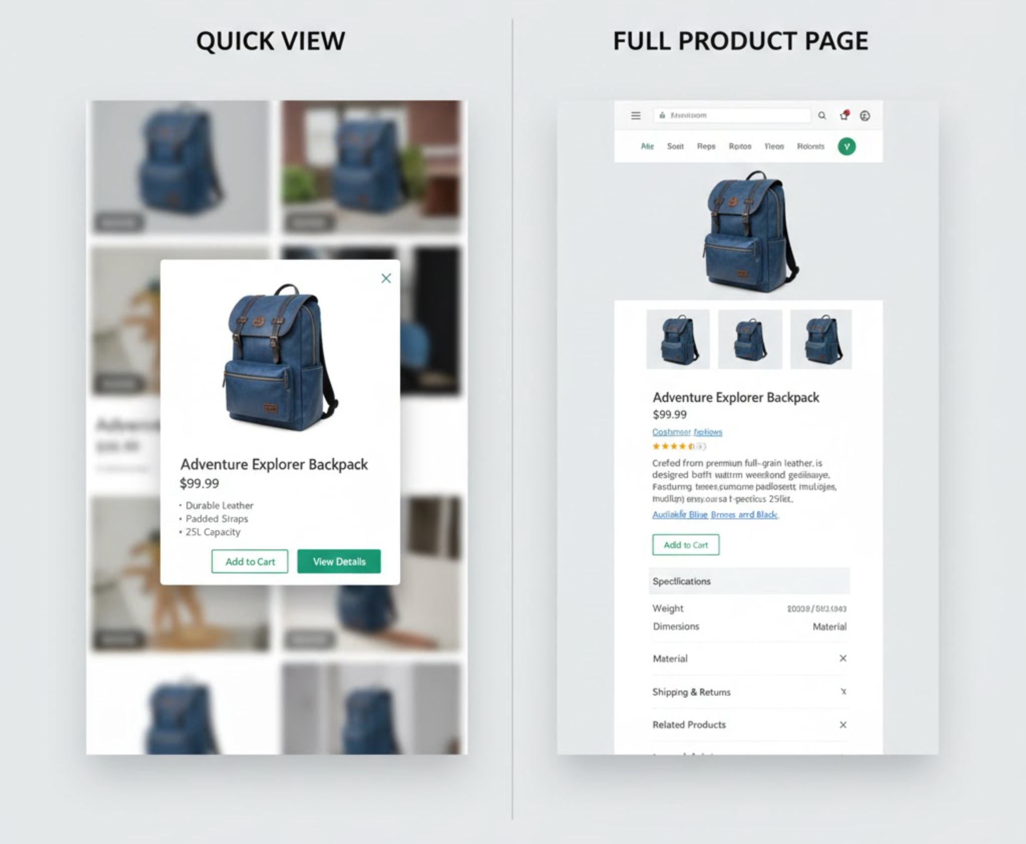
Quick View allows customers to preview essential product details in a modal or pop-up window without navigating away from the current page. It typically includes product images, short descriptions, price, variants, and an “Add to Cart” button.
Quick View offers instant gratification. Shoppers can stay focused on browsing while quickly checking whether a product fits their needs. It eliminates unnecessary page loads, streamlining the path between discovery and purchase, especially important for mobile users.

The Full Product Page is a standalone page dedicated entirely to one product. It provides extensive information like detailed descriptions, reviews, specifications, upselling suggestions, FAQs, and social proof.
Full Product Pages engage users at a deeper level. They help build confidence through transparency, storytelling, and detailed context. Customers who visit these pages are typically further along the decision-making process and more likely to convert with the right reassurance.

Below is a deeper look at how each performs across critical factors that influence conversions.
Verdict: Quick View wins in convenience, especially for fast-moving shoppers or mobile browsing.
Verdict: Full Product Pages dominate when your products require explanation or comparison.
Verdict: Quick View helps attract interest; Full Product Pages help finalize the purchase.
Verdict: Both are essential. Quick View for engagement, Full Product Page for commitment.
Verdict: Quick View is more mobile-optimized by design, while Full Product Pages need careful responsive design to compete.
Verdict: Full Product Page is critical for search visibility and long-term traffic growth.
Verdict: Full Product Page wins in emotional resonance and brand experience.
Verdict: Full Product Page provides more creative freedom to showcase your brand.
Verdict: Match the format to your product complexity and purchase frequency.
There’s no universal winner. Quick View enhances browsing flow and increases engagement, especially for stores with many products. However, Full Product Pages tend to convert more when trust and information are key.
In practice:
The best-performing stores integrate both, Quick View as a browsing accelerator and Full Product Pages as a trust anchor.
Quick View and Full Product Pages are not competitors, but they’re complementary. Quick View simplifies the browsing experience, reducing friction and boosting engagement, while Full Product Pages build trust, deliver depth, and close the sale.
For the highest conversions, your goal should be balance: attract with speed, convert with confidence. By designing both experiences strategically, you can guide every type of shopper, from the curious clicker to the confident buyer, toward completing their purchase with ease.

