Please select the platform to login


Product grids are one of the most influential components of any eCommerce store. They shape how shoppers explore collections, compare options, and decide which products deserve closer attention. When designed thoughtfully, product grids reduce cognitive effort and create a seamless browsing experience that naturally leads users toward conversion.
High-conversion stores don’t treat product grids as a simple layout decision. Instead, they design them strategically to balance clarity, speed, and persuasion without overwhelming shoppers. Below are essential product grid design best practices that consistently improve usability and conversion performance.
Visual hierarchy determines how quickly users can understand and evaluate products while scanning a grid. When hierarchy is weak or inconsistent, shoppers are forced to pause and interpret information, which slows down browsing and increases fatigue. Strong hierarchy allows users to instantly recognize key details without conscious effort.
By organizing information in a predictable order, you reduce friction and support faster decision-making across the entire grid.
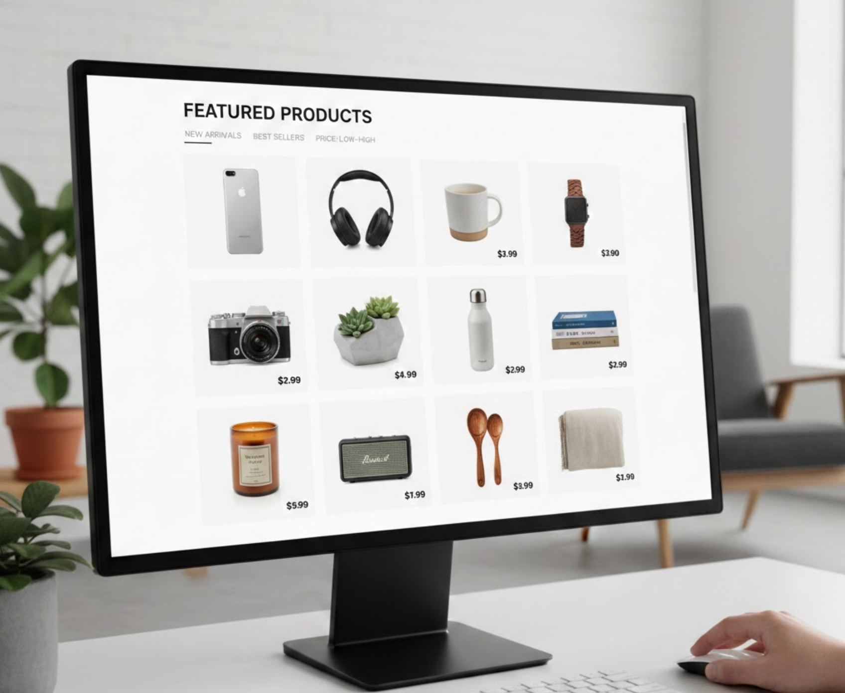
Product images do most of the selling work inside a grid. Inconsistent lighting, framing, or image styles make the grid feel messy and reduce perceived brand quality. A visually unified grid builds trust and makes comparison easier for shoppers.
Consistency in imagery also prevents any single product from unintentionally overpowering others or looking out of place.
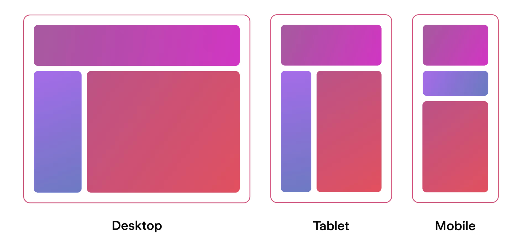
The number of columns directly affects how easily users can scan and process products. Too many columns shrink product cards and overwhelm shoppers with information density. Too few columns waste screen space and slow down browsing.
Finding the right balance helps users stay oriented and engaged while exploring collections.
Product grid cards should help users decide whether to click, not fully explain the product. When too much information is packed into each card, users experience visual overload and decision fatigue. Simplicity improves clarity and keeps browsing momentum high.
By limiting content to essentials, you guide users naturally toward product detail pages.

Visual cues help shoppers make faster decisions by signaling value or urgency. When used correctly, badges and labels reduce hesitation and draw attention to high-priority products. Overuse, however, weakens their impact and creates noise.
Strategic highlighting should guide, not pressure, users as they browse.
Price comparison is one of the main tasks users perform on product grids. If prices are hard to find or inconsistently styled, users lose confidence and may abandon the page. Clear pricing supports transparency and faster decision-making.
Well-presented prices reduce friction and reinforce trust.

Interactive elements can enhance browsing when they provide real value. Poorly implemented hover effects or quick views often feel gimmicky and distracting. Purpose-driven interactions support exploration without forcing extra steps.
The goal is to offer convenience, not complexity.
Speed and stability are critical for maintaining user trust. Slow-loading grids or shifting layouts disrupt browsing flow and increase bounce rates. A smooth grid experience feels reliable and professional.
Performance optimization directly influences conversion outcomes.
Filtering and sorting are essential tools for helping users find relevant products. If the grid jumps or reshapes unpredictably during updates, users can feel disoriented. Smooth transitions preserve context and reduce frustration.
Consistency helps users stay in control as they refine choices.

Mobile shoppers rely heavily on product grids to explore stores. Limited screen space makes clarity and simplicity even more important. Poor mobile grid design leads to frustration and early exits.
Mobile-first grids improve engagement and conversion across all devices.
Product grid design plays a critical role in shaping the eCommerce browsing experience. When grids are clear, consistent, and performance-optimized, shoppers can focus on evaluating products instead of fighting the interface. Every design decision, from hierarchy to spacing, quietly influences conversion outcomes.
High-conversion stores treat product grids as a UX strategy, not just a layout. By applying these best practices thoughtfully, your product grids can guide attention, build trust, and turn casual browsing into confident purchasing.

