Please select the platform to login


Decision fatigue happens when shoppers are forced to make too many choices or process too much information before completing a purchase. On product pages, this mental overload often leads to hesitation, abandonment, or endlessly “saving for later.” The goal of a well-designed product page is not to present every possible option, but to guide users smoothly toward a confident decision.
By simplifying choices, clarifying priorities, and reducing unnecessary cognitive effort, eCommerce brands can dramatically improve conversion rates and customer satisfaction. Below are 7 proven strategies to reduce decision fatigue on product pages and help shoppers move forward with ease.
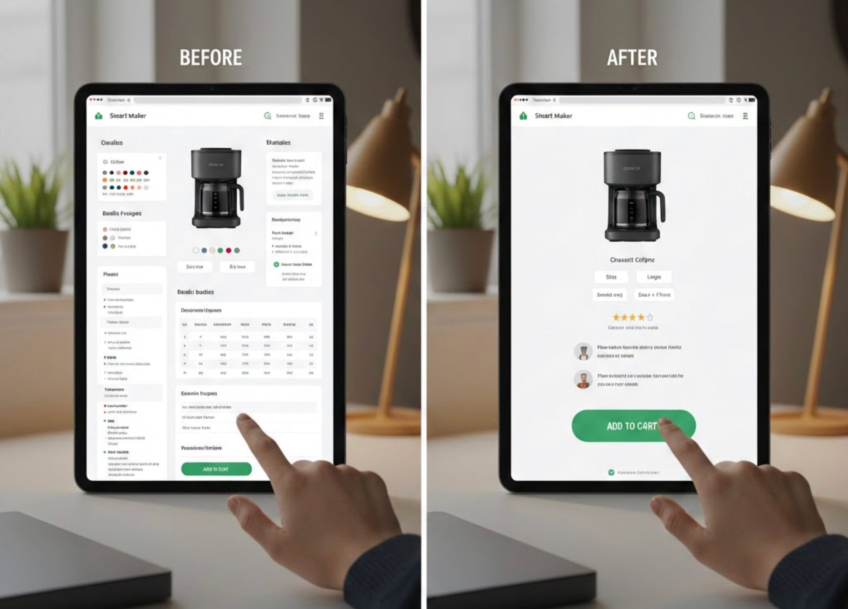
While offering variety is important, showing too many options at the same time can overwhelm users. When shoppers are faced with dozens of sizes, colors, bundles, or add-ons, they often struggle to compare them effectively and delay the decision altogether. Reducing visible choices helps users focus on what actually matters.
A good approach is to present a small, curated set of options upfront and reveal additional choices only when needed. This keeps the interface clean while still preserving flexibility for advanced users.
Default selections reduce effort by answering common questions before the user even asks them. When nothing is preselected, shoppers must evaluate every option, which increases mental load and friction. Thoughtful defaults act as a gentle recommendation and speed up the decision process.
Defaults work best when they align with the most common user preference or best value option. They should feel helpful, not manipulative.
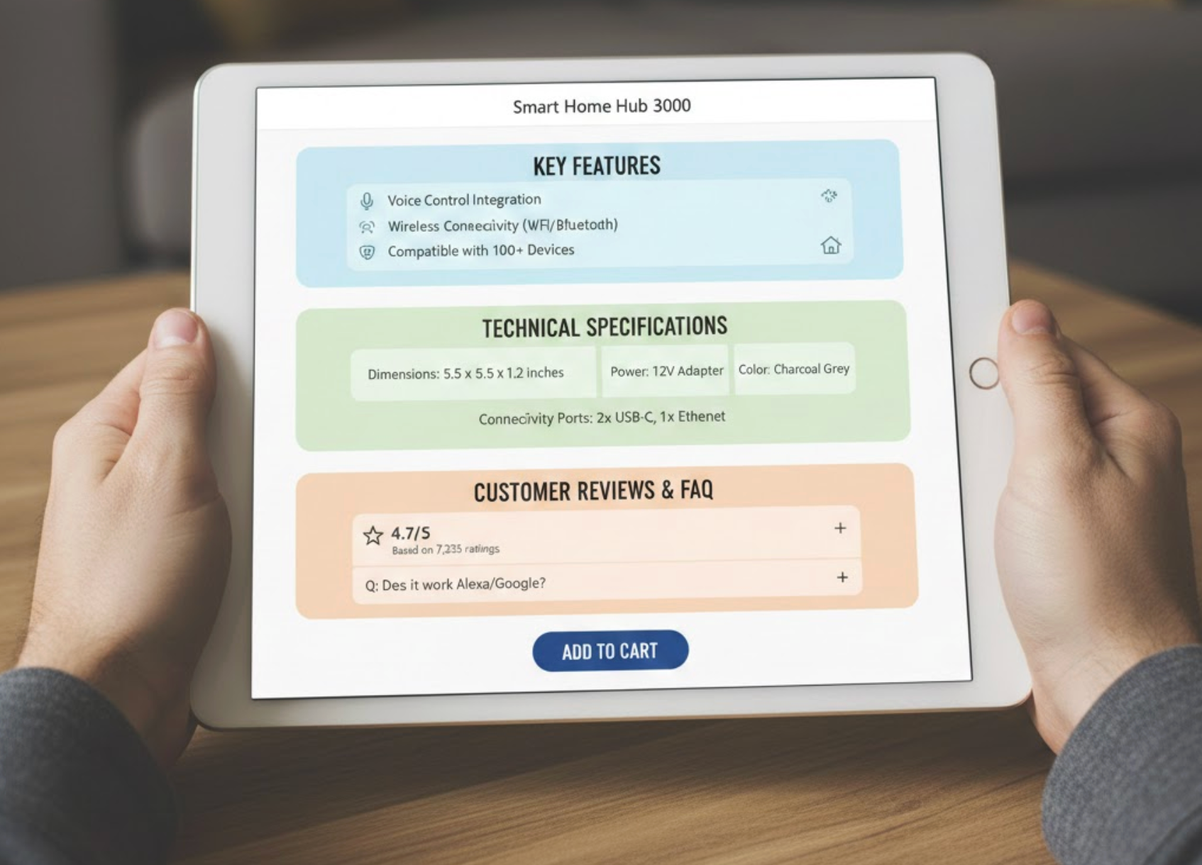
Large blocks of text and scattered information force users to hunt for details, increasing cognitive strain. When specifications, shipping info, reviews, and policies are poorly organized, shoppers must constantly switch context, which accelerates fatigue.
Breaking content into clearly labeled sections allows users to scan, pause, and process information at their own pace without feeling overwhelmed.
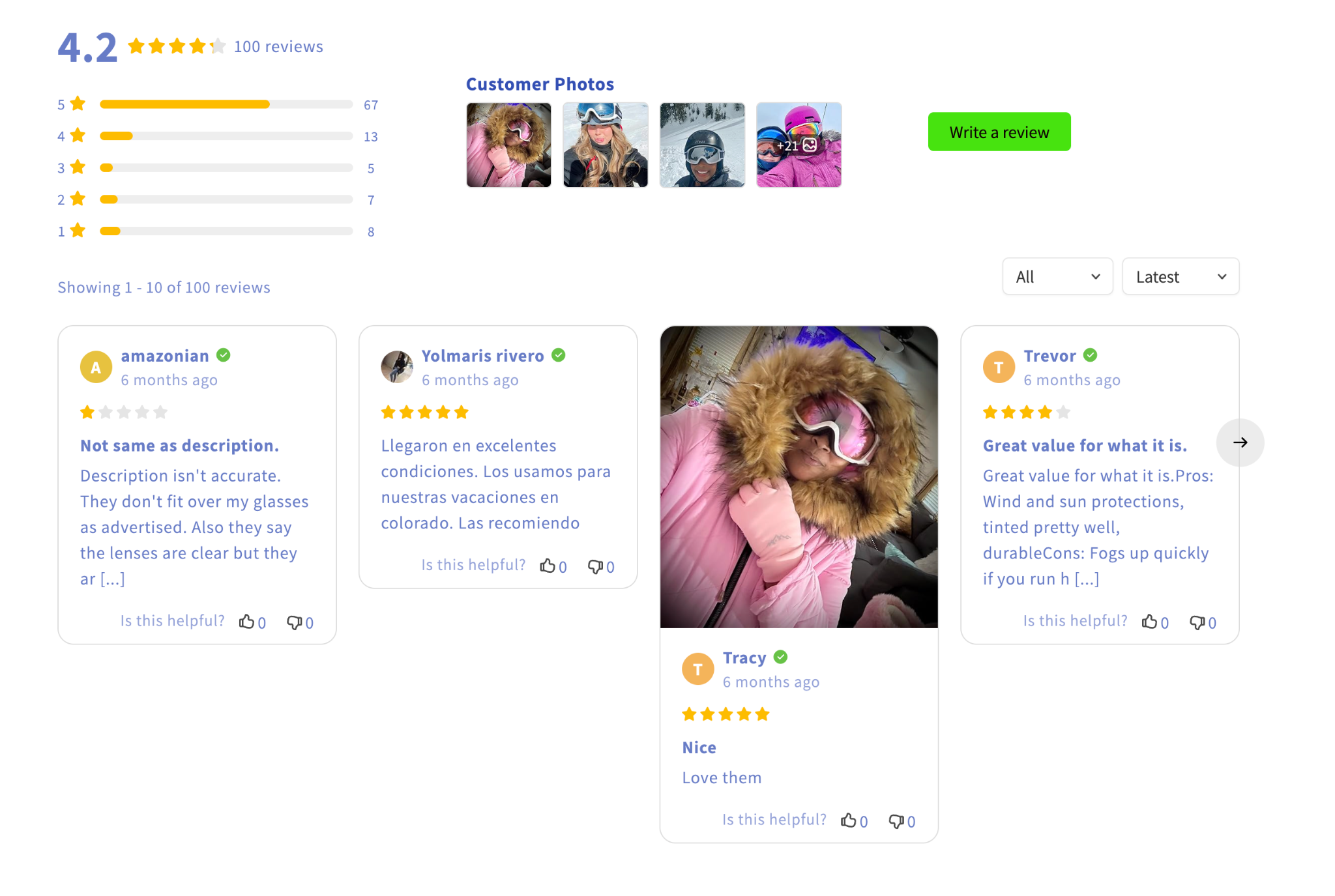
Forcing users to mentally compare options increases decision fatigue quickly. Visual cues help shoppers understand differences without reading long descriptions or remembering multiple details at once.
Design should do the comparison work for the user, not the other way around.
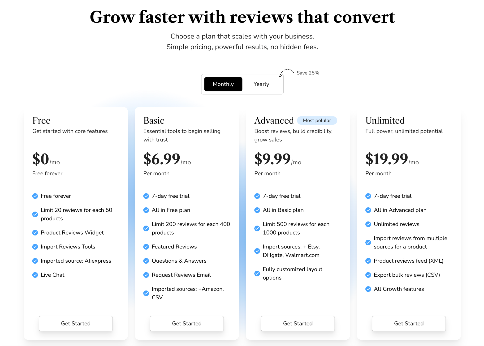
Complex pricing structures, unclear discounts, or hidden fees are major contributors to decision fatigue. When users are unsure what they’re paying for or why one option costs more than another, they hesitate.
Clear, transparent pricing removes uncertainty and speeds up decisions.
Even after narrowing choices, shoppers often pause due to fear of making the wrong decision. Small reassurance elements can ease anxiety and reduce the mental effort of second-guessing.
These signals work best when placed near calls-to-action, where hesitation is most likely.
Every extra banner, popup, or unrelated message competes for attention and adds cognitive load. Even helpful elements can become harmful if they interrupt the decision flow at the wrong moment.
A focused product page keeps the user’s attention on a single goal: deciding whether to buy.
Reducing decision fatigue on product pages is about respect for the shopper’s mental energy. By limiting choices, setting smart defaults, organizing information clearly, and offering reassurance at the right moments, you help users feel confident instead of overwhelmed.
When product pages guide rather than bombard, decisions become easier, and easier decisions lead directly to higher conversions, happier customers, and fewer abandoned carts.

