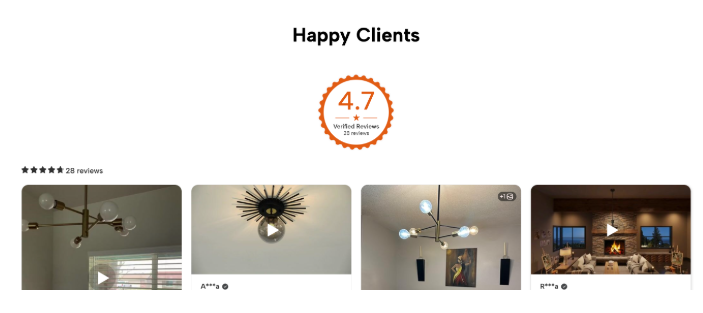

When it comes to running a successful Shopify store, there’s one truth that never changes: people trust people more than they trust brands. No matter how polished your product description is or how stunning your lifestyle photos look, shoppers still want to hear what other buyers think before they make a purchase.
That’s where reviews badge come in. They aren’t just nice add-ons; they’re conversion drivers. The real magic isn’t just in collecting reviews—it’s in placing them strategically so they’re seen at the right time in the buying journey. Think of review widgets as digital signposts that reassure, convince, and nudge shoppers toward checkout.
In this article, we’ll break down the psychology behind review placement, explore the best spots for review widgets on your Shopify product pages, and share actionable tips to help you design product pages that don’t just look good, but actually convert.
Reviews are powerful for one simple reason: they build trust. Studies show that over 90% of online shoppers read reviews before buying, and nearly 80% trust online reviews as much as personal recommendations. But here’s the catch—if those reviews are tucked away at the bottom of the page or buried under endless scrolling, they lose their power.
Think about your own shopping habits. If you can’t quickly find reassurance that others like you had a positive experience, hesitation creeps in. That hesitation can mean the difference between adding to cart and abandoning the page.
Strategic placement ensures that reviews aren’t just “there”—they’re seen at the exact moments when a shopper needs reassurance.
Modern shoppers don’t read product pages linearly. Instead, they:
Heatmap studies show that shoppers’ eyes gravitate toward three main areas on product pages:
If your reviews aren’t positioned around these “decision-making zones,” you’re leaving sales on the table.
Let’s break down the high-converting placements one by one, with examples of how they impact buyer psychology.
Placing star ratings and a review count right next to the product title and price is one of the smartest moves you can make. Why? Because it sets the tone from the very start.
Imagine landing on a product page and immediately seeing:
⭐⭐⭐⭐⭐ (4.8/5 based on 1,024 reviews)
Without even scrolling, you already feel reassured that this product is popular and trusted. It reduces the risk in your mind before you even dive into details.
Best for:
Pro tip: Keep it clean. A simple star rating + number of reviews is often enough at this stage.

The product description is where storytelling happens. It’s where you highlight benefits, features, and unique value. But adding review snippets here can create a seamless blend of brand narrative + social proof.
For example:
This placement works because it reinforces your claims in real time—you’re not just telling, you’re proving.
This is one of the most strategic review placements. Right before a shopper commits to buying, they often pause to double-check if they’re making the right choice. Seeing a handful of positive reviews right below the CTA acts as a conversion nudge.

Think of it as the salesperson who says, “Lots of people love this product—you’re making the right choice” just before you hand over your credit card.
Best for:
While quick-glance ratings are great, many shoppers want to dive deep into detailed feedback. That’s where a dedicated review section or tab at the bottom of the product page shines.
Benefits:
Make sure this section is easy to navigate. Filters (e.g., most recent, highest rating, reviews with photos) can enhance the browsing experience.
Visual proof has become just as important as text-based reviews. Shoppers want to see real people using your products in real life.
For fashion, beauty, home décor, and lifestyle brands, photo/video reviews are incredibly persuasive. They answer questions like:
You can create a dedicated photo/video review gallery section or integrate visuals directly into your review feed.
Sometimes, subtlety is powerful. A floating review badge (like a star rating bubble that stays in view as users scroll) is a gentle reminder of trustworthiness.
This works well for mobile, where scrolling is more common, and shoppers need constant reassurance without breaking the flow.
Tip: Keep it minimal. A sticky badge with average rating + link to “See all reviews” works best.
With mobile-first shopping now dominating eCommerce, review widget placement needs to be optimized for small screens.
Remember: always test placements on both mobile and desktop. What looks great on a laptop might feel cluttered on a phone.
Even with the best intentions, many Shopify stores sabotage conversions by misusing review widgets. Avoid these pitfalls:
To maximize the impact of your review widgets:
Reviews are one of the most powerful sales tools you already have. But like any tool, their effectiveness depends on how you use them. A five-star review buried at the bottom of a page won’t move the needle, but the same review placed next to your add-to-cart button could be the final push a shopper needs to convert.
By thoughtfully placing review widgets in high-visibility, decision-driving spots, you can turn casual browsers into confident buyers.
Remember: it’s not just about showing reviews—it’s about showing them at the right time, in the right place, and in the right way.
Take time to experiment, track results, and refine your placement strategy. With the right approach, your review widgets won’t just decorate your product pages—they’ll power your sales engine.


They browse, review, share, ask questions, and engage with content. Each of these actions contributes to brand growth and community building. By shifting the focus from rewarding purchases alone to rewarding meaningful interactions, businesses can create deeper relationships, encourage ongoing engagement, and build loyalty that extends far beyond a single transaction.
Transparency around additional costs is not just a technical requirement—it is a trust-building opportunity. When businesses communicate fees clearly and early, they transform potential friction into reassurance and confidence.
As fake reviews and manipulated ratings continue to challenge eCommerce credibility, verified buyer tags are no longer optional; they are essential.