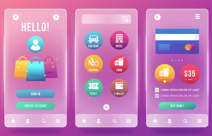
Please select the platform to login


Shoppers today expect more than a simple “Buy Now” button—they expect relevance. In an era where eCommerce competition grows daily and attention spans shrink by the second, brands must find ways to speak directly to customers at the right moment. Smart CTAs (Call-to-Action buttons that adapt to shopper behavior) have become one of the most effective methods to guide users toward purchasing without feeling pushy or generic.
This article explores how contextual CTAs work, why they matter, and how stores can strategically implement them to maximize conversions in a modern, user-first online shopping environment.
A traditional CTA appears the same to every visitor, regardless of their intent or stage in the buying journey. A smart CTA, on the other hand, reacts. It changes based on what the shopper is doing—how long they’ve viewed a product, whether they added items to cart, what device they’re using, where they entered from, how many times they’ve visited that page, and much more. Instead of a static trigger, the CTA becomes a dynamic guide that subtly encourages action based on real context. This responsiveness makes CTAs more human-like, engaging, and capable of nudging customers toward decisions more naturally.
Smart CTAs work because they reduce friction. A shopper browsing on a mobile device might need a quicker, simplified action. A returning visitor might need reassurance, not urgency. Someone lingering on a page might need a reason to stop hesitating. Human behavior is complex, and a single button cannot fit all. When CTAs adapt, they align with intent, creating a natural push toward the next step—exactly when a shopper is ready to take it.
A contextual CTA taps into subtle psychological triggers:
Smart CTAs remove the guesswork by presenting the right “ask” at the right time, improving both user experience and conversion potential.
When users scroll through a product page or informational article, their engagement level becomes clearer. A smart CTA can appear only after they have consumed enough content to show genuine interest. Instead of shouting at every visitor, it quietly emerges when attention is warm and intent is growing. This method prevents overwhelming new visitors while strategically targeting those already leaning toward a decision.
The deeper you go into this concept, the more opportunities arise. For example, a CTA can brighten, animate, or shift wording based on whether the user scrolled 30%, 60%, or 90% of the page. This creates a progressive system where the CTA supports the natural flow of curiosity rather than interrupting it.
Exit-intent CTAs are designed for users hovering toward the close button, switching tabs, or moving their cursor upward. This type of CTA functions as a safety net—one final chance to offer value before the shopper leaves. Instead of being a pushy popup, a smart exit CTA might shift the button copy to “Save My Cart,” “Unlock a Small Discount,” or “See Similar Items.” The strategy isn’t pure persuasion; it’s about giving users a meaningful reason to stay.
When executed thoughtfully, exit CTAs reduce abandonment. A subtle animation, softer tone, or alternative action prompt can turn a lost visitor into a returning customer later.
Different visitors need different messages. A first-time visitor wants clarity and trust. A returning visitor wants confirmation they’re making the right choice. A loyal customer wants speed and convenience. Smart CTAs personalize the micro-moment.
Examples of how this segmentation can reflect in CTA behavior:
This form of personalization supports a long-term customer lifecycle rather than focusing solely on immediate sales.
When shoppers explore multiple products or compare items, a smart CTA can highlight continuity. Instead of asking them to purchase immediately, it might emphasize saving their progress or revisiting recent views. When a visitor already has items in the cart, the CTA might switch to “Go to Checkout” or “Complete Your Order,” creating momentum toward purchase.
This shifts the CTA from a static button into an intelligent shopping companion. It follows the customer’s journey instead of forcing them into a generic flow.
A compelling CTA requires more than just creativity—it needs precision. CTA copy must communicate value instantly, using short, persuasive language that reflects user intent. The message changes depending on the shopper’s behavior, not the website’s preference.
Smart CTA copy examples include:
The challenge is to strike the balance between personalization and clarity. Overly creative CTAs might confuse shoppers. Overly generic CTAs will be ignored. Smart copy lives somewhere in the center—custom, timely, and unmistakably actionable.
Smart CTAs use movement sparingly but effectively. A slight bounce, a glowing edge, or a color transition can quietly draw attention without disrupting the user experience. These small animations signal that the CTA is active, responsive, and aligned with the user’s actions.
Going deeper, the visual language of a CTA can change based on behavior:
This approach turns CTAs into micro-interactions—engaging, situational, and meaningful.
Smart CTAs work best when they blend into the flow of content. Instead of relying on aggressive placement, they appear where shoppers naturally pause, evaluate, or decide. This supports intuitive interaction rather than forcing it.
Common strategic placements include:
The deeper strategy involves aligning the CTA with cognitive patterns. When users finish reading a section, their minds enter a decision-friendly state. Placing CTAs at these transition points enhances conversion without adding pressure.
Mobile shoppers require faster, simpler, thumb-friendly CTAs. Desktop users expect more context. Smart CTAs adjust layout and size accordingly. For mobile, buttons may enlarge, anchor to the bottom, or shorten copy. On desktop, they may expand into wider formats or incorporate additional reassurance points like shipping details.
This device-specific adaptation prevents frustration and increases overall usability, ensuring that the CTA remains powerful regardless of how users browse.
Smart CTAs rely heavily on real-time data. Tracking behavioral cues like scroll depth, dwell time, recently viewed items, time spent on checkout, and referral source allows stores to understand what users want before they express it explicitly.
Deeper analysis often includes:
These insights help fine-tune CTA timing, placement, and messaging for continuous improvement.
A/B testing is essential in refining smart CTAs. With responsive buttons, changes cannot be random—they must be strategic and data-driven. Testing different copy, colors, placements, and triggers reveals what resonates with distinct audiences and shopping behaviors.
Smart CTAs evolve through testing, gradually shaping a conversion system tailored to your customers, not assumptions.
Segmentation allows smart CTAs to feel truly personal. By categorizing users into groups based on browsing history, purchase frequency, location, or traffic source, brands can deliver unique CTA prompts that feel crafted for each individual.
Segmentation ensures that CTAs never feel generic. Instead, they serve as personalized nudges aligned with user identity and intent.
Modern eCommerce platforms like Shopify and WooCommerce support apps and scripts that create behavior-responsive CTAs. Brands should select tools that allow flexible conditional logic, visual customization, A/B testing, and analytics.
A good smart CTA tool provides:
These features form the foundation for a consistent, responsive CTA system.
Implementing smart CTAs isn’t just about adding animations or new wording—it’s about creating an entire conversion experience that adapts to the customer. Each CTA should feel relevant and natural. The goal is subtlety: helpful prompts, not overwhelming demands.
From entry to exit, each CTA should guide the user forward in:
The more consistent your strategy, the more your store feels like a personalized assistant instead of a static website.
Smart CTAs are no longer optional—they’re an essential part of modern eCommerce. By adapting to user behavior, these buttons create smoother journeys, more relevant interactions, and higher conversion rates. Contextual “Buy Now” buttons aren’t just about getting clicks; they’re about understanding the customer and guiding them based on intent, timing, and personal need.
Implemented correctly, smart CTAs transform your store from a passive platform into an active, intuitive shopping experience. As competition increases and attention becomes harder to capture, behavior-responsive CTAs give brands the advantage they need to convert browsers into confident, satisfied buyers.

