9 UX Mistakes to Avoid When Designing Breadcrumb Navigation

Marketing
Oct 1, 2025
8M
Alice Pham

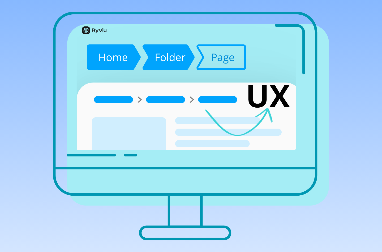
Breadcrumb navigation might look like a small detail in web design, but it’s one of those subtle UX features that can make or break a visitor’s browsing experience. When designed properly, breadcrumbs help users understand where they are, reduce clicks to navigate, and even improve SEO by giving search engines a structured path to follow. However, when done poorly, breadcrumbs can confuse visitors, clutter the interface, or go completely unnoticed.

Let’s dive into the most common UX mistakes with breadcrumb navigation and how you can avoid them.

1. Making Breadcrumbs Too Small or Hard to Find

A common error is treating breadcrumbs as an afterthought, placing them in corners, using faint colors, or shrinking them to the point of invisibility.

  • Why it’s a problem: Breadcrumbs are meant to be a quick navigation tool. If they blend into the background or are placed below the fold, most users won’t notice them. For example, if a shopper lands on a deep product page, they should be able to immediately spot breadcrumbs to go back to the category, without scrolling or searching.
  • Best practice: Always place breadcrumbs high on the page, right below the main navigation or header. Use a readable font size, proper spacing, and color contrast so they’re visible but not distracting.

2. Using Unclear or Overly Long Labels

Another mistake is using system-generated or overly technical long labels such as “cat123/subcat45/item678.” Others simply truncate text, leaving users with ellipses that don’t explain anything.

  • Why it’s a problem: Visitors scan breadcrumbs for quick orientation. Overly long, technical, or cut-off labels increase cognitive load, forcing them to guess what a breadcrumb means.
  • Best practice: Keep labels short, intuitive, and human-readable. Match them to the actual site structure and category names. For example, “Home > Electronics > Laptops > Gaming Laptop” communicates hierarchy clearly, while “Home > cat123 > item678” does not.

3. Not Making Breadcrumbs Clickable

Some designers mistakenly make breadcrumbs static text, treating them like an address rather than a navigation element.

  • Why it’s a problem: Users expect breadcrumbs to function like shortcuts. If they click and nothing happens, it breaks trust and reduces usability. Imagine being on a product page and wanting to go back to the main category, without clickable breadcrumbs, users are forced to hit the back button multiple times or navigate manually from the main menu.
  • Best practice: Make every level of the breadcrumb trail (except the last one) clickable. Each link should lead to a meaningful parent page that helps users move up the hierarchy with a single click.

4. Showing Redundant “Home” Links Incorrectly

Many breadcrumb trails start with “Home,” which is fine, but the mistake happens when “Home” is the only clickable breadcrumb, or when it duplicates the primary navigation without adding value.

  • Why it’s a problem: If the breadcrumb doesn’t show a useful hierarchy beyond “Home,” it becomes redundant. For instance, “Home > Product Page” doesn’t help users explore categories or subcategories.
  • Best practice: Always include the full path beyond “Home.” A clear trail like “Home > Electronics > Mobile Phones > iPhone 15” is far more helpful than “Home > iPhone 15.”

5. Using the Wrong Breadcrumb Type for Your Site

Not all breadcrumb types work equally well. There are three main types of breadcrumbs, including Location-based (shows the hierarchy), Path-based (show the actual steps a user took) and Attribute-based (show filters or product attributes applied).

  • Why it’s a problem: If you use the wrong type, it can mislead users. For example, path-based breadcrumbs might say “Home > Search > Red Shirts > Product” when a user actually wants to go back to the Shirts category. Attribute-based breadcrumbs like “Home > Shoes > Filter: Red > Filter: Size 10” can also overwhelm if not implemented carefully.
  • Best practice: Most websites should stick with location-based breadcrumbs. Use attribute-based only in complex filtering systems, and avoid path-based unless your site specifically benefits from it (like web apps with unique workflows).

6. Ignoring Mobile Usability

Breadcrumbs that work fine on the desktop often break on smaller screens. Text can overlap, get cut off, or become too small to tap.

  • Why it’s a problem: With mobile traffic dominating, ignoring breadcrumb usability on small screens risks frustrating most of your audience. If a shopper can’t easily tap a breadcrumb to move up a level, they may abandon the site.
  • Best practice: Design breadcrumbs to be responsive. Use horizontal scrolling or collapsible menus for long paths. Ensure touch targets are large enough (at least 44px tall). Also, test how breadcrumbs look in both portrait and landscape modes.

7. Overcomplicating the Design

Some designers add icons, animations, or unusual separators (like emojis or abstract symbols) in an attempt to make breadcrumbs more “fun.”

  • Why it’s a problem: While visually interesting, over-designing makes breadcrumbs harder to read and slows down navigation. If users have to interpret what an icon means, the breadcrumb fails its purpose.
  • Best practice: Stick to simple separators like “>” or “/.” Use minimal styling so users instantly recognize the pattern. Breadcrumbs are functional first, decorative second.

8. Forgetting Accessibility and SEO

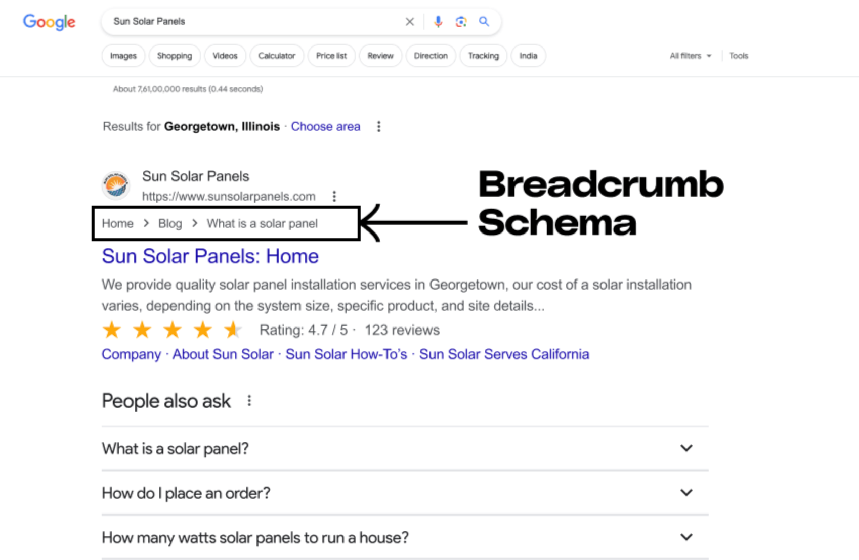
Breadcrumbs that rely only on visuals (like color changes) or lack semantic coding create accessibility issues. Similarly, ignoring structured data markup means missing out on SEO benefits.

  • Why it’s a problem: Screen readers may not recognize breadcrumbs without proper ARIA labels. Visually impaired users may not be able to distinguish breadcrumbs from body text. From an SEO standpoint, unstructured breadcrumbs don’t enhance search snippets.
  • Best practice: Mark up breadcrumbs with Schema to help search engines. Make sure they’re keyboard-navigable and visible in high-contrast modes.

9. Removing Breadcrumbs Entirely on Certain Pages

Some sites only show breadcrumbs on deep product or article pages but omit them from category pages. This creates inconsistency and forces users to depend on guesswork.

  • Why it’s a problem: Users should be able to trace their path no matter what page they’re on. Inconsistency makes users second-guess navigation and breaks the mental model of hierarchy.
  • Best practice: Keep breadcrumbs visible on all pages within the hierarchy. This reinforces site structure, improves orientation, and builds trust by offering users a consistent navigation aid.

Final Thoughts

Breadcrumbs might not grab attention like bold hero images or call-to-action buttons, but they play a vital role in creating a seamless, user-friendly navigation experience. By avoiding mistakes like poor visibility, unclear labels, non-clickable links, or bad mobile design, you ensure that breadcrumbs do what they’re supposed to do, guide users effortlessly.

They’re not just for users, either: when implemented with semantic code and structured data, breadcrumbs strengthen your SEO by giving search engines clear context about your site hierarchy.

For eCommerce, where users often land deep within a catalog, breadcrumbs can be the difference between a shopper exploring more products or abandoning your site.