Please select the platform to login


Category pages are designed to help shoppers explore options and move closer to a purchase. However, when users are presented with too many products, filters, or messages at once, decision-making slows down. This mental overload, known as choice paralysis, causes hesitation, frustration, and ultimately abandonment. Reducing choice paralysis is not about limiting options, but about structuring them in a way that feels manageable and reassuring.
By simplifying how choices are presented and guiding users step by step, category pages can become powerful conversion drivers instead of drop-off points.

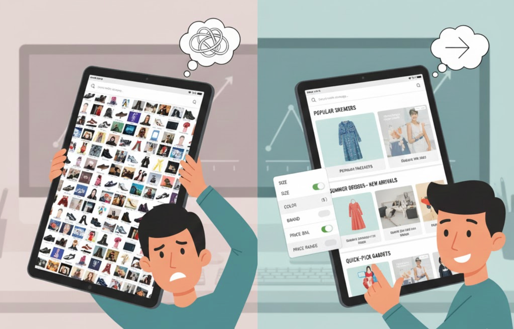
Choice paralysis occurs when users feel overwhelmed by the number or complexity of options available. Instead of feeling empowered by variety, shoppers struggle to compare products, fear making the wrong decision, or postpone the purchase altogether. This is especially common on category pages, where dozens or even hundreds of products compete for attention.
When users cannot quickly understand differences or identify a clear starting point, cognitive load increases. As a result, shoppers may bounce, endlessly scroll without action, or abandon the session entirely. Reducing this friction helps users regain confidence and momentum.
Presenting all products at once may seem transparent, but it often works against decision-making. Showing fewer options initially helps users focus and reduces mental fatigue. This approach allows shoppers to engage with the page without feeling pressured to evaluate everything at once.
To achieve this, structure product grids to highlight only the most relevant or popular items first. Additional products can still be accessed through pagination or “load more” interactions, preserving choice without overwhelming the user.
Shoppers often land on category pages without knowing exactly what they need. Without context, every product feels equally relevant, which increases hesitation. Clear guidance helps users understand what the category offers and how to navigate it effectively.
A short, informative introduction at the top of the page can set expectations and reduce uncertainty. When users understand the purpose of the category, they can narrow their focus more confidently.
Filters are meant to reduce choices, but poorly designed filters often create more confusion. Too many options, unclear labels, or technical language can overwhelm users instead of helping them decide. Simplifying filters ensures they serve as a support tool rather than a barrier.
Effective filters focus on what matters most to shoppers and present those options in an intuitive way. When filters are easy to understand, users feel more in control of their browsing experience.
When products look similar and are described in feature-heavy language, users struggle to compare them. Long lists of specifications force shoppers to do mental work that slows decisions. Highlighting meaningful differences helps users understand which option fits their needs best.
By framing product information around outcomes and comparisons, category pages can make choices feel clearer and safer. This approach reduces anxiety and builds confidence.

Shoppers are more confident when they know others have made similar choices successfully. Social proof reduces the perceived risk of choosing incorrectly and helps users move forward faster. On category pages, subtle social signals can have a strong impact.
When social proof is integrated naturally, it reassures users without adding extra complexity. The goal is to guide decisions, not distract from them.
Not all shoppers browse the same way. Some want the best deal, others want premium quality, and some want the safest option. When category pages acknowledge these different intents, users feel understood and guided instead of overwhelmed.
Segmenting paths reduces choice paralysis by narrowing the field based on user motivation. This makes the browsing experience feel personalized and intentional.
Even with the right number of products, visual clutter can trigger choice paralysis. Too many badges, colors, fonts, or promotional messages compete for attention and exhaust users. A clean, focused design helps shoppers stay calm and engaged.
Visual simplicity supports cognitive simplicity. When the page looks organized, users feel more capable of making a decision.
Choice paralysis on category pages is not caused by too many products, but by too many unstructured decisions. When users are forced to think too much, they hesitate. When choices are guided, simplified, and contextualized, confidence grows and conversions follow.
By limiting visible options, clarifying differences, simplifying filters, and using social proof strategically, category pages can transform overwhelming choice into guided exploration. The result is a smoother user experience, faster decisions, and higher conversion rates.

