Please select the platform to login


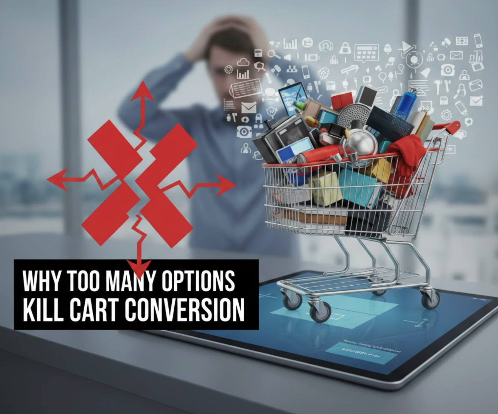
Offering more choices often feels like a customer-first strategy. More products, more variants, more deals, it sounds like you’re giving shoppers full control. However, in eCommerce, unlimited choice rarely leads to unlimited sales.
In reality, too many options can overwhelm customers, slow down decision-making, and quietly destroy cart conversion rates. Instead of feeling confident, shoppers feel pressured to choose correctly, which creates friction at the worst possible moment: right before checkout.
This problem is known as choice overload, and it’s one of the most underestimated reasons behind cart abandonment in online stores.
Choice overload happens when the brain is forced to evaluate too many alternatives at once. Each option requires attention, comparison, and mental energy. As the number of choices increases, so does cognitive strain.
Rather than feeling empowered, shoppers start feeling stressed and uncertain. They worry about missing out on a better deal, choosing the wrong version, or regretting their decision later. This emotional tension reduces purchase confidence and increases hesitation.
When the mental cost of deciding becomes too high, the brain naturally looks for relief. In eCommerce, that relief often comes in the form of leaving the page without buying.
High-converting eCommerce stores don’t eliminate choice, they structure it strategically. Instead of asking shoppers to evaluate everything, they guide them toward the best decision.
Clear visual hierarchy, strong recommendations, and simplified layouts reduce mental effort. When shoppers feel guided rather than overwhelmed, they move forward with confidence.
In many cases, presenting fewer options actually increases satisfaction because customers feel reassured that they’re choosing wisely.
The checkout stage should feel like the finish line. Shoppers expect speed, clarity, and reassurance. However, when the cart introduces additional decisions, such as extended warranties, add-ons, bundles, or multiple discount choices, it disrupts that momentum.
Instead of thinking, “I’m ready to pay,” customers are pushed back into comparison mode. This mental reset slows the checkout process and significantly increases the chance of abandonment.
Even small, optional choices can create enough friction to stop a purchase entirely.
The more choices shoppers see, the more they question their original decision. They start wondering whether a cheaper version would be smarter or whether a premium option offers better value.
This fear of regret weakens trust in their own judgment. When customers don’t feel confident, they hesitate, and hesitation kills conversions. In many cases, shoppers choose to leave rather than risk making a decision they might regret later.
Confidence, not variety, is what drives completed purchases.
Every extra second spent deciding increases the risk of distraction. Notifications, ads, messages, or even simple fatigue can interrupt the buying process.
When customers take too long to evaluate options, the emotional urgency to buy fades. What started as a strong purchase intent slowly turns into hesitation, then into abandonment.
A faster, more guided decision process keeps users focused and moves them efficiently toward checkout completion.
Choice overload is especially damaging on mobile devices. Smaller screens make comparing options harder, and mobile users typically browse in shorter, more distracted sessions.
A cart filled with dropdown menus, toggles, and optional selections can feel exhausting on mobile. If the checkout experience isn’t immediately clear, users are far more likely to exit and never return.
For mobile-first stores, simplicity isn’t optional, it’s essential.
Choice overload usually builds up gradually rather than appearing all at once. Many stores add features over time, unintentionally cluttering the buying journey.
The most common problem areas include:
Each element may seem helpful on its own, but together they create confusion and friction.
Reducing choice overload is about helping customers make decisions faster and with more confidence. When the cart feels simple and focused, shoppers are less likely to hesitate or second-guess their purchase. A streamlined checkout keeps momentum strong and removes unnecessary friction.
By presenting fewer, clearer choices, you guide customers smoothly toward completing their order.
More options don’t automatically create more value. In ecommerce, too much choice often leads to confusion, hesitation, and lost sales.
By simplifying the cart experience and guiding customers toward confident decisions, you remove friction at the most critical moment in the funnel. The result is higher cart conversion, faster checkouts, and a smoother buying experience overall.
In the end, the best-converting cart isn’t the one with the most options, it’s the one that makes buying feel easy.

