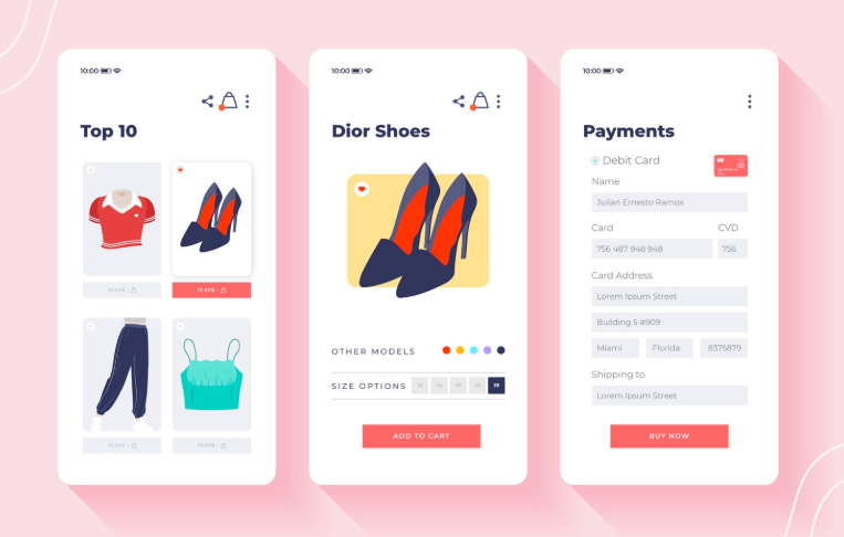

Your WooCommerce checkout page is the single most important step in your customer journey. It’s where browsing turns into buying, and small inconveniences can mean the difference between a new customer and a lost sale.
Research shows that nearly 70% of online shopping carts are abandoned, with a significant portion happening during checkout. Why? Because too many stores make it confusing, time-consuming, or untrustworthy. The upside is that checkout optimization can dramatically boost conversions.
This guide will give you practical, WooCommerce-specific strategies to streamline checkout, reduce abandonment, and turn more carts into completed orders.
When customers reach checkout, they’ve already overcome big hurdles: they found your site, liked your product, and decided to buy. Yet, many stores lose them here. According to Baymard Institute, improving checkout usability can lift conversion rates by 35% or more.
For WooCommerce stores competing against polished giants like Amazon or Shopify Plus retailers, an unoptimized checkout is costly. Customers today expect speed, clarity, and flexibility. A checkout that fails to meet those expectations can undermine all your marketing and acquisition efforts. On the flip side, even small improvements—like fewer fields or clearer shipping costs—can turn into thousands of dollars in recovered revenue.
Before improving, let’s uncover where most stores go wrong:
These mistakes pile friction onto an already delicate stage. WooCommerce makes it easy to fix most of them—you just need a plan.

A well-designed checkout feels effortless. Here’s how to streamline the flow:
Think of your checkout like a clean, guided path—straightforward and reassuring.
Every extra field feels like extra work. Streamlining forms directly reduces abandonment.
Example: ASOS reduced checkout abandonment significantly after allowing guest checkout. In WooCommerce, this is as simple as enabling it in Settings → Accounts & Privacy.
Trust is non-negotiable. Even interested buyers won’t risk their card details if they don’t feel safe.
Trust signals don’t just boost conversion—they also encourage bigger order values.
Payments should feel effortless. If customers can’t pay the way they want, they’ll leave.
WooCommerce integrates with dozens of payment providers, so there’s no excuse for limited options.
Shipping is the single biggest driver of abandonment. To reduce friction:
Pro tip: Use plugins like Table Rate Shipping for WooCommerce to show flexible shipping rates.
Mobile traffic dominates, but mobile checkout is often neglected. Fix it with:
Studies show mobile abandonment rates are significantly higher than desktop, so focusing here has a huge payoff.
WooCommerce’s default checkout is functional but basic. Plugins unlock its full potential:
These plugins reduce friction, add flexibility, and make your store feel more professional.
Checkout optimization isn’t guesswork—it’s science.
WooCommerce’s flexibility means you can test everything—so never assume your first version is the best one.
Once basics are in place, go beyond:
These tactics not only reduce abandonment but also increase average order value.
Let’s compare a poor vs. optimized WooCommerce checkout.
❌ Before:
✅ After:
The result? Lower abandonment, higher order values, and happier customers.
Checkout is the heartbeat of your WooCommerce store. Yet too many businesses treat it as an afterthought. By removing friction, building trust, expanding payment and shipping options, and leveraging the right plugins, you can dramatically improve conversions.
Remember, optimization is ongoing: test, measure, refine, and repeat. Customers today expect a fast, transparent, and secure checkout experience—and delivering that will not only reduce abandonment but also build loyalty. Treat your checkout page like the most important salesperson on your team, and it will reward you with consistent, compounding revenue growth.


“Before and after” testimonial narratives capture this journey in a simple yet powerful way. When crafted thoughtfully, these narratives go beyond basic reviews. They become compelling stories that build trust, reduce uncertainty, and guide potential buyers toward confident decisions.
A testimonial section that feels disconnected from your brand voice can weaken the overall experience, while over-editing can strip away authenticity. The goal is not to control what customers say, but to present their voices in a way that harmonizes with your brand. When done well, testimonials feel like a natural extension of your identity.
By carefully extracting and reshaping key moments, businesses can preserve authenticity while improving clarity and impact. Done well, this approach turns dense feedback into powerful, digestible content that drives trust and conversions.