Please select the platform to login


In the world of eCommerce, visuals speak louder than words. A well-planned product image layout can make or break a customer’s decision to buy. While high-quality photography is crucial, the way you present those images, their arrangement, size, angles, and consistency, plays an equally vital role in building trust and enhancing the shopping experience.
Whether you’re designing your Shopify product pages or optimizing a full catalog view, layout choices directly affect user engagement, time on page, and conversion rates. In this article, we’ll explore the best practices for product image layouts that help you turn casual browsers into confident buyers.
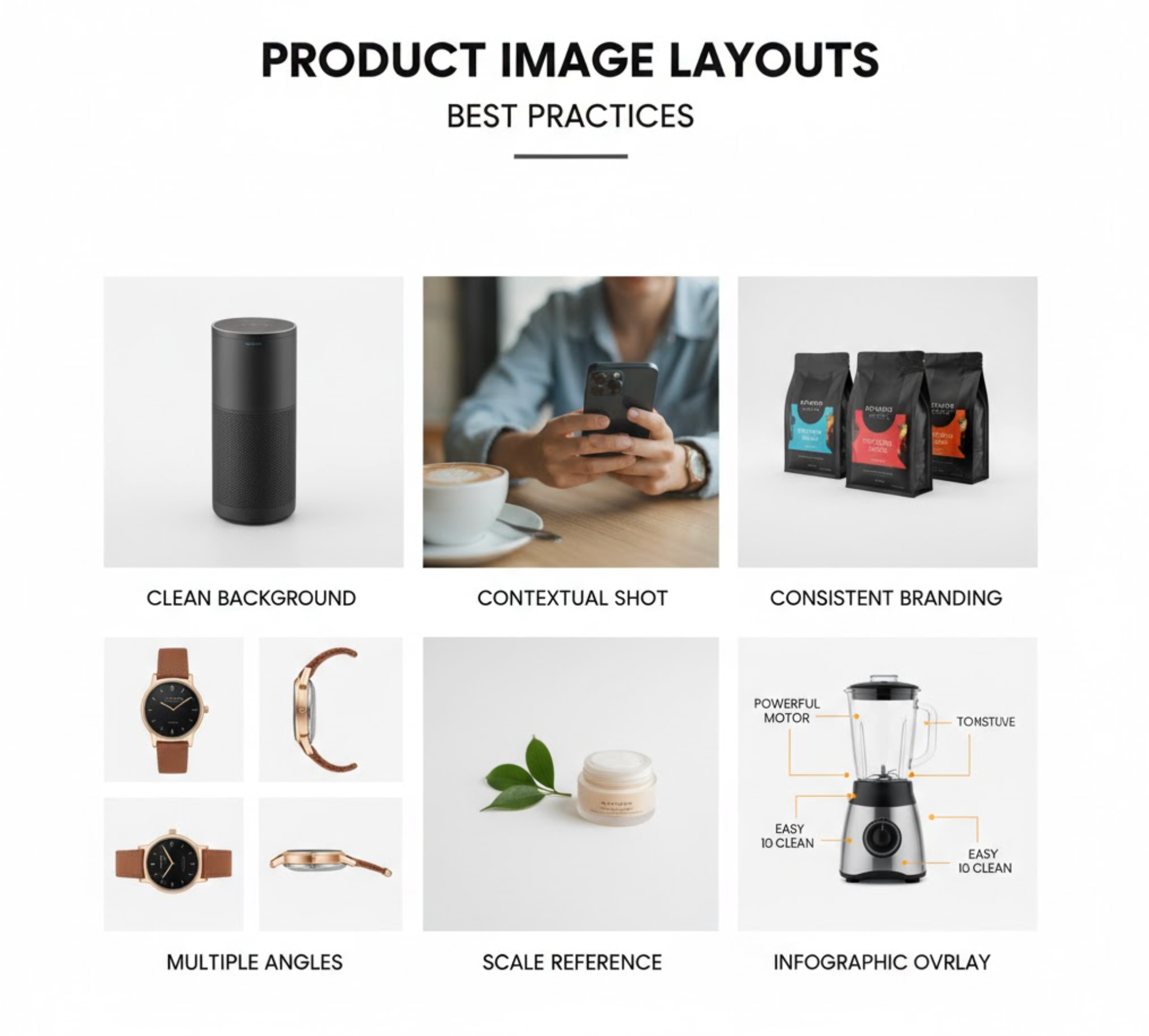
Consistency builds trust. When shoppers scroll through your store, they subconsciously look for uniformity. Using consistent image sizes, backgrounds, lighting, and framing helps your catalog look professional and reliable.
Why it matters: Inconsistent images can make your store appear unpolished or confusing, especially when products differ drastically in dimensions or orientation. A clean, standardized layout helps customers focus on the products themselves, not the inconsistencies in presentation.
Best practices:

Online shoppers can’t physically interact with your products, so you must help them visualize every detail. Providing multiple angles of each product gives a sense of depth and realism that static images can’t achieve.
Why it matters: According to studies, customers who see multiple product views are more likely to make a purchase, as they feel they “know” the product better. This approach also helps reduce returns caused by mismatched expectations.
Best practices:
A cluttered product image layout can overwhelm visitors and distract from the shopping journey. Clean layouts improve readability, make your store appear modern, and encourage focus on what truly matters, the product.
Why it matters: Minimalist layouts create breathing space, improve scannability, and drive visual hierarchy. When customers can quickly understand what they’re looking at, they’re more likely to add items to their cart.
Best practices:
While plain studio shots are essential for clarity, contextual images help customers imagine how your product fits into their life. Lifestyle photos bring personality to your store and evoke emotion, making the product more relatable and desirable.
Why it matters: When buyers can see your product in real-world use, they can better visualize themselves owning it. This emotional connection is key to driving conversions.
Best practices:

More than half of online shopping now happens on mobile devices. If your product image layout doesn’t adapt seamlessly to different screen sizes, you risk losing valuable sales opportunities.
Why it matters: Mobile users have shorter attention spans and expect fast-loading, responsive layouts. A poor mobile experience, such as misaligned grids or cropped images, can cause immediate drop-offs.
Best practices:
High-resolution images look great but can slow down your website if not optimized correctly. Fast load times are critical for both user satisfaction and SEO.
Why it matters: Even a one-second delay in load time can significantly impact conversion rates. Striking the right balance between image clarity and speed ensures a smooth shopping experience.
Best practices:
Interactive elements like zoom or hover effects give shoppers a deeper look at the product without leaving the main page. These features add a tactile feel to the online experience.
Why it matters: When users can explore texture, stitching, or fine details effortlessly, it mimics the physical act of examining a product in-store, increasing confidence and satisfaction.
Best practices:

For fashion, home décor, or lifestyle brands, one of the most engaging ways to showcase products is through Shop the Look layouts. These allow you to display multiple complementary items within a single image, for example, an outfit with all its accessories or a styled room with furniture and décor.
Why it matters: Shoppers can instantly visualize entire ensembles or setups, increasing the likelihood of multi-item purchases. It’s a natural upselling strategy that feels inspirational rather than pushy.
If you’re a Shopify merchant, tools like Lookfy make this process simple. Lookfy lets you create stunning “Shop the Look” galleries or lookbooks where each item is directly linked to its product page. This not only enhances visual storytelling but also helps you guide customers through coordinated collections without overwhelming them.
Best practices:
There’s no one-size-fits-all layout for every store. The ideal design depends on your niche, audience, and catalog size. A/B testing helps you discover which arrangements drive the most engagement and sales.
Why it matters: Small tweaks, such as changing grid size, adjusting spacing, or repositioning product thumbnails, can have a big impact on conversions.
Best practices:
Finally, your product image layout should reflect your brand identity. Every visual element, from lighting style to composition, tells your story. Cohesive image presentation helps customers recognize and remember your brand.
Why it matters: In a crowded eCommerce market, strong visual branding builds emotional connections and long-term loyalty.
Best practices:
Your product image layout is far more than a design choice, but it’s a conversion tool. From maintaining consistency and showcasing multiple angles to optimizing for mobile and implementing “Shop the Look” displays, each element contributes to a seamless, engaging shopping experience. By combining these best practices for product image layouts, you can build visual harmony across your store, inspire buyer confidence, and boost your sales.

