Please select the platform to login


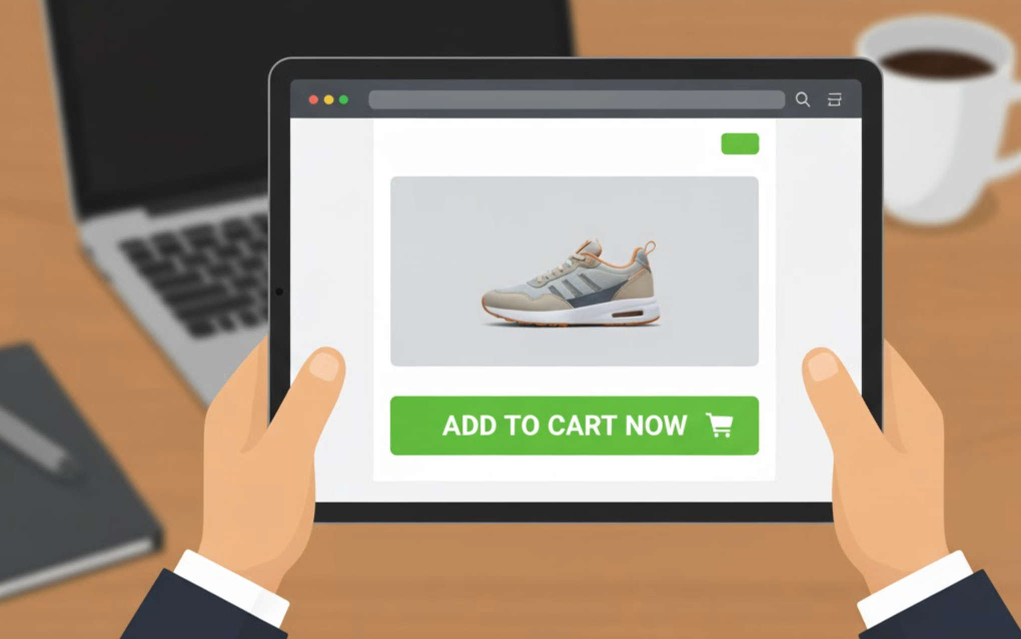
In today’s fast-paced eCommerce world, every second counts. Online shoppers often browse multiple products before deciding to buy, and if they need to scroll back up to find the “Add to Cart” button, you risk losing their attention. That’s where sticky Add to Cart buttons come in.
A sticky button remains visible on the screen as the customer scrolls through a product page, allowing them to add items to their cart instantly. This simple UX enhancement can significantly improve conversions, especially on mobile, where constant scrolling is common. Many Shopify stores have reported higher “Add to Cart” rates and smoother shopping experiences after implementing sticky buttons.
To help you choose the right one, here’s a detailed look at what makes a good sticky Add to Cart app and the best Shopify apps currently available.
Before you install any app, it’s essential to understand what separates a great sticky button solution from a mediocre one. Here are the key factors to consider:
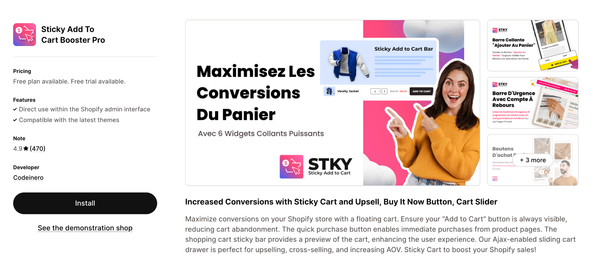
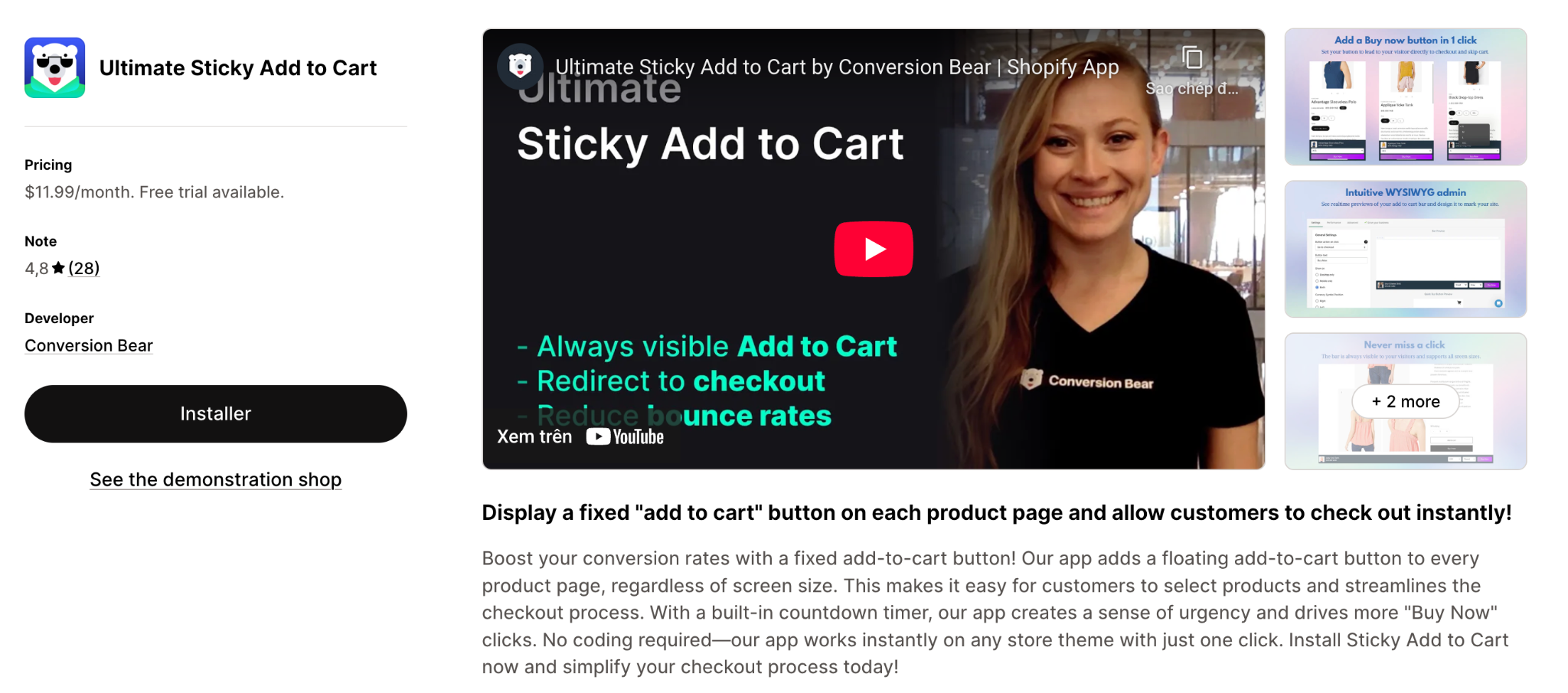
This app ensures the “Add to Cart” button remains visible as the shopper scrolls, and it includes advanced features such as a countdown-timer urgency bar, floating sticky cart icons and quick-buy functionality. The UI is designed for both desktop and mobile, and the app emphasises speeding up checkout while increasing conversions.
Key Features:
Pricing:
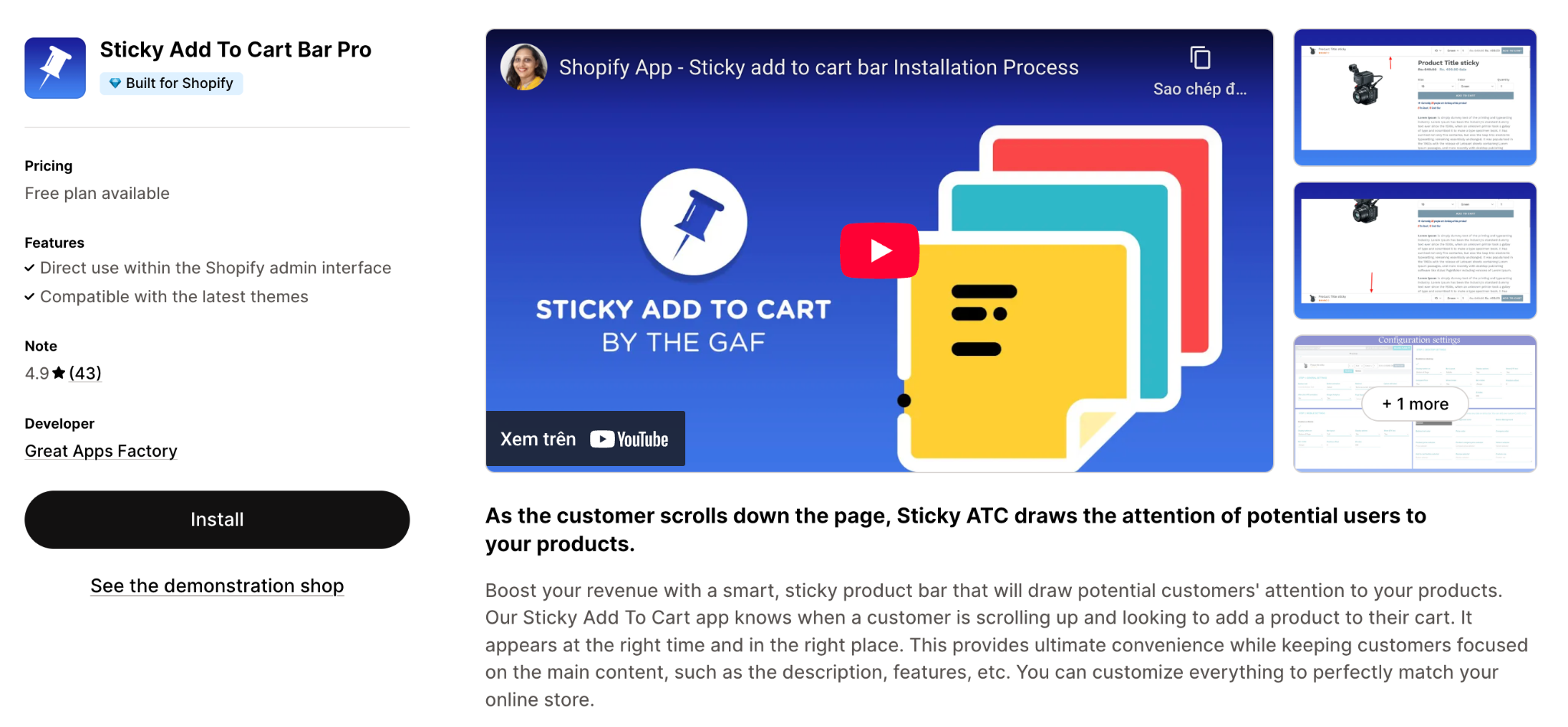
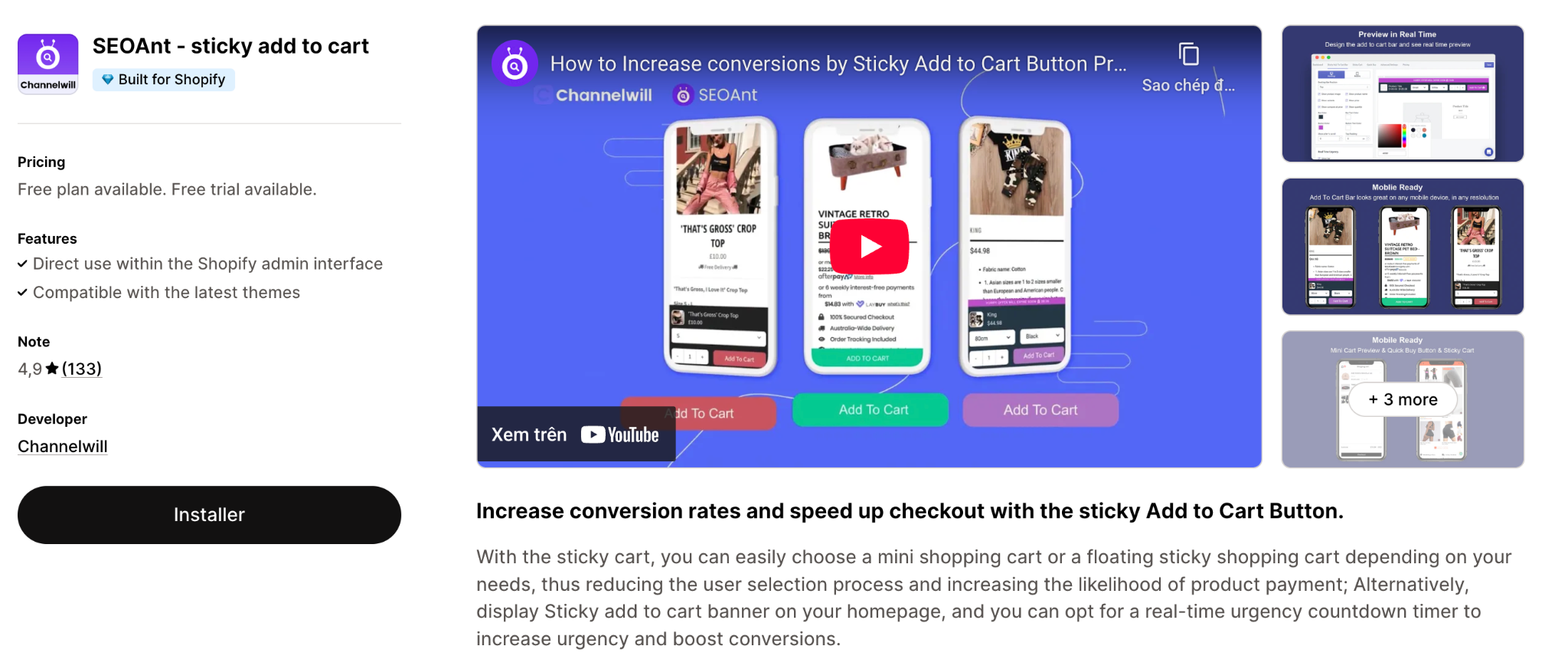
This app smartly detects when a shopper scrolls and ensures the Add to Cart bar appears at the right time, rather than from the start. It aims to keep the store layout clean and only show the sticky bar when shoppers need it. Multi-store, multi-currency and multi-language support are also highlighted.
Key Features:
Pricing: (Specific pricing not clearly listed in the reference; you may need to check the app store for the latest)
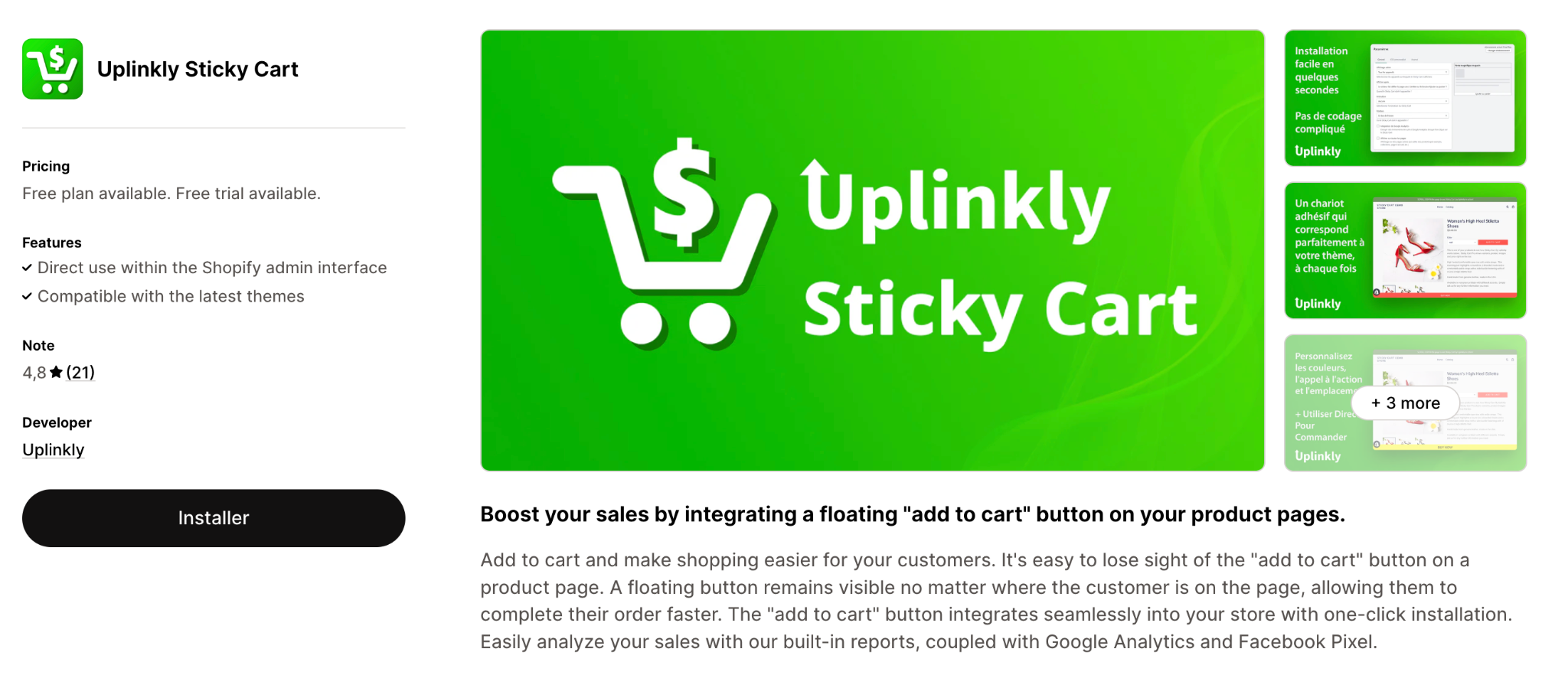
A more budget-friendly option with a generous free plan, designed to add a highly visible sticky Add to Cart button quickly and without coding. Particularly good for new or lower-traffic stores that just want to test the concept.
Key Features:
Pricing:
This app focuses on simplifying the checkout flow by adding a floating Add to Cart button (always visible on product pages) and direct “Buy Now” behaviour. It also includes a built-in countdown timer to create urgency. No coding is required and it works across all devices.
Key Features:
Pricing:
A lightweight, minimal-impact app that emphasises site speed and simplicity. The free plan allows for a limited number of clicks, making it suitable for smaller stores, with a paid plan unlocking unlimited clicks. They also promise no leftover code after uninstalling the app.
Key Features:
Pricing:
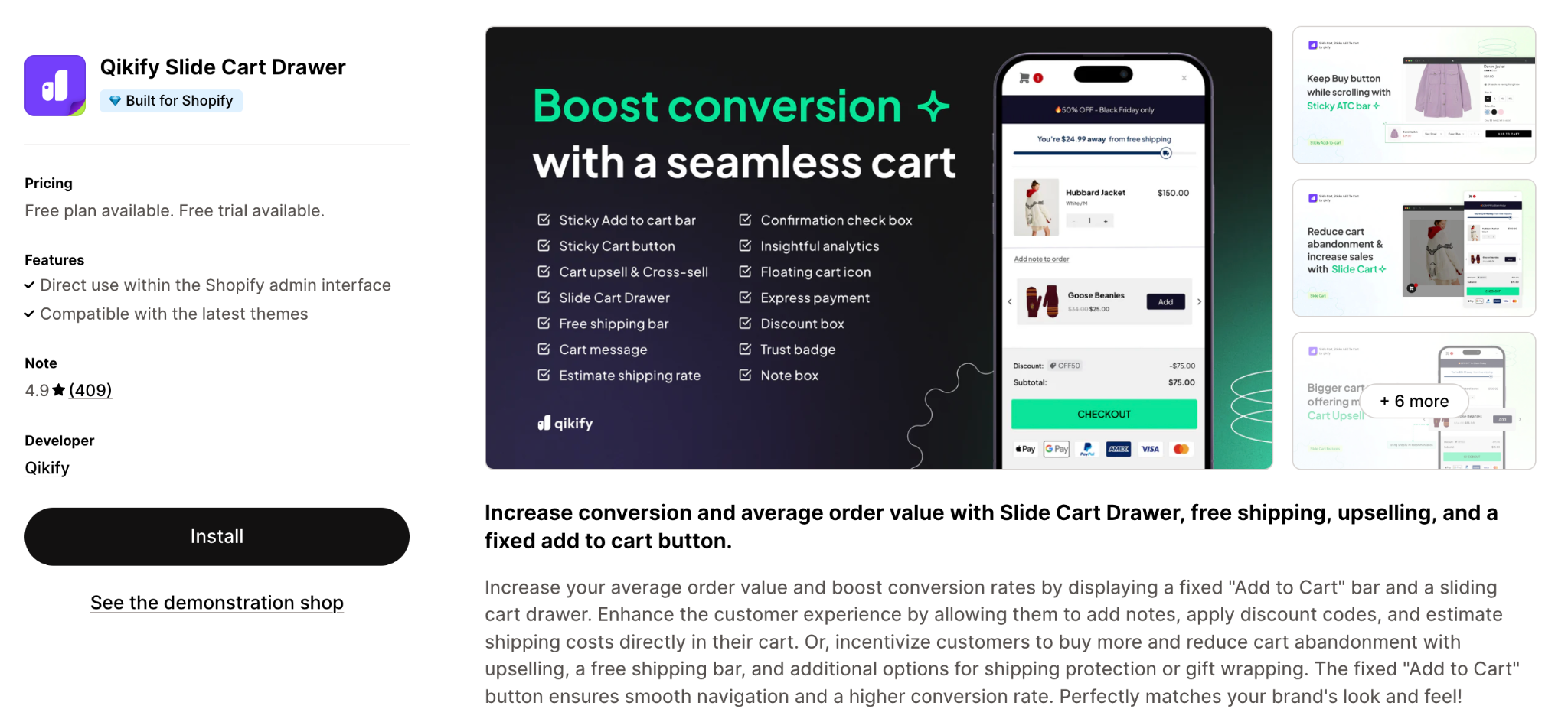
While primarily a slide-cart/side-cart upsell app, it also offers a sticky Add to Cart bar feature. It’s ideal if you want more than just a sticky button, for example, cart drawer views, upsells/cross-sells, free shipping progress bars etc. It’s a more robust solution if you’re focusing on increasing AOV, not just conversion.
Key Features:
Pricing:
Choosing the right app depends on your store size, design style, and business goals. Here’s how to narrow it down:
A sticky Add to Cart button may seem like a minor design tweak, but it’s one of the most effective ways to improve your store’s user experience and mobile conversions. By keeping the buying action visible at all times, you reduce friction, capture impulse purchases, and make checkout more intuitive.
Whether you prefer a simple, free solution or an advanced, analytics-driven app, the options above cover every type of Shopify merchant. Try a few, measure your results, and choose the one that best aligns with your goals because even small UX enhancements can make a big difference in your bottom line.

