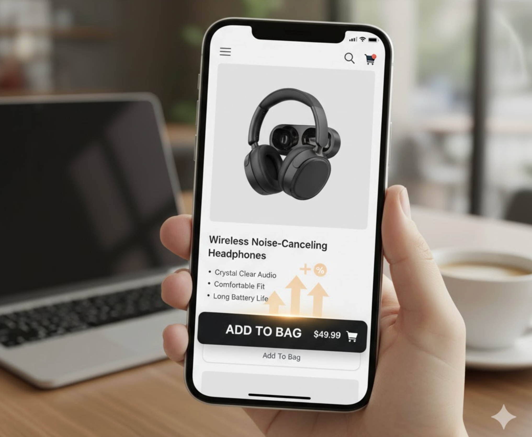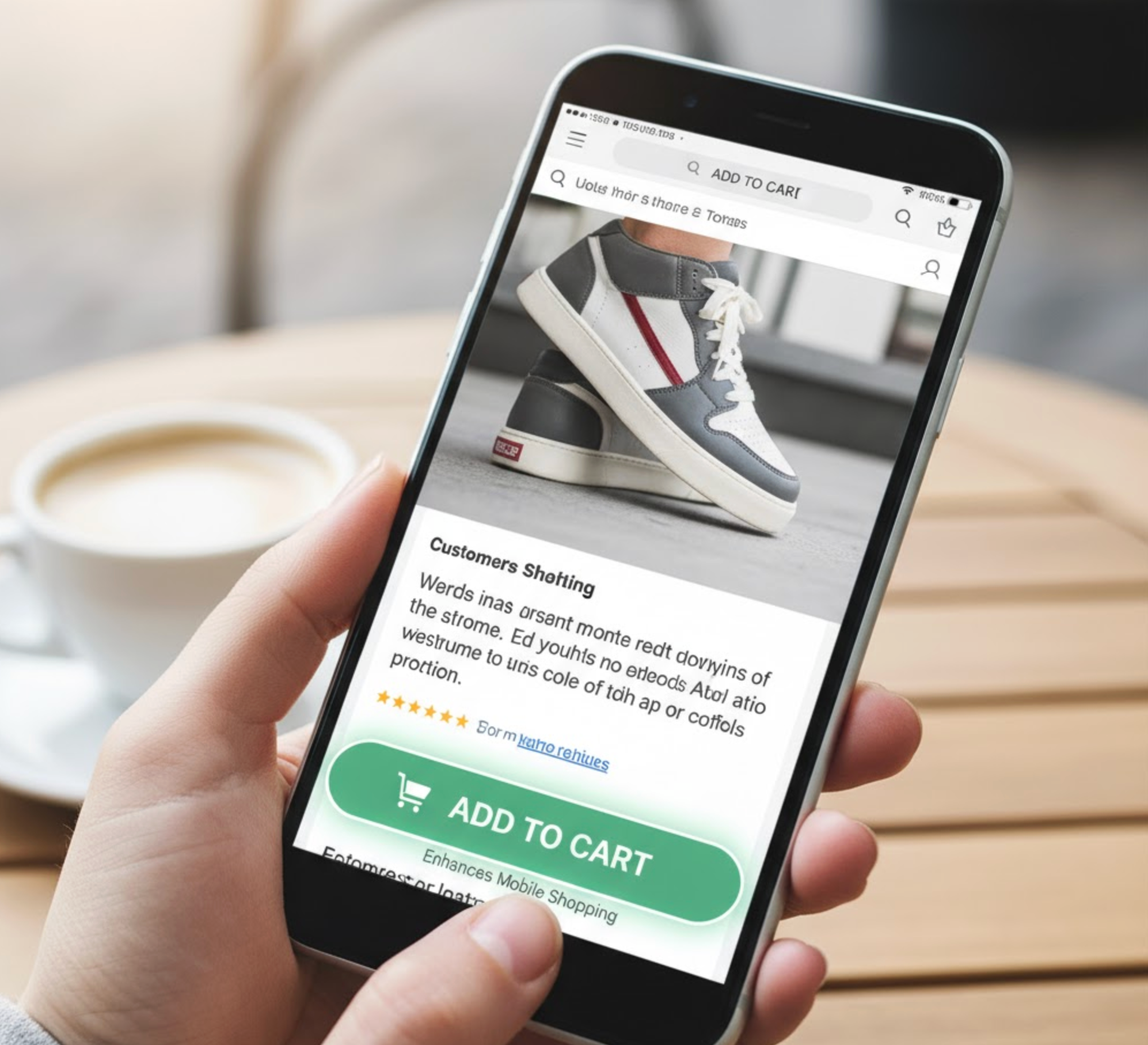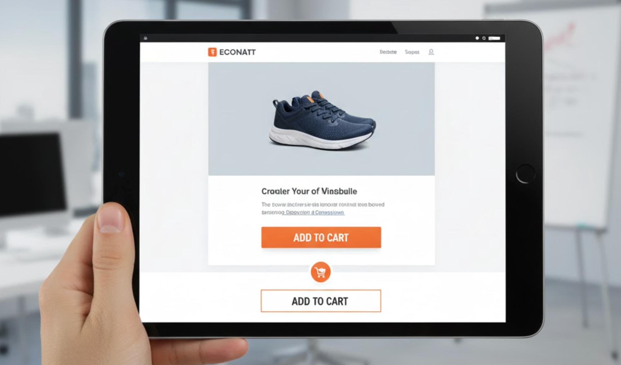
In mobile eCommerce, user experience defines success. Shoppers today expect instant access, minimal friction, and easy navigation, especially when browsing from a smaller screen. If your store’s Add to Cart button disappears as customers scroll, you risk losing sales. That’s where sticky Add to Cart bars come in.
A sticky Add to Cart bar is a floating button or bar that stays visible at the bottom (or top) of a product page as users scroll. It gives customers the freedom to add products to their cart at any moment without scrolling back. Simple in appearance yet powerful in effect, this feature has been shown to significantly boost conversions on mobile devices.
Let’s dive deeper into why sticky Add to Cart bars are essential for mobile optimization and how they improve your store’s overall sales performance.

Mobile shopping comes with unique challenges. Limited screen space means customers must scroll multiple times to read descriptions, view images, and check reviews. If the Add to Cart button is only at the top or bottom of the page, users might lose interest before reaching it again.
A sticky Add to Cart bar eliminates this friction. By keeping the CTA accessible at all times, you create a smooth and intuitive journey for mobile shoppers. Customers no longer have to hunt for the button, they can add an item instantly, regardless of where they are on the page.
This convenience leads to a more enjoyable browsing experience and higher engagement. The less effort required to complete an action, the more likely customers are to make a purchase.
Mobile users are quick to abandon sites that make buying complicated. A long scroll or hidden CTA can easily cause distraction or frustration, resulting in high bounce rates and lost conversions.
With a sticky Add to Cart bar, the purchase action is always within view. Even as customers explore product details, sizing charts, or customer reviews, they constantly see a visible “Add to Cart” button reminding them that they can buy at any time.
This subtle psychological nudge keeps users engaged and reduces the chance of them leaving mid-scroll. By shortening the decision path and minimizing effort, sticky bars help reduce cart abandonment and increase completed purchases.

Visibility is everything in conversion design. On desktop, CTAs can be large and persistent, but mobile screens are smaller, and CTAs often disappear as users scroll. A sticky bar ensures the Add to Cart button stays anchored in the most visible area of the screen, right where users’ thumbs naturally rest.
This consistent presence builds familiarity and encourages quick actions. When users don’t have to scroll or guess where to click next, they feel more confident. The bar serves as a gentle reminder that the purchase option is always available, reinforcing commitment and trust throughout the browsing process.

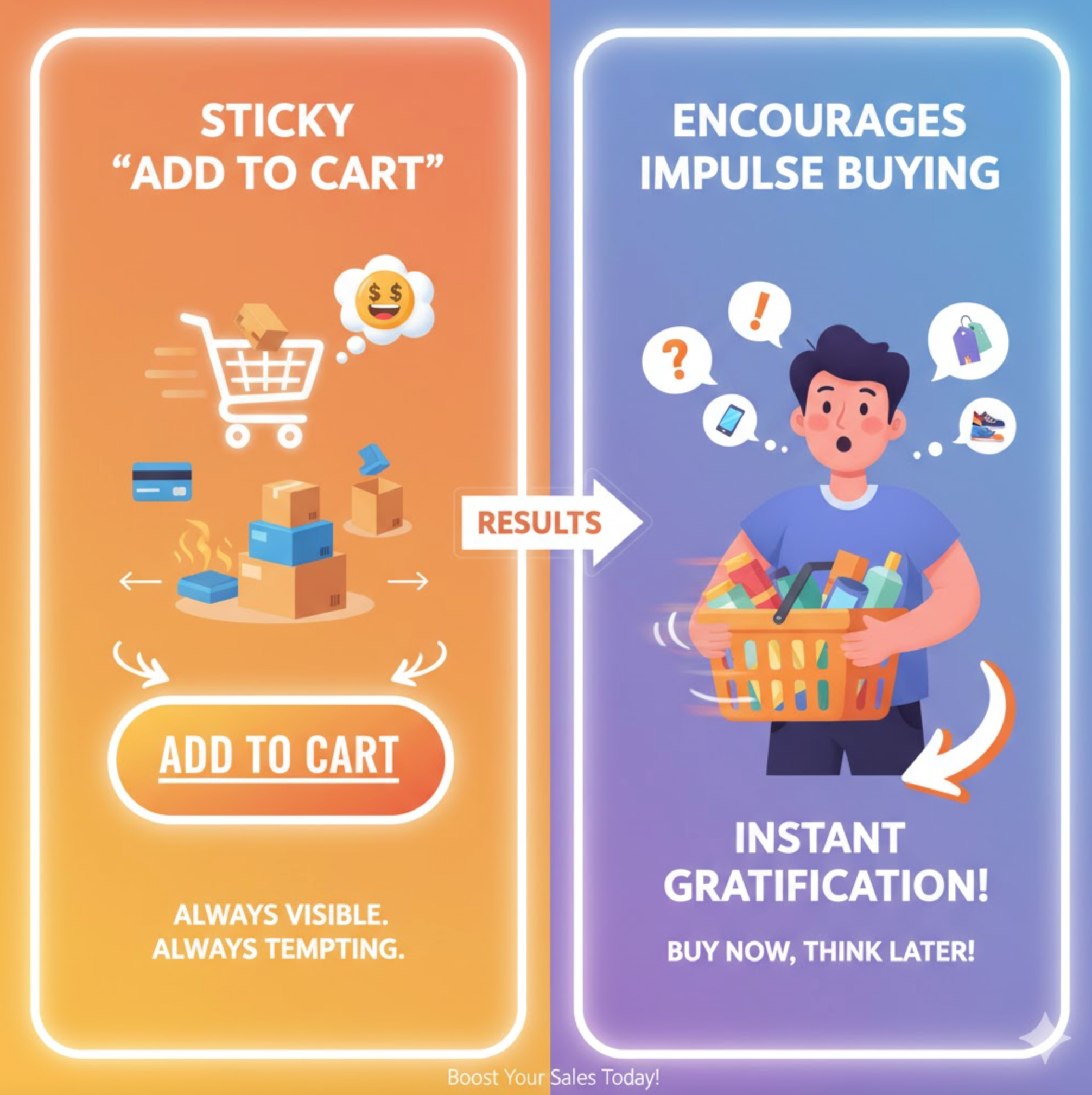
Impulse buying is a major driver of online sales. When a product looks appealing, customers are more likely to purchase it if they can act immediately. The longer the delay between desire and action, the greater the risk of hesitation.
A sticky Add to Cart bar eliminates that delay. The CTA remains in constant view, inviting customers to make quick, spontaneous purchases. This is especially effective for limited-time offers, flash sales, or items with visible scarcity messages such as “Only 3 left in stock.”
By reducing cognitive load and maintaining a sense of urgency, sticky bars make it easier for shoppers to act on their emotions, leading to higher conversion rates and more revenue.
Not all users interact with websites the same way. Some prefer scrolling through reviews, others focus on product details or images. A sticky Add to Cart bar ensures that no matter how customers browse, the path to purchase remains effortless and accessible.
This inclusive design enhances usability for all visitors, including those who may find repetitive scrolling challenging. It also creates a consistent and predictable shopping interface, which boosts confidence and satisfaction.
In short, sticky bars remove unnecessary obstacles, helping every visitor move smoothly from interest to action.
Mobile behavior studies show that most users navigate websites using their thumbs. This means essential actions should be positioned within the “thumb-friendly zone” at the bottom of the screen. Sticky Add to Cart bars perfectly align with this ergonomic principle.
By placing the button exactly where users’ thumbs rest, you create a natural, one-handed browsing experience. The result is a store that feels effortless to use, no zooming, scrolling, or awkward tapping required.
This kind of comfort and efficiency translates directly into higher engagement and conversion rates on mobile devices.
Modern sticky Add to Cart bars do more than display a button. Many include dynamic details such as:
These features provide relevant information without forcing users to scroll back to the top. This clarity reduces hesitation, builds trust, and keeps shoppers focused on completing their purchase.
Customers often associate a well-designed shopping experience with professionalism and reliability. A sticky Add to Cart bar signals that your store is optimized for convenience and care.
By reducing confusion and streamlining navigation, you make shoppers feel that your site is trustworthy and user-focused. This psychological comfort often leads to higher customer satisfaction, repeat visits, and stronger brand loyalty.
Another advantage of sticky Add to Cart bars is their adaptability. You can customize colors, fonts, button shapes, or animations to match your brand identity. You can also test various CTA messages such as “Add to Bag,” “Buy Now,” or “Get Yours Today” to see what resonates best with your audience.
Consistency in design and messaging reinforces brand recognition while maintaining visual harmony across your store. A polished, on-brand sticky bar helps maintain trust and creates a seamless look that complements your overall design.
Sticky Add to Cart bars are one of the simplest yet most effective tools for improving mobile conversions. They make shopping faster, easier, and more intuitive, qualities that today’s mobile users expect.
By ensuring the Add to Cart button is always visible, you reduce friction, improve usability, and encourage impulse buying. Combined with the right Shopify app, this small design enhancement can lead to measurable increases in sales and customer satisfaction.
In an era where mobile traffic dominates eCommerce, optimizing your store for mobile convenience is no longer optional—it’s essential. A sticky Add to Cart bar doesn’t just keep your CTA visible; it keeps your revenue flowing.


To effectively engage this segment, businesses need to understand their motivations and behaviors before designing strategies that gradually build deeper loyalty.
Custom and personalized products are powerful drivers of emotional connection and brand differentiation. Businesses must carefully manage expectations while protecting themselves from losses. A well-designed return policy becomes essential to maintaining both trust and profitability.
Customer reviews that compare your product to competitors are both a challenge and an opportunity. Handled well, these reviews can strengthen trust and influence future buyers. The key lies in responding with clarity, confidence, and customer-focused insight.