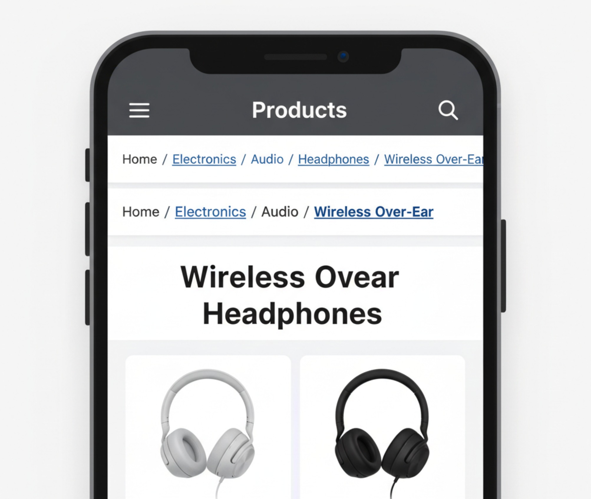
Breadcrumbs are essential for guiding users through a website’s hierarchy, especially on mobile devices where navigation space is limited. They provide context, save time, and improve the overall browsing experience. To maximize their value, breadcrumbs must be designed specifically with mobile usability in mind. Let’s explore the best practices to optimize breadcrumbs navigation for mobile.
Mobile navigation is often more challenging than desktop browsing because menus are condensed, sidebars are removed, and screen space is extremely limited. Users are forced to rely on icons, hidden menus, or endless scrolling, which can easily lead to frustration. Breadcrumbs provide a simple yet powerful solution by giving users a clear sense of where they are and how they can move around without unnecessary effort.
Breadcrumbs enhance mobile navigation by reducing frustration, saving time, and keeping users oriented within a site’s hierarchy. By combining context, efficiency, and clarity, they ensure visitors remain engaged longer and are more likely to continue exploring.
Since mobile screens are narrow, breadcrumbs should remain short and easy to scan at a glance. Long labels not only clutter the design but also frustrate users when text wraps awkwardly. Keeping them concise ensures that navigation feels light and user-friendly.
Short, scannable breadcrumbs give users exactly the information they need without overwhelming the interface.

Separators between breadcrumb levels are small but powerful design elements. On mobile, they help users quickly distinguish one step from another. Choosing the right separator ensures clarity without adding visual clutter.
With clear separators, users can follow breadcrumb trails with ease, even when multitasking on mobile.
Breadcrumbs should not only inform users but also act as a navigation shortcut. On mobile, where every tap matters, tappable breadcrumbs save time and reduce friction. This transforms breadcrumbs from static text into an interactive feature.
Tappable breadcrumbs empower users to move freely through your site without frustration.
If breadcrumbs are hidden or buried, their usefulness disappears. On mobile, where attention spans are short, they should be one of the first navigation cues a user sees. Proper visibility ensures that users immediately recognize breadcrumbs as a helpful tool.
When breadcrumbs are visible at first glance, they naturally guide users through your site.
Mobile devices come in many sizes, and a one-size-fits-all breadcrumb design often fails. Breadcrumbs must adjust gracefully to different screens and orientations. Responsiveness keeps navigation smooth no matter what device a user chooses.
Responsive breadcrumbs guarantee that your navigation remains effective, regardless of device size.
On long product or content pages, users often scroll far away from the top navigation. Breadcrumbs can disappear from view, reducing their usefulness. A sticky breadcrumb bar solves this by keeping navigation always accessible.
Sticky breadcrumbs improve convenience, allowing users to retrace steps without scrolling back up.
Breadcrumbs do more than guide users, they also improve search visibility. When optimized with structured data, they often appear in Google search results. This creates a better experience for both users and search engines.

Optimized breadcrumbs strengthen your site’s SEO while improving user navigation at the same time.
Breadcrumbs may seem small, but they have a big impact on mobile navigation. By making them concise, visible, interactive, and SEO-friendly, you enhance both user experience and search performance. A well-designed breadcrumb trail keeps users oriented and confident as they move through your site.


To effectively engage this segment, businesses need to understand their motivations and behaviors before designing strategies that gradually build deeper loyalty.
Custom and personalized products are powerful drivers of emotional connection and brand differentiation. Businesses must carefully manage expectations while protecting themselves from losses. A well-designed return policy becomes essential to maintaining both trust and profitability.
Customer reviews that compare your product to competitors are both a challenge and an opportunity. Handled well, these reviews can strengthen trust and influence future buyers. The key lies in responding with clarity, confidence, and customer-focused insight.