Please select the platform to login


The cart experience is one of the most decisive moments in the eCommerce journey. By the time a customer reaches the cart, interest has already been established, but the purchase is still not guaranteed. Small design choices at this stage can either reinforce buying intent or introduce hesitation that leads to abandonment.
Traditionally, eCommerce stores have relied on a dedicated cart page to help shoppers review their orders. However, with changing user behavior, especially on mobile, mini carts have become increasingly popular as a faster, more seamless alternative. Both options aim to guide customers toward checkout, yet they do so in very different ways.
To understand which one converts better, it’s essential to compare them across key factors that directly influence user behavior and purchasing decisions.
Before evaluating which option converts better, it is important to understand the fundamental role each cart type plays in the shopping journey. Although both serve the same purpose, helping customers review selected products and move toward checkout, the way they guide users through this stage is very different.
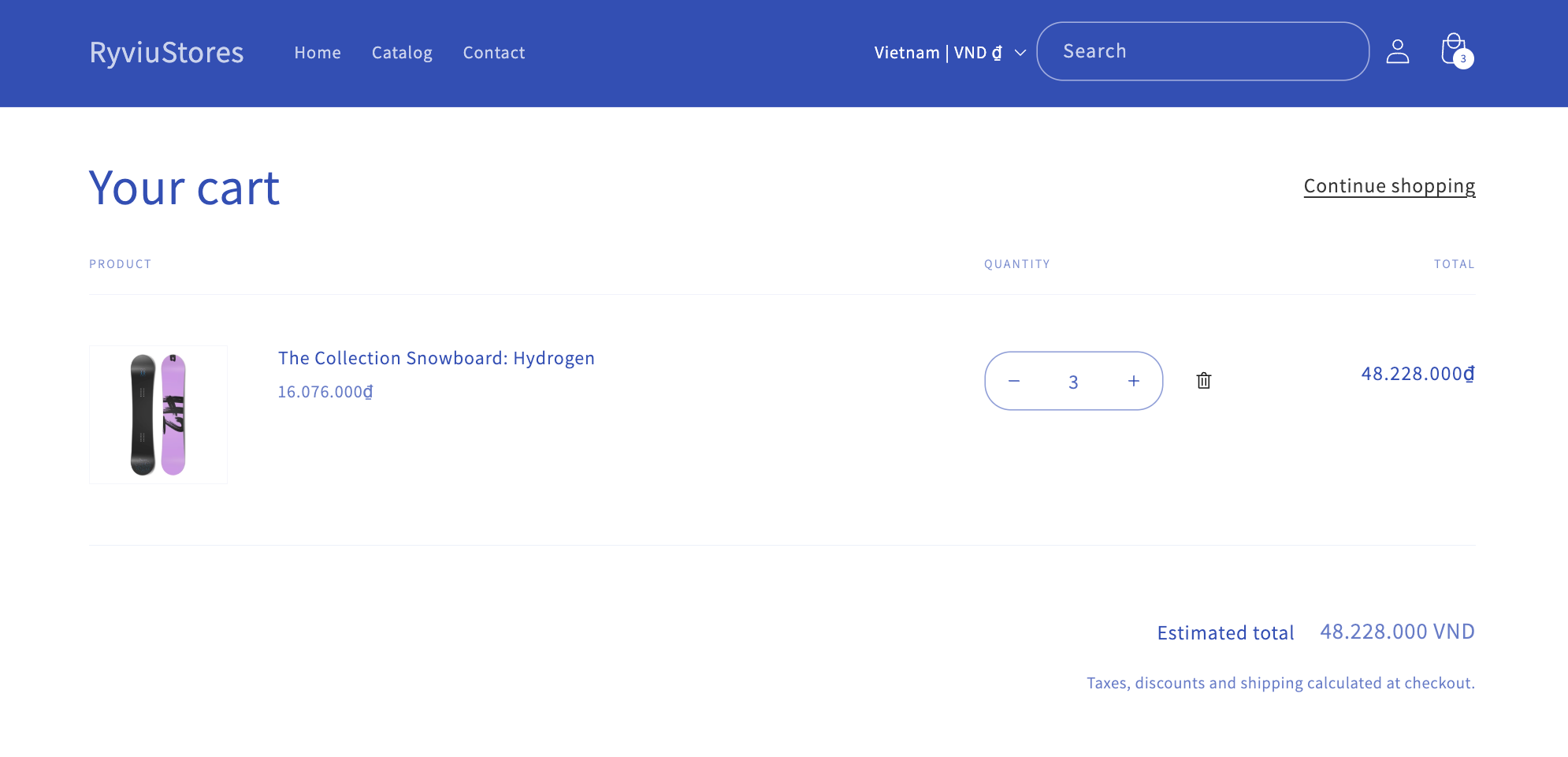
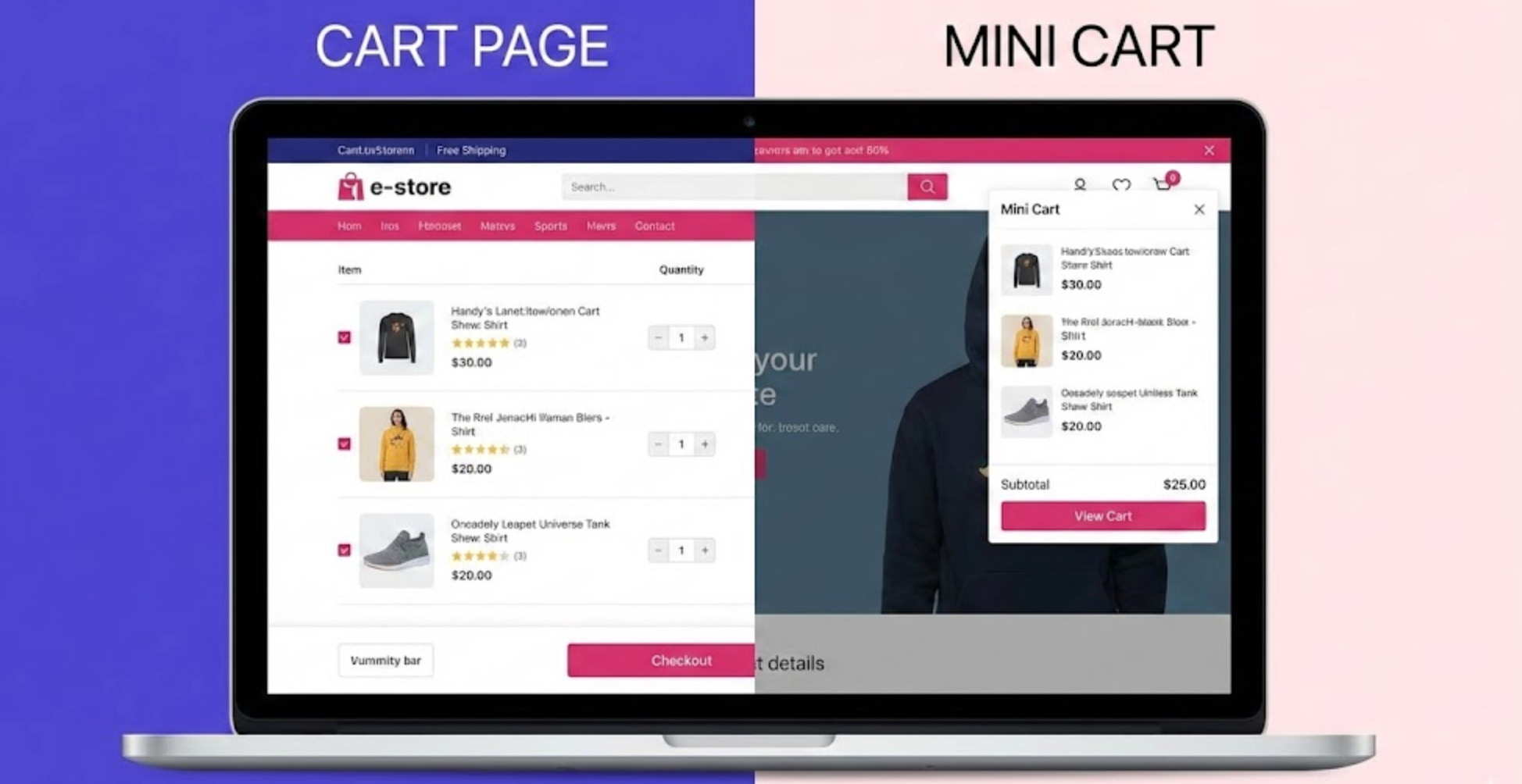
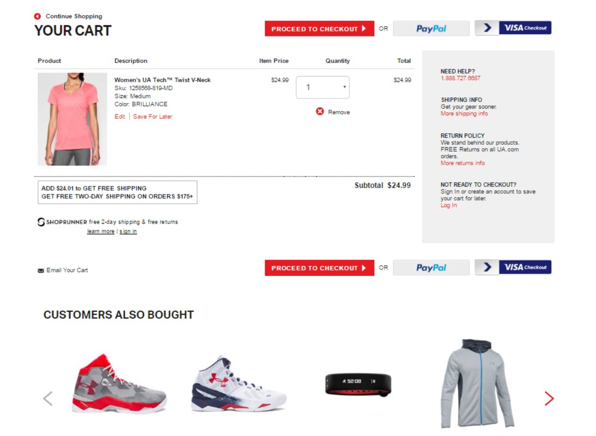
A cart page creates a clear, intentional break between browsing and purchasing. When shoppers are redirected to a dedicated page, their mindset often shifts from exploration to evaluation. This space allows them to carefully review product details, adjust quantities, apply discount codes, and confirm pricing or shipping information. In many cases, this pause is not a drawback but a necessary moment for reassurance, especially when customers are buying multiple items or higher-value products.
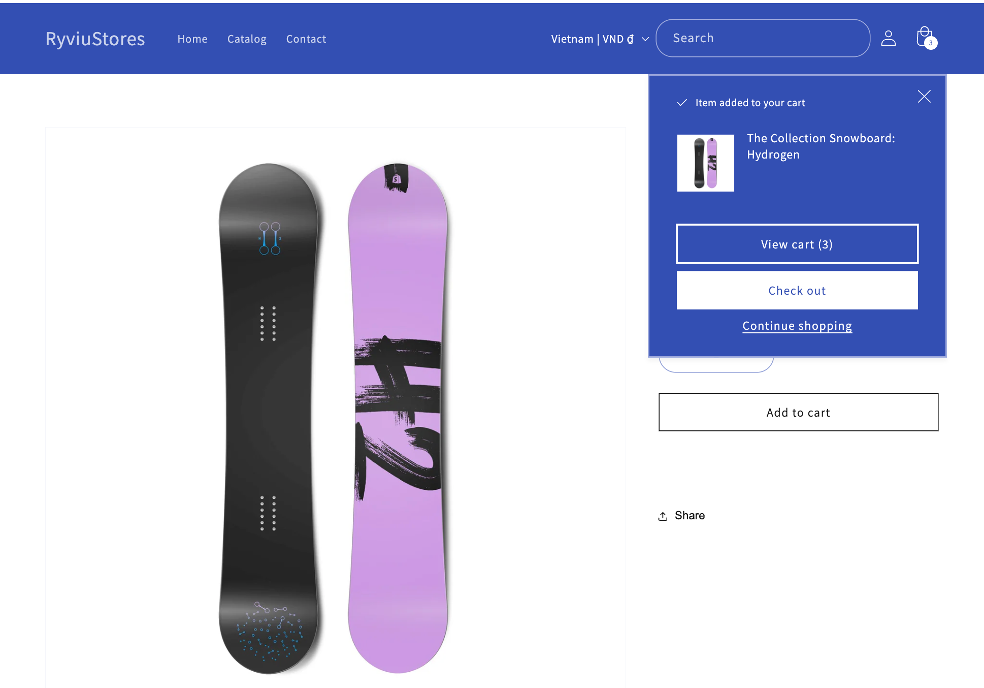
On the other hand, a mini cart is designed to preserve momentum rather than interrupt it. By appearing as an overlay, drawer, or popup on the same page, it keeps users within the browsing context. Shoppers can quickly confirm what they’ve added, make small adjustments, and proceed to checkout without feeling like they’ve entered a new stage of the journey. This approach aligns well with modern shopping behavior, where speed and convenience often outweigh detailed review.
At its core, the difference comes down to intentional friction versus continuous flow. Cart pages introduce a controlled pause that encourages thoughtful decision-making, while mini carts remove friction to capitalize on immediate buying intent. This contrast, pause versus continuity, directly influences how users behave at the cart stage and ultimately shapes how each cart type impacts conversion rates.
User experience at the cart stage determines whether shoppers feel confident enough to proceed or frustrated enough to leave. At this point, customers are no longer exploring, they are validating their decision.
A cart page introduces a clear transition from browsing to purchasing. By moving users to a dedicated page, it encourages them to slow down, review product details, adjust quantities, and confirm pricing. This structured environment helps reduce uncertainty, particularly for shoppers who want to double-check their choices before committing.
In contrast, a mini cart keeps the experience fluid and uninterrupted. Appearing as a drawer or overlay, it allows users to review their cart without losing context. This creates a faster, more modern shopping flow that feels effortless, especially for confident buyers.
Verdict: Cart pages deliver a stronger experience for reassurance, while mini carts deliver a smoother experience for speed.
The way a cart influences conversions depends on whether it reduces doubt or preserves buying momentum. Both approaches can convert well, but for different reasons.
Cart pages support conversion by providing clarity and trust signals. Shipping details, return policies, and full order summaries help users feel secure before checkout. When designed cleanly, this reassurance can significantly reduce last-minute hesitation.
Mini carts convert by minimizing steps. By removing page reloads and shortening the path to checkout, they capitalize on high purchase intent. This is particularly effective for impulse purchases and repeat customers who already trust the brand.
Verdict: Mini carts generally convert better for fast decisions, while cart pages convert better for considered purchases.
Mobile shoppers are more sensitive to friction, slow loading, and excessive scrolling. As a result, cart performance on small screens has a direct impact on abandonment rates.
Cart pages on mobile often require more scrolling and taps, which can feel cumbersome. Mini carts, however, are designed to fit naturally into mobile interaction patterns, using slide-in drawers that are easy to view and dismiss.
Verdict: Mini carts perform better on mobile due to their compact, touch-friendly design.
The cart is also a strategic point to increase order value, but each cart type supports upsells in different ways.
Cart pages provide enough space for detailed recommendations, bundles, and “complete the look” suggestions. This allows shoppers to understand the value of additional items without feeling rushed.
Mini carts, on the other hand, favor simplicity. Quick add-ons that can be added with one click perform well, while complex offers tend to be ignored due to limited space.
Verdict: Cart pages are better for thoughtful upsells, while mini carts are better for impulse add-ons.
Shoppers arrive at the cart with varying levels of readiness. Some want to review every detail, while others simply want to complete the purchase as quickly as possible.
Cart pages align with users who are still validating their decision, while mini carts cater to users who are already confident and ready to pay.
Verdict: Cart pages suit cautious buyers, while mini carts suit decisive buyers.
The effectiveness of each cart type also depends on what a store sells.
Stores offering high-ticket, customizable, or B2B products benefit from the structure and transparency of a cart page. Stores selling fashion, lifestyle, or fast-moving products often see higher conversions with mini carts due to shorter decision cycles.
Verdict: Product complexity favors cart pages, while simplicity and repeat purchases favor mini carts.
When comparing cart pages and mini carts, the question is not which one is objectively better, but which one is better for your customers.
For many Shopify stores, the highest-converting approach is not choosing one over the other, but combining both strategically. A mini cart maintains momentum, while a clean, optimized cart page provides reassurance for users who need it. The best-converting cart experience is the one that adapts to different user intents, offering speed when shoppers are ready to buy and clarity when they need confidence.

